Micro-SaaS & Developer Tools Professional Website Template
Vault is a scroll-reveal landing page template built for cloud storage platforms. It uses a Midnight Blue color system, animated competitor comparisons, and a single-field migration form to move visitors toward action fast. The design feels like a live server room at midnight, cold, authoritative, and completely convincing.
by Rocket studio
Quick summary
Vault is a single-page, scroll-reveal landing page template designed for cloud storage platforms. It pairs a cinematic dark interface with structured comparison sections, animated speed benchmarks, and a flipping pricing reveal. Every scroll feels like a system coming online. The template is built to convert technically minded visitors who are actively evaluating storage providers.
Who this template is for
This template is made for founders, technical decision-makers, and platform builders who need to win over cautious, comparison-driven buyers. It speaks directly to people who read specs before they read headlines.
- Startup founders hitting the ceiling on free-tier cloud storage plans
- Chief Technology Officers (CTOs) migrating infrastructure away from on-premise hardware
- Compliance-aware operators who need to communicate reliability and data control to prospects
What problem this template solves
Cloud storage platforms struggle to stand out in a market where every competitor claims speed, reliability, and value. Visitors arrive skeptical and leave quickly if the page does not immediately prove its case. Generic landing pages fail this audience.
- Visitors leave without converting because the value difference is never made clear
- Comparison shopping happens off-page, pulling potential customers toward competitors
- Pricing confusion slows decisions and increases drop-off before the call to action
What you get with this template
Vault delivers a fully structured, atmosphere-driven landing page that leads visitors through a logical evidence sequence. The layout escalates from emotional atmosphere to hard data to a decisive call to action.
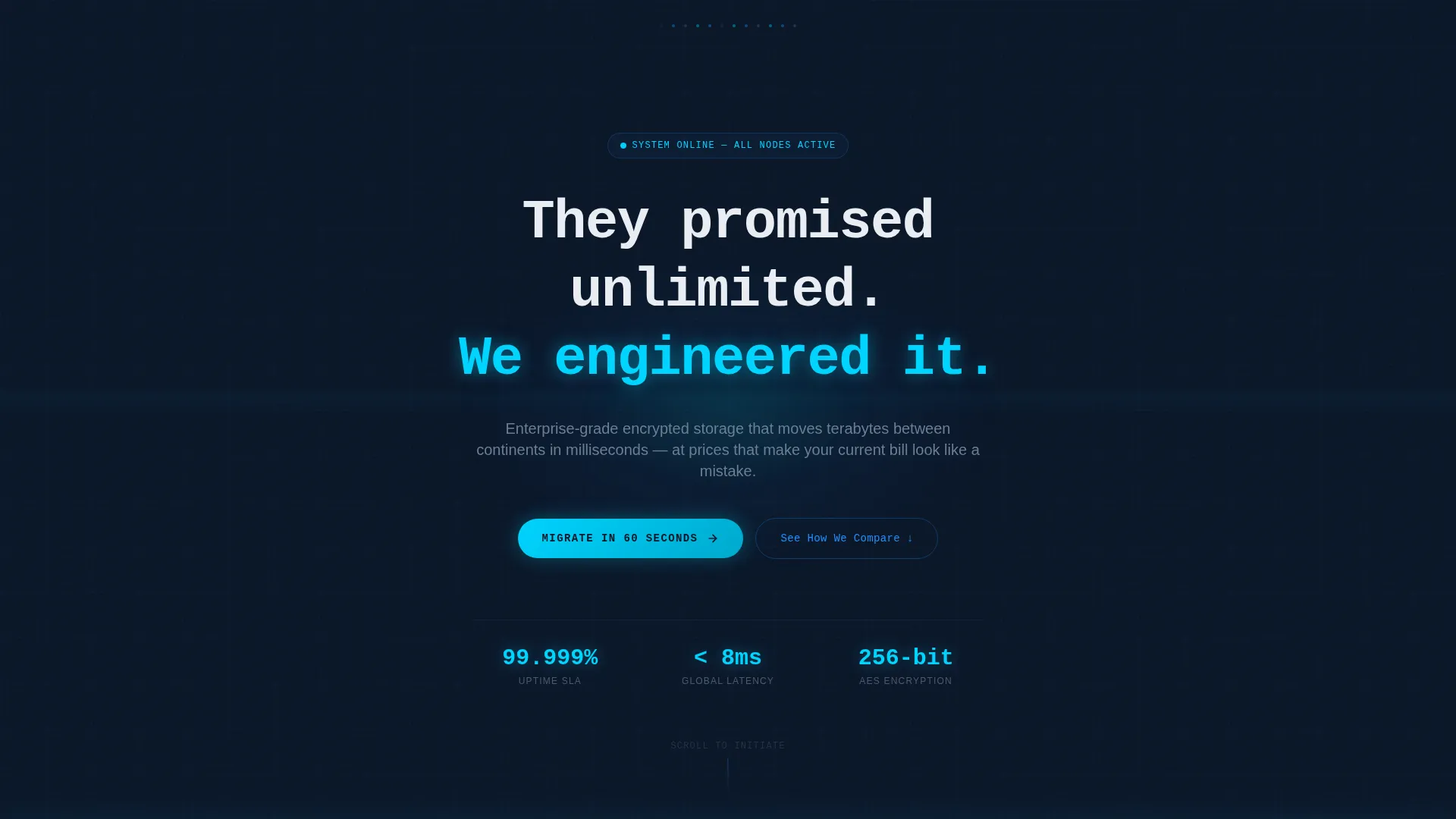
- A dark full-bleed header with a pulsing cyan radial glow and a self-typing monospaced headline
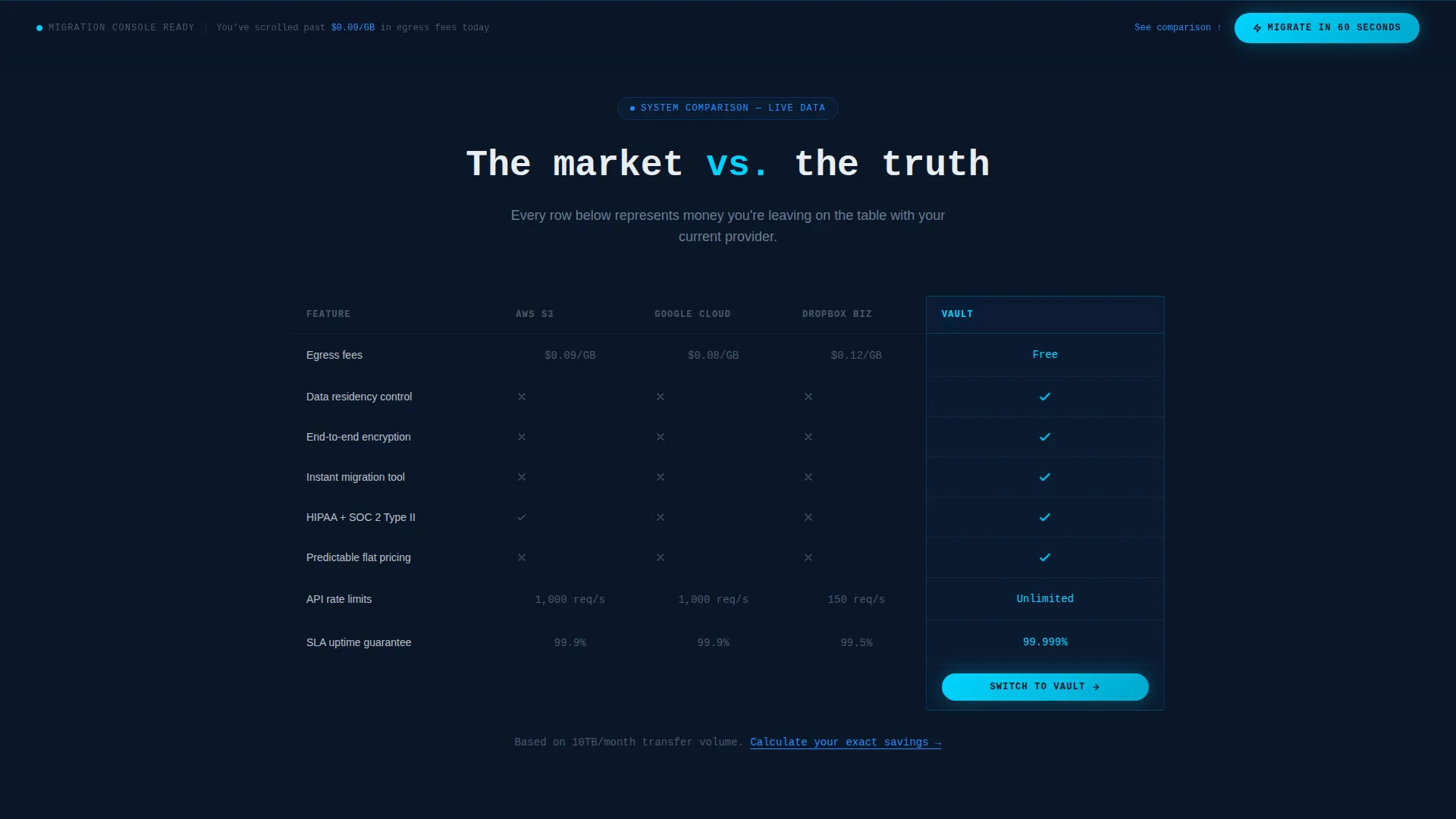
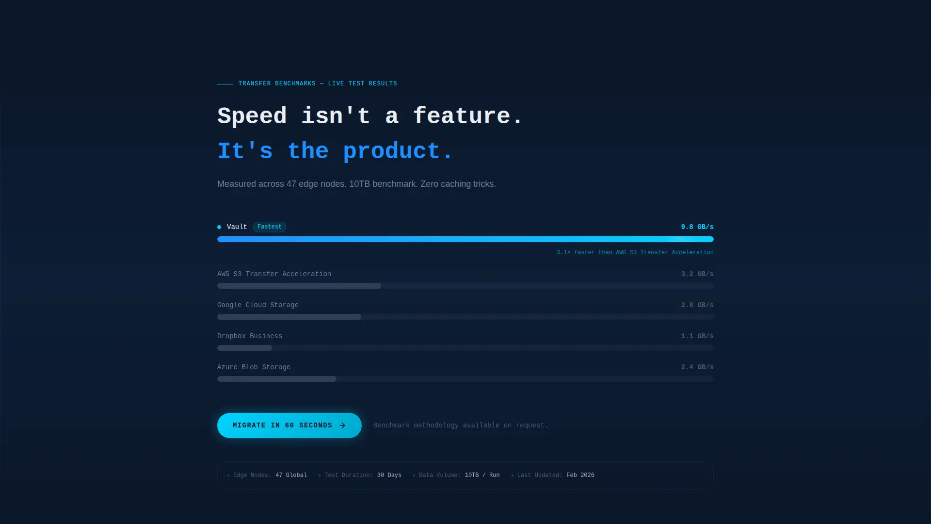
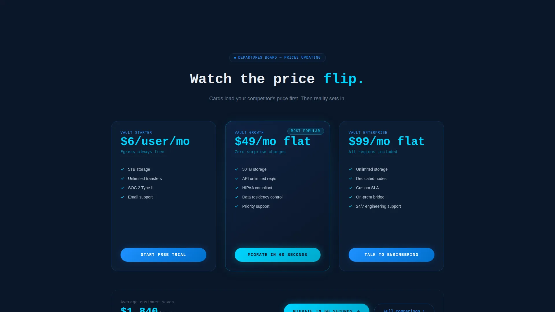
- An animated competitor comparison table, transfer speed benchmarks with progress bars, and a flipping pricing reveal
- A fixed bottom call-to-action bar, a single-field email form with a provider dropdown, and three strategically placed primary action buttons
Feature list
This template includes purpose-built components that work together to build trust and push conversion. Each section is designed for a specific stage in the visitor's decision process.
Self-Typing Monospaced Headline
The header opens with a headline that types itself into existence on a dark canvas. A cyan radial glow pulses on a four-second loop, creating atmosphere before a single word is read. Navigation stays hidden for the first three seconds so the mood lands fully.
Scroll-Reveal Section Animations
Each section activates as the visitor scrolls, mimicking a system coming online. The progressive reveal builds a sense of momentum and keeps visitors engaged across the full page length rather than bouncing at the top.
Animated Competitor Comparison Table
Rival platform columns appear first in muted gray, then Vault's column lights up in electric cobalt with checkmarks animating into place. This layout makes the advantage immediate and visual without requiring the visitor to read dense copy.
Live Transfer Speed Benchmarks
Animated progress bars race named competitors in real time as the section scrolls into view. Speed differences are shown visually, giving data-oriented visitors the proof they need without requiring them to leave the page.
Flipping Pricing Reveal
Each pricing card flips from a competitor's listed price to Vault's price, styled like a departures board. The effect is dramatic and direct, reinforcing the cost advantage at exactly the moment the visitor is weighing value.
Fixed Bottom Call-to-Action Bar
A persistent action bar activates once the visitor scrolls past the fold. It stays visible throughout the rest of the page, ensuring the primary call to action is always within reach no matter where the visitor is reading.
Page sections overview
| Section | Purpose |
|---|---|
| Dark Header Canvas | Sets atmosphere and introduces the headline with a pulsing glow effect |
| Competitor Comparison Table | Shows feature advantages visually with animated column reveals |
| Speed Benchmark Section | Demonstrates transfer performance with animated, racing progress bars |
| Pricing Flip Cards | Contrasts competitor pricing with Vault's tiers using a flip animation |
| Migration Form Block | Captures email and current provider for a personalized next step |
| Fixed call to action Bar | Keeps the primary call to action visible throughout the scroll journey |
Design & branding system
The visual identity follows a Data Command theme. Every color choice is deliberate and functional, creating a NOC (Network Operations Center) dashboard aesthetic that communicates authority without decoration.
- Abyssal navy (#0A1628) as the primary background, electric cobalt (#1E90FF) for interactive elements and hover states, and pale signal white (#E8EDF2) for body typography
- Pulsing cyan (#00D4FF) reserved exclusively for calls to action and data-in-motion indicators, keeping the eye trained on conversion points
- Monospaced typography used in the headline to reinforce a terminal or command-line aesthetic that resonates with technical audiences
Mobile & speed optimization
The template is structured to maintain its visual hierarchy and animation flow across screen sizes. The scroll-reveal behavior and dark palette are designed to read clearly on smaller displays without losing impact.
- Section animations are built to trigger correctly on mobile scroll events, preserving the progressive reveal experience on touch devices
- The fixed bottom call-to-action bar remains accessible on mobile viewports, keeping the primary action within thumb reach throughout the session
How this template helps you convert
Vault is built around a Comparison/Versus conversion strategy. The page earns the click by stacking evidence progressively, so by the time the visitor reaches the form, the case has already been made.
- The competitor comparison table and speed benchmarks remove doubt early by showing data rather than making claims, giving skeptical technical buyers the proof they need before committing.
- The flipping pricing cards and three-point placement of the primary call to action ("Migrate in 60 Seconds") create urgency at the right moments, turning a passive scroll into an active decision.
Other information about this template
Vault is a single-page scroll-reveal template built specifically for the cloud storage niche within the Micro-SaaS and developer tools space. It is designed for teams who need to compete visually and factually against established cloud platforms.
- The migration form includes a provider dropdown covering options such as AWS, Google Cloud, and Dropbox Business, allowing the next screen to serve a personalized migration cost calculator
- The secondary call to action ("See How We Compare") anchors back to the versus table, giving undecided visitors a lower-commitment path that keeps them on the page
- The template falls under the Technology category and is suited for any cloud storage product competing against large incumbents in the market
Theme
Data Command
Creative direction
Launch Energy
Color system
Midnight Blue
Style
Scroll Reveal (Progressive)
Direction
Comparison/Versus
Page Sections
Self-typing Monospaced Headline
Scroll-reveal Section Animations
Animated Competitor Comparison Table
Live Transfer Speed Benchmarks
Flipping Pricing Reveal Cards
Fixed Bottom Call-to-action Bar
Related questions
Who is this landing page template designed for?
Can I edit the competitor names in the comparison table and pricing cards?
What does the migration form collect?
How does the scroll-reveal animation sequence work?
Is this template suited for a dark-mode brand identity?



