AI-Powered DAM Comparison Table Landing Page
Vault is a single-page comparison table landing page template built for an AI-powered digital asset management platform. It leads with an interactive search preview, walks prospects through a structured feature matrix, and drives sign-ups through a three-step progressive form. The design runs on a deep indigo and black palette that feels sharp, fast, and enterprise-ready.
by Rocket studio
Quick summary
Vault is a lead generation landing page template designed for an AI-powered digital asset management platform. It opens with a live interactive search preview, builds trust through a structured feature comparison matrix, and closes with a progressive three-step sign-up form. The electric indigo and deep black visual system signals speed, precision, and technical confidence.
Who this template is for
This template is built for teams who need to sell a complex software product to a skeptical, results-oriented audience. It works best when your product can prove its value through direct interaction rather than marketing language.
- Creative operations managers who need to show buyers instant relief from messy shared drives
- Brand directors and agency producers evaluating AI-powered asset management tools
- Software founders and product marketers pitching enterprise digital asset platforms to procurement-aware buyers
What problem this template solves
Finding the right asset at the right moment costs creative teams real money and real time. Buyers of AI-powered asset tools are already burned by legacy systems and need more than a feature list before they commit.
- Teams waste billable hours searching Slack threads and email chains for approved files
- Brand managers keep finding outdated logo versions embedded in decks and campaign materials
- Legacy digital asset management tools offer slow search and poor auto-tagging with no meaningful comparison data to justify switching
What you get with this template
This template delivers a fully structured, single-page layout that guides a visitor from curiosity to booked demo without friction. Every section is designed to answer a skeptic's question with visual evidence rather than copy.
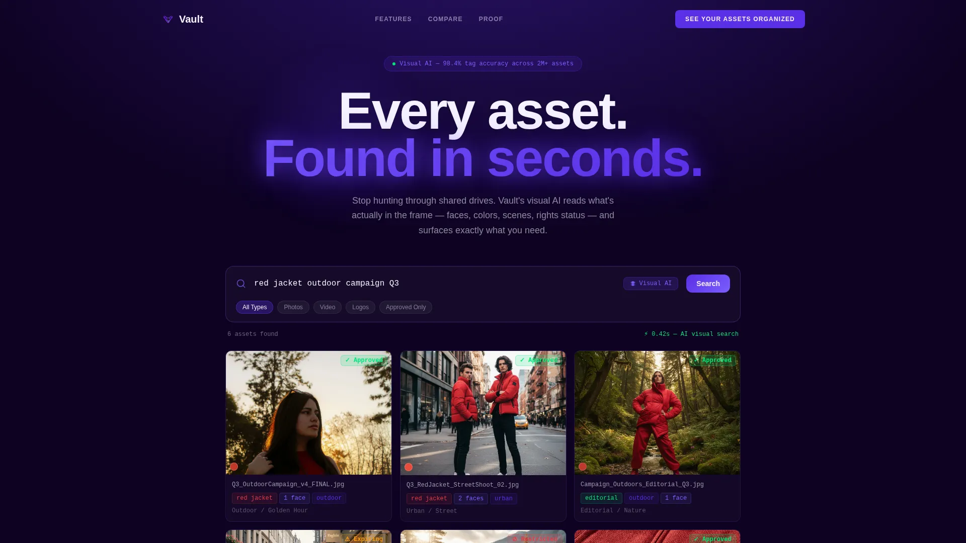
- An interactive header search preview with a mock asset grid and visible AI-generated tags
- A three-column feature comparison table with expandable rows, signal green checkmarks, and gray competitor dashes
- A three-step progressive lead generation form followed by a sticky call-to-action bar that persists through scroll
Feature list
This template is built around one core idea: let the product prove itself before the form ever appears. Each feature below is grounded in that principle.
Interactive Search Header
A live search bar sits centered on the page with a blinking cursor and ghost text. When a visitor types or clicks, a mock asset grid populates in real time with thumbnail cards showing AI-generated tags including face count, dominant color, scene type, and usage rights status.
Three-Column Comparison Table
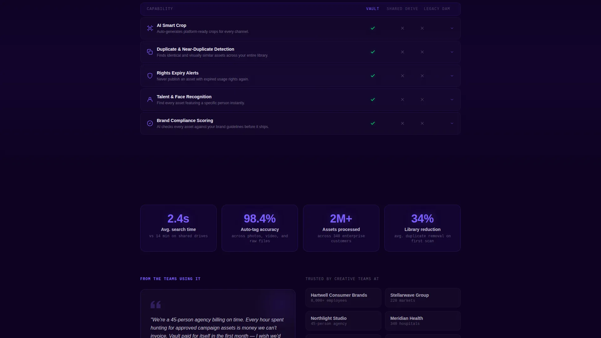
The first major scroll section places Vault beside shared drives and legacy digital asset management tools in a side-by-side table. Rows cover metrics like average search time, auto-tagging accuracy, and version control depth, with signal green checkmarks marking Vault's advantages and gray dashes for competitors.
Expandable Feature Matrix Rows
Beneath the primary comparison table, deeper capability rows are structured as expandable items. Visitors can reveal details on AI crop suggestions, duplicate detection, and expiry alerts at their own pace, rewarding curiosity without overwhelming first-time visitors.
Sortable and Filterable Comparison
Visitors can sort and filter the comparison table themselves. This micro-interaction keeps buyers engaged and lets them prioritize the criteria that matter most to their specific workflow.
Three-Step Progressive Lead Form
The sign-up flow breaks commitment into three low-friction steps. The first step asks only for a work email. The second collects company size and estimated asset volume via dropdowns. The third embeds a calendar for a personalized demo booking.
Sticky Call-to-Action Bar
After the first comparison table, the primary call-to-action reads "See Your Assets Organized" and reappears as a sticky bar throughout the scroll. A secondary path labeled "Try the AI Search" links back to the header preview, keeping commitment pressure low.
Page sections overview
| Section | Purpose |
|---|---|
| Interactive Search Header | Demonstrate AI search with a live mock asset grid before any copy appears |
| Primary Comparison Table | Pit Vault against shared drives and legacy tools across key performance rows |
| Expandable Capability Rows | Reveal deeper features like duplicate detection and expiry alerts on demand |
| First call to action Block | Place the primary sign-up prompt immediately after the first comparison table |
| Progressive Lead Form | Collect work email, company details, and calendar booking across three steps |
| Sticky call to action Bar | Keep the primary call-to-action visible throughout the full page scroll |
Design & branding system
The visual system follows a Startup Velocity theme built entirely on the Electric Indigo color palette. The overall feel is a glowing screen in a dark room: focused, fast, and precise.
- Deep space black (#0D0221) anchors backgrounds; electric indigo (#5B2FE6) and UV glow violet (#7B5FFF) dominate interactive surfaces and gradient transitions; crisp interface white (#F4F2FF) keeps comparison tables razor-legible
- Signal green (#00E676) is reserved strictly for checkmarks and active states inside the comparison matrix, making Vault's advantages immediately readable at a glance
- No stock photography or illustration appears anywhere on the page; the product interface is the sole visual hero throughout every section
Mobile & speed optimization
The layout is built with a scroll-driven, section-led structure that translates cleanly to smaller viewports. The comparison table and expandable rows are the most component-heavy elements and are structured to remain navigable on touch screens.
- The three-column comparison table is designed to stay legible on mobile with the white-on-black palette maintaining strong contrast at smaller sizes
- The sticky call-to-action bar and three-step form are positioned to work as persistent, thumb-reachable elements during mobile scroll sessions
How this template helps you convert
Every design and layout decision in this template is built to reduce hesitation and move a skeptical buyer toward booking a demo. The page architecture is sequenced to answer objections before the form ever appears.
- The interactive header lets visitors experience the AI search tool firsthand, building confidence in the product before any feature claim is made in copy.
- The comparison table uses numbers, checkmarks, and competitor gaps to answer the "prove it" question with visual evidence rather than sales language.
- The three-step progressive form lowers perceived commitment at each stage, with the secondary "Try the AI Search" path giving hesitant visitors a no-pressure way to stay engaged.
Other information about this template
This template is categorized under Technology and specifically targets the AI-powered enterprise software space, with a niche focus on AI-powered digital asset management. It is designed as a single comparison table landing page rather than a multi-page website, making it straightforward to deploy as a standalone campaign or product page.
- The Startup Velocity theme and Electric Indigo color system were chosen to signal technical speed and modern enterprise credibility to a product-savvy audience
- The Feature Matrix creative direction means the page is structured around escalating evidence rather than narrative storytelling, which suits buyers who arrive with specific objections
- The template style is a Comparison Table format, which pairs well with competitive positioning and structured product evaluations common in the AI-powered DAM category


Theme
Startup Velocity
Creative direction
Feature Matrix
Color system
Electric Indigo
Style
Comparison Table
Direction
Lead Generation
Page Sections
Interactive AI Search Header
Three-column Comparison Table
Expandable Capability Rows
Sortable and Filterable Table Interactions
Three-step Progressive Lead Form
Sticky Call-to-action Bar
Related questions
Who is the ideal buyer for this template?
Can I customize the comparison table rows?
How does the three-step lead form work?
Does the interactive header require a live backend connection?
Is this template suitable for a product already in market, or only for pre-launch?



