Architecture Firm Software Professional Website Template
Vault is a split-screen landing page template built for architecture firm document management platforms. It pairs a live code-snippet header with scroll-driven micro-interactions, letting visitors drag, click, and search before they ever sign up. The Midnight Blue color system and Dynamic Motion theme give it the focused precision of a drafting table at midnight.
by Rocket studio
Quick summary
Vault is a single-page, split-screen landing page template designed for architecture firm document management software. It uses a Dynamic Motion theme, a Midnight Blue color palette, and an Interactive Explorer creative direction to turn passive visitors into active users. Every scroll section is a working micro-interaction that demonstrates the platform before anyone commits to signing up.
Who this template is for
This template is built for teams launching or marketing a document management platform aimed at the architecture and construction industry. It speaks directly to the people who feel the daily pain of disorganized drawing sets and lost revision histories.
- Project architects managing transmittal logs, RFI (Request for Information) threads, and revision sets across multiple consultants
- Office managers who need to locate current sheet sets quickly before a site visit
- Principals who require a clear audit trail when a contractor disputes a change order
What problem this template solves
Architecture firms deal with a constant flood of submittals, permit stamps, consultant markups, and superseded drawing versions. Finding the right document at the right moment is rarely simple. This template positions a platform as the solution to that exact chaos.
- Teams waste time chasing outdated sheets because there is no single living archive for all drawing versions
- Disputes over change orders become costly when audit trails are incomplete or hard to access
- Visitors to a software landing page leave without converting because they cannot feel the product working for them
What you get with this template
You get a fully structured, section-led landing page that doubles as an interactive product demo. The layout is a 50/50 split screen throughout, keeping code or interface logic on one side and rendered output on the other.
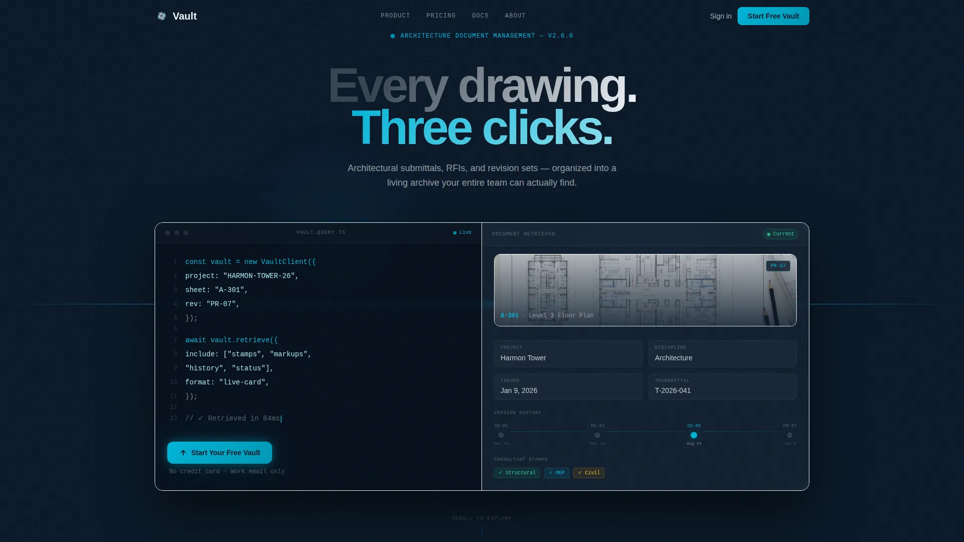
- A typewriter-animated code-snippet header that shows a live API call retrieving a document by project number, sheet designation, and revision
- Scroll-driven micro-interaction sections where visitors drag files, click revision dots, and filter search results in real time
- A freemium conversion flow with a primary call to action reading "Start Your Free Vault" and contextual variants after each interactive section
Feature list
A paragraph introducing the feature set: each capability below is drawn directly from the template brief and reflects what the finished page delivers to both the visitor experience and the conversion goal.
Split-Screen Code Snippet Header
The header divides into two equal halves. The left side displays a real API call with syntax highlighted in cyan and white against deep navy, appearing line by line with a typewriter animation. The right side responds in sync, sliding in a rendered document card complete with a thumbnail, version history timeline, consultant stamps, and a pulsing green live status badge.
Scroll-Driven Interactive Explorer
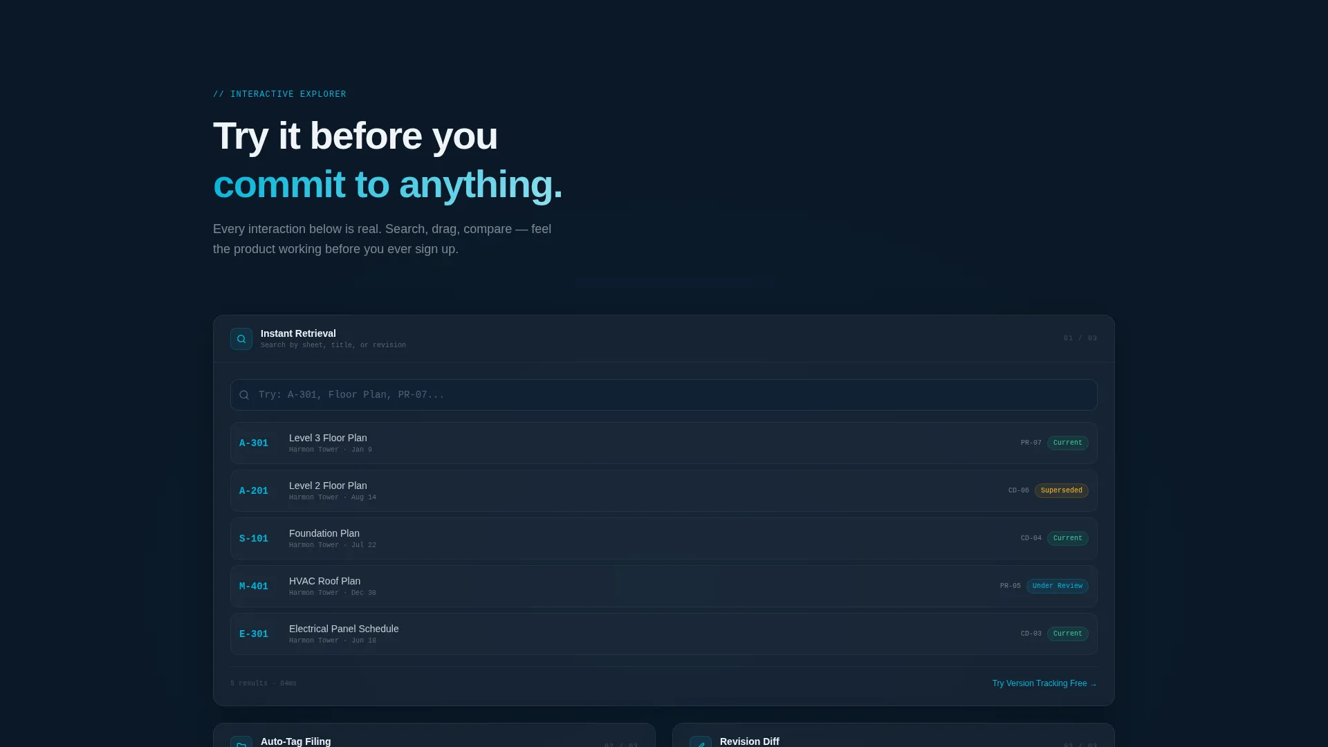
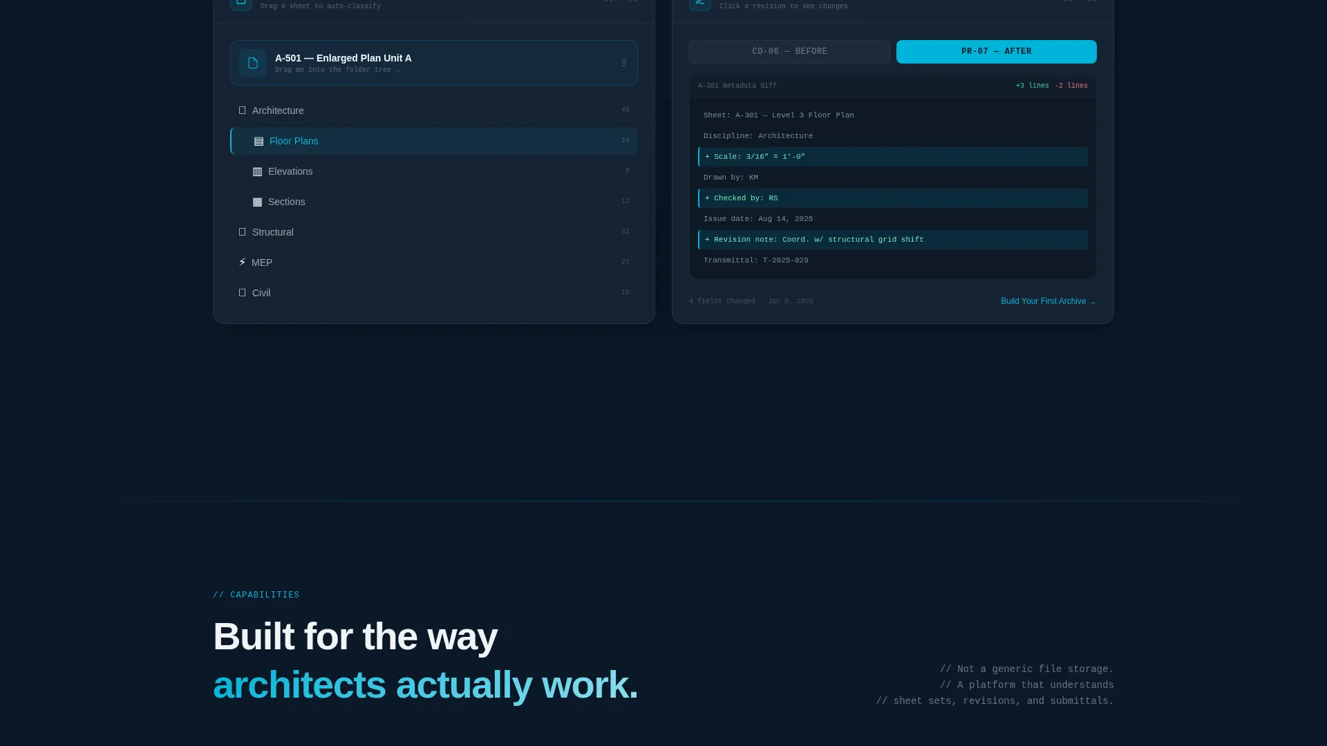
Every scroll section is a working micro-interaction, not a static screenshot. Visitors can drag a drawing into a folder tree and watch it auto-tag, click a revision dot on a timeline to see a diff overlay between sheet versions, and type a project number into a mock search bar to watch results filter with motion-blurred transitions.
Escalating Scenario Sections
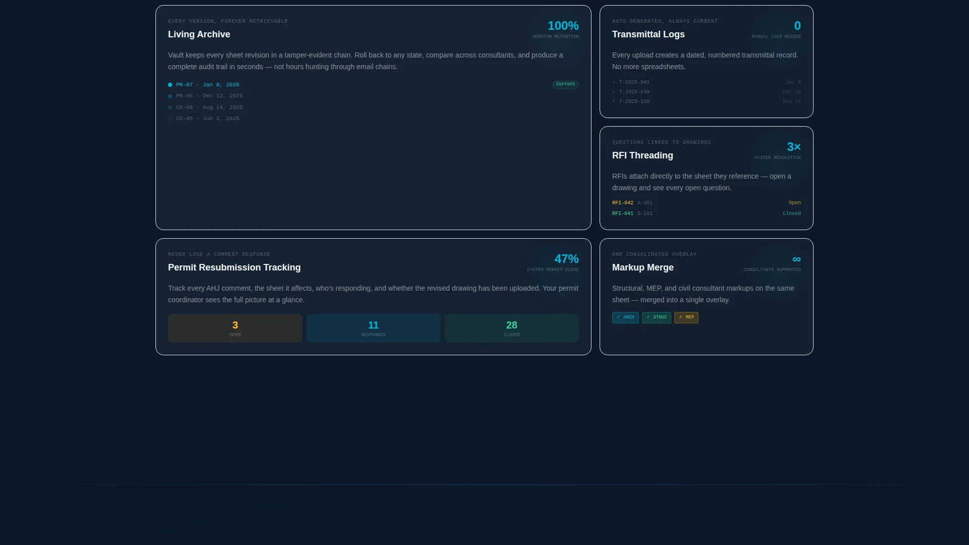
The page builds stakes as the visitor scrolls. Early sections cover simple document retrieval. Later sections demonstrate cross-consultant markup merging, permit resubmission tracking, and a live dashboard showing an entire project's document health at a glance.
Freemium Conversion Path
The primary call to action, "Start Your Free Vault," appears first inside the header panel as a glowing cyan button. It resurfaces after each interactive section with contextual variants such as "Try Version Tracking Free" and "Build Your First Archive." The sign-up form collects only work email and firm name, with no credit card or phone number required.
Secondary Migration Path
A second conversion route labeled "Import a Live Project" targets firms ready to migrate existing documents. It links to a guided onboarding flow, giving experienced buyers a faster path to value without interrupting the primary freemium journey.
Dynamic Motion Visual System
Hover states trace in bright blueprint cyan. Animated transitions use motion blur to signal speed and responsiveness. The overall effect reinforces the platform's core promise: ask for anything, get it instantly.
Page sections overview
| Section | Purpose |
|---|---|
| Split-Screen Header | Introduce the platform via a typewriter API call and a live document card response |
| Drag-and-Tag Section | Let visitors drop a drawing into a folder tree and see auto-tagging in action |
| Revision Timeline Section | Allow visitors to click revision dots and view a diff overlay between sheet versions |
| Live Search Section | Show real-time filtering as a project number is typed into a mock search bar |
| Markup Merge Section | Demonstrate cross-consultant markup merging as a higher-complexity scenario |
| Permit Tracking Section | Walk through permit resubmission tracking as an escalated use case |
| Project Health Dashboard | Display a full project's document health at a glance as the final capability reveal |
| Contextual call to action Blocks | Resurface conversion prompts with relevant variants after each interactive section |
| Sign-Up Form | Capture work email and firm name with no credit card required |
| Secondary Onboarding Path | Offer a guided "Import a Live Project" flow for firms migrating existing documents |
Design & branding system
The Midnight Blue color system gives Vault the atmosphere of a drafting table at midnight: dark, focused, and illuminated by the precise glow of active work. Every color choice serves a functional role in guiding the eye and signaling interactivity.
- Deep command-center navy (#0B1929) dominates backgrounds, architectural graphite (#1E2A3A) structures cards and panels, bright blueprint cyan (#00B4D8) traces every hover state and animated transition, and clean vellum white (#F0F4F8) gives typography room to breathe
- The Dynamic Motion theme drives all transitions, with cyan-lit animations and motion-blurred search results reinforcing the platform's speed and precision
- Typography sits on vellum white content surfaces, keeping readability sharp against the dark navy and graphite layers
Mobile & speed optimization
The split-screen layout and interactive micro-interactions are designed with a responsive structure in mind. Visitors on smaller screens should still move through the product demonstration without losing the core experience.
- The 50/50 split-screen stacks vertically on mobile, keeping code snippet and document card panels readable at any viewport width
- Interactive sections are built as contained micro-interactions, so each demo moment loads as a focused unit rather than as a single heavy experience
- Motion and animation elements are scoped to their respective sections, preventing visual clutter as visitors scroll through on touch devices
How this template helps you convert
The conversion strategy behind Vault is built on the principle that a visitor who has already used the product is far easier to convert than one who has only read about it. The page earns the click by removing the leap of faith entirely.
- The interactive explorer approach turns each scroll section into a hands-on demo, so by the time a visitor reaches the sign-up form, they have already experienced the product's core value across multiple scenarios.
- The freemium model lowers the commitment barrier to a single work email and firm name, while the secondary "Import a Live Project" path gives more motivated buyers an immediate route to full onboarding.
Other information about this template
This template is categorized under Technology, specifically within the Architecture Firm Software subcategory and the Architecture Firm Document Management niche. It is built as a single landing page using a Split Screen (50/50) template style and carries an Intersection Match Score of 13, reflecting a strong alignment between the chosen design direction and the target niche.
- The Interactive Explorer creative direction and the Code Snippet header concept work together to make the page feel like a product trial, not a brochure
- The freemium and trial landing page direction means the page is optimized for low-friction sign-ups, not quote requests or demo bookings
- This template is a strong fit for software teams building in the architecture firm software space who want a visually distinctive, interaction-led launch page
Theme
Dynamic Motion
Creative direction
Interactive Explorer
Color system
Midnight Blue
Style
Split Screen (50/50)
Direction
Freemium/Trial
Page Sections
Split-screen Typewriter Header
Scroll-driven Micro-interactions
Escalating Scenario Structure
Freemium Conversion Flow
Secondary Onboarding Path
Dynamic Motion Color System
Related questions
Who is the Vault landing page template designed for?
Does the template include a sign-up form?
What makes the interactive sections different from a static screenshot walkthrough?
Can the template support two different conversion paths?
What is the overall visual style of this template?



