Storage Digital Presence Professional Website Template
Vault is a single-page comparison table landing page template built for a storage management mobile app. It combines a dark Tech Glass visual identity, scroll-triggered animations, and a 12-row frosted-glass comparison grid to show app visitors exactly why Vault outperforms spreadsheets, paper lists, and guesswork. The primary goal is driving app downloads from city renters, small business owners, and military families.
by Rocket studio
Quick summary
Vault is a comparison table landing page template designed for a storage management app. It uses a dark Tech Glass aesthetic, animated statistics, and a progressive 12-row comparison grid to convert visitors into app downloads. Three distinct user types are served: city renters, small business owners, and military families managing long-term storage.
Who this template is for
This template is built for app developers and product teams launching a storage management tool. It speaks directly to mobile-first audiences who need a fast, visual argument for why their current method is not working.
- City renters aged 25 to 40 who manage seasonal gear in self-storage units
- Small business owners tracking product overflow across multiple facilities
- Military families coordinating household goods through multi-year deployments
What problem this template solves
Most storage users rely on memory, paper lists, or scattered spreadsheets. None of those methods scale when items are spread across multiple units or facilities. This template gives your app a landing page that makes that frustration visible and then resolves it row by row.
- Visitors cannot quickly understand why an app beats their current manual system
- A generic app store page cannot walk someone through twelve specific real-world tasks
- Without a side-by-side comparison, the app's advantages stay abstract and unconvincing
What you get with this template
You get a fully structured single-page layout that moves visitors from first impression to app download without friction. Every section is purpose-built to build trust, then drive action.
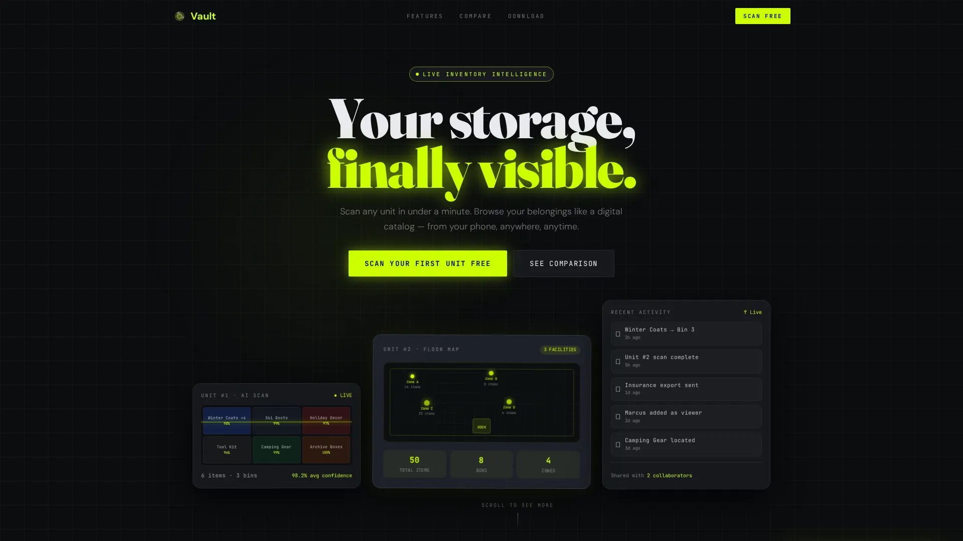
- A hero section with three floating dark glass panels showing live inventory data, a unit map, and an activity feed
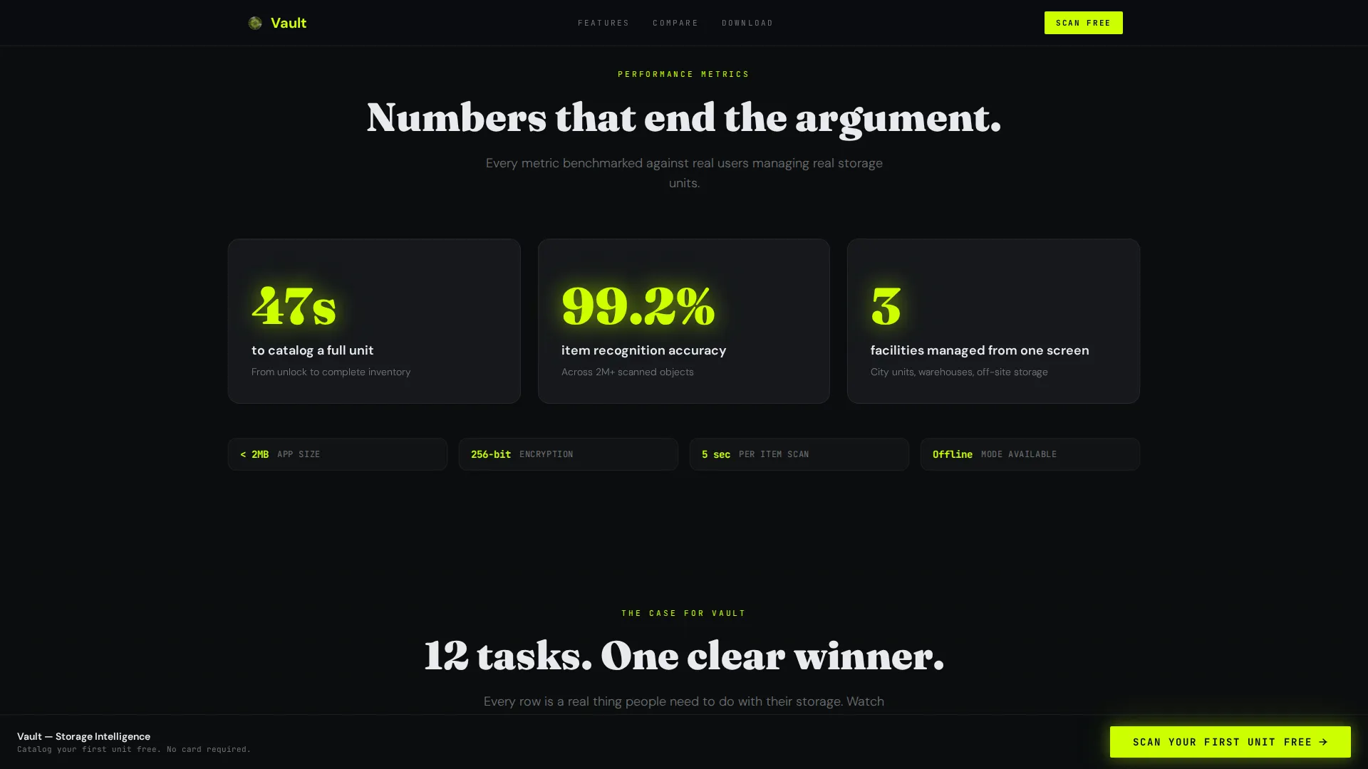
- An animated statistics block with scroll-triggered lime numerals highlighting key performance figures
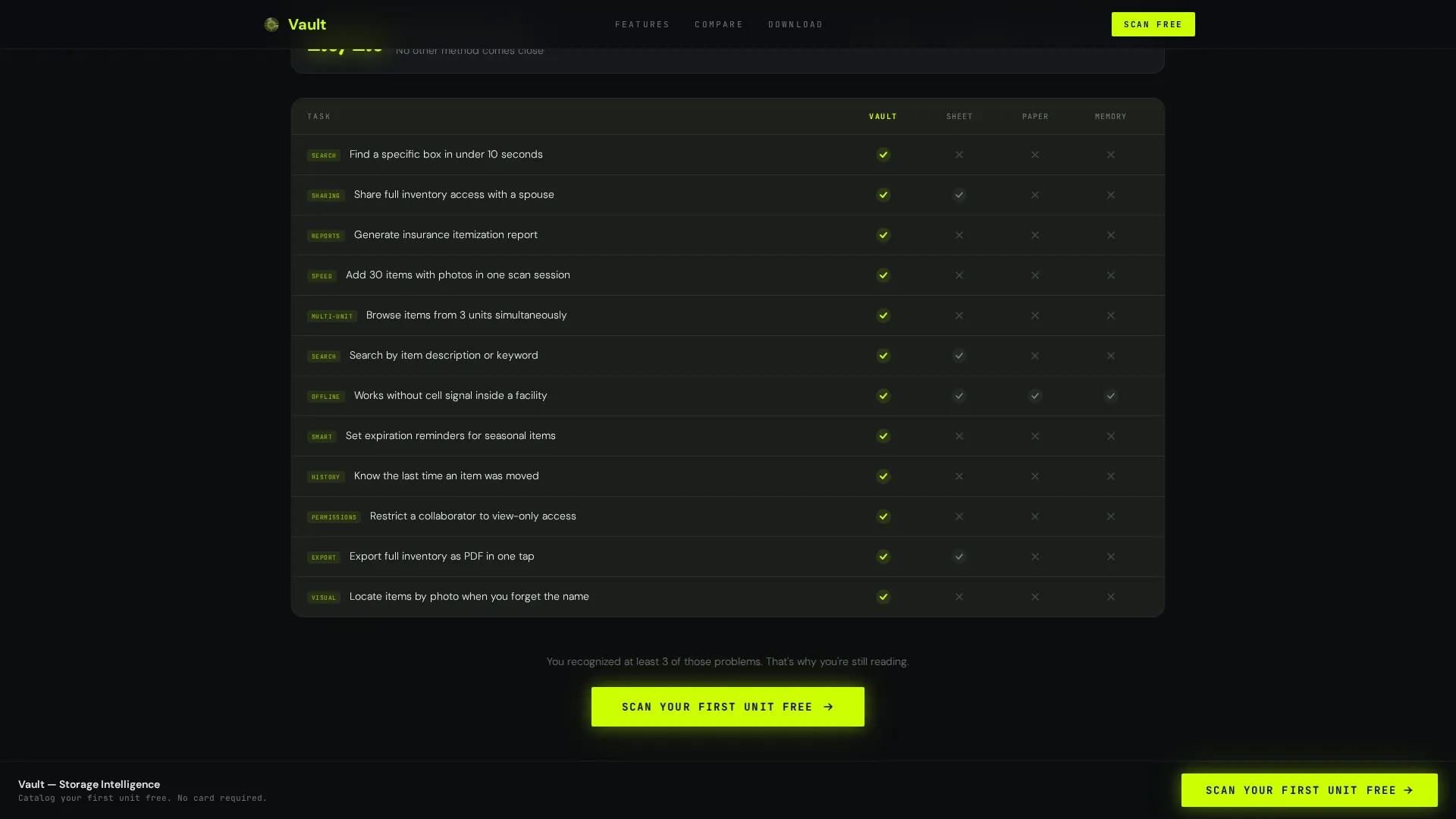
- A 12-row frosted-glass comparison table pitting the app against spreadsheets, paper lists, and memory across real tasks
Feature list
This template delivers a set of purpose-built components, all grounded in the brief and designed to work together as a conversion sequence.
Three-Panel Dark Glass Hero
Three translucent, frosted-glass cards float against a void black field. The left card shows a photo grid of labeled items. The center card displays a full unit map with item counts. The right card streams a recent activity feed, showing real-time inventory events like item moves and bin updates.
Scroll-Triggered Statistics Block
Bold electric lime numerals animate in on scroll, surfacing figures such as "47 seconds to catalog a full unit" and "99.2% item recognition accuracy." The effect creates immediate credibility before the visitor reaches the comparison table.
12-Row Frosted-Glass Comparison Table
A structured grid tests the app against spreadsheets, paper lists, and memory across twelve real storage tasks. Tasks include finding a specific box, sharing access with a household member, and generating an insurance inventory. Each row resolves with a lime checkmark that illuminates on scroll.
Pinned App Download Call to Action
A lime-on-black "Scan Your First Unit Free" button stays fixed to the bottom of the viewport once the hero section scrolls out of view. Tapping opens a platform selector for iOS or Android, plus a QR code for desktop visitors.
SMS Download Path
A secondary conversion path lets visitors enter a single phone number to receive the download link by text message. This lowers the barrier for visitors who discover the page on a desktop or shared screen.
Testimonial Cards for Three User Profiles
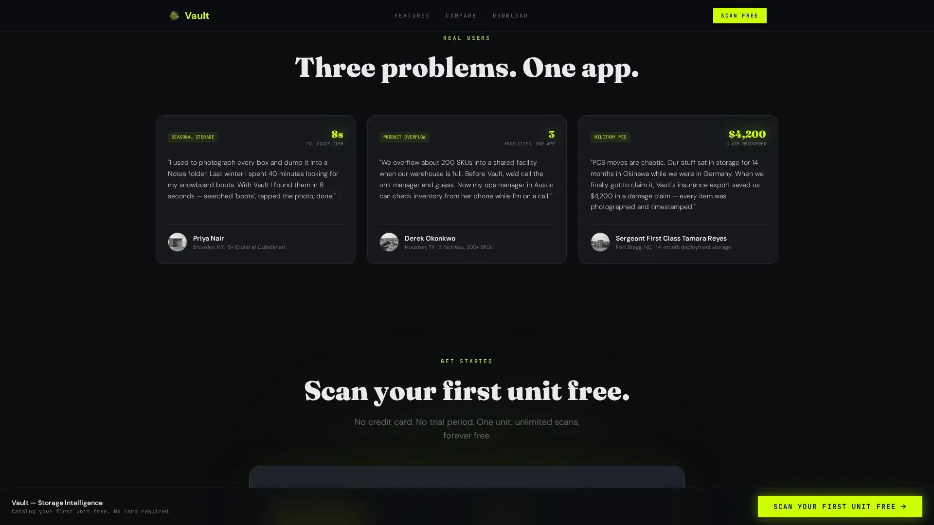
Three distinct testimonial cards each represent a different target user: a city renter, a small business owner, and a military spouse. Specific quotes and concrete metrics ground each card in recognizable real-world context.
Page sections overview
| Section | Purpose |
|---|---|
| Hero Glass Panels | Introduce the app through three floating frosted-glass inventory cards |
| Stats Impact Block | Animate key performance figures in electric lime on scroll |
| Comparison Table | Compare app versus three alternatives across 12 real storage tasks |
| Testimonial Cards | Reinforce trust with quotes from three distinct user profiles |
| Download Call to Action | Drive app installs via platform selector, QR code, and SMS field |
| Footer | Close the page with a minimal developer-clean aesthetic |
Design & branding system
The visual identity follows a Tech Glass direction, built around a heads-up display feel. Every element is designed to glow against darkness, making data feel precise and worth trusting.
- Color palette: void black (#0B0D0F) as the base, smoked glass gray (#1A1D23) for card surfaces, electric lime (#CCFF00) for active states and data highlights, and cool interface white (#E8EAED) for all body typography
- Typography: DM Sans handles interface labels and supporting text for clean readability; Fraunces carries the hero headline weight for contrast and presence
Mobile & speed optimization
This template is built mobile-first, reflecting the primary conversion goal of an app download from a phone. The layout and interactions are designed to feel native on small screens.
- Mobile-first layout with a pinned call-to-action button that stays accessible as the visitor scrolls through the comparison table
- Scroll-triggered animations use client-side rendering for counter effects and lime checkmark reveals, while static sections use server components to keep the page responsive
How this template helps you convert
The page is structured as a progressive argument. Each section adds a new layer of evidence before the final download prompt appears.
- The animated statistics block establishes credibility instantly, surfacing specific figures that city renters and business owners recognize as meaningful before they reach the comparison table.
- The 12-row comparison table builds the case row by row, with each illuminating lime checkmark reinforcing the app's advantage over manual methods until the answer feels obvious by the time the download call to action appears.
Other information about this template
This template is part of a storage digital presence category and is designed for Technology niche use cases where the product needs to demonstrate superiority over manual alternatives rather than simply describe features.
- Template style: Comparison Table, single-page layout with a section-led scroll flow
- Theme: Tech Glass with an Acid Digital color system
- Creative direction: Stats-First Impact, leading with data before narrative
- Header concept: Dark Glass Panels with floating frosted-glass inventory cards
- Landing page direction: App Download, optimized for mobile-first visitors with a desktop QR code fallback
- The footer follows a GitHub-minimal, developer-clean aesthetic for a credible, technical close
Theme
Tech Glass
Creative direction
Stats-First Impact
Color system
Acid Digital
Style
Comparison Table
Direction
App Download
Page Sections
Three-panel Dark Glass Hero
Scroll-triggered Statistics Block
Row Frosted-glass Comparison Table
Pinned App Download Button
SMS Download Path
Three-profile Testimonial Cards
Related questions
Who is this landing page template designed for?
Can I customize the comparison table rows?
Does the template support both iOS and Android download flows?
What animations are included in this template?
Can someone with no coding background edit this template?



