Vault - Powerful StoragePortal Landing Page Template
Vault is a hub-and-spoke landing page template built for storage facility operators who need a single command-center view of their entire portfolio. It combines a glassmorphic dark interface with stats-first impact sections, scroll-triggered micro-animations, and a dual-path lead capture flow that turns real operational data into a persuasive, high-converting page.
by Rocket studio
Quick summary
Vault is a single-page, anchor-navigated landing page template designed for storage client portal products. It targets regional storage operators running three to fifteen facilities. The design language is dark, glassmorphic, and data-forward. Every section earns attention with a bold stat before it explains anything. Two lead capture paths close the page.
Who this template is for
This template speaks directly to regional storage operators who have grown beyond manual tracking tools. They run multiple facilities, and they need a portal product that feels as capable as the data it manages.
- Operators running three to fifteen self-storage facilities who have outgrown spreadsheets
- Product teams and agencies building or marketing a storage client portal to that operator segment
- Founders or marketers who need a credible, data-rich landing page that generates qualified leads fast
What problem this template solves
Legacy storage management interfaces feel slow, visually outdated, and disconnected from how operators actually think about their business. A plain or generic landing page cannot communicate the intelligence and speed of a modern portal. Vault solves both problems at once.
- It gives the portal product a visual identity that matches operator expectations: precise, fast, and in control
- It removes the mismatch between a powerful backend product and a flat, unconvincing marketing page
- It structures the pitch so visitors encounter proof before they are ever asked to take action
What you get with this template
Vault is a fully structured, hub-and-spoke landing page with five anchor-navigated spoke sections, a conversion-focused header, and a dual-path lead capture system. Every layout decision is driven by the goal of making complex operational data feel immediately legible and compelling.
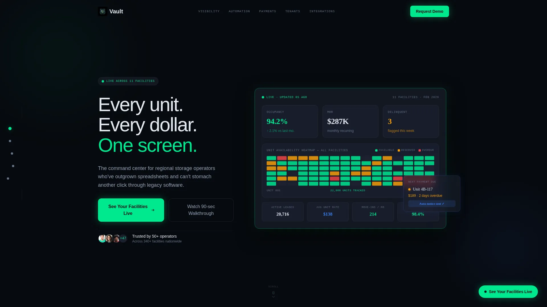
- A dark full-bleed header with a floating glassmorphic dashboard card showing live-style occupancy, revenue, and unit heatmap data
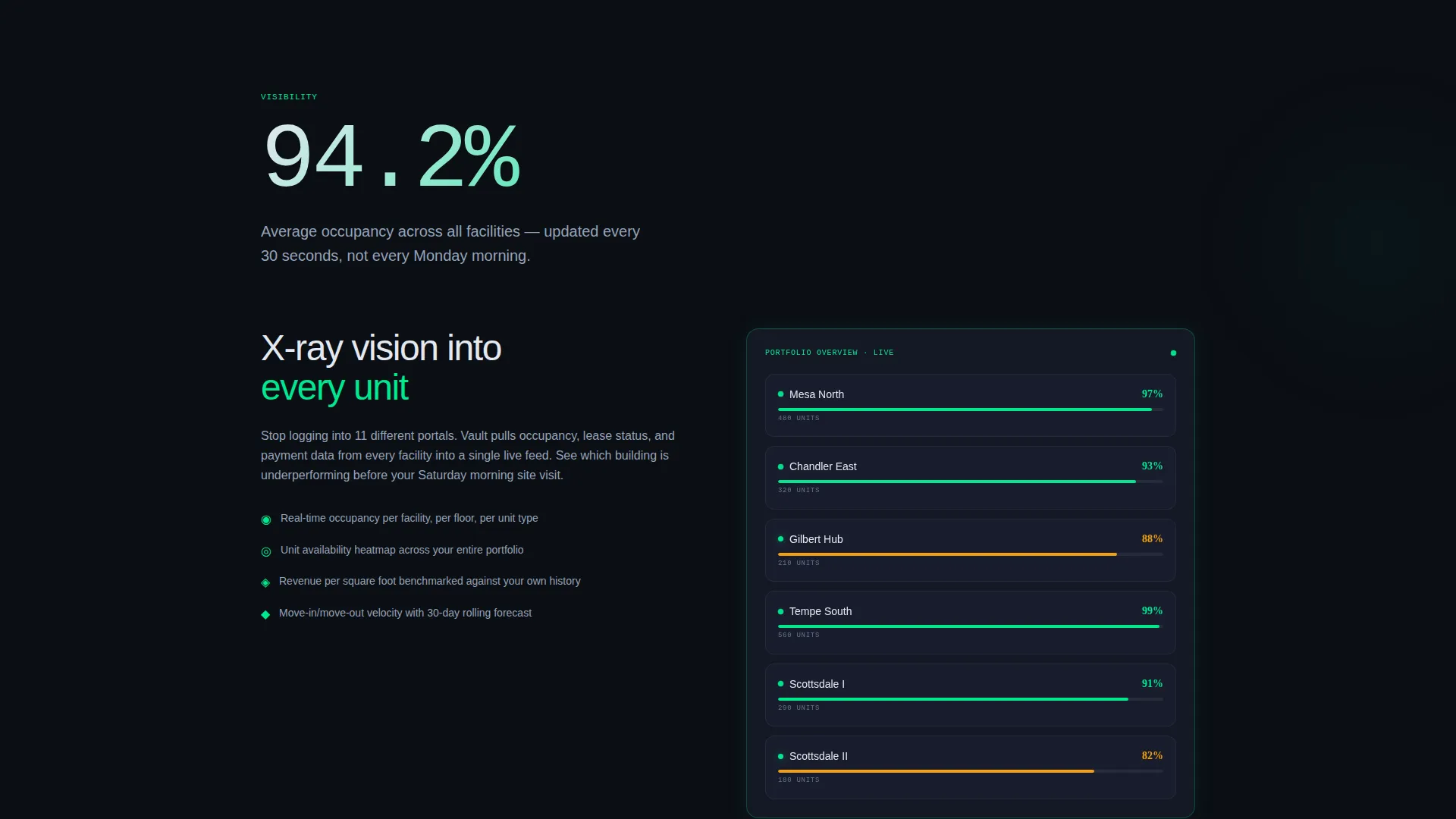
- Five vertically anchored spoke sections covering Visibility, Automation, Payments, Tenants, and Integrations, each opening with a jaw-dropping stat at 120-pixel type
- A persistent phosphor-green call-to-action button and a frosted modal form, plus a secondary video walkthrough path for visitors not ready to convert immediately
Feature list
This template delivers several built-in design and structural capabilities rooted directly in the source brief.
Stats-First Impact Sections
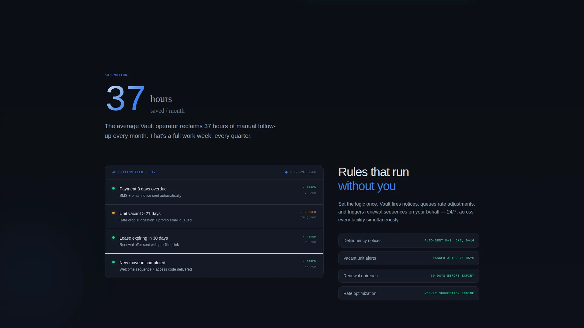
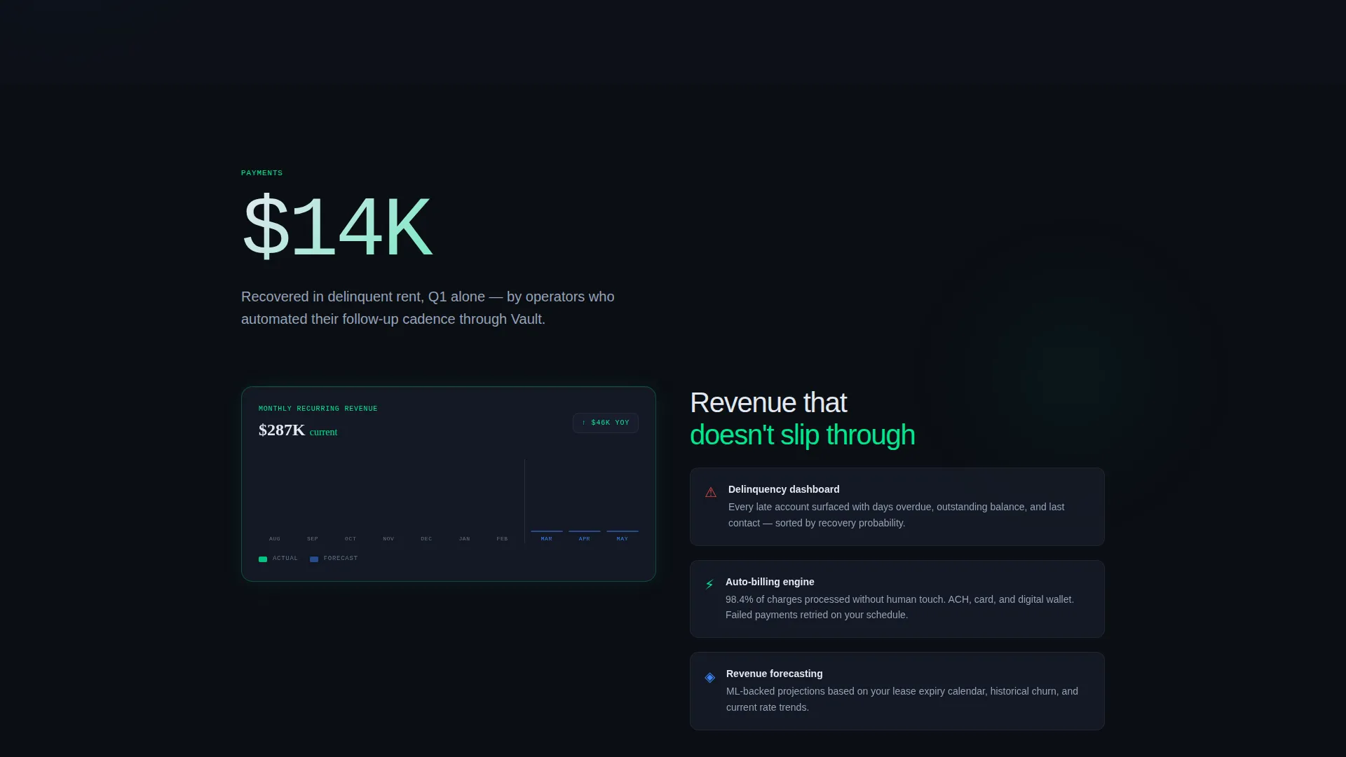
Each spoke section opens with a single bold performance stat rendered at 120-pixel type. Examples built into the template include figures like 37 hours saved per month and $14,000 recovered in delinquent rent. The stat appears before any explanatory copy, immediately establishing credibility.
Glassmorphic Card System
Frosted-panel cards use a dark void-black base with a semi-transparent overlay, a 12-pixel blur, and phosphor-green or cold-signal-blue rim lighting. Cards stack and overlap with parallax depth, giving the visual impression of peeling back layers of a live system.
Scroll-Triggered Micro-Animations
Numbers count up as they enter the viewport. Status indicators blink from amber to green. A lease timeline draws itself left to right on scroll. These animations reward attentive scrolling and reinforce the sense that the data is alive.
Fixed Vertical Anchor Navigation
A left-rail spoke nav sits fixed during scroll. Five glowing dots are labeled with section names: Visibility, Automation, Payments, Tenants, and Integrations. Visitors can jump to any section instantly without losing their place.
Dual-Path Lead Capture Flow
The primary path is a persistent "See Your Facilities Live" button in the bottom-right corner. Clicking opens a frosted modal with a three-field form ordered by ease of commitment. The secondary path captures email on play of a 90-second walkthrough video, serving visitors who are not yet ready to speak with anyone.
Holographic Header Dashboard
The header features a floating dashboard card with no laptop or screenshot border. It displays 94.2 percent occupancy across 11 facilities, $287,000 in monthly recurring revenue, and a miniature unit-availability heatmap using green, amber, and red clusters. The headline sits above it in lightweight sans-serif type.
Page sections overview
| Section | Purpose |
|---|---|
| Dark Header Hero | Establishes command-center credibility with a floating live-data card and headline |
| Fixed Spoke Nav | Lets visitors jump between the five anchor sections at any scroll depth |
| Visibility Spoke | Shows real-time occupancy rates and unit-level data with a bold opening stat |
| Automation Spoke | Communicates time saved through automated workflows with an impact stat lead |
| Payments Spoke | Highlights delinquent-account recovery and revenue forecasting capabilities |
| Tenants Spoke | Covers lease management and tenant-level detail within the portal |
| Integrations Spoke | Positions the portal's connectivity and compatibility for operator workflows |
| Lead Capture Modal | Collects facility count, current software, and work email via a frosted overlay form |
| Video Walkthrough Path | Offers a 90-second demo as a lower-commitment alternative to form submission |
Design & branding system
Vault uses a Data Command theme expressed through a glassmorphic color system. The palette is intentionally dark and precise, built to make data feel authoritative and alive rather than decorative.
- Core colors: void black (#0B0E14) as the base, frosted panel (#1A1F2E at 60% opacity with 12-pixel blur) for card surfaces, phosphor green (#00E88F) for live-data accents and success states, cold signal blue (#3B82F6) for navigation and interactive elements
- Typography: lightweight sans-serif at large display sizes for headlines and stats; off-white (#E2E8F0) for primary body text; muted slate (#64748B) for secondary labels and supporting copy
- Visual style: surfaces that read as semi-transparent glass, edges that catch light like beveled crystal, and data elements that pulse as if they have a heartbeat
Mobile & speed optimization
The template is structured with a scroll-based section flow that translates cleanly across screen sizes. The fixed left-rail navigation and parallax card stacking are designed to work within a responsive layout.
- Glassmorphic card layers and parallax depth effects are built to adapt to narrower viewports without losing the layered depth aesthetic
- Micro-animations are tied to scroll entry points, keeping interactions smooth and intentional rather than loading all effects at once
How this template helps you convert
Vault earns each conversion by front-loading proof. By the time a visitor reaches any form element, they have already seen multiple data points that make them feel the gap between where they are and where this portal could take them.
- The stats-first section structure means every spoke opens with a concrete number, building a cumulative case for the portal before any feature explanation appears
- The dual-path lead capture system meets visitors at different stages of readiness: the modal form for those ready to engage directly, and the video walkthrough for those who need one more nudge before committing
Other information about this template
Vault is a single landing page template, not a multi-page site. It is purpose-built for the storage client portal niche and is not a general SaaS template. The hub-and-spoke anchor navigation pattern is what distinguishes it structurally from a standard scrolling page.
- The template is categorized under Technology and the Storage Digital Presence subcategory, making it a strong fit for niche portal product launches
- The creative direction is Stats-First Impact, meaning the visual hierarchy always prioritizes a quantified result over a feature label
- The lead generation flow is sequenced to ask for the easiest commitment first: facility count before software details before work email, reducing form abandonment
- This template works equally well for a direct operator-facing product launch or as an agency deliverable for a storage technology client
Theme
Data Command
Creative direction
Stats-First Impact
Color system
Glassmorphic
Style
Hub & Spoke (Anchor Nav)
Direction
Lead Generation
Page Sections
Stats-first Impact Section Design
Glassmorphic Card Layouts
Scroll-triggered Micro-animations
Fixed Vertical Anchor Navigation
Dual-path Lead Capture System
Holographic Header Dashboard Card
Related questions
Is Vault a single landing page or a multi-page website template?
Who is this landing page template designed for?
How does the two-path lead capture system work?
Do the stats shown in the template reflect real data?
Can a design agency use this template for a storage technology client?



