Robust Coverage Monitor Landing Page Template
Ledger is a scroll-reveal insurance landing page built for nonprofit gift planning teams. It presents a command-center dashboard that tracks every life insurance policy gift, premium payment, and beneficiary designation from pledge to payout. The page uses interactive donor record cards, a portfolio view, an alert simulator, and a two-step signup form to convert visitors before asking for credentials.
by Rocket studio
Quick summary
Ledger is a powerful insurance landing page template designed specifically for life insurance donor management platforms. It transforms a traditionally paperwork-heavy insurance workflow into a transparent, real-time digital experience. The page guides visitors through four fully interactive scroll sections before presenting the signup form, earning trust by demonstrating the product first.
Who this template is for
This insurance landing page is built for teams that manage life insurance policy gifts at scale. Every section speaks directly to the professionals who spend their days chasing carriers and reconciling spreadsheets.
- Nonprofit development directors managing dozens of active life insurance donors
- Gift planning officers at universities handling paid-up policy inquiries
- Foundation CFOs who need board-ready reports on irrevocable policy values
What problem this template solves
Most insurance company gift planning teams rely on scattered spreadsheets, email threads, and manual carrier calls to track policy status. That approach breaks down fast when a portfolio grows. An insurance landing page that simply lists features does not fix the problem. This one shows the solution in motion.
- No single location exists for premium payment history, beneficiary designations, and carrier correspondence
- Lapsed premiums and policy maturities go unnoticed without proactive reminders, risking costly lapses
- Board-level reports on insurance coverage values require hours of manual data collection
What you get with this template
This template delivers a fully interactive, scroll-reveal insurance landing page that functions as a live product demonstration. Visitors do not read about the platform. They use it. Every section progressively discloses a deeper layer of capability, keeping users engaged from the hero all the way to the signup form.
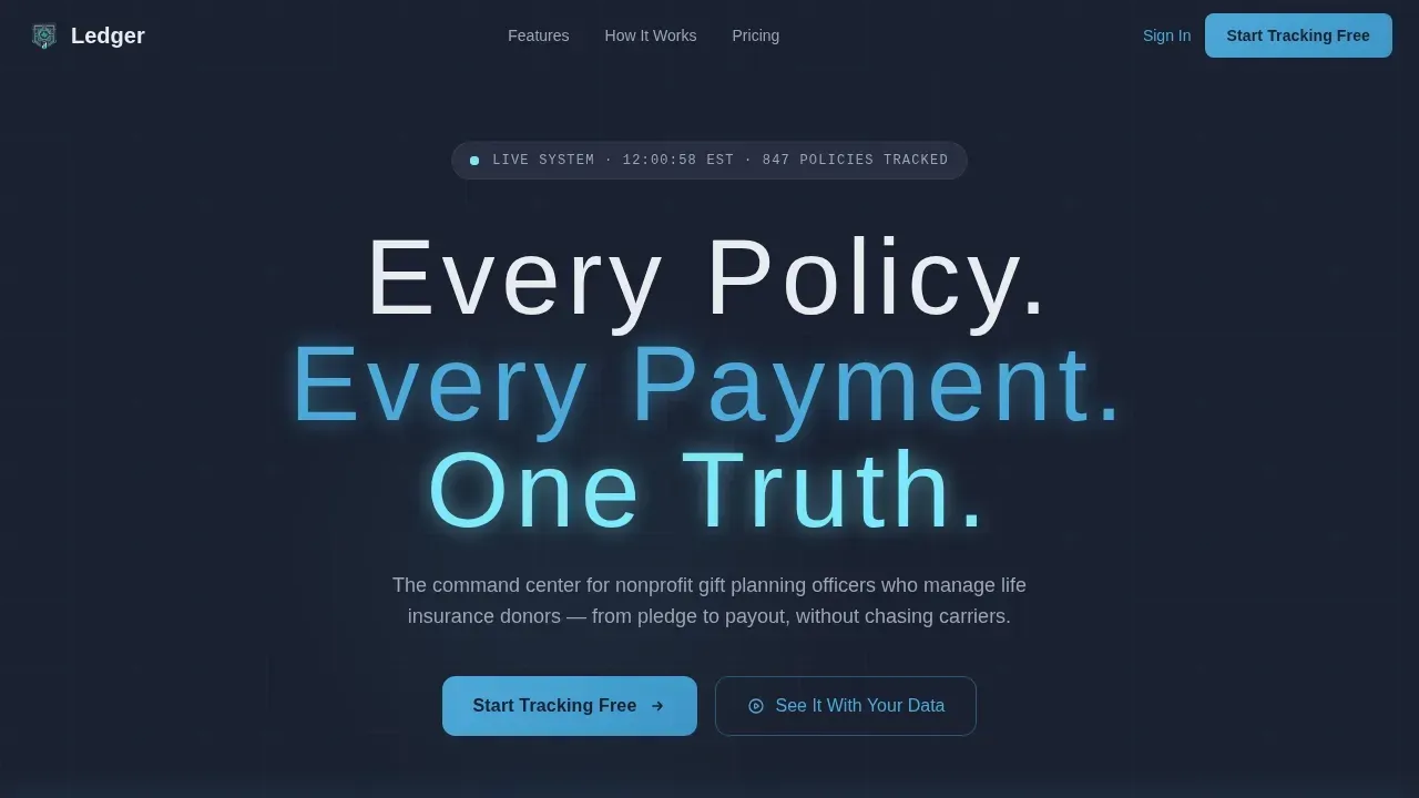
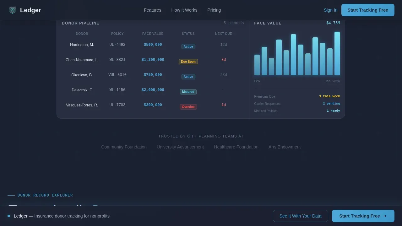
- A dark, glowing hero section with a live donor pipeline visualization and a catchy headline that lands the value proposition immediately
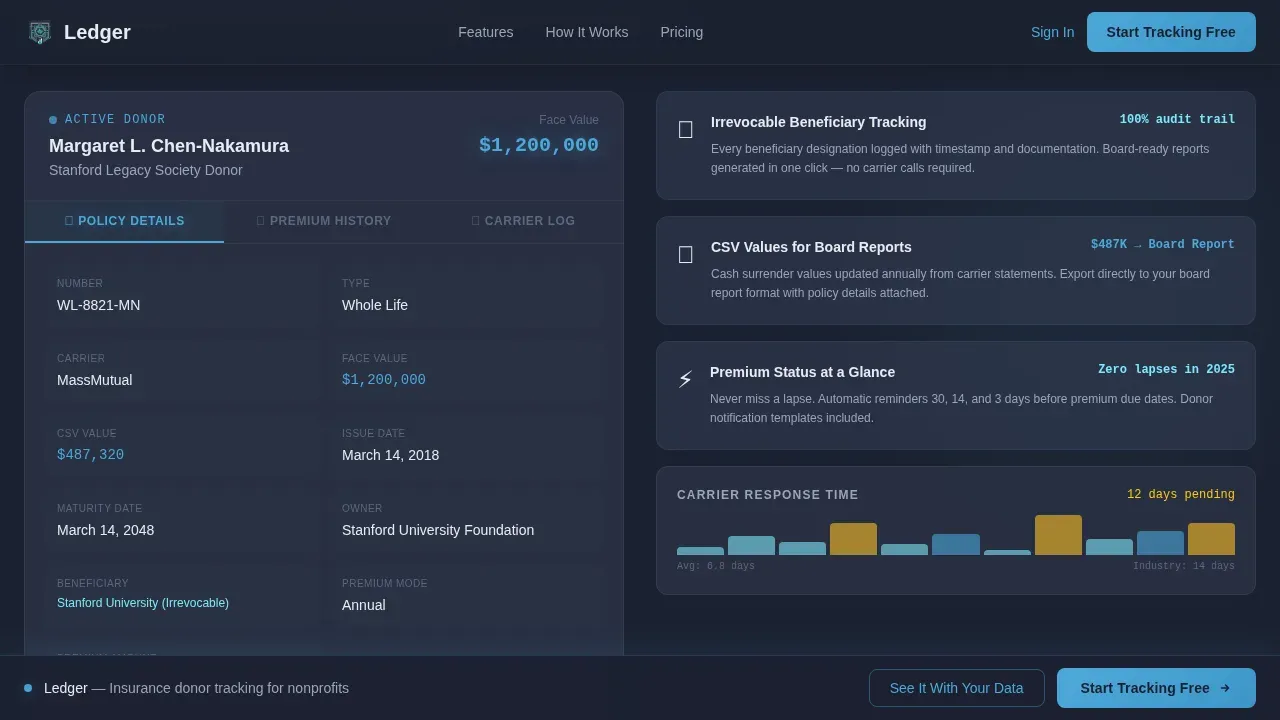
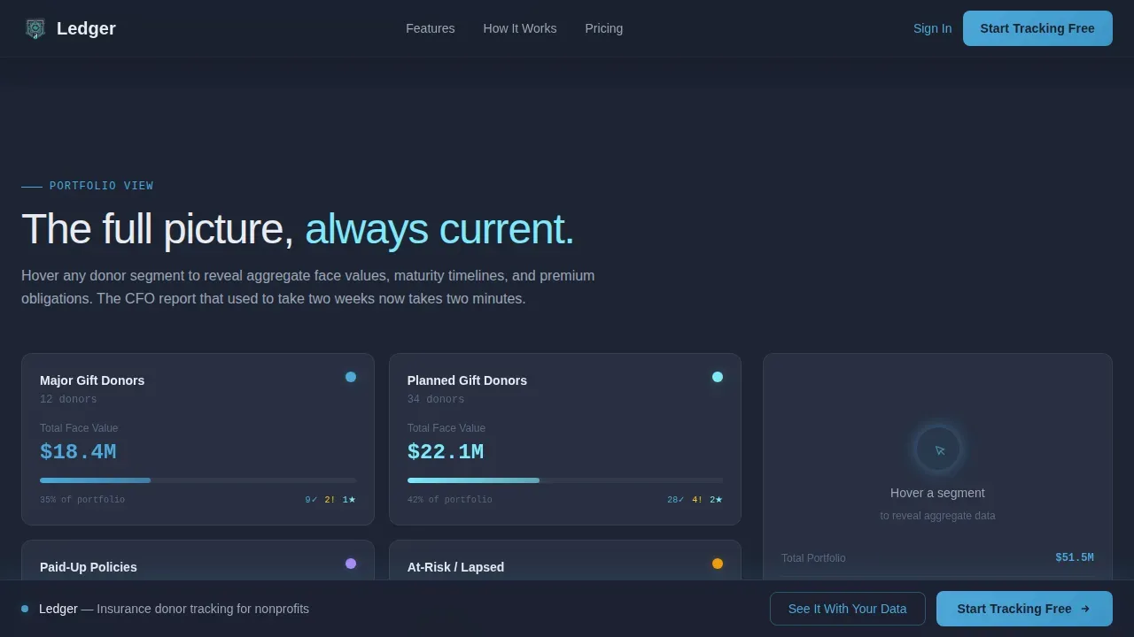
- Three interactive mid-page sections: a tabbed donor record card, a hover-reveal portfolio view, and a toast notification alert simulator
- A two-step conversion form plus a secondary "See It With Your Data" CSV import path for visitors who want proof before commitment
Feature list
This insurance landing page template includes six core capabilities drawn directly from the brief. Each one serves a specific purpose in the visitor's journey from first impression to free trial signup.
Hero Dashboard Visualization
The hero section opens on a full-bleed dark viewport. A softly glowing cockpit interface fades in, with policy face values, premium statuses, and carrier response timers illuminating one by one. The catchy headline "Every Policy. Every Payment. One Truth." floats above the interface as a heads-up display projection, giving visitors an immediate, visceral sense of the platform's focus.
Interactive Donor Record Card
Scrolling past the hero drops visitors into a tabbed donor record card they can explore directly. Tabs cover policy details, premium history, and carrier correspondence log. This section lets visitors navigate real insurance data structures before they have signed up, building confidence that the platform can manage the complexity they face daily.
Portfolio-Level Hover View
The next section presents an aggregate portfolio view. Hovering over donor segments reveals face values and maturity timelines in real time. This gives development directors and foundation CFOs a direct preview of the reporting layer they need to address board-level questions about insurance coverage and policy performance.
Alert Simulator with Toast Notifications
Visitors can toggle alert types, including lapsed premium warnings, beneficiary change flags, and policy maturity countdowns. Each toggle fires a toast notification that slides into view. Automated notifications like these are a key features of any serious insurance donor management platform, and showing them live removes doubt about whether the system actually delivers proactive reminders.
Two-Step Conversion Form
The signup form asks only for work email and organization name on the first step. A second micro-step asks for portfolio size to personalize onboarding. Frictionless forms like this minimize the chance of visitors bouncing off the page, and the short field count keeps the conversion rate high by asking only for essentials.
CSV Data Import Path
A secondary conversion path invites visitors to upload a spreadsheet of existing donors. The platform returns a populated dashboard preview before the visitor commits to a full signup. Securely uploading policy documents and digitalizing existing records helps organizations move from paper chaos to a unified digital dashboard without waiting for a lengthy onboarding process.
Page sections overview
| Section | Purpose |
|---|---|
| Hero Dashboard | Open with glowing cockpit visualization and primary call to action |
| Donor Record Explorer | Interactive tabbed card showing policy details, premium history, carrier log |
| Portfolio Hover View | Aggregate face values and maturity timelines revealed on hover |
| Alert Simulator | Toggle lapsed premium, beneficiary, and maturity toast notifications live |
| Conversion Section | Two-step signup form and CSV import path with social proof metrics |
| Footer | Linear single-row footer with navigation and legal links |
Design & branding system
The visual identity follows a Dashboard Pro theme built on the Slate and Sky color system. The palette reads like a clear night sky reflected in polished granite: dark enough to let data luminance carry the page, with sky-blue tones that signal trust and action rather than decoration. White space is used deliberately to let each data element breathe without overwhelming visitors with density.
- Deep command-center charcoal (#1B2130) for backgrounds, mid-slate panel gray (#2D3548) for card surfaces, sky-blue (#4DA8DA) for interactive accents, aurora highlight (#7EE8FA) for hover glows and notification pulses, and crisp cloud white (#E8ECF1) for all body text
- DM Sans in thin, wide-tracked weight for headlines; JetBrains Mono for all data values and numeric displays
- GSAP ScrollTrigger powers staggered data point reveals, floating elements, and bar chart hover animations throughout the page
Mobile & speed optimization
The page is built desktop-first to serve development directors and CFOs working at their desks. However, the layout is fully responsive. A good insurance landing page should load fast, look great on any device, and remain easy to interact with whether accessed from a desktop workstation or a mobile screen. Every interactive component scales cleanly to smaller viewports without losing its core function.
- Static sections use Server Components so the page loads fast on first paint, while interactive simulators run as Client Components to keep animations smooth
- The fixed bottom bar carrying the primary call-to-action button remains visible on every device once a visitor scrolls past the hero, ensuring the sign-up path is never more than one tap away
- Forms are minimal by design: two fields on step one, one question on step two, keeping mobile interaction frictionless
How this template helps you convert
A high-converting insurance landing page must combine clarity, trust, and a focused call to action. This template earns the click by building genuine confidence through interaction before asking for credentials. Every element on this insurance landing page works toward making the signup process as easy as possible.
- Four full scroll sections of interactive product exposure come before the signup form, so visitors arrive at the conversion point already convinced the platform works, improving the conversion rate substantially compared to static insurance landing page examples.
- Trust signals appear throughout: aggregate metrics show donors tracked, total face value managed, and number of organizations on the platform, and the job-title-specific copy acts as implied social proof that the product understands each visitor's exact role.
- The two-step form and the CSV import path give visitors two distinct routes to conversion, matching the way most people prefer to evaluate software: one group wants to sign up fast, while another group wants to see their own data before committing.
Other information about this template
This template is a great example of an insurance landing page that earns trust by demonstrating capability rather than just describing it. It fits naturally alongside the strongest insurance landing page examples in the market today. Teams building or evaluating insurance products across health insurance, auto insurance, travel insurance, and life insurance policy management will recognize the structural patterns this page follows, even though the template is focused on gift planning and donor management specifically.
The insurance landing page best practices baked into this template include a catchy headline that targets a specific pain point, a subheadline that explains the value proposition, bullet points to keep copy scannable, and trust signals placed near every call-to-action. A good insurance landing page grabs attention early and sustains it. This one does both.
This template can be used to create a focused insurance landing page for any insurance company operating in the gift planning, nonprofit technology, or donor services space. Teams can customize sections, update color values, and adjust form fields to fit their specific insurance business without rebuilding the layout from scratch. Insurance landing page examples across health insurance landing page campaigns, auto insurance microsites, and travel insurance signup flows all share the same core principles this template applies.
A good insurance landing page should also build trust visibly. This page does that through social proof metrics, implied testimonials via role-specific copy, and the progressive product demonstration itself. Studies consistently show that reputation, reviews, and recommendations are among the top factors that build trust. The interactive sections here generate the same confidence that testimonials provide, by letting visitors experience the product quality firsthand.
For teams evaluating insurance landing page builders, this template works well as a starting point. The page structure is compatible with tools that let users customize insurance landing pages for specific campaigns. Insurance companies can connect their paid ads to this focused landing page, improving conversion rates by eliminating distractions and keeping the single action, starting the free trial, front and center.
- The hero image is a rendered dashboard interface, not a photograph, keeping the focus on product data rather than stock imagery
- The page address and organization name are the only fields required at signup step one, keeping costs of entry low for new signups
- Automated notifications shown in the alert simulator include lapsed premium warnings, beneficiary change flags, and policy maturity countdowns
- The template is relevant to any insurance company or nonprofit organization that needs to manage a portfolio of life insurance policy gifts and report on them with confidence
Theme
Dashboard Pro
Creative direction
Interactive Explorer
Color system
Slate & Sky
Style
Scroll Reveal (Progressive)
Direction
Freemium/Trial
Page Sections
Hero Dashboard with Live Data Visualization
Interactive Tabbed Donor Record Card
Portfolio Hover-reveal View
Alert Simulator with Toast Notifications
Two-step Frictionless Signup Form
CSV Import Preview Path
Related questions
Who is this insurance landing page template built for?
What interactive components does this landing page include?
How does the conversion flow work on this page?
Can this template be customized for other insurance use cases?
Why does the page show the product before asking visitors to sign up?



