Threat Protection Landing Page Template
Breach is a bold brutalist bento grid landing page built for cybersecurity membership sites. It opens with a live threat exposure calculator above the fold, then cascades into proof-driven content cards. Designed for security professionals who expect substance over style, the template converts through utility first and asks for nothing until it has already delivered real value.
by Rocket studio
Quick summary
Breach is a single-page bento grid landing page template for cybersecurity membership communities. It leads with an interactive threat exposure calculator, then builds trust through live data cards, lab previews, and a transparent tier comparison. The monochrome steel palette and monospaced typography make every section feel like a working terminal, not a marketing brochure.
Who this template is for
This template was built for operators who run or are building a cybersecurity membership community. The target member base is technical, skeptical of polish, and quick to leave if the page feels dishonest.
- Security engineers and SOC (Security Operations Center) analysts looking for structured, updated training resources
- Startup CISOs (Chief Information Security Officers) building internal playbooks from scratch who need a credible community platform
- Bug bounty hunters and red team practitioners who want a no-nonsense membership page that respects their technical background
What problem this template solves
Most membership landing pages lean on testimonials and vague benefit statements. Security professionals do not respond to that. They want evidence before they hand over an email address. Breach solves the credibility gap by delivering value before making a single ask.
- Visitors leave generic membership pages feeling pitched rather than informed
- Security audiences can spot filler content immediately and disengage fast
- Free-tier and pro-tier value differences are usually buried or unclear, killing conversion on both paths
What you get with this template
You get a complete, section-led landing page built around one clear conversion philosophy: earn the click before you ask for it. Every card in the bento grid is a proof artifact, not a placeholder.
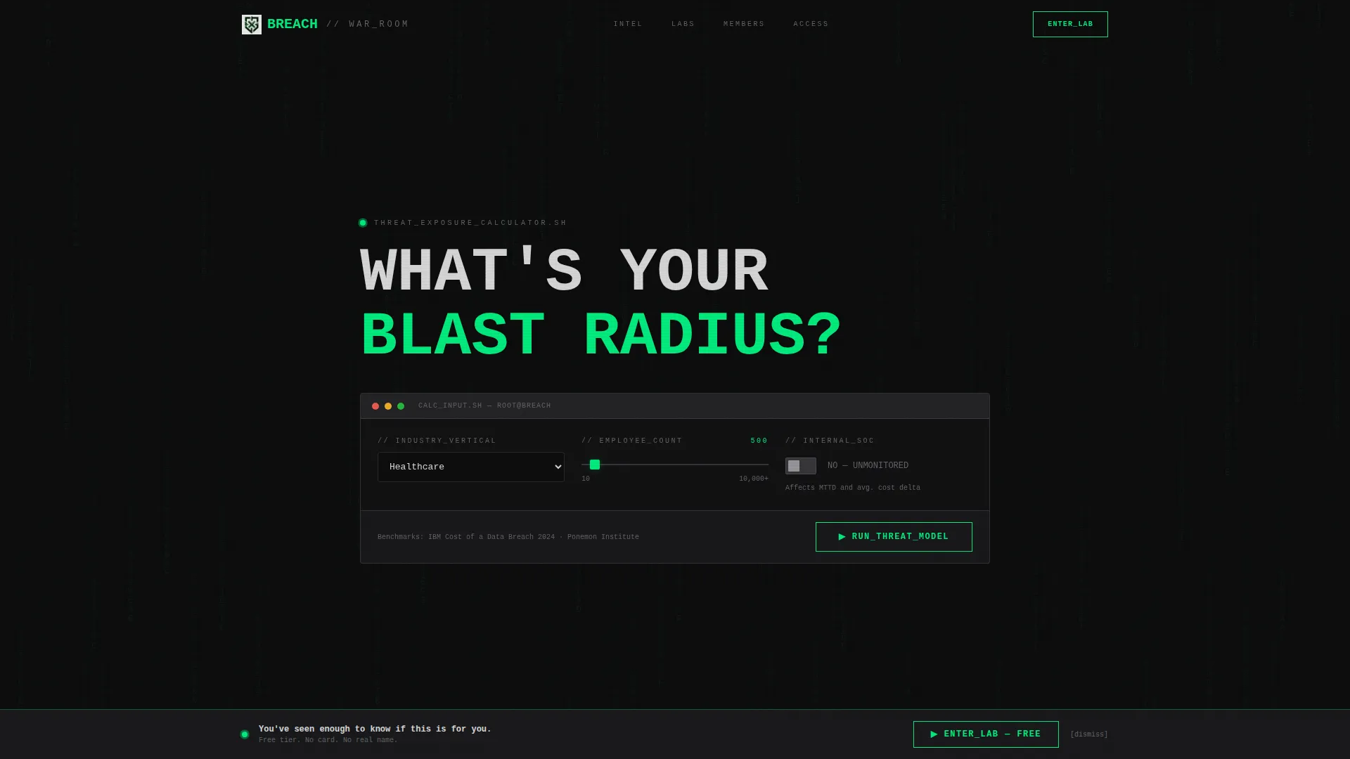
- A functioning threat exposure calculator embedded above the fold as the primary header element
- A full bento grid layout with self-contained cards including a CVE (Common Vulnerabilities and Exposures) ticker, lab screenshot card, rotating testimonials, a module map, and a tier comparison panel
- Two conversion paths with distinct signup forms, one for free-tier entry and one for a seven-day pro trial, each kept intentionally minimal
Feature list
This section covers the core functional and design components built into the Breach template.
Interactive Threat Exposure Calculator
The header is the tool. Visitors input their industry vertical, approximate employee count, and whether they run an internal SOC. On submit, the template renders a bento result card showing estimated annual breach probability, average incident cost sourced from IBM and Ponemon benchmark data, and the three most common attack vectors for that profile. All output animates in using typewriter-style green text on black.
Live CVE Ticker Card
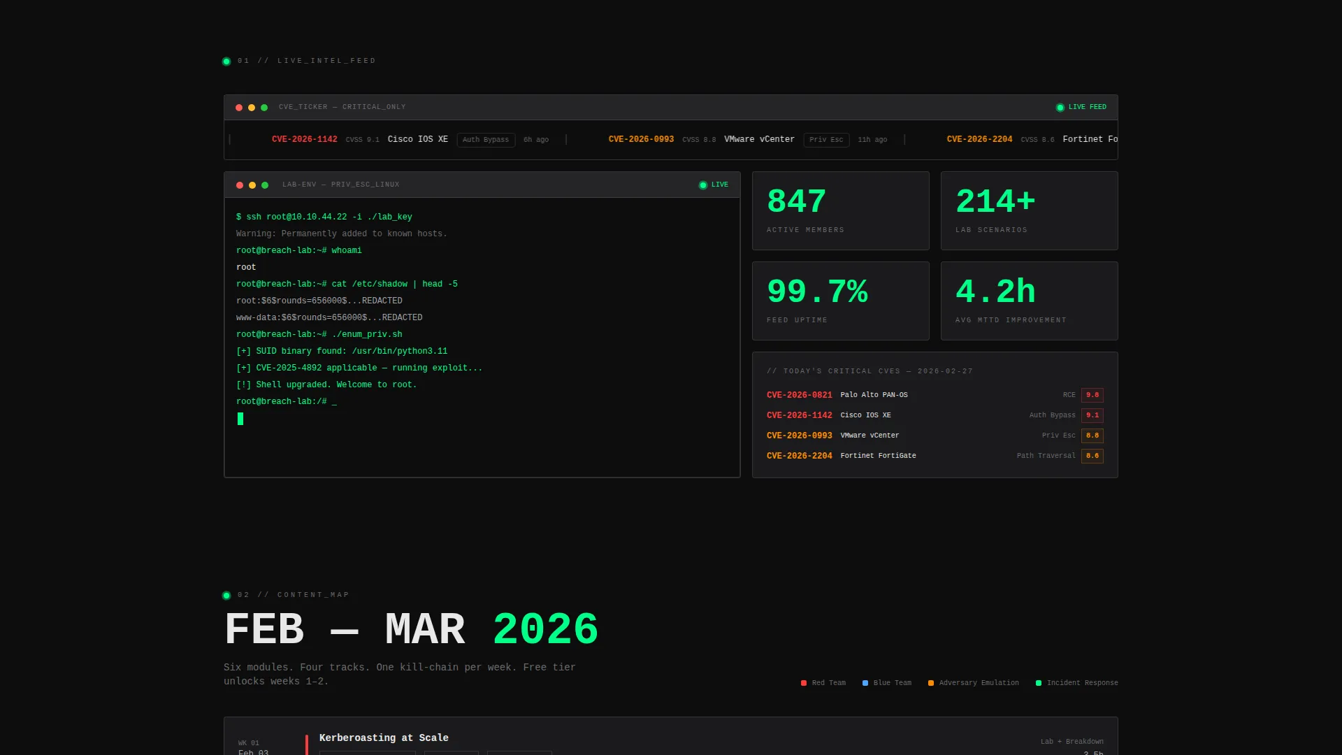
A dedicated bento card displays a live-updating feed of today's critical CVEs. This card serves as immediate proof that the membership feed is active and current. It is visible on scroll without any interaction required.
Lab Environment Preview Card
A sample lab environment screenshot sits inside its own bento card with a blinking cursor mid-exploit. The card communicates hands-on access without requiring a login. It is designed to be scannable in under four seconds.
Rotating Member Testimonial Card
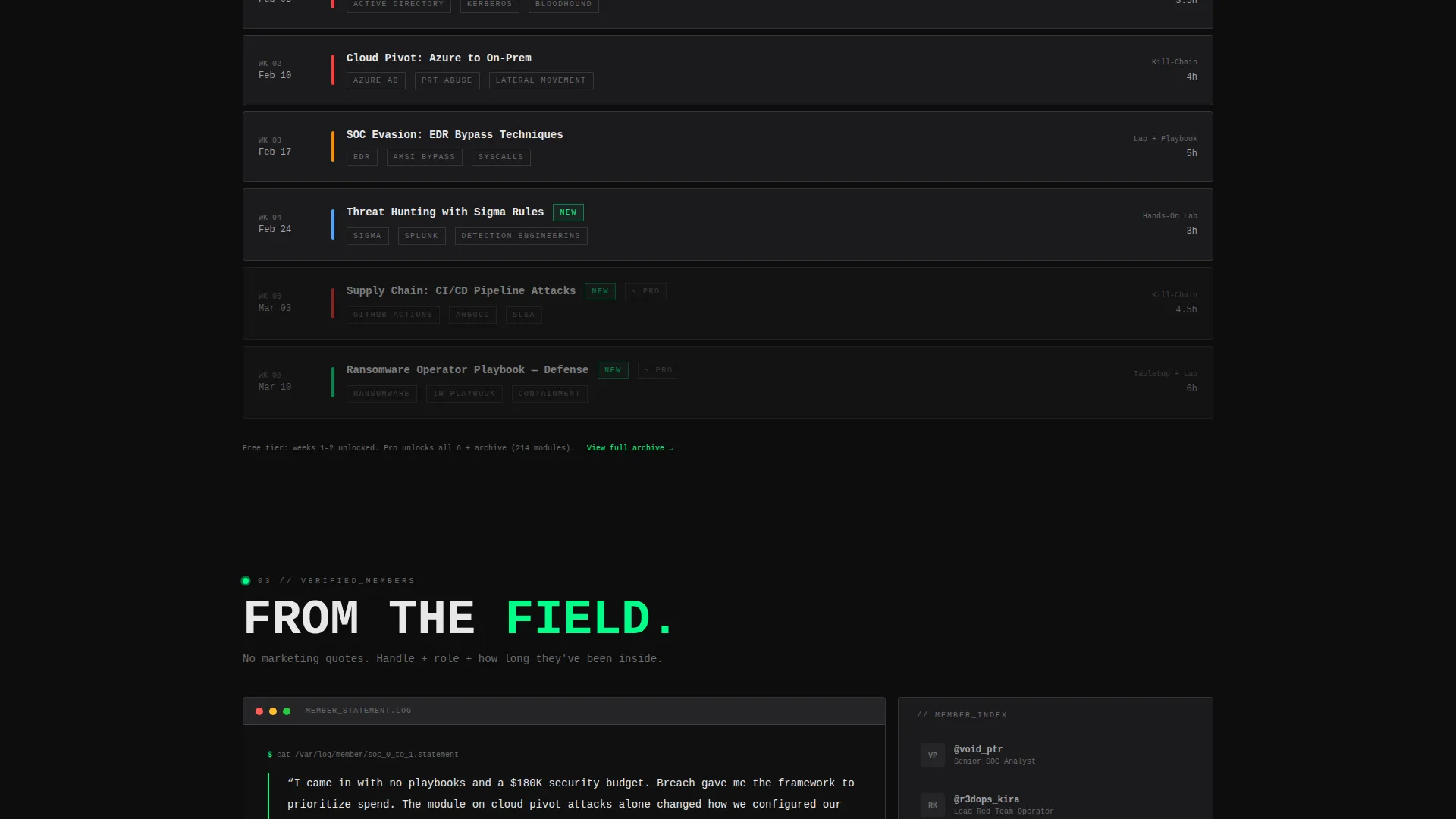
Testimonials cycle through verified member profiles that include role and clearance context. This card is self-contained within the bento grid and is designed to build peer credibility rather than generic social proof.
Free Versus Pro Tier Comparison Card
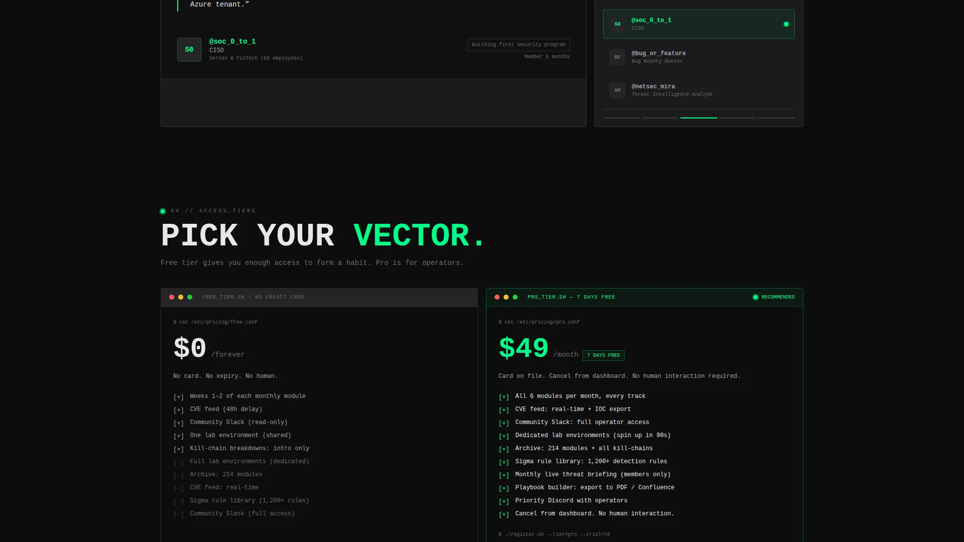
Two terminal windows sit side by side inside a single bento card. Free-tier and pro-tier features are rendered honestly, with paywall content clearly marked. The pro path includes a seven-day free trial prompt and a single payment method field framed as low-friction and cancelable from the dashboard.
Persistent Conversion Bottom Bar
A bottom conversion bar activates after the visitor reaches forty percent scroll depth. It holds the primary call to action for free-tier entry. It stays visible without being intrusive, reinforcing the conversion path without interrupting the reading experience.
Page sections overview
| Section | Purpose |
|---|---|
| Threat Calculator Header | Delivers immediate value and frames the offer through a live tool |
| Calculator Result Card | Shows breach probability, incident cost, and top attack vectors |
| CVE Ticker Card | Proves the live feed is active and current |
| Lab Preview Card | Demonstrates hands-on access with a blinking mid-exploit cursor |
| Member Testimonials Card | Builds peer credibility with role and clearance context |
| Module Map Card | Shows current month content drops for transparency |
| Tier Comparison Card | Renders free versus. pro access as two terminal windows |
| Free Tier call to action | Collects email and handle with no real name required |
| Pro Trial call to action | Adds a payment method field for the seven-day pro path |
| Persistent Bottom Bar | Activates at forty percent scroll depth with the primary call to action |
Design & branding system
The visual identity follows a Bold Brutalist theme using the Monochrome Steel color system. The palette was chosen to feel like the inside of a decommissioned server rack: all matte metal, exposed structure, and one indicator light confirming the system is still live.
- Core colors are forge-black (#0D0D0D) for backgrounds, brushed gunmetal (#3A3A3C) for content cards, and cold-rolled silver (#A1A1A6) for borders and secondary text
- Electric fault-line green (#00FF88) is reserved exclusively for hover states, active inputs, live data output, and typewriter-style animated text
- Typography is oversized and monospaced throughout; all card borders are 1px silver on gunmetal containers; no hero imagery or stock photography is used anywhere in the layout
Mobile & speed optimization
The bento grid layout is structured to reflow cleanly on smaller viewports. Cards collapse into a single-column stack on mobile without losing their self-contained readability. Every card is designed to be scannable in under four seconds, which keeps the layout practical on any screen size.
- Bento cards are individually structured, so each one loads and reads independently without depending on surrounding context
- The calculator form uses simple input types (dropdown, slider, toggle) that are touch-friendly by design
- The persistent bottom bar remains visible on mobile scroll without overlapping critical card content
How this template helps you convert
Breach is built around a specific conversion philosophy: deliver value first, ask second. The page does not open with a pitch. It opens with a tool that tells the visitor something true and useful about their own risk profile.
- The calculator gives the visitor a personalized output before any call to action appears, which means the first interaction with your brand is a useful one rather than a request
- Each bento card below the calculator adds a new layer of evidence, from live CVE data to a transparent tier comparison, so by the time the visitor reaches the signup form they have already been using the product in a limited sense
- The free-tier path asks only for email and a handle, removing friction for a pseudonymity-conscious security audience, while the pro-trial path is framed as fully self-serve with no human interaction required
Other information about this template
Breach is purpose-built for one niche: the serious cybersecurity practitioner who does not have patience for generic membership pages. Several design and structural decisions reflect the specific expectations of that audience.
- The template style is Bento Grid, which keeps each proof artifact visually isolated and scannable without requiring the visitor to read in linear order
- The creative direction is Calculator First, meaning the interactive tool functions as both the headline and the trust-builder before any other content is seen
- The header concept is an Interactive Preview rather than a static hero, so the above-the-fold experience is functional rather than decorative
- The conversion direction is Freemium and Trial, with two parallel paths kept structurally separate so neither audience feels pushed toward the wrong offer
- The theme is Bold Brutalist, a deliberate choice for an audience that associates clean, polished interfaces with consumer tools rather than professional security environments
Theme
Bold Brutalist
Creative direction
Calculator/Tool First
Color system
Monochrome Steel
Style
Bento Grid
Direction
Freemium/Trial
Page Sections
Threat Exposure Calculator
Live CVE Ticker Card
Bento Grid Proof Layout
Dual Conversion Path Forms
Persistent Scroll-activated Call to Action Bar
Bold Brutalist Visual System
Related questions
Does this template include a working calculator backend?
Can I customize the tier comparison card for my own membership tiers?
Why does the signup form only ask for email and a handle?
Is this template suitable for a solo practitioner or small team?
Can the persistent bottom bar be adjusted or disabled?



