Blockchain-Based Enterprise Software Privacy Policy Website Template
Ledger is a Bold Brutalist blockchain-based CRM landing page template built for comparison-driven conversion. It pits immutable record-keeping against traditional CRM platforms in a high-contrast, data-first layout. Designed for compliance officers, sales leaders, and procurement teams, it makes the case for tamper-proof customer relationship management before asking for anything.
by Rocket studio
Quick summary
Ledger is a single-page comparison landing page template for a blockchain-based CRM platform. It follows an Industry Report creative direction, opening with a full-bleed void header and building a prosecutorial case through data, pull-quotes, and a structured comparison table. Every design choice reinforces one message: traditional CRMs can be edited. This one cannot.
Who this template is for
This template is built for enterprise software teams and founders who need to win high-stakes, high-scrutiny buyers. It speaks directly to audiences where trust in data integrity is non-negotiable.
- Compliance officers at regulated financial technology companies who need provable, tamper-proof interaction records
- Sales leaders and vice presidents who have lost pipeline history when departing team members deleted records before leaving
- Procurement and vendor management teams at government contractors who must produce auditable relationship trails for every transaction
What problem this template solves
Traditional CRM platforms carry a structural weakness: any admin with the right permissions can silently edit or delete records. For regulated industries, that is not a minor inconvenience. It is an audit failure waiting to happen.
- Sales history can be quietly altered to hide missed targets, obscure pipeline manipulation, or remove inconvenient contact records before legal proceedings
- Compliance reviews and procurement audits demand a provable chain of custody that most CRM platforms simply cannot produce
- Buyers in this space have been burned before and arrive skeptical, a standard feature-list landing page will not earn their trust
What you get with this template
You get a fully structured comparison landing page that functions as an authoritative industry report. The layout is designed to build a case methodically, earn trust through data, and convert visitors who are deep in evaluation mode.
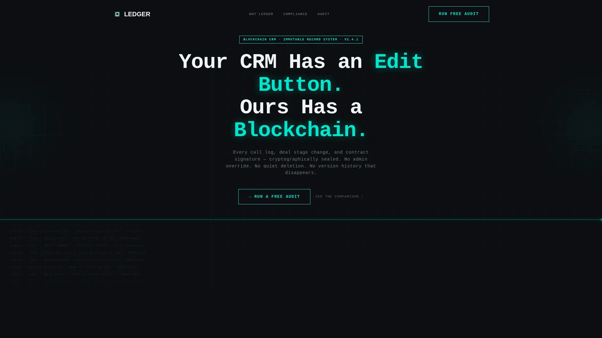
- A dark full-bleed header with a teal pulse line, oversized monospaced headline, and a live-scrolling transaction hash grid that sets the tone immediately
- A multi-row comparison table pitting the platform against leading CRM alternatives across dimensions like record immutability, audit trail depth, and timestamp verification
- Two conversion paths: a sticky "Run a Free Audit" call-to-action button and a secondary gated PDF download for visitors not yet ready to trial
Feature list
This section covers the core template components drawn directly from the source brief.
Void Header with Teal Pulse Line
The header fills the full viewport width with void black (#0B0E11). A single horizontal teal (#00E5CC) line pulses slowly across the center like a heartbeat monitor. Above it, an oversized monospaced brutalist headline commands attention. Below it, a faint grid of hashed transaction identifiers scrolls upward in gunmetal text, creating the impression of a ledger writing itself in real time.
Multi-Platform Comparison Table
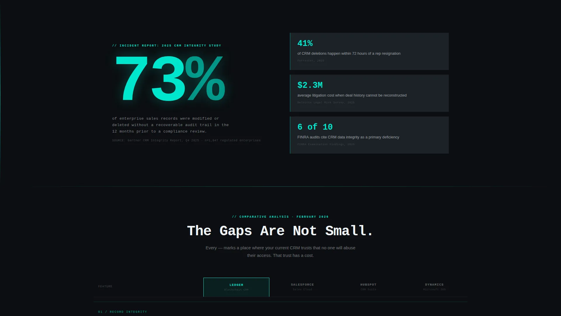
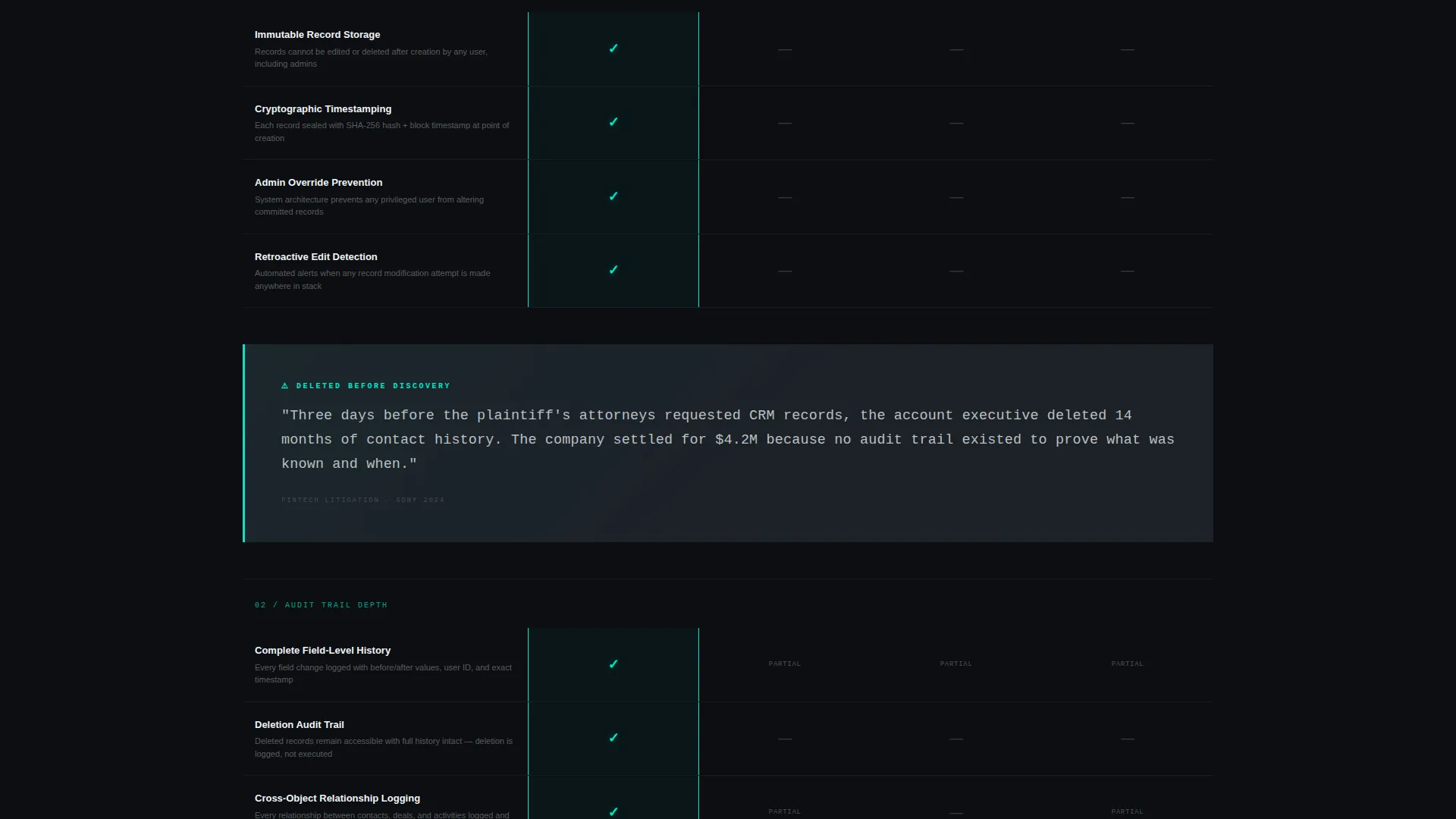
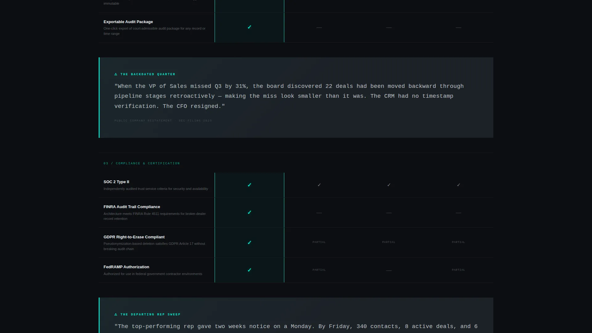
The spine of the page is a structured comparison table. It measures the platform against major CRM alternatives across rows covering record immutability, audit trail depth, data sovereignty, timestamp verification, and compliance certifications. Teal checkmarks glow against the void for the featured platform. Dim gray dashes mark every competitor column.
Brutalist Pull-Quote Blocks
Between table sections, full-width pull-quote blocks surface real horror scenarios. Each one describes a concrete failure: a deleted contact history before a lawsuit, a backdated deal stage hiding a missed quarter. These blocks make the next row of checkmarks feel like resolution rather than marketing.
Sticky "Run a Free Audit" Call to Action
After the first table section scrolls past, a teal-bordered brutalist button pins itself to the bottom of the viewport. Clicking it opens a minimal two-field form: work email and current CRM platform via dropdown. It captures decision-ready visitors at the exact moment the gaps become undeniable.
Gated PDF Report Download
Below the full comparison table, a secondary conversion path offers a downloadable full comparison report in PDF format. It requires only an email address, making it low-friction for visitors in research mode who are not yet ready to start a trial but want to take the data with them.
Stat Block with Source Citation
Immediately below the header, a single hard-hitting statistic lands before the table begins. It cites the percentage of sales records altered without audit trails annually, complete with source attribution. This stat block anchors the Industry Report narrative and establishes credibility before any product claims are made.
Page sections overview
| Section | Purpose |
|---|---|
| Full-Bleed Header | Sets tone, brutalist headline, scrolling transaction hash grid |
| Cited Stat Block | Opens the prosecutorial case with a sourced data point |
| Primary Comparison Table | Head-to-head feature rows versus competing CRM platforms |
| Pull-Quote Horror Block | Real-world failure scenario between table sections |
| Secondary Table Section | Additional comparison rows with continued teal checkmark treatment |
| Sticky Audit call to action | Persistent bottom-viewport button capturing decision-ready visitors |
| PDF Download Section | Gated secondary conversion for research-stage visitors |
Design & branding system
The visual identity follows a Bold Brutalist theme using the Teal Catalyst color system. Every color in the palette has a specific, functional role, nothing is decorative.
- Void black (#0B0E11) dominates all backgrounds, card surfaces use gunmetal slab (#1C2127), catalyst teal (#00E5CC) marks borders, data points, hover states, checkmarks, and the pulse line, and searing white (#F0F4F8) is reserved strictly for text
- Typography is monospaced and oversized in the headline, reinforcing a terminal-screen aesthetic that aligns with the blockchain and data-ledger product narrative
- There are no illustrations, no photography, and no soft gradients, the teal glow is the only visual effect, and it earns its place through function
Mobile & speed optimization
The template is designed with a mobile-first viewport in mind. The comparison table and sticky call-to-action button are structured to remain functional and readable at smaller screen sizes.
- The full-bleed header and scrolling hash grid are built to scale across viewport widths without losing the terminal-screen atmosphere
- The sticky audit button is positioned at the bottom of the viewport, a placement that works naturally on both desktop and mobile interaction patterns
- The two-field audit form keeps friction low on any device, just work email and a dropdown selection, nothing more
How this template helps you convert
This template is engineered specifically for the Comparison/Versus conversion goal. It does not ask for the click until the case is already made.
- The Industry Report structure builds credibility before any product claim appears, using a cited statistic and a side-by-side comparison table to let the data do the persuading first.
- The sticky "Run a Free Audit" call-to-action captures visitors at peak conviction, appearing only after the first table section has scrolled past and the platform gaps are already visible.
- The gated PDF download provides a second conversion path for evaluation-stage visitors, capturing qualified leads who want to take the comparison data into internal review meetings.
Other information about this template
This template is purpose-built for the blockchain-based enterprise software category. It suits teams positioning a CRM platform in regulated markets where auditability is a buying requirement.
- The comparison table structure is directly relevant to buyers evaluating alternatives and needing a clear, side-by-side breakdown of immutability and audit features
- The Industry Report creative direction gives the page authority typically associated with analyst content rather than product marketing, which suits procurement and compliance audiences
- The template's Bold Brutalist visual theme is unconventional in the CRM software space and is designed to stand out against generic SaaS landing pages
- Teams building a case against established CRM platforms will find the pull-quote horror scenario blocks especially useful for articulating real-world risks that feature lists alone cannot convey
Theme
Bold Brutalist
Creative direction
Industry Report
Color system
Teal Catalyst
Style
Comparison Table
Direction
Comparison/Versus
Page Sections
Void Header with Teal Pulse Line
Multi-platform Comparison Table
Brutalist Pull-quote Horror Blocks
Sticky Audit Call-to-action Button
Gated PDF Report Download
Sourced Stat Block
Related questions
Who is this landing page template built for?
What conversion actions does this template support?
Can I adapt the comparison table rows to my platform's specific features?
Does this template work without illustrations or photography?
Is this template suitable for a product still in early access or beta?



