Advanced Tech & AI Platforms Specialist Cost Calculator Website Template
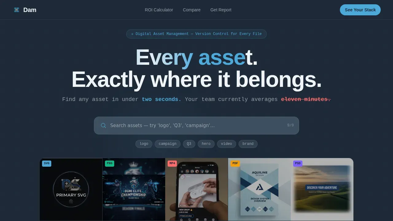
Vaultify is a dark-themed, modular card grid landing page built for digital asset management platforms. It opens with a live-filtering asset search, flows into an interactive ROI calculator, and closes with head-to-head comparison cards. The design uses a deep graphite and stratosphere blue palette to deliver an instrument-panel aesthetic that builds trust and drives comparison-report signups.
by Rocket studio
Quick summary
Vaultify is a single-page, card grid landing page designed for digital asset management (DAM) platforms. It combines an interactive search preview, a flipping ROI calculator, and versus cards to give visitors a hands-on sense of the product before they ever fill out a form. The result is a landing page that earns the click by proving value first.
Who this template is for
This landing page is built for marketing and technology teams who need to present a DAM platform to a skeptical, data-driven audience. A well-designed landing page is essential for connecting with prospective clients and promoting services clearly.
- Marketing ops managers who need to justify a platform switch with hard numbers
- Creative directors and brand leads responsible for asset consistency across many markets
- Enterprise software teams launching or repositioning a DAM product to new clients
What problem this template solves
Asset chaos is expensive. Teams spend an average of eleven minutes finding a single file across scattered Dropbox folders, shared drives, and legacy storage. This landing page gives DAM platforms a structured way to display that cost in the visitor's own numbers, then present the solution with confidence.
- Wrong file versions circulating across dozens of locations
- No clear way to evaluate one storage platform against another side by side
- Visitors leaving without understanding the real cost of their current setup
What you get with this template
You get a fully structured, single-page layout with high interactivity built in at every scroll depth. The page is designed to provide a clear journey from curiosity to conversion, using modular card designs that can be updated as your messaging grows.
- An interactive hero with a live asset search grid and real-time filtering
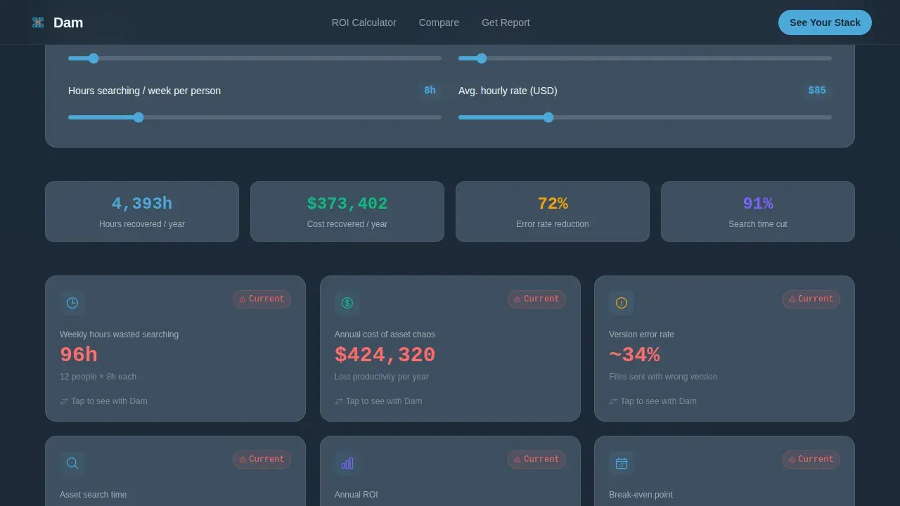
- A flipping ROI calculator that populates time-saved and cost-recovered results from user inputs
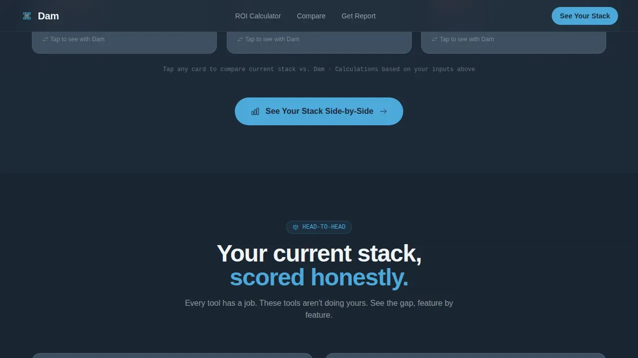
- Head-to-head versus cards comparing your platform against common storage tools
Feature list
This template is built around purposeful interactivity. Each feature is grounded in the brief and designed to support a comparison-led conversion strategy.
Live Asset Search Preview
The hero section displays a mock asset library grid. Visitors interact with a functioning search bar that filters cards in real time. Metadata overlays, file types, dimensions, and last-modified timestamps appear on hover. It feels like using the product before signing up.
Flipping ROI Calculator Cards
Below the hero, a modular card grid collects three inputs: team size, assets managed, and hours spent searching per week. The cards flip to display calculated results including time saved, cost recovered, and error reduction. Each card also shows a before-and-after comparison to help visitors understand the gap in their current setup.
Versus Comparison Card Grid
As visitors scroll deeper, the grid shifts into head-to-head mode. Comparison cards score features like metadata taxonomy, permission granularity, content delivery speed, and integration depth against common alternatives. This section helps the audience evaluate options with structured, side-by-side information.
Gated call to action with Personalized Report
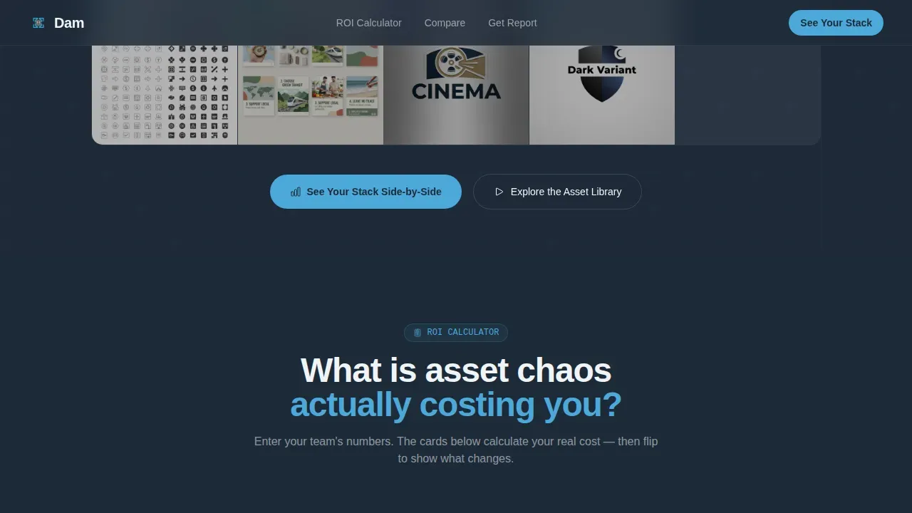
The primary call to action, "See Your Stack Side-by-Side," gates a personalized comparison report behind a three-field form: work email, current storage tool, and team size. The form appears after the calculator results and again as a sticky bar once the visitor scrolls past the third versus card.
Sandbox Demo Secondary Path
A secondary call to action offers "Explore the Asset Library," linking to a live sandbox demo with no form required. This path supports clients who prefer to explore before committing, giving the page two active conversion routes.
Sticky Scroll call to action Bar
Once a visitor passes the third versus card, a sticky bar locks to the top of the browser window and keeps the primary call to action visible. This scroll-linked behavior ensures the conversion prompt stays accessible without interrupting the reading flow.
Page sections overview
| Section | Purpose |
|---|---|
| Hero Search Preview | Live filtering asset grid with headline stat |
| ROI Calculator Cards | Input-driven results showing time and cost savings |
| Versus Comparison Cards | Feature-by-feature platform scoring |
| call to action Report Gate | Three-field form for personalized comparison report |
| Secondary Trust call to action | Sandbox demo link and social proof metrics |
| Footer | Linear single-row with essential links |
Design & branding system
The visual identity follows a Data Command theme. The palette is built on deep graphite and stratosphere blue, designed to feel like the cockpit of a long-haul flight: dark instrument panels, glowing readouts, and calm sky beyond the glass. Color psychology suggests that blue invokes a sense of calm and trust, which works well for platform designs targeting enterprise clients.
- Deep graphite (#1E2A38) as the primary background; mid-slate (#3D4F5F) for card surfaces
- Stratosphere blue (#4DA8DA) reserved for interactive elements, data highlights, and active states
- DM Sans for headings; JetBrains Mono for metadata readouts and data displays to reinforce the instrument-panel feel
Mobile & speed optimization
The landing page is optimized for both desktop and mobile devices to ensure consistent performance across screen sizes. These designs follow mobile-first principles, ensuring appropriate button sizing and uncluttered layouts on smaller screens. Client components handle the interactive sections while static sections are server-rendered to keep load times firm.
- Responsive card grid that reflows cleanly on mobile viewports
- Touch-friendly inputs for the ROI calculator on smaller screens
- Sticky call to action bar tested for correct display behavior across common mobile browsers
How this template helps you convert
The page is built around a calculator-first strategy. Visitors see their own numbers before they see any ask. This approach builds confidence and makes the comparison report feel like a natural next step rather than a cold form.
- The ROI calculator produces personalized results early, so visitors have completed a value assessment before reaching the call to action.
- The versus cards remove doubt by letting the page do the comparison work, helping visitors grow their conviction without needing to run their own research.
- The sticky bar and dual call to action paths keep the conversion prompt visible and accessible at every scroll depth, supporting visitors who are ready to start at different points in the page.
Other information about this template
The Vaultify smart asset management landing page template is designed for fintech and SaaS platforms that need to store, organize, protect, and distribute brand assets at scale. Teams in wealth management, compliance-heavy industries, and enterprise marketing will find the structure particularly useful for presenting secure document services to prospective clients.
- The template can connect to analytics tools. Technical elements like Google Analytics and SSL certificates are important for tracking site traffic and ensuring site security once deployed.
- A well-designed website is a digital calling card. Your site's home page is likely the first page a prospective client will see, so it should encapsulate your firm's value clearly.
- The polished, modern look of the template is important for user adoption and satisfaction, conveying a sense of safety and efficiency to clients evaluating DAM services.
- This template identifies a strong intersection between web design quality and conversion strategy, making it well-suited for firms that need to grow their client base through a high-trust landing page.
- Teams working in wealth management or adjacent financial services can adapt the comparison card content to highlight compliance, security, and data governance as key differentiators.
- The template supports future content updates. It is important to send updated information to clients promptly when key details, team members, or services change on your platform's home page.
- No-code and low-code platforms enable non-technical users to build and deploy pages like this without traditional programming, and this template is built to work within those environments.
- The template utilizes advanced tools like Spline to create interactive 3D animations where the creative direction calls for immersive experiences beyond the core card grid.
- Consent preferences and browser-level data settings should be configured during deployment to align with your firm's compliance and privacy requirements.
Theme
Data Command
Creative direction
Calculator/Tool First
Color system
Slate & Sky
Style
Card Grid (Modular)
Direction
Comparison/Versus
Page Sections
Live Asset Search with Real-time Filtering
Interactive Flipping ROI Calculator
Head-to-head Versus Comparison Cards
Gated Comparison Report Call to Action
No-form Sandbox Demo Path
Scroll-linked Sticky Call to Action Bar
Related questions
Who is this landing page template designed for?
Can I customize the ROI calculator inputs and results?
Does the template support a secondary conversion path?
Is this template responsive on mobile devices?
How does the versus card section work?



