Luxe Gothic Lifestyle Blog Landing Page Template
Veil is a gothic lifestyle landing page template built for dark-aesthetic creators, independent makers, and niche editorial voices. It combines a full-bleed Type Over Image header, a modular card grid, and a minimal waitlist form into one cohesive, atmosphere-first design. The Obsidian and Gold color system and ultra-thin serif typography make every section feel intentional and distinctly non-generic.
by Rocket studio
Quick summary
Veil is a single-page waitlist landing page for a gothic lifestyle blog. It uses a modular card grid layout, a dramatic full-bleed header, and a pared-down email signup form. The Obsidian and Gold palette, ultra-thin serif type, and scroll-triggered card reveal work together to create a space that feels curated, not constructed.
Who this template is for
This template is built for creators who speak to a specific, style-conscious audience. It fits voices that live at the intersection of beauty, ritual, and deliberate living.
- Independent makers such as small-batch jewelers and perfumers who need a launch platform that matches their aesthetic
- Gothic fashion and lifestyle bloggers building an audience before their full site goes live
- Art school graduates and creative professionals launching a curated editorial or personal brand online
What problem this template solves
Most blog and waitlist templates feel built for speed, not atmosphere. They prioritize conversion mechanics over the sensory experience that draws niche audiences in. Veil solves the mismatch between a creator's visual world and the generic templates available to them.
- Generic waitlist pages lose the right audience before a single word is read
- Standard card grid layouts feel predictable and fail to signal a curated, high-context editorial identity
- A mismatch between visual tone and target reader erodes trust before the signup even appears
What you get with this template
Veil delivers a complete, ready-to-use landing page structure. Every section has been designed with the gothic lifestyle niche in mind, from the header photograph to the final form line.
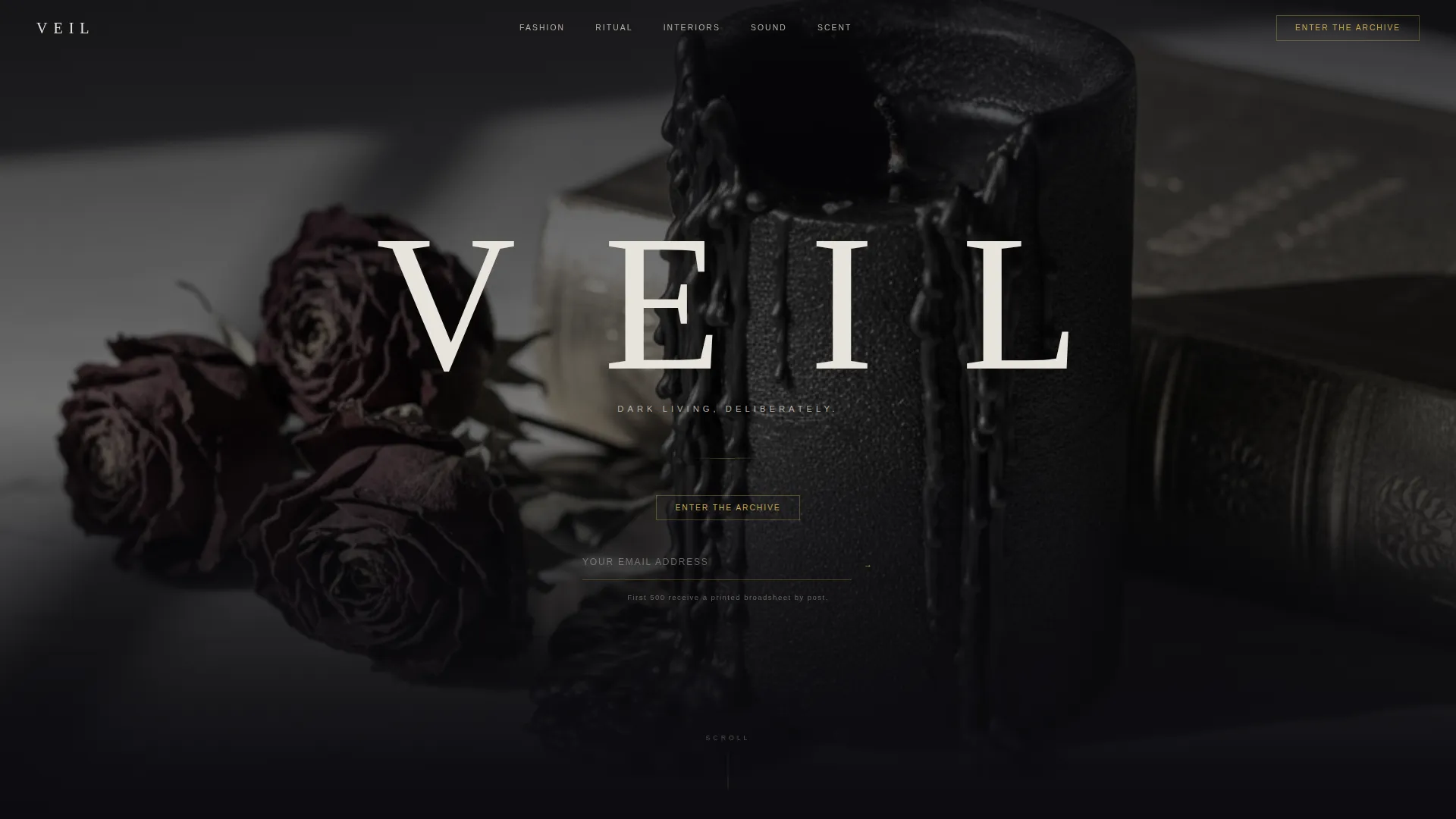
- A full-bleed Type Over Image header with ultra-thin serif display type and a small-caps tagline
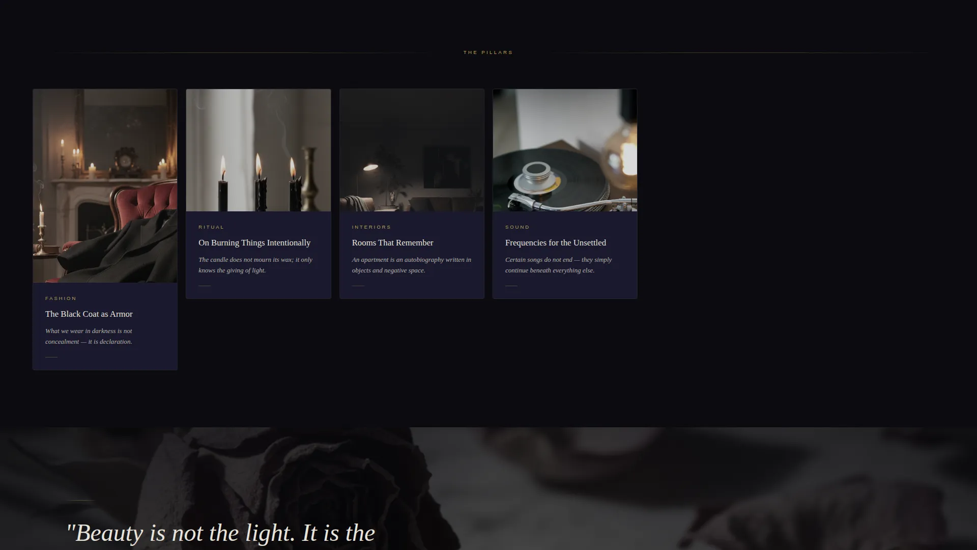
- A modular card grid covering five content pillars: Fashion, Ritual, Interiors, Sound, and Scent
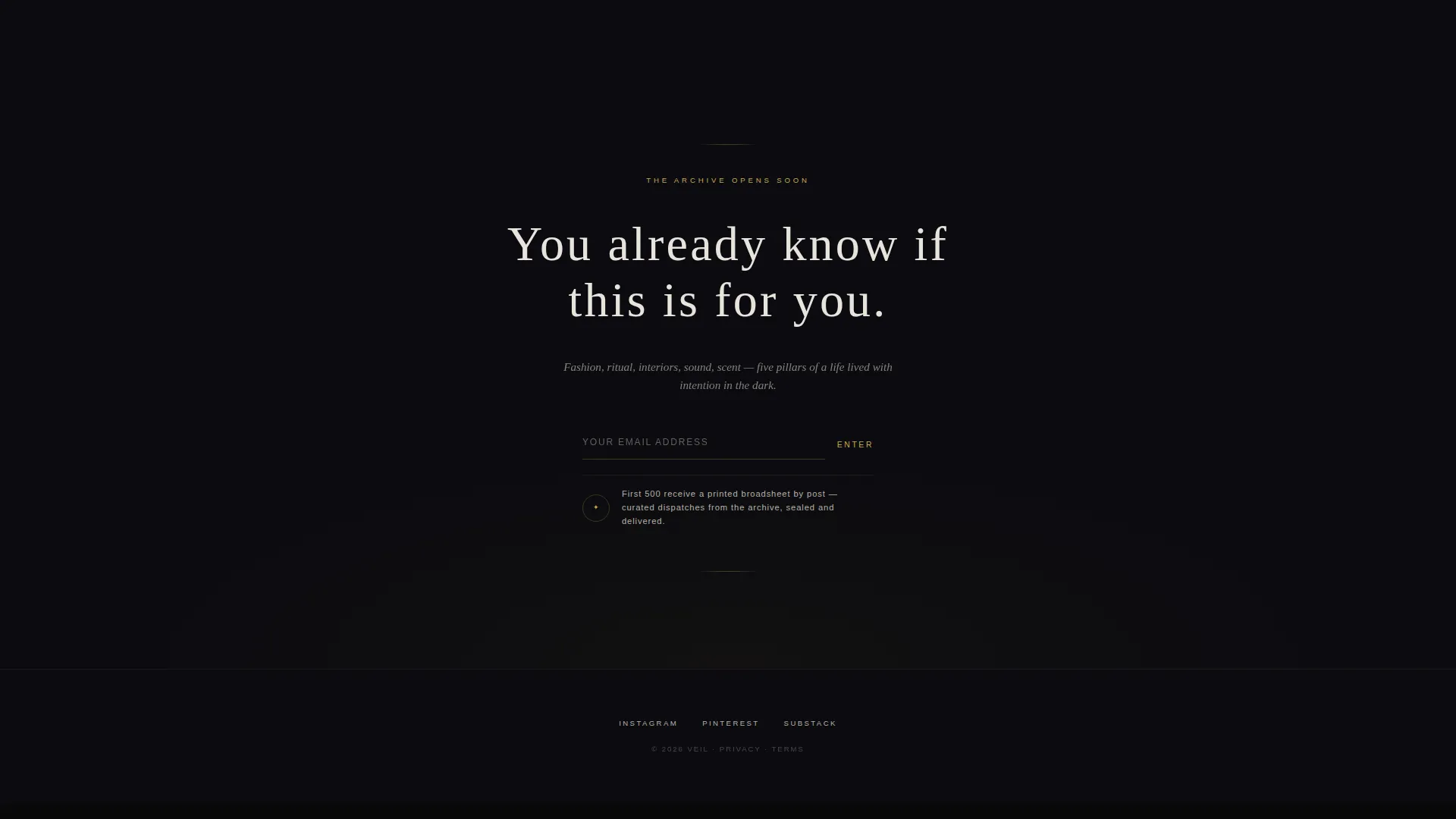
- A minimal email waitlist form with a gold underline input and a physical incentive line beneath it
Feature list
Veil ships with a tightly considered set of components. Each one serves the overall atmosphere and the specific goal of earning a waitlist signup.
Full-Bleed Editorial Header
The header uses a desaturated still-life photograph as its canvas. The blog name appears at enormous scale in an ultra-thin tracked serif, with a single-line small-caps tagline beneath it. The effect reads like an inscription rather than a headline.
Modular Card Grid with Scroll Reveal
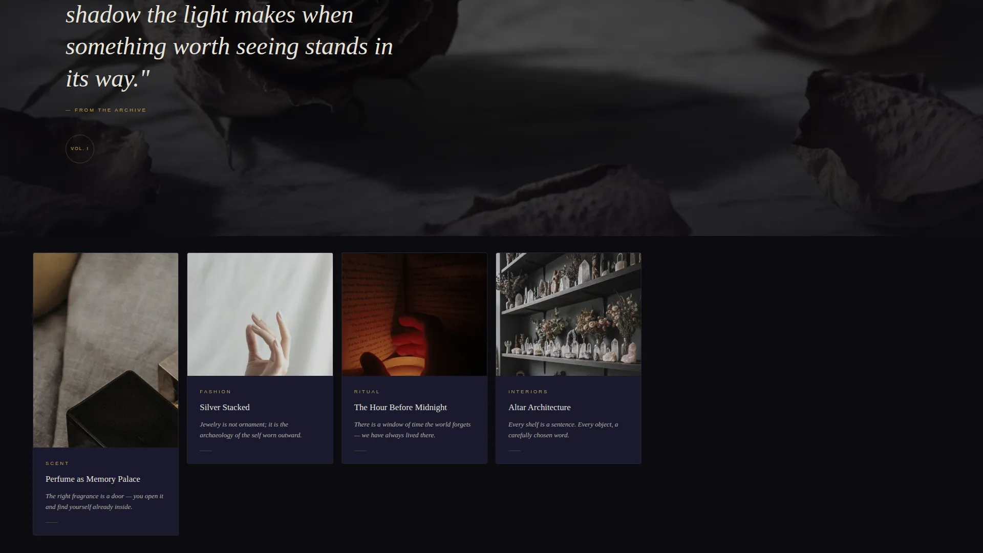
Cards vary in height and surface with a subtle upward drift as the reader scrolls. They never all appear at once, which creates a sense of discovery. The rhythm shifts between clustered smaller cards and full-width editorial image interruptions so the layout stays unpredictable.
Content Pillar Cards
Each card in the grid is dedicated to one of five editorial pillars: Fashion, Ritual, Interiors, Sound, and Scent. Every card carries a single image, a tarnished gold category label, and a one-sentence teaser written to feel poetic rather than functional.
Minimal Waitlist Form
The signup form asks for an email address only. The input renders as a borderless field with a thin gold underline that brightens on focus. A quiet line beneath the field reads "First 500 receive a printed broadsheet by post," converting a digital action into something tangible.
Persistent Ghost Button Navigation
The primary call to action, "Enter the Archive," appears both beneath the header tagline and as a persistent ghost button in the navigation bar. This keeps the conversion path visible without overwhelming the editorial atmosphere.
Obsidian and Gold Color System
The palette uses true obsidian as the dominant background, a slightly lifted cathedral shadow tone for card surfaces, tarnished gold for interactive elements and typographic accents, and bone white for body text. The restraint of the system ensures the gold always draws the eye first.
Page sections overview
| Section | Purpose |
|---|---|
| Full-bleed header | Sets atmosphere and displays the blog name and tagline over a still-life photograph |
| Navigation bar | Holds the persistent ghost button call to action for continuous signup access |
| Card grid opening | Introduces the first cluster of modular content pillar cards with scroll reveal |
| Editorial image break | Interrupts the card rhythm with a full-width image to reset the visual pace |
| Card grid continuation | Resumes modular cards after the editorial break with varied heights |
| Email waitlist form | Captures signups with a minimal gold-underline input and a physical incentive line |
Design & branding system
Veil uses a Luxe Minimal theme that treats restraint as a deliberate design choice. Every color, typeface decision, and spacing choice reinforces the idea that this space was built for a specific kind of reader.
- Color palette: true obsidian (#0B0B0F) for the background, cathedral shadow (#1A1A2E) for card surfaces, tarnished gold (#C9A84C) for interactive elements and accents, and bone white (#E8E4DD) for body text
- Typography: an ultra-thin serif at display scale for the header, small caps for the tagline, and tarnished gold used sparingly to mark category labels and key accents
- Visual rhythm: card heights vary intentionally, full-width editorial images interrupt the grid, and scroll-triggered upward drift keeps the experience feeling like discovery
Mobile & speed optimization
The modular card grid and full-bleed header are designed to translate across screen sizes without losing the atmospheric quality that defines the template.
- The card grid reflows to a single-column layout on smaller screens while preserving scroll-reveal behavior
- The minimal form design, a single borderless input with a gold underline, remains clean and easy to interact with on touch devices
- Full-bleed images and the still-life header photograph are structured to maintain visual impact at any viewport width
How this template helps you convert
Veil earns the signup by building belonging before making an ask. Every design detail signals to the right reader that this space was made for them specifically.
- The "Enter the Archive" call to action appears twice, beneath the header tagline and as a persistent ghost button in the navigation bar, so the path to signup is always visible without interrupting the editorial experience
- The physical incentive line beneath the form, "First 500 receive a printed broadsheet by post," reframes a digital signup as an exclusive, tangible reward that creates real urgency
Other information about this template
Veil is a single landing page template suited for launch-phase positioning in the gothic fashion and dark lifestyle niche. It is not a multi-page site build.
- Template style: Card Grid (Modular), designed for editorial content previews across five named pillars
- Landing page direction: Waitlist and Coming Soon, focused on list building before full content launch
- Header concept: Type Over Image, using a desaturated still-life photograph with display-scale serif type
- Creative direction: Curated Collection, with varied card heights, scroll reveal, and full-width editorial image interruptions
- This template is well suited to creators building on platforms such as Framer, Webflow, or any system that supports modular card layouts and custom color tokens
Theme
Luxe Minimal
Creative direction
Curated Collection
Color system
Obsidian & Gold
Style
Card Grid (Modular)
Direction
Waitlist/Coming Soon
Page Sections
Full-bleed Editorial Header
Modular Card Grid with Scroll Reveal
Five Content Pillar Cards
Minimal Gold-underline Waitlist Form
Persistent Ghost Button Call to Action
Related questions
Can I use this template before my blog content is ready?
How many content sections does the card grid include?
Is this template suitable for a product launch or just a blog?
What makes the signup form different from a standard email capture?
Can I change the color palette and typography?



