Datadriven Community | Free Website Template | Rocket
Velo is a hub-and-spoke landing page built for a developer-focused community forum. It pairs a Code Snippet header with a dark Data Command aesthetic and a five-spoke anchor navigation. Comparison data cards stack evidence across speed, depth, expertise, cost, and ecosystem, guiding visitors toward a full-width search bar and a lightweight email sign-up.
by Rocket studio
Quick summary
Velo is a single-page community forum landing page with anchor navigation and a Void & Violet color system. A live-typed code snippet opens the page, five comparison spokes lay out side-by-side evidence, and two conversion paths move visitors from curiosity to action with minimal friction.
Who this template is for
This template is built for anyone promoting or presenting a developer-community forum to an audience of builders. It speaks directly to people who already live inside a code editor and want proof before they commit.
- Freelance web designers who manage multiple client sites and need a reliable support community
- Small business owners debugging live site issues and looking for fast, credible answers
- Hobbyist coders who learned scripting inside a visual web editor and want a deeper community
What problem this template solves
Generic forum pages fail technical audiences. They bury value behind vague copy and ask visitors to trust claims rather than see evidence. This template replaces soft promises with structured comparison data.
- Visitors leave without converting because they cannot tell whether the forum is active or useful
- Response time, resolution rate, and contributor quality are invisible on most forum landing pages
- No clear path exists from browsing a landing page to actually posting a first question
What you get with this template
You get a fully structured hub-and-spoke landing page with five anchor-linked spoke sections, a sticky side navigation, animated data cards, and two distinct conversion paths. Every section is designed around a specific comparison argument.
- A styled Code Snippet header with a live-typing animation and a monospaced headline
- Five comparison spokes covering Speed, Depth, Expertise, Cost, and Ecosystem
- A full-width autocomplete search bar and a single-field email sign-up as conversion endpoints
Feature list
This template ships with a focused set of components, each tied directly to the forum-comparison conversion flow.
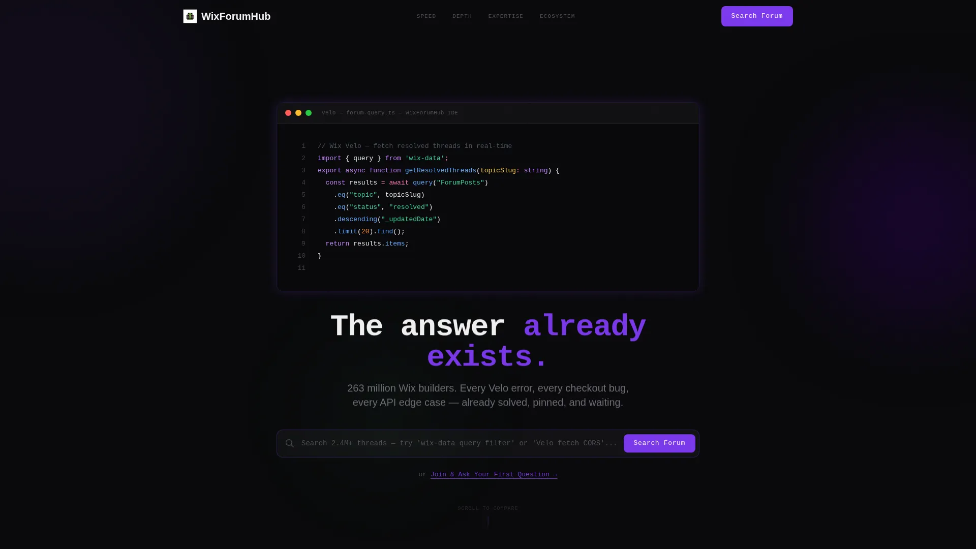
Live-Typed Code Snippet Header
The header centers a styled code block that renders a real Velo function call character by character, simulating live IDE input. A monospaced headline fades in below, and the background stays pure void black with a blinking cursor for atmosphere.
Sticky Anchor Side Navigation
A side navigation bar stays fixed as visitors scroll. It labels each spoke clearly: Speed, Depth, Expertise, Cost, and Ecosystem. Clicking any label jumps the visitor directly to the relevant comparison section without losing context.
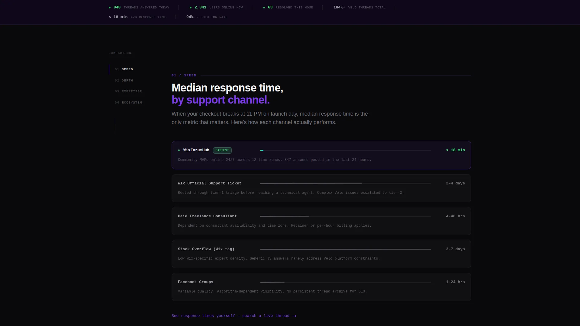
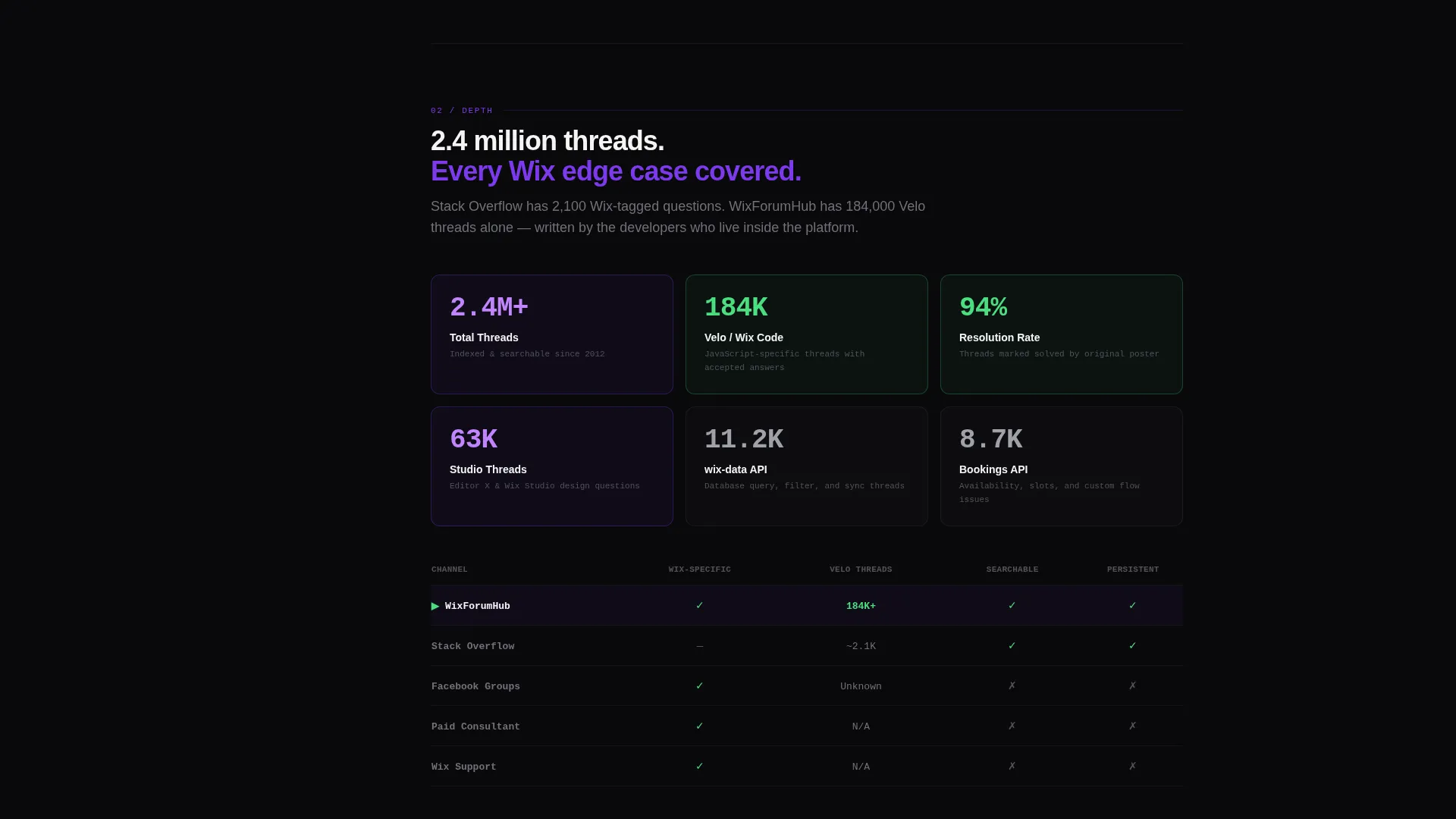
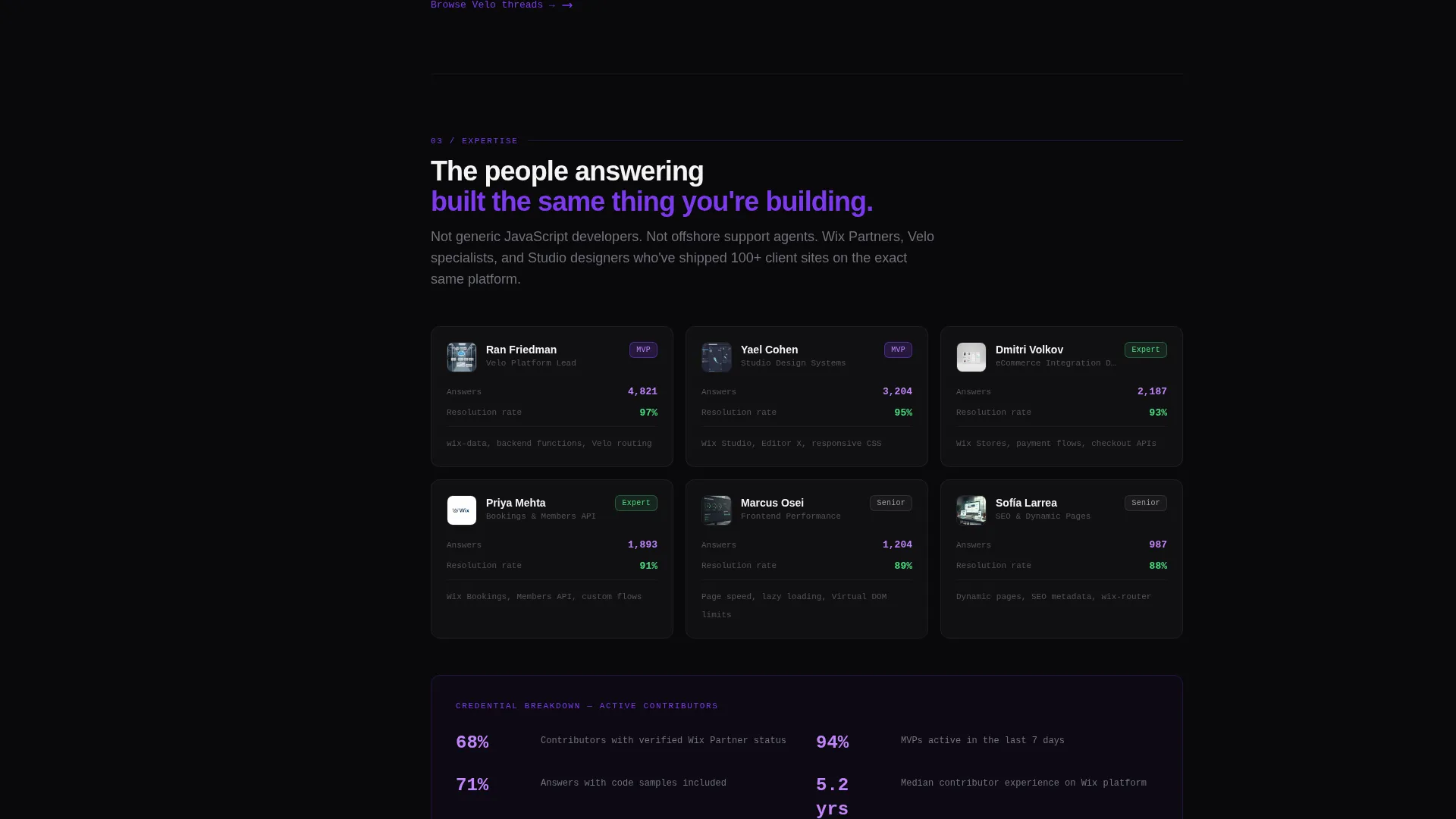
Animated Comparison Data Cards
Each spoke section contains data cards showing metrics such as median response times, resolution rates, and contributor credential breakdowns. Cards animate into view as the visitor scrolls, mimicking a live dashboard loading fresh data.
Full-Width Autocomplete Search Bar
The primary call to action is a full-width search bar positioned to autocomplete real thread titles as the visitor types. The interaction demonstrates forum depth before the visitor ever clicks through.
Contextual Micro-calls to action Per Spoke
Every comparison spoke ends with a short, action-specific prompt such as "See response times yourself" or "Browse Velo threads." These micro-calls to action reduce scroll-to-click distance and match visitor intent at each stage.
Single-Field Email Sign-Up
A secondary conversion path offers a minimal email sign-up labeled "Join & Ask Your First Question." One field, one action, zero distractions.
Page sections overview
| Section | Purpose |
|---|---|
| Code Snippet Header | Opens with live-typed Velo code and a fading monospaced headline |
| Sticky Side Nav | Anchors all five spokes and keeps orientation while scrolling |
| Speed Spoke | Compares forum response times against paid consultants and support tickets |
| Depth Spoke | Shows thread volume and topic breadth versus generic Q&A channels |
| Expertise Spoke | Presents contributor credential data against Facebook groups and forums |
| Cost Spoke | Contrasts free community access with paid support channel costs |
| Ecosystem Spoke | Maps community coverage of editor features and developer APIs |
| Primary call to action Block | Full-width autocomplete search bar with "Search the Forum Now" label |
| Secondary call to action Block | Single-field email sign-up for new member onboarding |
Design & branding system
The visual identity follows a Data Command theme. Every color choice is functional, mapping to a specific interaction or content state rather than decoration.
- Void black (#09090B) covers all backgrounds and card surfaces, creating a code-editor atmosphere
- Electric violet (#7C3AED) marks every anchor link, hover state, and interactive element across the page
- Phosphor green (#4ADE80) pulses on live-data accents including posts answered, users online, and threads resolved this hour
Mobile & speed optimization
The layout is built for scrolling on any screen size. The sticky side navigation adapts to keep spoke context visible without blocking content on smaller displays.
- Monospaced typography and card-based layouts scale cleanly across breakpoints
- Animated data cards are triggered on scroll entry, keeping the initial load visually light
- The full-width search bar and single-field sign-up remain accessible and tap-friendly on mobile
How this template helps you convert
The page moves visitors along a deliberate path from skepticism to action. Each layer adds evidence before asking for a commitment.
- The live-typed code snippet signals immediately that this page speaks the visitor's language, establishing credibility before a single word is read.
- Five comparison spokes remove the visitor's biggest objections one by one, using data cards to replace vague claims with specific, scannable metrics.
- Contextual micro-calls to action at the end of each spoke funnel engaged visitors directly into the search bar or sign-up field at the peak of their interest.
Other information about this template
This template is designed specifically for community forums serving web developers and visual-builder audiences. It pairs well with platforms where Velo API documentation, Wix community forum threads, and Wix documentation resources are the primary support layer.
- The hub-and-spoke structure keeps the page organized as a single scrollable unit while still supporting deep comparison content
- The Void & Violet color system is fully customizable and can be adapted to match any developer-community brand palette
- The Industry Report creative direction makes this template well-suited for audiences familiar with competitive analysis formats and technical benchmarks
Theme
Data Command
Creative direction
Industry Report
Color system
Void & Violet
Style
Hub & Spoke (Anchor Nav)
Direction
Comparison/Versus
Page Sections
Live-typed Code Snippet Header
Sticky Anchor Side Navigation
Animated Comparison Data Cards
Full-width Autocomplete Search Bar
Contextual Micro-ctas Per Spoke
Single-field Email Sign-up
Related questions
How many sections does this landing page include?
Can I customize the comparison data shown in the data cards?
Does the autocomplete search bar connect to live forum data?
Who is the primary audience for this template?
Is this template suitable for non-developer communities?


