High Performance Database Landing Page Template
The Ingest landing page template is purpose-built for time series database platforms competing on raw performance. It opens with five oversized benchmark metric cards, then walks engineers through a modular card grid of competitive teardowns, interactive latency sliders, retention cost toggles, and a zero-downtime migration terminal recording. Every section is designed to show proof before asking for commitment.
by Rocket studio
Quick summary
The Ingest template is a single-page, card grid layout built for a high-performance time series database platform. It leads with a live metrics wall, then steps engineers through competitive comparisons, query latency demonstrations, compression cost breakdowns, and migration evidence. The page earns trust through data first and asks for a click only after the numbers have done their job.
Who this template is for
This template serves technical teams who need to evaluate, migrate, or champion a serious time series database investment. The audience is not casual. These are people who understand what write throughput means and why query performance degrades at high cardinality. They want proof, not promises. This template is designed to meet them exactly where they are.
- Infrastructure engineers and site reliability engineers (SREs) facing Prometheus cardinality explosions and scaling walls
- DevOps leads comparing time series databases at midnight before a migration deadline
- CTOs and engineering directors signing off on enterprise data platform decisions that cannot afford downtime
What problem this template solves
Time series databases live or die by their benchmarks. The challenge for any platform in this space is that engineers are deeply skeptical. They have seen marketing numbers that fall apart under real workloads. Traditional databases struggle to handle the continuous nature of time stamped data at scale, and even purpose-built time series databases diverge sharply in how they handle high cardinality data, large data volumes, and data retention over time. A generic landing page does not survive contact with this audience.
This template solves the credibility gap directly by leading with quantifiable results and letting the numbers speak before any call to action appears.
- Engineers arrive looking for benchmark evidence, and the five-card metrics wall gives them exactly that above the fold
- The modular versus-card structure turns every scroll into a direct competitive teardown, eliminating the need for visitors to hunt for comparisons elsewhere
- The proof-first, gate-later conversion model respects the engineer mindset: show the data first, then ask for a click
What you get with this template
You get a fully structured, modular card grid landing page designed for the time series database platform niche. Every section is purpose-built to support a technical audience that demands clarity and evidence. The template is built around a Data Command visual theme using a Slate and Sky color system, with high animation fidelity and interactive components that make the data feel alive.
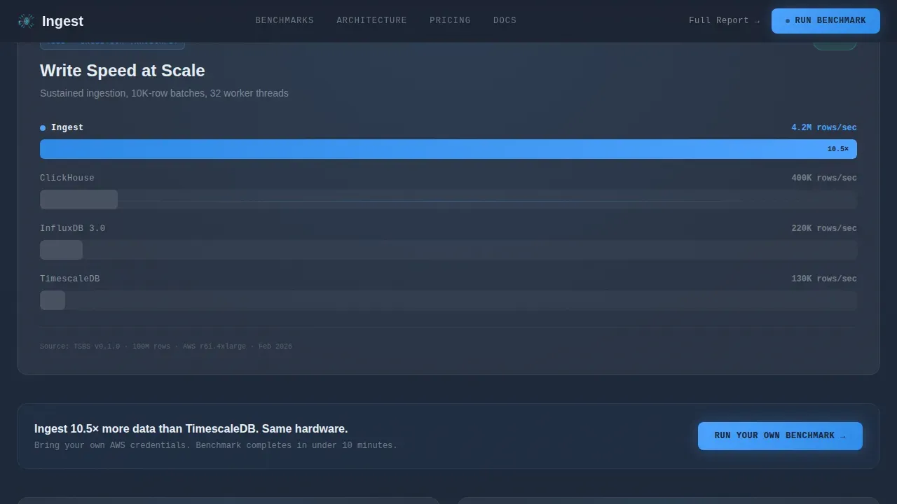
- A five-card benchmark metrics wall header with animated micro-sparklines showing ingestion rate, compression ratio, query latency, cardinality, and storage cost per gigabyte
- Three modular versus cards covering ingestion throughput, interactive query latency with a cardinality slider, and a retention cost toggle across 30-day, 90-day, and one-year windows
- A migration section featuring a terminal recording card and a zero-downtime case study, followed by a sticky call-to-action bar and a single-field email-gated benchmark report
Feature list
This template is built around a set of focused, high-impact components. Each one serves the goal of converting a skeptical infrastructure engineer into a benchmark runner. Below is a breakdown of what the template delivers.
Live Benchmark Metrics Wall
The header is a full-viewport metrics wall with five oversized key performance indicator cards. Each card displays a real benchmark number: 4.2 million rows per second ingestion rate, 94.3% compression ratio, p99 query latency of 2.1 milliseconds, 50 billion or more unique series in cardinality, and storage cost of $0.023 per gigabyte per month. Every card includes a micro-sparkline that animates upward on page load, making data feel live and measured rather than static.
Modular Versus Comparison Cards
Three competitive comparison cards follow the metrics wall, each framed as a direct matchup. The ingestion throughput card compares write throughput across competing time series databases side by side. The query latency card includes an interactive cardinality slider that updates p99 latency curves in real time, letting engineers analyze data points at their own scale. The compression and storage card uses a retention toggle to compare storage costs at 30-day, 90-day, and one-year intervals. Each card animates in with an upward-thrust stagger reveal.
Interactive Cardinality Slider
The query latency card includes a live cardinality slider. Engineers can drag the slider to adjust the cardinality dimension and watch p99 latency curves update instantly. This is a direct answer to the problem of high cardinality data causing performance degradation in time series databases. It lets visitors run a mini benchmark inside the page itself, building trust before they commit to the full sandbox.
Zero-Downtime Migration Terminal
The migration section includes a terminal recording card that plays through a live migration completing in under four minutes. Alongside it, a case study card presents real downtime numbers, specifically zero, from a production migration. This section speaks directly to the fear of query timeouts during peak traffic and the cost of downtime when data volumes grow beyond what a legacy platform can handle.
Proof-First Conversion Architecture
The primary call to action, "Run Your Own Benchmark," links to a free sandbox environment and appears after the third comparison card. It is also repeated as a sticky bottom bar throughout the scroll. A secondary path offers the full benchmark report behind a single-field email gate. This structure keeps the page focused on a single conversion action while giving engineers two clear entry points based on where they are in their evaluation.
Sticky Call-to-Action Bar
A persistent call-to-action bar anchors to the bottom of the viewport throughout the scroll experience. It stays visible without being intrusive, surfacing the primary benchmark action at exactly the moment each section finishes making its case. This ensures that any engineer who reaches peak conviction mid-scroll can act immediately without hunting for a button.
Page sections overview
| Section | Purpose |
|---|---|
| Metrics wall header | Display five live benchmark KPI cards with sparkline animations and a competitive tagline |
| Ingestion throughput card | Compare write throughput against competing time series databases in a direct bar chart |
| Query latency card | Show p99 latency curves with an interactive cardinality slider for self-directed analysis |
| Compression storage card | Compare storage costs across retention windows using a 30-day, 90-day, one-year toggle |
| Migration terminal card | Play a live migration terminal recording and present a zero-downtime production case study |
| Sticky call to action bar | Persist the primary benchmark call to action across the full scroll depth |
| Single-row footer | Provide minimal navigation, legal links, and secondary contact in a linear single-row layout |
Design & branding system
The template uses a Data Command visual theme rooted in a Slate and Sky color palette. The design evokes a mission control terminal at midnight: dark surfaces recede, data floats forward, and blue pulses wherever something is alive and measured. Every color, font, and animation choice reinforces the idea that this platform is built for serious operational environments where engineers trust the readout in front of them.
- Color system: deep operations-center slate (#1B2332) for backgrounds, gunmetal panel gray (#2A3444) for card surfaces, stratosphere blue (#4DA3FF) for live accents and interactive highlights, and horizon white (#E8EEF4) for typography and data labels
- Typography: DM Sans for headings, JetBrains Mono for data labels and metrics, Manrope for body copy, creating a clear hierarchy between human narrative and machine-precise numbers
- Animation direction: high-fidelity sparkline draw-on animations, staggered card reveal sequences with upward-thrust timing, bar chart fill animations, and a terminal typewriter effect in the migration section
Mobile & speed optimization
The template is built desktop-first, reflecting the primary audience of infrastructure engineers working on workstations. The layout prioritizes wide-viewport fidelity for the metrics wall and versus cards, where data density matters. It remains fully responsive down to 768 pixels so engineers can review the page on secondary devices without losing context.
- Static sections are built with server components to keep initial load weight low, while interactive cards such as the cardinality slider and retention toggle use client components for live responsiveness
- The modular card grid structure means each section loads and renders independently, keeping the page functional even as heavier animation components resolve
- The sticky call-to-action bar is optimized to remain visible and responsive across viewport sizes without overlapping critical content on smaller screens
How this template helps you convert
This template is engineered around a single insight: engineers trust numbers more than narratives. Every layout decision, section sequence, and interactive element is designed to build that trust progressively so the conversion action feels like a logical next step, not a sales interruption.
- The metrics wall delivers five hard benchmark numbers above the fold, capturing high-intent visitors immediately and establishing credibility before a single sentence of marketing copy appears
- The three modular versus cards escalate confidence section by section, moving from ingestion throughput to query latency to storage costs, each one answering a distinct objection that an infrastructure engineer would raise during a real evaluation
- The migration terminal recording and zero-downtime case study remove the final blocker, fear of migration risk, and the sticky call-to-action bar ensures the "Run Your Own Benchmark" action is always one click away at peak conviction
Other information about this template
This template is positioned at the intersection of high-performance infrastructure tooling and technical content strategy. It is designed for platforms where the audience actively wants to analyze time series data, compare time series databases, and make decisions based on reproducible benchmarks rather than vendor claims. The sections below provide additional context on the use cases, technical environment, and broader ecosystem this template is built to serve.
- A time series database (TSDB) is specifically designed to store, manage, and analyze data points indexed by time. Typical time series data includes a timestamp, one or more measured values, and metadata describing the source or context. This template is built to communicate exactly that kind of structured, time stamped data story to a technical audience.
- Time series databases handle high write throughput, time based queries, and efficient storage compression in ways that traditional databases struggle to replicate. Traditional relational databases like those built for online transaction processing are optimized for transactional workloads, not for the continuous data ingestion patterns that define modern observability stacks, IoT sensor data pipelines, or financial market data feeds.
- The demand for time series databases is growing as organizations collect more temporal data and need efficient ways to store, process, and analyze it. As data volumes grow, relational databases that rely on multiple tables and row-oriented data structures face increasing performance degradation under write-heavy workloads. Time series databases use columnar storage and specialized data structures to achieve storage efficiency and maintain query performance even as data volume climbs.
- The template is designed for platforms covering a wide range of time series database examples and use cases: IoT data from sensor networks tracking fixed intervals of machine telemetry, application performance monitoring for infrastructure health, real time analytics over continuous data streams, time series data visualization for operational dashboards, financial tick data capture for stock prices and market data, server error logs and network data from distributed systems, and product analytics including tracking user behavior across continuous streams of events.
- Time series data analysis often requires the ability to detect anomalies across high cardinality data sets, run fast analytical queries over historical time series data, and process data with consistent latency even as collected data accumulates over months or years. The template showcases a platform that can do all of this while keeping storage costs predictable through data lifecycle management, including data retention policies and storage tiering.
- Engineers evaluating time series databases want to analyze data points at their own scale before committing. They need to understand how the platform handles recent data differently from historical data, how a new data point is written when data arrives at peak velocity, how the query language supports complex queries over large data volumes, and whether raw data can be retained or whether older data is downsampled or data deleted after a defined retention window.
- The template references well-known time series database examples in competitive comparisons without advocating for any third party. Organizations across industries have adopted purpose-built time series databases to replace traditional databases: teams use tools like Grafana, Telegraf, and Prometheus in their observability stacks; financial market teams capture and analyze financial market data and financial data in real time; IoT fleets generate operational data and sensor data across tens of thousands of endpoints; and SRE teams rely on real time analytics and time series data analytics to maintain uptime and detect anomalies before they escalate. This template is built to speak credibly to all of those audiences.
- The template supports a data model where time based queries drive the primary access pattern. Unlike relational data models built around multiple tables and relational databases optimized for online transaction processing, time series databases are append-only by design. Every new data point flows into an ordered series, recent data is immediately available for analysis, and historical data is retained according to configurable data retention rules. The template communicates this model clearly through its interactive components and section copy.
- For teams using the Ingest high performance time series database landing page template as a starting point, the design system is fully customizable. Brand colors, benchmark numbers, competitive matchups, and case study details can all be updated to reflect the platform's actual performance data. The template provides the structural framework; the engineering team provides the proof.


Theme
Data Command
Creative direction
Launch Energy
Color system
Slate & Sky
Style
Card Grid (Modular)
Direction
Comparison/Versus
Page Sections
Live Benchmark Metrics Wall
Modular Versus Comparison Cards
Zero-downtime Migration Section
Proof-first Conversion Architecture
Data Command Visual Theme
High-fidelity Animation System
Related questions
What kind of database platform is this template designed for?
Can I update the benchmark numbers and competitive comparisons?
How does the interactive cardinality slider work?
Is this template suitable for platforms serving financial market use cases?
Does the template include a mobile-responsive layout?


