Startup Tactical Consulting & Go-to-Market Website Template
Velocity is a split-screen landing page template built for tactical startup consulting firms. It leads with a live engagement calculator, stacks evidence through a spec-sheet comparison layout, and drives conversions with a persistent call-to-action bar and a low-friction two-step modal. The design runs on a Slate and Sky palette with terminal-style typography for a data-first, zero-clutter feel.
by Rocket studio
Quick summary
Velocity is a single-page consulting landing page template designed for firms that work with scaling startups. It opens with a live calculator that scopes engagements by stage and team size, then builds conviction through a four-row without-versus-with comparison layout. Every pixel earns its place. The result is a page that converts through arithmetic, not storytelling.
Who this template is for
This template is built for B2B consulting firms that serve early-to-growth-stage startups. It fits practices where the buyer is analytical, time-pressured, and skeptical of vague agency language.
- Startup consultants and fractional operators targeting CTOs, founders, and operations leaders
- Consulting teams offering ops restructuring, capital deployment planning, or technical debt triage
- Practitioners who want their landing page to qualify leads before a discovery call
What problem this template solves
Most consulting landing pages lose technical buyers inside the first scroll. They lead with narrative copy and soft social proof that feels unconvincing to a founder who just closed a round. Velocity replaces that pattern with immediate utility.
- Visitors arrive and interact with a tool, not a headline, which filters intent from the first second
- The comparison layout removes ambiguity by pairing real anonymized metrics side by side
- Two separate conversion paths serve buyers at different readiness levels without splitting the page
What you get with this template
Velocity delivers a fully structured single-page layout with high-interactivity components ready to present your consulting practice with precision. Every section is built from the brief and ready to customize.
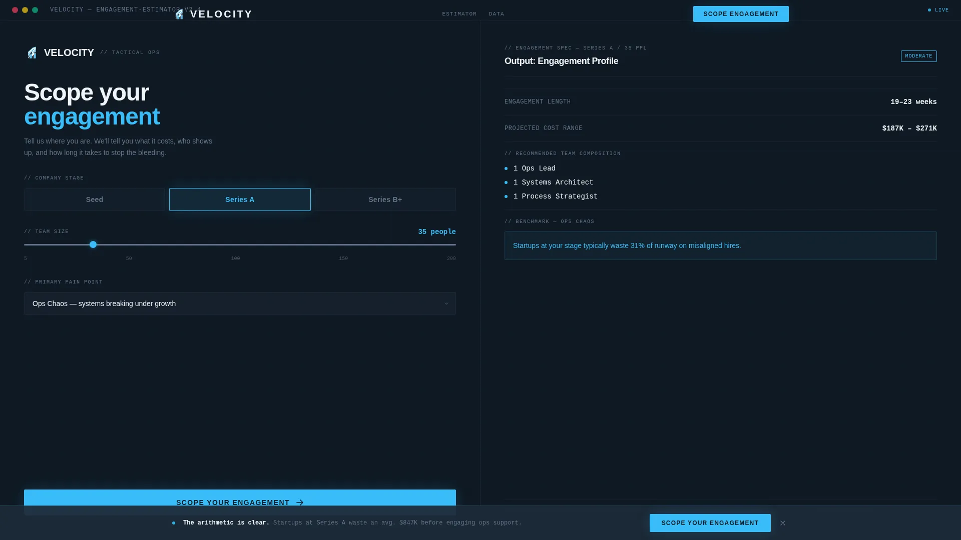
- A live 50/50 split-screen calculator header with stage selector, team-size slider, and pain-point dropdown feeding a real-time spec-sheet output panel
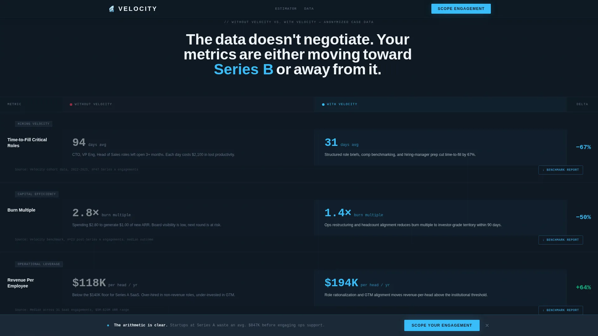
- A four-row spec-sheet comparison section with "Without Velocity" and "With Velocity" columns covering hiring speed, burn rate, revenue per employee, and board-readiness score
- A persistent bottom call-to-action bar, a two-step engagement modal, and a benchmark report email-capture link embedded in each comparison row
Feature list
This section covers the core built-in components that make Velocity function as a conversion-oriented consulting landing page.
Live Engagement Calculator
The header splits 50/50. The left panel holds a compact intake form: a stage selector covering Seed, Series A, and Series B+, a team-size slider from 5 to 200, and a pain-point dropdown with options including ops chaos, hiring velocity, burn rate, and go-to-market. The right panel updates in real time with estimated engagement length, projected cost range, recommended team composition, and one inline benchmark stat.
Spec Sheet Comparison Layout
Four comparison rows stack evidence progressively. Each row presents a left column labeled "Without Velocity" with anonymized case-study metrics and a right column labeled "With Velocity" in sky blue with directional arrows. The rows escalate from hiring speed through burn rate, revenue per employee, and board-readiness score, turning the scroll into a cumulative data argument.
Persistent Call-to-Action Bar
A bottom bar activates after the visitor passes the second comparison row. It carries the primary call to action "Scope Your Engagement" and stays visible through the remainder of the scroll. This keeps the conversion prompt present without interrupting the comparison reading flow.
Two-Step Engagement Modal
Clicking "Scope Your Engagement" opens a modal with two steps. Step one captures email and company name. Step two presents a single open-text field asking "What broke this week?" The low-friction framing makes the ask feel like venting rather than form-filling, which reduces drop-off at the conversion point.
Benchmark Report Lead Capture
Each comparison row includes a secondary "Download the Benchmark Report" link. This gates a PDF behind an email-only form for visitors who are not ready to talk but are willing to be nurtured. It creates a secondary conversion path without requiring a separate page or campaign.
Terminal-Style Typography System
The template uses DM Sans for interface and body elements and JetBrains Mono for data outputs, calculator readouts, and code-adjacent elements. The typographic pairing reinforces the spec-sheet identity and signals precision to a technical audience.
Page sections overview
| Section | Purpose |
|---|---|
| Split Calculator Header | Live intake form with real-time spec-sheet output panel |
| Spec Sheet Row 1 | Hiring speed comparison using anonymized case-study metrics |
| Spec Sheet Row 2 | Burn rate comparison with directional improvement indicators |
| Spec Sheet Row 3 | Revenue per employee before and after engagement |
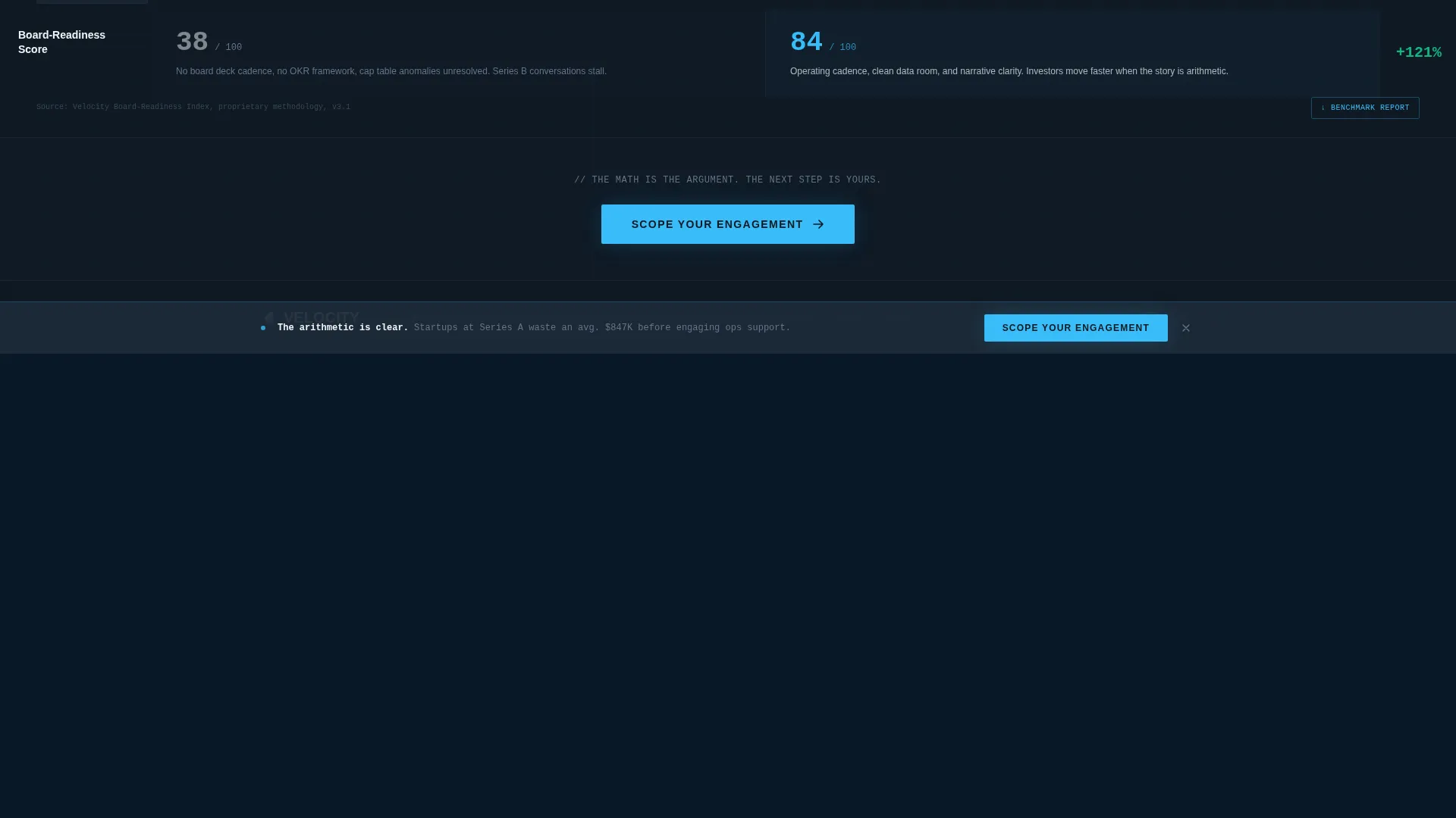
| Spec Sheet Row 4 | Board-readiness score comparison closing the evidence stack |
| Persistent call to action Bar | Activates after row 2, anchors "Scope Your Engagement" action |
| Engagement Modal | Two-step capture: contact info then open-text pain-point field |
| Footer | Linear single-row pattern for links and legal copy |
Design & branding system
The design language is terminal meets glass-tower: precise, cold in the right places, and deliberately readable under pressure. Every color decision reinforces the data-first identity.
- Deep graphite slate (#1E2A38) dominates backgrounds and heavy text, brushed aluminum mid-tone (#64748B) handles secondary labels, open-sky blue (#38BDF8) activates on call-to-action elements, hover states, and "With Velocity" data highlights, and cloud-white (#F0F4F8) opens up comparison columns for fast visual parsing
- DM Sans drives interface legibility while JetBrains Mono marks data outputs and calculator fields as precise and machine-readable
- Scroll-reveal word animations and counter animations on the comparison rows add medium-weight motion without distracting from the content
Mobile & speed optimization
The template is desktop-first by design, matching how its primary audience works. That said, a mobile fallback is built into the layout structure so the page remains usable on smaller screens.
- The 50/50 split-screen calculator stacks vertically on mobile, keeping the intake form and output panel accessible without horizontal scrolling
- Static sections use server components for efficient rendering, while the live calculator and two-step modal are handled as client components to keep interactivity isolated and fast
How this template helps you convert
Velocity is structured around two conversion paths that work in parallel without competing. The layout earns trust before it asks for anything.
- The calculator header converts intent immediately: a visitor who inputs their stage, team size, and pain point receives a personalized spec-sheet output, which creates investment in the result and raises the likelihood they continue to the call-to-action prompt.
- The comparison rows build cumulative conviction row by row, so by the time the persistent bar activates and the modal opens, the visitor has already processed four rows of evidence and the decision feels logical rather than emotional.
Other information about this template
Velocity is built for the Technology category, specifically within the Consulting Firm Website Templates subcategory. It targets the Consulting Firm Team Page niche and is configured for the US market with English copy and USD pricing references.
- The template follows a Startup Velocity theme and uses a Comparison/Versus landing-page direction to frame every engagement as a before-and-after data story
- The Calculator/Estimator header concept and Spec Sheet creative direction are foundational to the layout, meaning the interactive tool and the comparison table structure are load-bearing elements, not decorative additions
- No stock photography or hero illustrations are used anywhere in the template; the calculator and comparison data carry the visual weight of the page

Theme
Startup Velocity
Creative direction
Spec Sheet
Color system
Slate & Sky
Style
Split Screen (50/50)
Direction
Comparison/Versus
Page Sections
Live Split-screen Engagement Calculator
Four-row Spec Sheet Comparison
Persistent Scope Engagement Call to Action Bar
Low-friction Two-step Modal
Benchmark Report Email-capture Link
Terminal-inspired Typography Pairing
Related questions
Who is this consulting landing page template built for?
Can I customize the calculator fields and comparison row metrics?
What information does the two-step engagement modal collect?
Is the benchmark report download included in the template?
Does the template work on mobile devices?



