Event Planning Digital Presence Specialist Directory Website Template
Vendora is a single-page event planning directory landing page built for two-sided marketplaces. It connects vendors like DJs, florists, and caterers with hosts planning weddings, corporate retreats, and product launches. A live search header, animated stats, a three-tier comparison table, and a progressive sign-up form work together to turn visitors into listings fast.
by Rocket studio
Quick summary
Vendora is a high-impact, single-page directory landing page for event planning marketplaces. It leads with a live-filtering search header, delivers proof through animated vendor stats, and guides both vendors and hosts toward action. The design follows a Startup Velocity theme using a sharp Monochrome Steel palette that signals professionalism and urgency from the first scroll.
Who this template is for
This template is built for founders and product teams launching an event planning directory or vendor listing site. It suits anyone who needs to attract two distinct user types from a single page.
- Marketplace builders recruiting vendors such as DJs, florists, caterers, photographers, and event planners
- Platform operators targeting hosts planning weddings, corporate retreats, product launches, or private events
- Early-stage directory startups that need to demonstrate platform traction before the product is fully scaled
What problem this template solves
Vendors currently depend on word-of-mouth and social media messages to find new clients. Hosts waste time jumping between disconnected websites trying to compare pricing, availability, and portfolios. This template replaces both problems with a single convincing page.
- Vendors have no central, credible place to display their services and get discovered at scale
- Hosts spend hours comparing vendor options across separate, unrelated pages with no side-by-side view
- Directory operators struggle to convert cold visitors into listings without proving platform value first
What you get with this template
You get a fully structured, one-page landing page designed to serve both sides of an event planning marketplace at once. Every section is built to escalate trust and reduce hesitation before the sign-up form appears.
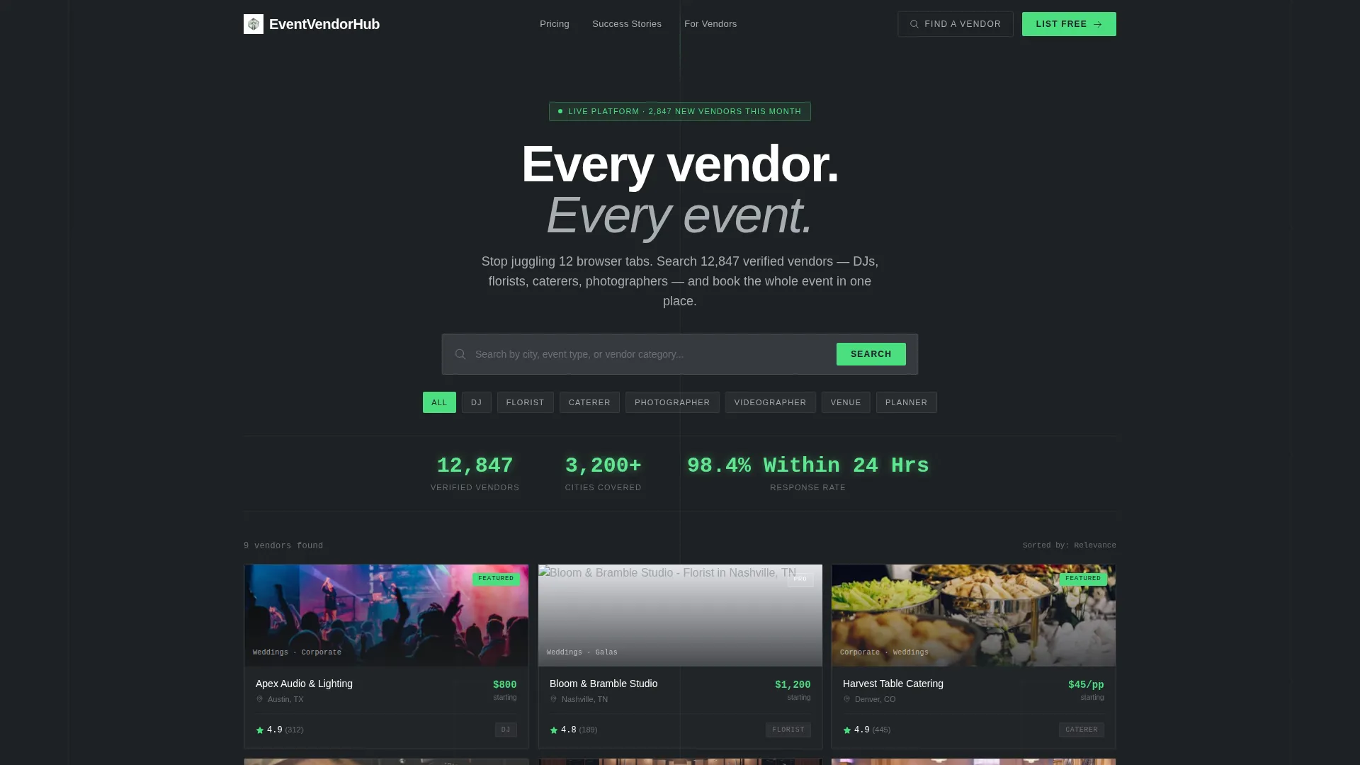
- An interactive search header with real-time vendor card filtering and three live-counter stats
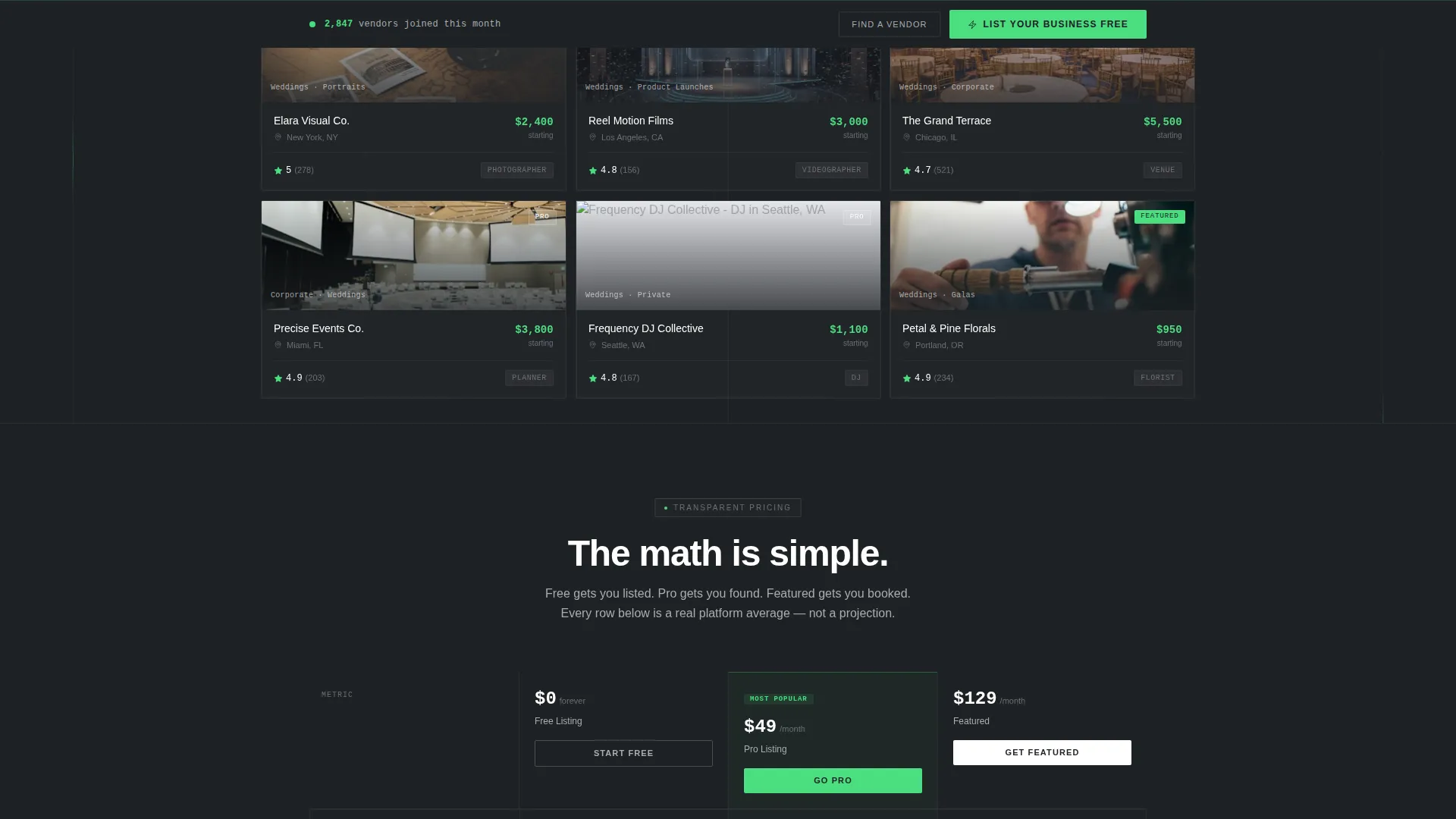
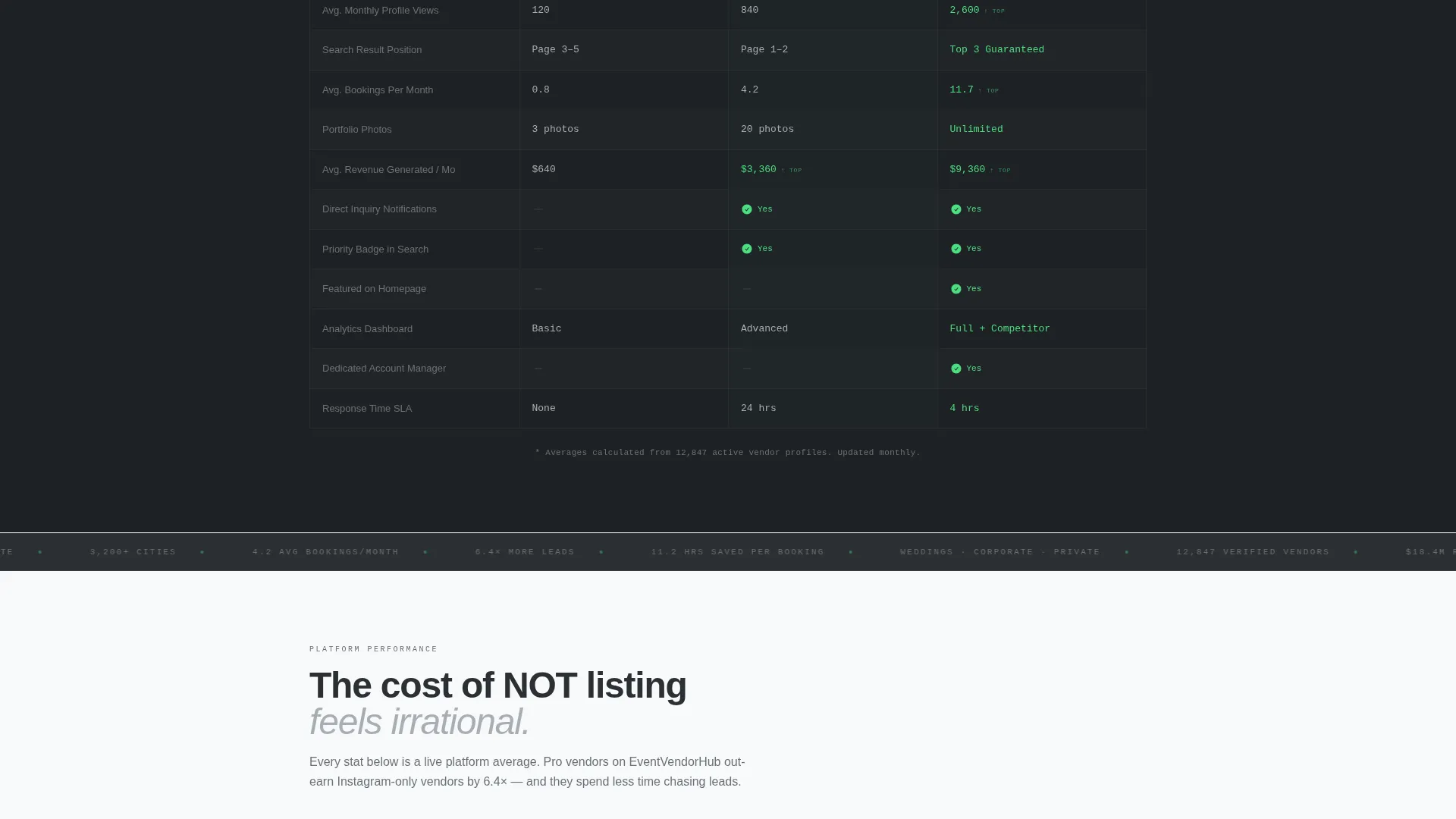
- A three-column comparison table showing Free, Pro, and Featured listing tiers with hard per-row metrics
- A three-step progressive lead capture form with a sticky bottom bar anchored to the primary call to action
Feature list
This template includes a focused set of high-signal components. Each one serves a specific conversion or trust function within the single-page layout.
Real-Time Search Header
The header places a functioning search bar center-screen over a lightly animated grid of vendor cards. Cards shuffle and filter live as a visitor types a city, event type, or vendor category. The product experience begins before the visitor touches anything.
Live Counter Stats Bar
Three stats tick upward on load directly below the search bar. The numbers shown are 12,847 verified vendors, 3,200 or more cities covered, and a 98.4 percent response rate within 24 hours. Each counter uses the electric green accent to signal live, real data.
Three-Tier Comparison Table
A structured table compares Free Listing, Pro Listing, and Featured Listing side by side. Each row surfaces a hard number, for example average monthly profile views of 120, 840, and 2,600 respectively. Steel-bordered columns and clear metrics make the upgrade decision feel logical, not pressured.
Animated Vendor Success Metrics
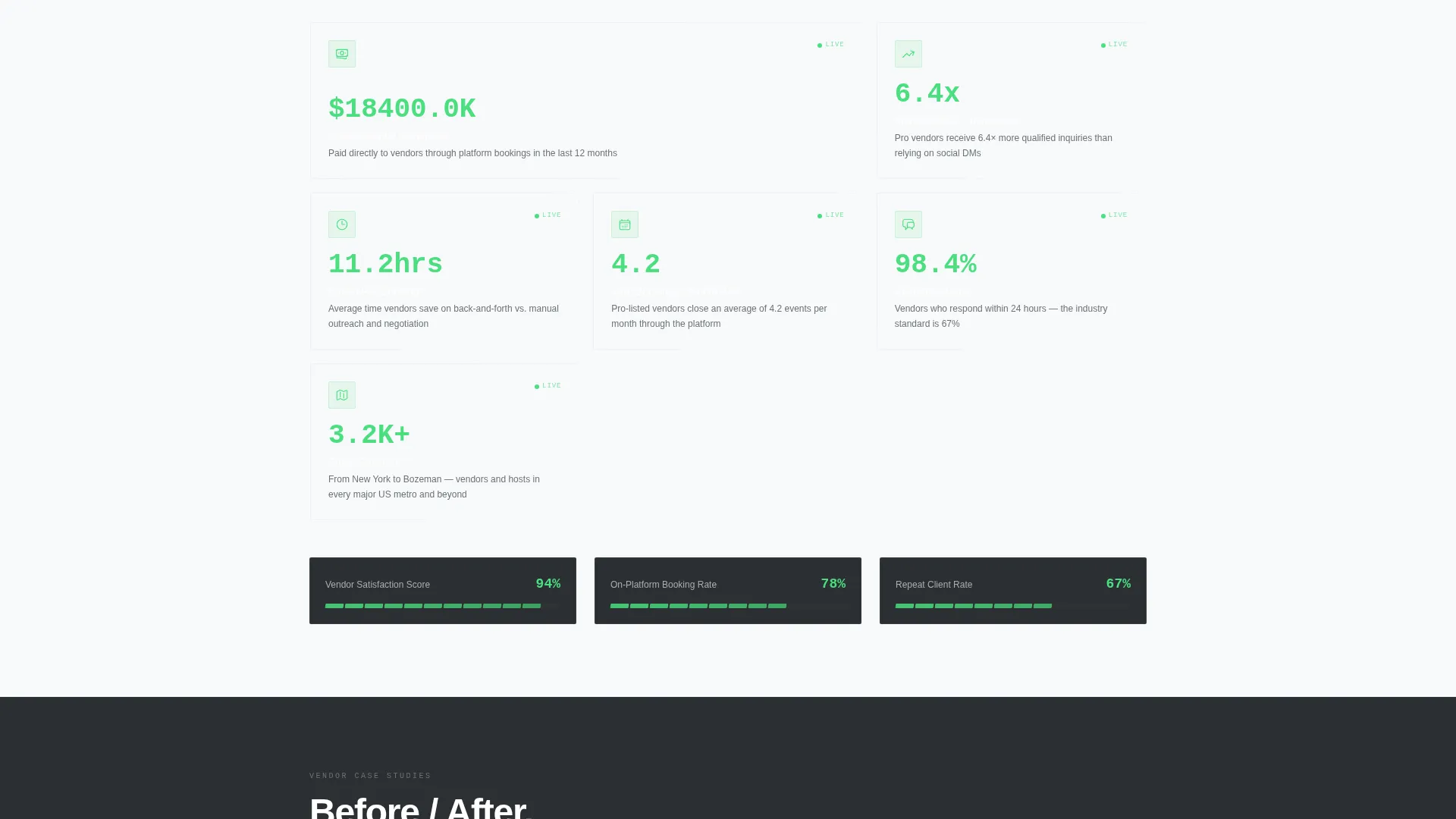
Below the comparison table, a dedicated section displays revenue generated through the platform, average bookings per month, and time saved versus manual outreach. Each stat animates into view on scroll with the green accent pulsing on the number itself.
Case Study Testimonial Cards
Testimonials are formatted as before-and-after metric cards, not plain quote blocks. Each card shows a measurable outcome, turning social proof into quantified evidence that builds confidence in the platform.
Progressive Three-Step Lead Form
The primary sign-up flow breaks into three clear steps. Step one captures vendor category and zip code. Step two asks for business name and portfolio link. Step three collects email and phone number. The form reduces friction by asking for small pieces of information at a time.
Page sections overview
| Section | Purpose |
|---|---|
| Interactive Search Header | Live vendor card filtering with search bar and animated counters |
| Live Stats Bar | Three ticking counters establish platform scale and credibility |
| Comparison Table | Side-by-side tier breakdown with hard monthly metrics per row |
| Vendor Success Metrics | Scroll-animated stats proving revenue, bookings, and time savings |
| Case Study Cards | Before-and-after metric testimonials replacing plain quote blocks |
| Sticky call to action Bar | Persistent "List Your Business Free" button anchored after the table |
| Progressive Lead Form | Three-step capture flow for vendor category, details, and contact |
| Top Navigation | Secondary "Find a Vendor" path routing hosts to search-and-browse |
Design & branding system
The visual identity follows a Startup Velocity theme built entirely on a Monochrome Steel color system. The palette reads like a SaaS dashboard built from precision materials: no warmth, no decoration, only signal.
- Core colors include gunmetal base (#2C2F33), brushed aluminum (#A8ADB3), bright white panel (#F8F9FA), and electric accent green (#4ADE80) reserved exclusively for live data points, toggle states, and primary calls to action
- Backgrounds alternate between gunmetal and white panels; text appears in aluminum gray on dark backgrounds and gunmetal on light panels
- The green accent fires only when something is clickable or countable, keeping every visual cue purposeful and noise-free
Mobile & speed optimization
The layout is built to remain clear and functional across screen sizes. The high-information density of a comparison table and live stats bar requires deliberate structure at smaller viewports.
- The comparison table stacks or scrolls horizontally on mobile so tier differences remain readable without pinching
- The sticky call to action bar is designed to stay visible and tappable on mobile screens throughout the scroll journey
- The three-step form flow reduces per-screen input load, making mobile completion feel manageable rather than heavy
How this template helps you convert
Every section of this landing page is sequenced to reduce doubt and increase the perceived cost of not acting. The design earns the click before asking for it.
- The live search header and ticking counters establish platform credibility within the first three seconds, giving vendors immediate proof that the marketplace is active and populated.
- The comparison table presents the free listing tier as an obvious starting point. Hard monthly view numbers make the value gap between tiers visible without a sales pitch.
- The progressive form lowers the psychological barrier to entry by splitting sign-up into three small steps, so vendors commit gradually rather than facing a long form at once.
Other information about this template
Vendora is designed as a standalone landing page, not a multi-page website. It handles both vendor acquisition and host discovery from a single scrollable experience. The template suits any two-sided marketplace in the events space.
- The secondary "Find a Vendor" navigation path gives hosts a dedicated entry point without competing with the vendor sign-up flow
- The template style is a Comparison Table layout, making tier differentiation and upgrade logic central to the page architecture
- The creative direction is Stats-First Impact, meaning every section leads with a number before asking for any action
- The header concept is an Interactive Preview, making the platform feel alive and populated from the first moment on the page
- The lead generation direction means every design decision, from sticky bar placement to form step count, prioritizes capturing vendor contact details efficiently
Theme
Startup Velocity
Creative direction
Stats-First Impact
Color system
Monochrome Steel
Style
Comparison Table
Direction
Lead Generation
Page Sections
Real-time Search Header
Live Counter Stats Bar
Three-tier Comparison Table
Scroll-animated Vendor Metrics
Before-and-after Case Study Cards
Progressive Three-step Lead Form
Related questions
Can this template serve both vendors and hosts from the same page?
Does the comparison table support custom tier names and metrics?
Is the search bar connected to a live vendor database by default?
Can I replace the electric green accent with my own brand color?
How many steps does the vendor sign-up form include?



