Law Firm Email Marketing Directory Website Template
Verdict is a comparison table landing page template built for legal technology platforms that run feedback request email campaigns. It pairs a data-command visual identity with a Feature Tab Switcher header, a 12-row spec sheet, and a click-through conversion flow aimed at managing partners and legal ops directors at AmLaw 200 firms.
by Rocket studio
Quick summary
Verdict is a single-page template engineered for legal feedback email platforms. It combines a dark data-command aesthetic with an interactive tab switcher, a 12-row comparison table, and a pinned call-to-action bar. Every section is designed to move AmLaw 200 decision-makers from first impression to demo booking without friction.
Who this template is for
This template is built for B2B software-as-a-service companies in the legal technology space. It speaks directly to buyers who evaluate tools with measurable criteria and expect hard numbers before a conversation.
- Managing partners at AmLaw 200 firms who need proof that feedback campaigns will actually get responses
- Legal ops directors measuring client satisfaction or tracking response rate lift across matter types
- Practice group leaders collecting peer reviews before compensation committee meetings
What problem this template solves
Generic survey tool landing pages fail legal professionals. They lead with feature lists but skip the operational evidence that partners and legal ops directors require before committing to a demo.
- Vague feature claims do not answer "how much better" or "compared to what"
- No side-by-side proof means buyers leave to find benchmarks elsewhere
- Standard page layouts cannot carry the command-console credibility this audience expects
What you get with this template
You get a fully structured, single-page layout that earns the click before it asks for it. Every section advances the visitor's confidence rather than interrupting it.
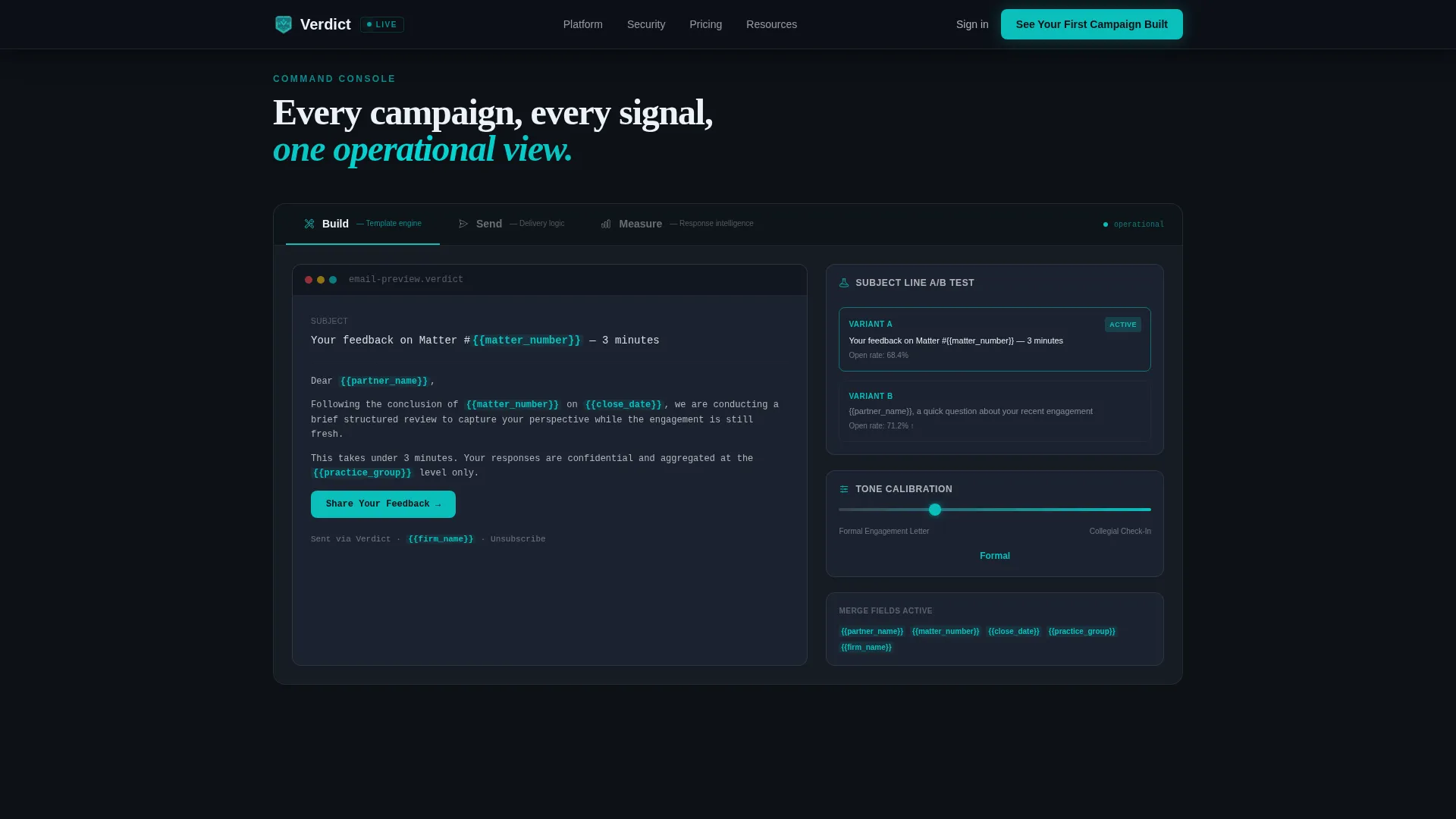
- A Feature Tab Switcher with three operational panels: Build, Send, and Measure
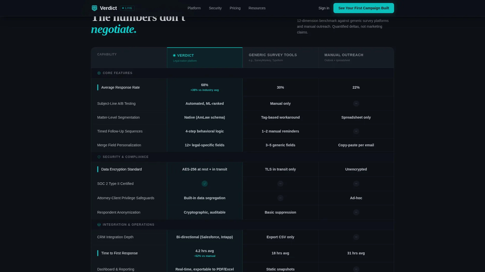
- A 12-row comparison table benchmarking your platform against generic survey tools and manual email outreach
- A sticky call-to-action bar that appears after first scroll and a full-width call-to-action block beneath the return-on-investment row
Feature list
This template ships with purpose-built components that reflect the operational rigor your audience already applies to case work.
Feature Tab Switcher with Three Live Panels
Three tabs labeled Build, Send, and Measure sit across a dark interface frame. The default Build view displays a live-rendered email template with merge fields highlighted in catalyst teal, a subject-line A/B variant selector, and a tone-calibration slider. Each tab swap reveals a distinct operational panel without a page reload.
12-Row Spec Sheet Comparison Table
The comparison table benchmarks your platform against two alternatives across twelve rows. Rows escalate in specificity: features first, then security compliance, then return-on-investment metrics. Teal checkmarks and quantified deltas replace vague claims, keeping every cell scannable and objection-proof.
Sticky Call-to-Action Bar
A slim dark bar pins to the viewport after the visitor scrolls past the hero. It carries the primary call to action continuously as the visitor moves through the comparison table, ensuring the demo entry point is never more than one click away.
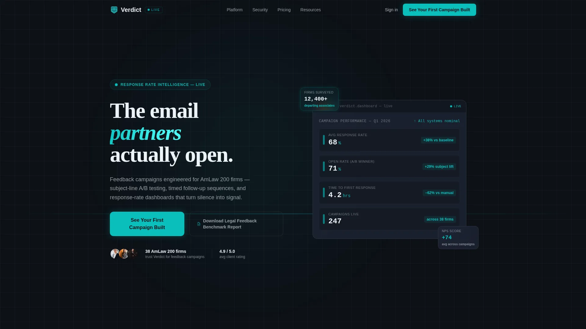
Hero with Live Metric Cards
The hero section uses large display typography over a deep operations-black background. Floating cards carry teal pulse indicators showing live-style metrics. The effect communicates that the product is already running and the data is already moving.
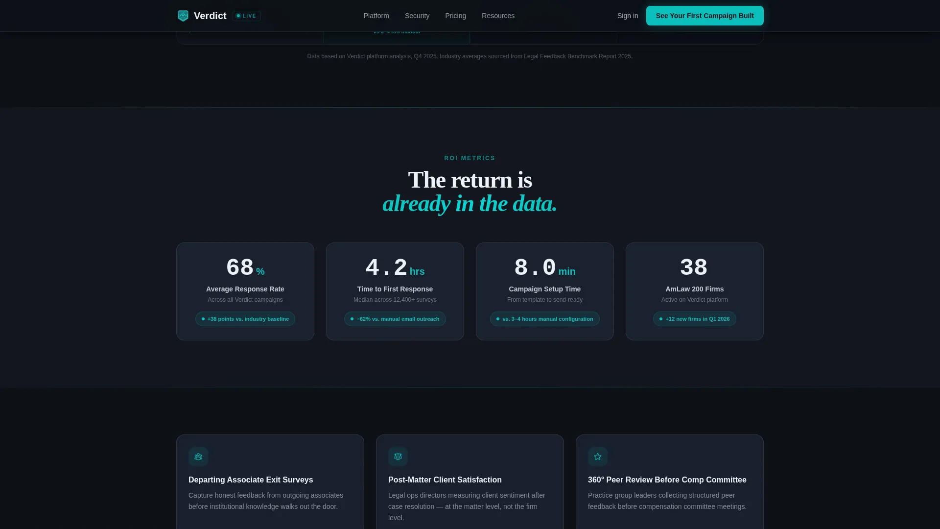
ROI Metrics Strip
A dedicated horizontal strip displays hard numbers with animated count-up behavior. This section anchors the return-on-investment argument before the full-width call-to-action block, so the visitor arrives at the demo click already holding the numbers that matter.
Secondary Nurture Link
Below the primary call to action, a text link offers a legal feedback benchmark report download. This captures email addresses for nurture without adding a form to the main conversion flow, keeping the page focused on demo clicks.
Page sections overview
| Section | Purpose |
|---|---|
| Hero with Metrics | Opens with dark typography and floating teal live-metric cards to establish credibility instantly |
| Feature Tab Switcher | Lets visitors explore Build, Send, and Measure panels in a single interactive frame |
| Comparison Table | Benchmarks the platform across 12 rows against generic survey tools and manual outreach |
| ROI Metrics Strip | Delivers animated hard numbers that quantify response rate lift and time savings |
| Full-Width Call to Action | Drives demo bookings with the primary call-to-action copy and a nurture text link |
| Footer | Single-row linear footer with minimal navigation |
Design & branding system
The visual identity follows a Data Command theme built to feel like a network operations center at 2 a.m. Every color choice prioritizes legibility of live data over decoration.
- Deep operations black (#0D1117) forms the page background, keeping teal accents visually dominant
- Catalyst teal (#0ABFBC) drives live-data accents, hover states, merge field highlights, and teal checkmarks in the comparison table
- Muted steel (#3B4252) handles table borders and secondary containers, while clean brief white (#EDF2F7) covers cell backgrounds and body text
- Typography pairs DM Sans for interface labels and data readouts with Fraunces for display headlines, creating contrast between operational precision and editorial authority
Mobile & speed optimization
The template is built desktop-first to serve legal ops professionals at workstations, with a responsive layout that adapts cleanly to smaller screens.
- Tab switching and comparison table hover states are handled client-side on a static-first foundation, keeping interactions fast without server round-trips
- Teal pulse animations and count-up number behavior are layered on top of static markup, so the core content remains readable regardless of animation state
- The sticky call-to-action bar reflows for mobile viewports, keeping the demo entry point accessible throughout the scroll on any device
How this template helps you convert
The conversion architecture treats every scroll position as a moment to earn the next click rather than demand it.
- The hero delivers floating metric cards before any copy asks for attention, so the visitor's first impression is data, not a pitch
- The 12-row comparison table answers "how much better" with quantified deltas like "+38% average response rate," removing the objections that typically stall demo requests
- The sticky call-to-action bar and full-width demo block appear at the exact moments when a persuaded visitor is most likely to act, making the click feel like confirmation rather than commitment
Other information about this template
This template is categorized under Technology, specifically within the law firm email templates subcategory, targeting the law firm feedback request email niche. A few additional details worth knowing before you customize it:
- The page is localized for English-language audiences in the United States, using US legal industry terminology throughout
- The primary call to action reads "See Your First Campaign Built" and links to a guided demo environment pre-loaded with a sample AmLaw firm workflow
- The secondary text link, "Download the Legal Feedback Benchmark Report," is designed to capture email addresses for a nurture sequence without disrupting the main demo-booking flow
- Animation intensity is set to high: teal pulse effects, scroll-linked sticky bar, tab panel transitions, and count-up numbers all require client-side JavaScript layered over a static HTML and CSS base
Theme
Data Command
Creative direction
Spec Sheet
Color system
Teal Catalyst
Style
Comparison Table
Direction
Click-Through
Page Sections
Feature Tab Switcher with Live Panels
Row Spec Sheet Comparison Table
Sticky Call-to-action Bar
Hero with Teal Pulse Metric Cards
Animated ROI Metrics Strip
Secondary Nurture Capture Link
Related questions
Who is this template designed for?
How does the Feature Tab Switcher work in this template?
Does this template include a lead capture form?
Can the comparison table rows be edited to match real product data?
What animation and interactivity does this template support?



