Micro-SaaS & Developer Tools Professional Website Template
Verify is a dashboard-style landing page template built for two-factor authentication apps. It opens with a live-styled six-digit code in monospaced type, scrolls through a breach-statistics data grid, then pivots to a clean account-tile interface. The design uses deep navy, teal, and white to feel purposeful and precise, built to move visitors from concern to download.
by Rocket studio
Quick summary
Verify is a single-page app download landing page template designed for two-factor authentication tools. It follows a Problem to Solution arc, opening with a ticking code display and breach-data dashboard, then resolving into a calm, organized account grid. The color system is Midnight Blue, deep navy backgrounds, teal active states, and crisp white code type.
Who this template is for
This template is built for teams and individuals shipping authentication apps that need to earn trust fast. The brief imagines three distinct user types, and the page layout speaks directly to each of them.
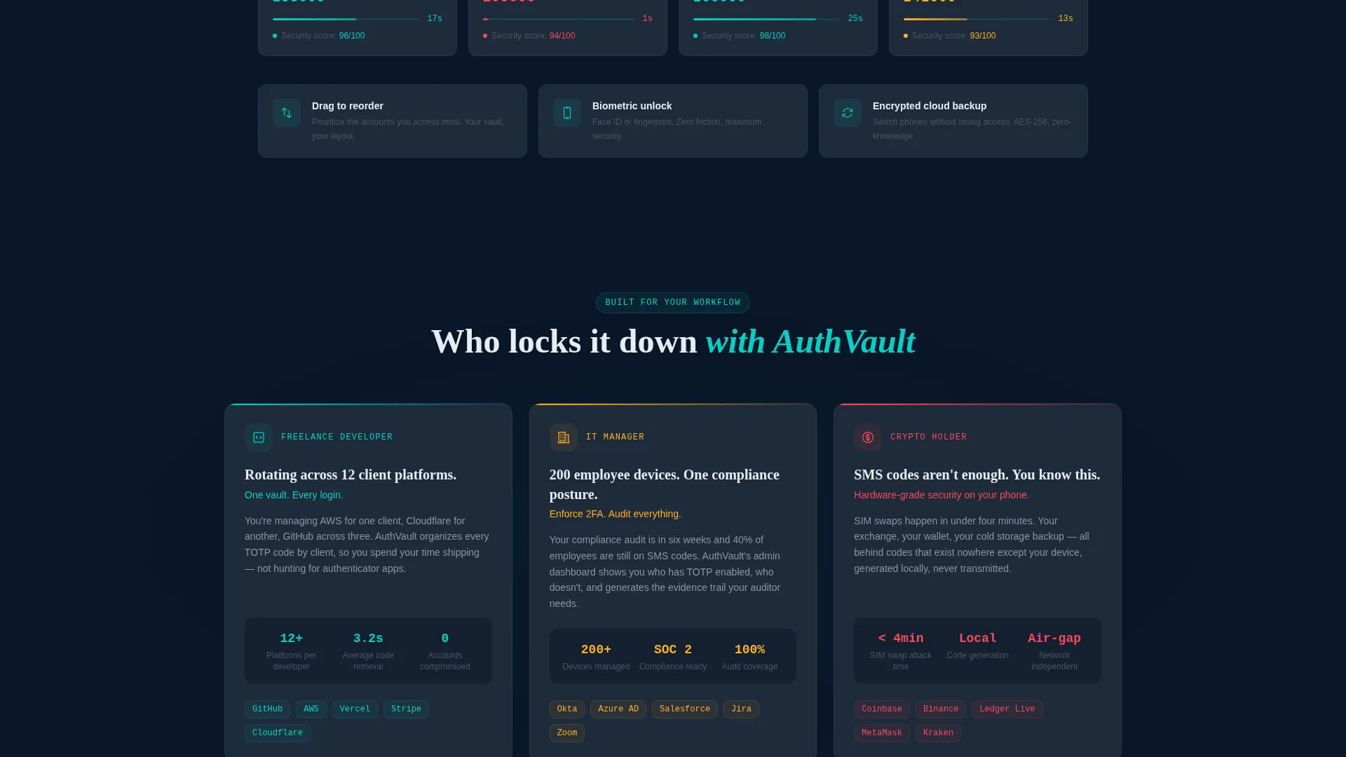
- Freelance developers managing logins across multiple client platforms
- IT managers rolling out compliance-grade authentication to large teams
- Security-minded individuals who have moved away from SMS-based verification
What problem this template solves
Most app landing pages either oversell with abstract promises or undersell with a plain feature list. Neither approach earns the download. Verify fixes this by making the stakes visible before asking for anything.
- Visitors see real breach statistics rendered as dashboard cards before they reach any call to action
- The page connects the emotional weight of account compromise to a concrete, usable solution
- The scroll journey moves from threat awareness to tool confidence in a single continuous flow
What you get with this template
You get a fully structured single-page layout with every section already designed and sequenced. No placeholder wireframes, the template ships with purpose-built components drawn directly from the app's own visual language.
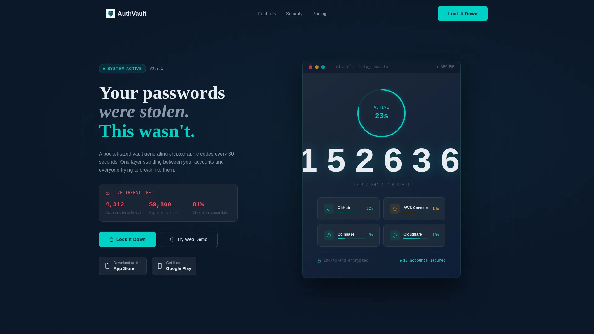
- A header with an oversized animated code display and circular teal countdown ring
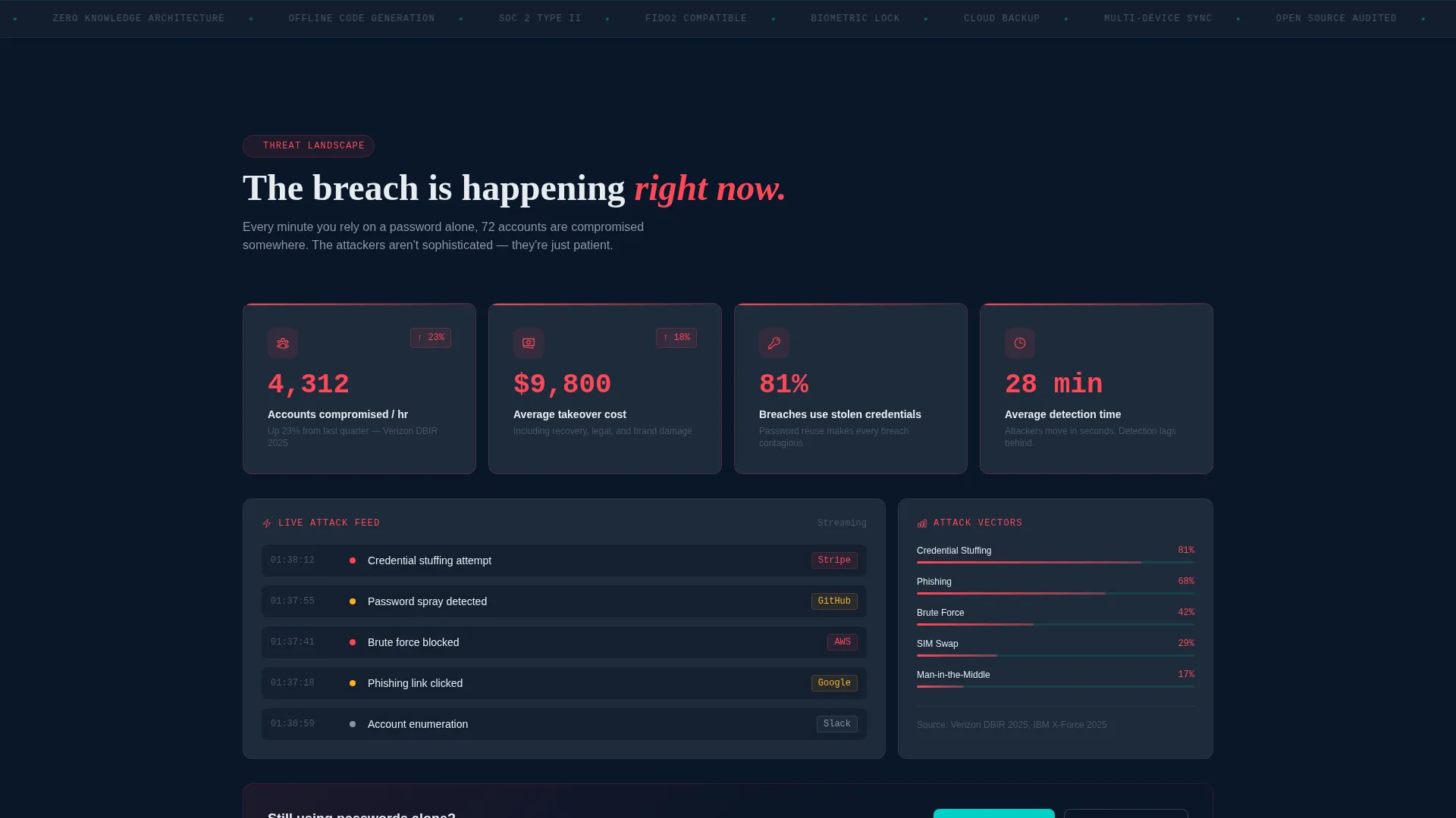
- A breach-statistics data grid rendered as dashboard cards with bold metric figures
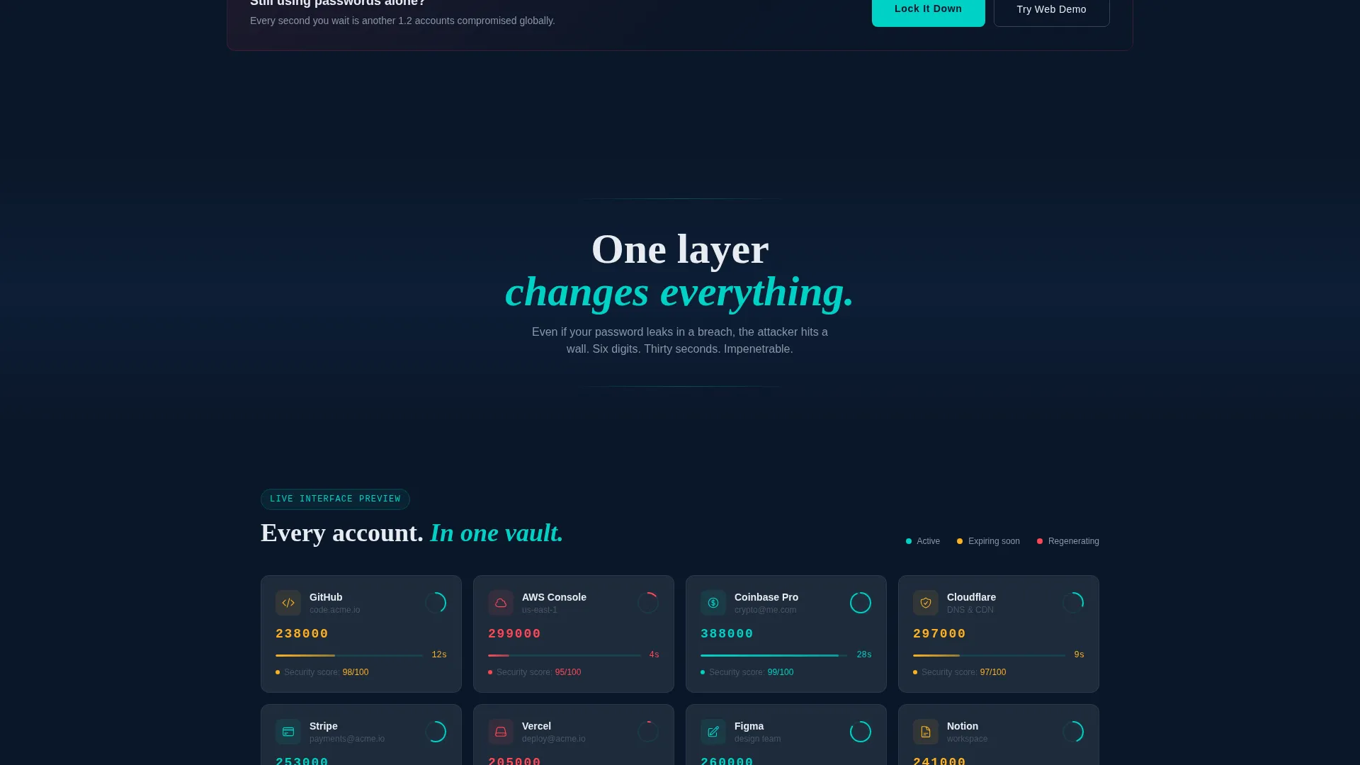
- An account-tile grid section showing live countdown rings, color-coded security scores, and drag-to-reorder layout
- Repeated call-to-action blocks with App Store and Google Play badge pairings and a secondary web demo link
Feature list
This template delivers a tightly scoped set of components. Every element below is drawn from the source brief.
Animated Code Display Header
The header centers a six-digit authentication code in oversized monospaced type against a deep navy background. A circular countdown ring pulses teal as the timer approaches zero, and a micro-animation shows the digits dissolving and regenerating on each new cycle.
Breach Statistics Dashboard Grid
Below the header, a data grid presents threat metrics as styled dashboard cards. Each card surfaces a single gut-punch statistic, accounts compromised per hour, average cost of an account takeover, and the percentage of breaches tied to stolen credentials.
Problem-to-Solution Scroll Arc
A single divider line marks the pivot between the threat section and the solution section. The headline "One layer changes everything" signals the transition. The layout shifts from dark, data-heavy cards into the app's own organized interface.
Account Tile Grid Interface
The solution section mirrors the app's real interface. Account tiles are organized by service, each showing a live countdown ring and a color-coded security score. The drag-to-reorder layout gives the section an interactive, product-demo quality.
Repeated Call-to-Action Blocks
The primary call to action, "Lock It Down," appears three times: after the hero, after the breach statistics, and in the footer. Each instance pairs App Store and Google Play badges with a secondary "Try the Web Demo" link.
Monospaced Typography System
Code values and key figures are rendered in monospaced type throughout the page. This keeps the visual language consistent with the authentication context and makes data feel precise rather than decorative.
Page sections overview
| Section | Purpose |
|---|---|
| Hero Code Display | Opens with animated six-digit code and countdown ring |
| Breach Statistics Grid | Shows threat data as dashboard cards to establish stakes |
| Problem Pivot Divider | Signals the shift from threat landscape to solution view |
| Account Tile Grid | Demonstrates the app interface with live rings and scores |
| Primary call to action Block | Drives app downloads with store badges and demo link |
| Footer call to action Repeat | Closes the page with a final download prompt |
Design & branding system
The Midnight Blue color system gives the page a focused, terminal-style atmosphere. Every color has a clear structural role and nothing is used decoratively.
- Deep terminal navy (#0A1628) dominates the background across wide full-bleed slabs
- Status-active teal (#00D2C6) fires on countdown rings, active toggles, and hover states
- Muted interface gray (#1E2A3A) structures the card grid and tile backgrounds
- Clean token white (#E8ECF1) renders all codes and primary typography in monospaced type
Mobile & speed optimization
The template's layout is built around a vertical scroll flow that translates naturally to smaller screens. The data grid and account tile sections are structured as responsive card grids.
- Dashboard cards and account tiles stack cleanly into single-column layouts on mobile viewports
- Oversized monospaced code type remains legible at reduced scale without layout changes
- call to action blocks with badge pairings are sized and spaced for thumb-friendly interaction
How this template helps you convert
The page earns the download by guiding the visitor through a deliberate emotional sequence before presenting the call to action.
- The breach statistics section quantifies real risk, making inaction feel like a conscious choice rather than a default
- The account tile grid lets visitors picture themselves inside the app before they install it, reducing friction at the decision point
- Three well-placed "Lock It Down" blocks with store badges and a web demo option give visitors multiple low-pressure moments to convert
Other information about this template
Verify fits naturally into a Micro-SaaS or developer tools product ecosystem. The template style is Dashboard and Data Grid, which means the layout borrows visual patterns from real productivity interfaces rather than generic marketing pages. The Directory and Discovery theme supports a structured, scannable presentation that feels familiar to technical audiences.
- The template category is Technology, with a subcategory of Micro-SaaS and Developer Tools
- The header concept is a Code Snippet, which anchors the entire page in the app's core mechanic
- The creative direction is a Problem to Solution Arc, a format that works well for security tools where trust must be built before conversion is attempted
- The landing page direction is App Download, so every call to action and badge placement is oriented toward store conversions and demo engagement
Theme
Directory & Discovery
Creative direction
Problem→Solution Arc
Color system
Midnight Blue
Style
Dashboard/Data Grid
Direction
App Download
Page Sections
Animated Six-digit Code Header
Breach Statistics Data Grid
Problem-to-solution Page Arc
Account Tile Grid with Security Scores
Triple Call-to-action Placement
Monospaced Typography System
Related questions
What type of product is this template designed for?
Can I use this template to promote a web app as well as a mobile app?
How does the page convince skeptical visitors to download?
Is the countdown ring animation included in the template?
Who is this template best suited for?



