Fitness & Gym Software Professional Website Template
The Certify premium gym quality discovery landing page template is a bento grid fitness landing page built for a gym quality intelligence platform. It features a live stats dashboard, an interactive city-explorer map, draggable scoring methodology cards, and a radial score chart. With a clinical glassmorphic visual style and app-download-first flow, this landing page turns gym data into a compelling discovery experience.
by Rocket studio
Quick summary
Certify is a bento grid fitness landing page template designed for a gym audit and ranking platform. It opens with a full-viewport stats dashboard, moves visitors through a city-explorer map, walks through a five-category scoring methodology, and closes with a conversion-focused app download call to action. The design is clinical glassmorphism with charcoal depth and luminous green and amber data accents.
Who this template is for
This landing page template speaks directly to founders and product teams building fitness tech platforms with real data to show. It is ideal if your fitness business targets multiple audience types at once and needs one page to serve all of them without confusion.
- Gym owners who want a premium rating to attract high-value gym members and justify elevated gym membership pricing
- Municipal health inspectors and fitness program administrators who need a credible platform to reference during facility checks
- Fitness-obsessed professionals and personal trainers who refuse to train at a facility without verified hygiene and equipment scores
What problem this template solves
Many fitness landing pages struggle to convey data credibility. A gym website that relies on marketing copy alone, relying solely on claims without evidence, loses trust fast. Visitors need to feel the platform is authoritative before they download anything.
- Most fitness landing pages bury their strongest social proof below the fold, causing a high bounce rate before visitors ever reach the call to action
- Generic gym landing page designs fail to communicate clear differentiation between a rigorous audit platform and a basic directory listing
- Fitness website templates rarely account for a dual audience of gym owners and health-conscious end users who each have distinct pain points
What you get with this template
This template delivers a complete, single-page discovery experience designed around one conversion goal: app downloads. Every section is purpose-built to engage visitors, build trust through social proof, and guide users toward that download tap.
- A live stats dashboard bento grid header with animated counters, sparklines, and a rotating city leaderboard
- An interactive city-tap explorer that reveals local gym rankings in expanding bento tiles as visitors scroll deeper
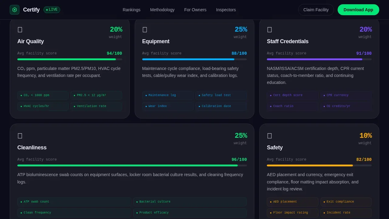
- A draggable methodology section with five scoring category cards covering Air, Equipment, Staff, Cleanliness, and Safety
- A single-gym deep dive section with a radial score chart and hover interaction on each axis
- A dual call to action system: a sticky mobile download bar and a lightweight two-field facility claim form
Feature list
This landing page template includes purpose-designed components that balance high interactivity with conversion-focused design. Each feature is grounded in the platform's core promise: data you can trust, presented in a way that earns the download.
Live Stats Dashboard Header
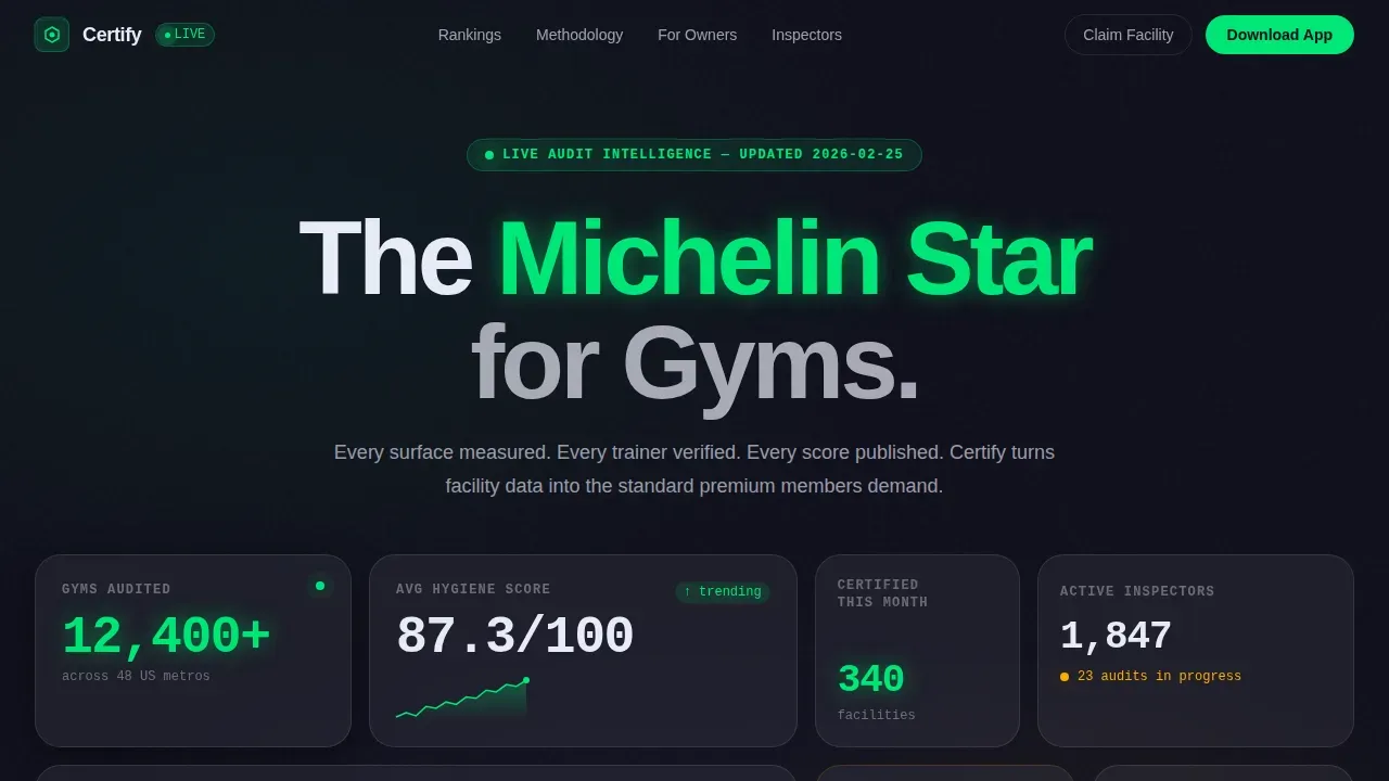
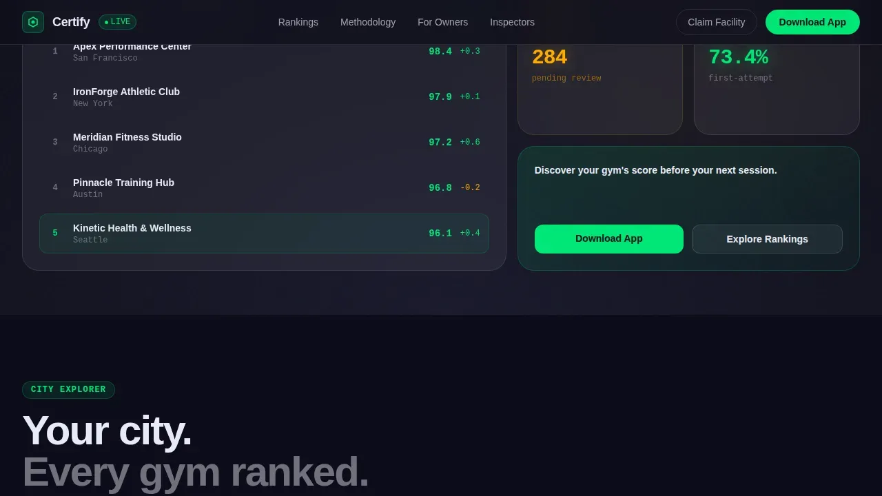
The header runs full viewport width and displays four key metrics: 12,400-plus gyms audited, an average hygiene score trending upward on a micro-sparkline, 340 newly certified facilities this month, and a rotating leaderboard of top-rated gyms by city. Numbers are rendered in a monospaced typeface with counter animations. Each metric sits inside its own frosted glass card with a faint border glow, arranged asymmetrically so new visitors scan the page like a control room display.
Interactive City-Explorer Map
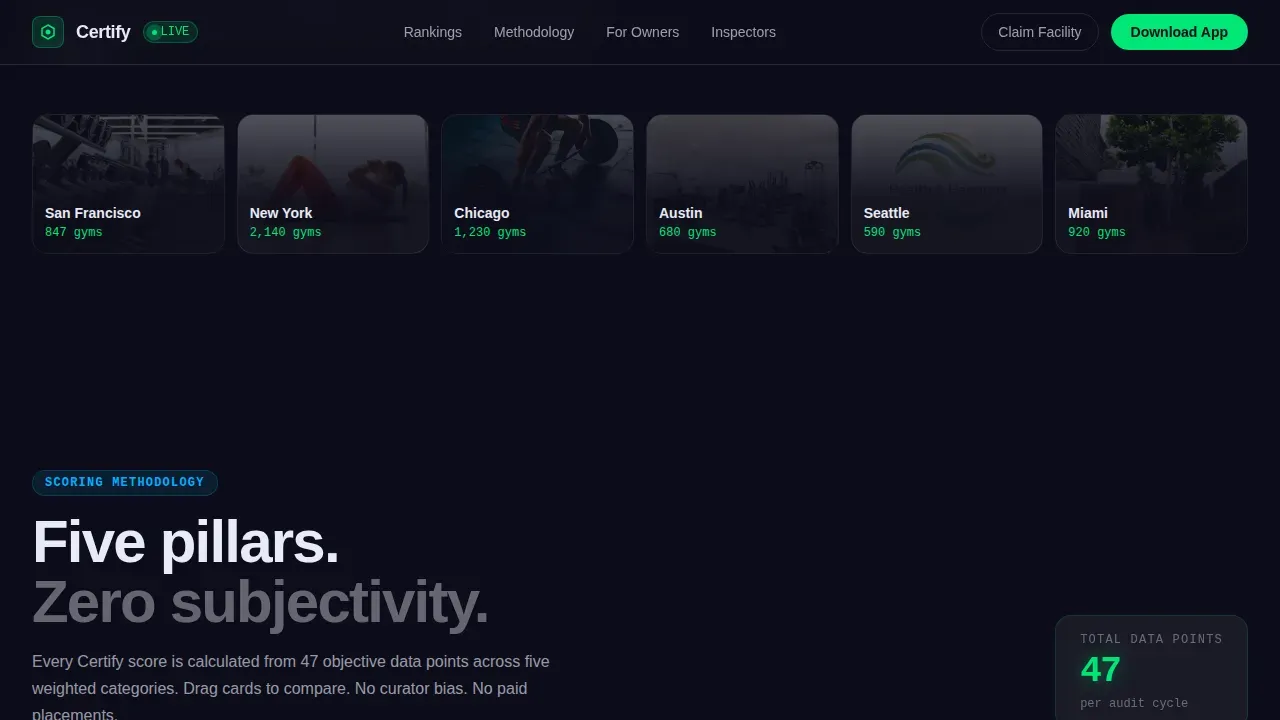
Below the header, a searchable map module lets visitors tap any city to reveal local gym rankings inside expanding bento tiles. The experience deepens with each scroll, narrowing from a broad city view down to individual facility scores. This section doubles as a social proof engine, showing real ranking data before asking for any commitment. It also surfaces the primary call to action for visitors who reach a data depth that requires the app.
Draggable Scoring Methodology Cards
Five category cards covering Air, Equipment, Staff, Cleanliness, and Safety can be dragged and rearranged. This interaction lets visitors explore the scoring system at their own pace. The section sets expectations clearly: the platform measures gym quality the way a rigorous certification body would, not the way a user review site does.
Radial Score Chart with Hover Interaction
The deep-dive section showcases a single gym through a radial chart. Hovering each axis reveals the sub-score for that dimension. This motivating visual lets prospects visualize exactly what a certified gym audit looks like in practice. It is one of the most powerful trust signals on the page.
Dual Conversion Call to Action System
The primary call to action, "Download and Discover Your Gym's Score," appears as a sticky bottom bar on mobile and inside the map explorer module. A secondary path lets gym owners tap "Claim Your Facility," which opens a two-field form asking only for gym name and email before prompting the download. Simplified lead capture forms like this reduce drop-off by asking only for what is needed.
Glassmorphic Bento Grid Layout
Every section uses a bento grid structure with frosted glass panels stacked over a deep charcoal background. Electric compliance green pulses on verified badges. Alert amber draws the eye to flagged metrics. The modern layout creates visual appeal through layered translucency while keeping readable text and clean layouts that guide users toward each next step.
Page sections overview
| Section | Purpose |
|---|---|
| Live Stats Dashboard | Opens page with animated key metrics and city leaderboard |
| City Explorer Map | Lets visitors tap cities and browse local gym rankings |
| Scoring Methodology Cards | Explains five audit categories through draggable interactive cards |
| Single Gym Deep Dive | Showcases a radial score chart with per-axis hover interaction |
| App Download call to action | Sticky mobile bar and in-explorer prompt drive app downloads |
| Facility Claim Form | Two-field form captures gym owner leads before download prompt |
| Footer | Single-row linear footer with essential platform links |
Design & branding system
The visual identity follows a Directory and Discovery theme built on clinical glassmorphism. Frosted panels at 60% opacity sit over a deep gym-floor charcoal background, creating a layered depth that feels both premium and data-rich. The palette creates compelling visuals that carry the platform's authority without overcrowding the page.
- Colors: frosted panel white at 60% opacity, deep charcoal at #1A1A2E, electric compliance green at #00E676 for passing scores, and alert amber at #FFAB00 for flagged metrics
- Typography: DM Mono for all counter and data displays; Manrope for headings and body copy; both chosen to keep readable text at every viewport size
- Subtle animations include scroll-linked blur transitions, IntersectionObserver section reveals, counter tick-ups, and GPU-accelerated transforms only
Mobile & speed optimization
Over 70% of fitness searches happen on mobile devices, making mobile first design a baseline requirement for any fitness landing page that wants to convert. This template is built with that in mind. Mobile responsiveness is handled through a layout that reflows bento grid tiles into a single column without losing hierarchy or visual appeal.
- The sticky bottom app download bar is mobile-exclusive, keeping the primary call to action visible without requiring scrolling on smaller screens
- CSS native scroll-behavior and GPU-accelerated transforms only keep animations smooth without heavy JavaScript overhead
- The minimalist design approach on mobile removes decorative chrome and relies on white space and eye catching visuals to maintain user engagement
How this template helps you convert
A good fitness landing page does not just look impressive. It moves visitors through a deliberate user journey that builds trust before asking for anything. This template earns the download by letting visitors explore real data first.
- The stats dashboard opens with social proof at maximum visibility, showing 12,400-plus gyms audited and live certification counts so new visitors trust the platform within seconds of arriving
- The explorer and deep-dive sections deepen investment progressively, so by the time visitors hit a data wall that requires the app, they are already curious and engaged enough to tap the call to action buttons
- The dual call to action system serves both audience types: the sticky bar drives sign ups among fitness users while the claim form captures gym owners, making it possible to drive sign ups from two segments on one landing page
Other information about this template
This template is part of a broader conversation about what makes fitness landing pages work. The best fitness landing page examples share a few common traits: clear differentiation, strong social proof, and a user journey that speaks directly to the audience's goals. This template applies all of those principles to a data-intensive fitness tech platform.
- When comparing landing page templates for fitness programs, look for conversion goals built into the structure, not added as an afterthought. This template bakes conversion-focused design into every scroll layer.
- Personal trainers, gym owners, and health inspectors all have different needs. Good fitness landing page design accounts for each of them without overwhelming any single visitor.
- Platforms like Orangetheory Fitness have shown that premium branding and data-forward experiences can elevate gym membership perception. This template draws from that same principle.
- Tracking landing page performance with tools like Google Analytics helps confirm which sections are driving the most user engagement and where to focus continuous testing.
- Fitness landing page examples that perform well tend to combine eye catching visuals with class descriptions, instructor bios, membership options, and workout programs in a structured, skimmable flow. This template applies the same hierarchy to audit data.
- A strong unique selling proposition, combined with a unique value proposition that connects to real audience goals, is one of the key elements separating high converting landing pages from forgettable ones.
- Builders such as Leadpages, Unbounce, and Landingi offer fitness landing page options, but none are purpose-built for a gym quality audit platform. This template fills that specific gap.
- The premium version of this template includes all the bento grid components, animation layers, and the dual conversion system described here, ready to customize with your platform's live data.
Theme
Directory & Discovery
Creative direction
Interactive Explorer
Color system
Glassmorphic
Style
Bento Grid
Direction
App Download
Page Sections
Live Stats Dashboard with Animated Counters
Interactive City-explorer Map Module
Draggable Scoring Methodology Cards
Radial Score Chart with Hover Interaction
Dual Conversion Call to Action System
Clinical Glassmorphic Bento Grid Design
Related questions
Who is this landing page template best suited for?
Can I adapt this template for personal trainers or boutique studios?
Does the template include the interactive animations described?
How does the two-field facility claim form work?
Is this template optimized for mobile devices?



