Consulting Firm Software Privacy Policy & Terms Website Template
Comply is a bento grid landing page template built for consulting firm compliance management practices. It pairs a Bold Brutalist visual identity with an industry-report scroll structure, guiding visitors from the cost of regulatory inaction straight to a managed compliance solution. The persistent comparison table and three-step progressive form work together to turn conviction into qualified leads.
by Rocket studio
Quick summary
Comply is a single-page bento grid template designed for compliance-focused consulting firms. It opens with a scrolling framework logo bar, escalates the cost of regulatory exposure through stark stat cells and a risk-severity matrix, then pivots to methodology and a persistent head-to-head comparison table. The primary call to action drives visitors into a three-step gap analysis form.
Who this template is for
This template is purpose-built for firms that sell compliance as a core service, not a side offering. It speaks directly to the professionals who carry regulatory risk every day and need a page that matches the weight of that responsibility.
- Managing partners at mid-tier consultancies who have experienced a near-miss with data protection regulations
- Compliance officers inside large subcontractor networks holding multiple active frameworks at once
- Boutique strategy firms moving into regulated industries without dedicated compliance staff on hand
What problem this template solves
Most consulting firm websites bury compliance credentials inside generic service pages. Prospects who are already stressed about an upcoming audit need immediate proof that someone else has this under control. This template confronts that anxiety head-on.
- It replaces vague service descriptions with discrete, data-backed proof points presented as audit findings
- It removes the cognitive gap between "we need help" and "here is a clear comparison of doing it ourselves versus outsourcing it"
- It gives firms a structured way to capture qualified leads before those prospects book a competitor's discovery call
What you get with this template
The template delivers a complete, conversion-oriented bento grid landing page. Every section is structured to escalate urgency first and then resolve it with the firm's methodology and proof.
- A scrolling compliance framework logo bar, a brutalist headline cell, stat cells, a risk-severity matrix, framework coverage maps, audit timeline cells, and client outcome cells
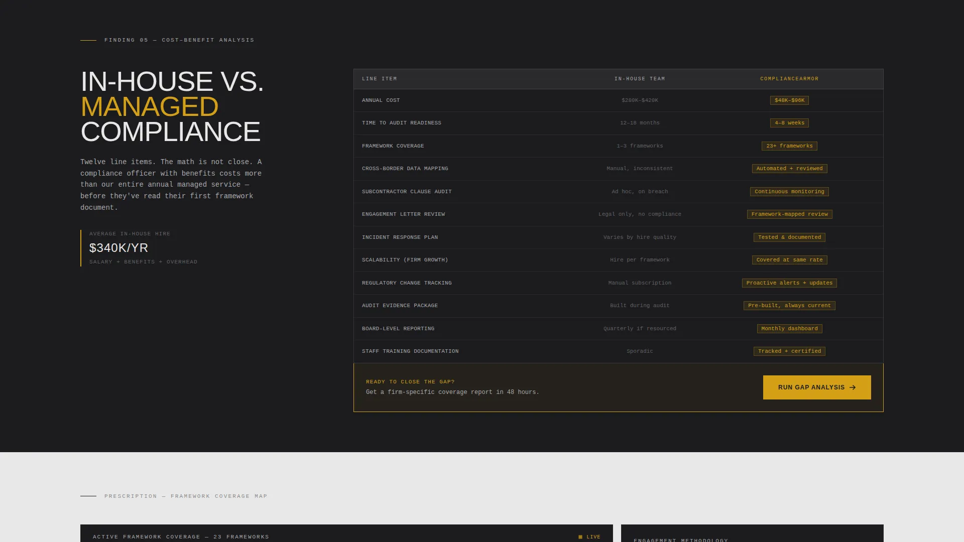
- A persistent right-rail comparison table with twelve line items contrasting in-house compliance teams against managed compliance
- A three-step progressive intake form covering firm size, vertical, framework targets, contact details, and a scheduling widget
Feature list
This template is built around a tight set of purposeful components. Each one contributes directly to the diagnosis-to-prescription scroll structure described in the brief.
Bento Grid Layout System
Every section of the page lives inside a self-contained bento cell. Cells are hard-edged, background-alternating blocks that present one discrete finding or proof point each. The grid confronts rather than flows, matching the tone of a regulatory audit report.
Scrolling Framework Logo Bar
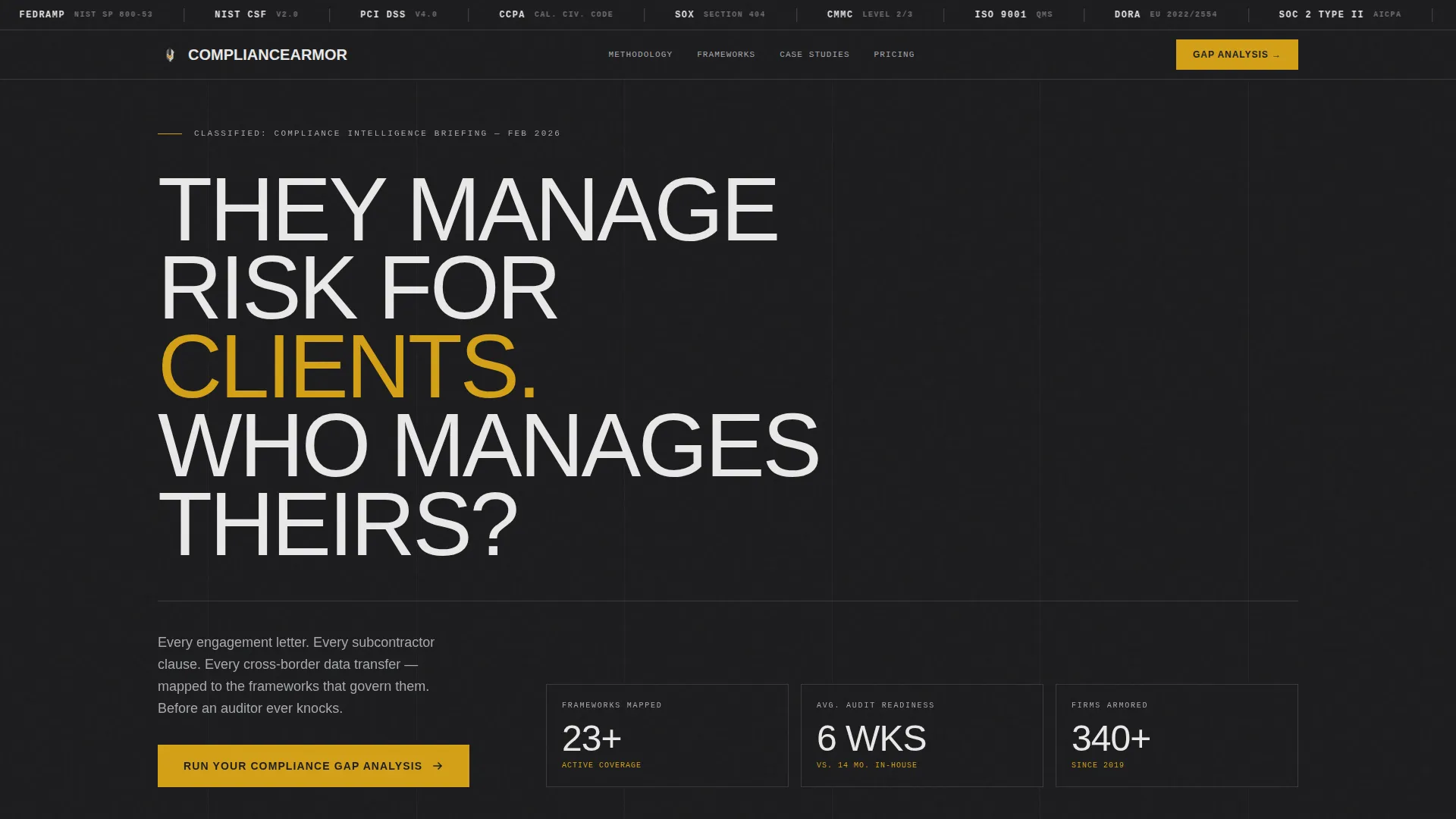
A horizontal ticker band at the top of the viewport displays compliance framework identifiers rendered in monochrome steel tones. The bar moves slowly across the full viewport width, framing the regulatory landscape as the challenge the firm is built to solve.
Risk-Severity Matrix Cell
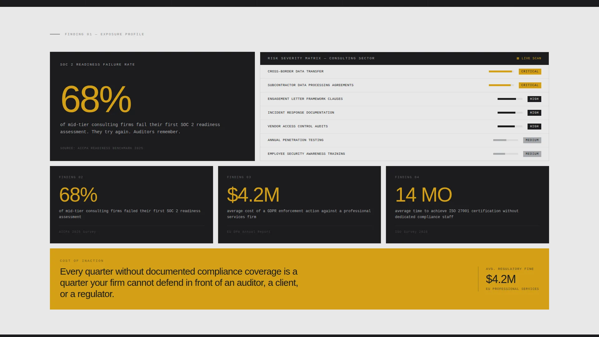
A dedicated bento cell presents a risk-severity matrix with amber pulsing used exclusively on critical-risk line items. This gives visitors a fast visual read on exposure levels before the template shifts to the firm's resolution methodology.
Persistent Comparison Table
A bento cell locks to the right rail throughout the scroll. It holds a two-column, twelve-item table contrasting an in-house compliance team against managed compliance across dimensions such as annual cost, time to audit readiness, framework coverage, and scalability.
Three-Step Progressive Intake Form
The primary call-to-action opens a staged form. Step one collects firm size and industry vertical. Step two asks which frameworks the visitor currently holds or is pursuing. Step three captures contact details and surfaces a scheduling widget for a direct conversation.
Industry Report Scroll Structure
The full page reads like a declassified compliance audit. The first half escalates the cost of inaction using stat cells, comparison data, and a risk matrix. The second half shifts to prescription, presenting framework coverage maps, audit timelines, and client outcome data as self-contained proof cells.
Page sections overview
| Section | Purpose |
|---|---|
| Framework Logo Bar | Opens the page with a scrolling ticker of compliance framework identifiers in monochrome steel |
| Brutalist Headline Cell | Delivers the primary tension statement in 120-pixel all-caps type |
| Stat Highlight Cell | Presents a single data point on first-assessment failure rates to establish urgency |
| Risk-Severity Matrix | Visualizes exposure levels with amber reserved for critical risk indicators |
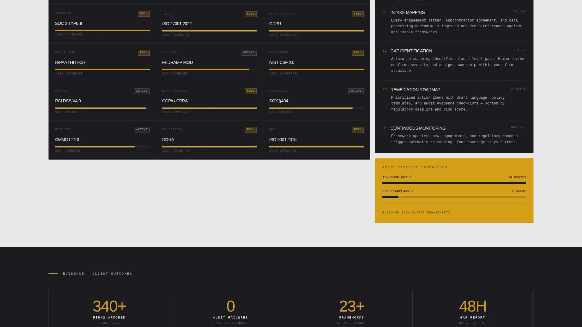
| Framework Coverage Maps | Shows which regulatory frameworks the firm's methodology addresses |
| Audit Timeline Cell | Lays out the engagement timeline so prospects understand what readiness looks like |
| Client Outcome Cells | Provides self-contained proof points drawn from past engagement results |
| Persistent Comparison Table | Locks to the right rail with a twelve-item in-house-versus-managed comparison |
| Gap Analysis call to action | Anchors the primary call to action below the comparison table |
| Three-Step Form | Captures firm size, framework targets, contact details, and a scheduling option |
| Page-Bottom call to action | Repeats the primary call to action for visitors who scroll the full page |
Design & branding system
The visual identity follows a Bold Brutalist theme built on a Monochrome Steel color palette. Every design decision enforces the feeling of authoritarian order over regulatory chaos.
- Four-color palette: structural charcoal (#1C1C1E), mill-finish aluminum (#A8A9AD), cold-rolled highlight (#E8E8E8), and warning-stripe amber (#D4A017) used only for calls to action and risk indicators
- Hard-cut background blocks alternating between #1C1C1E and #E8E8E8 with no gradients, no rounded corners, and no softness anywhere in the layout
- Typography is oversized and set in all-caps for section headers, with monospaced type used wherever data or figures appear, evoking stamped metal signage
Mobile & speed optimization
The bento grid structure is designed to restack cleanly at smaller viewport widths. The layout's hard-edged, block-based nature translates well to narrow screens without losing the visual authority of the brutalist aesthetic.
- Individual bento cells collapse into a single-column stack on mobile, preserving the one-finding-per-cell logic at every screen size
- The persistent right-rail comparison table adapts so that it appears inline within the natural scroll order on smaller devices
- Typography scaling keeps the oversized headline and monospaced data figures legible across screen sizes without horizontal overflow
How this template helps you convert
The conversion architecture is deliberate. The page never asks for a commitment before it has established the full cost of inaction and the clear advantage of managed compliance.
- The diagnostic first half (stat cell, risk matrix, and comparison table) builds a shared understanding of the problem, so visitors arrive at the call to action already persuaded rather than still evaluating.
- The three-step progressive form lowers friction by breaking a complex qualification process into three small, logical steps, reducing drop-off at the moment of commitment.
Other information about this template
This template is part of a category focused on consulting firm software and specifically on compliance management tooling for professional services firms. A few additional details worth knowing before you customize it.
- The template is built for a single-page, section-led flow, not a multi-page site, so all content lives within one scrollable document
- The amber accent (#D4A017) is intentionally restricted to calls to action and risk indicators; using it elsewhere would dilute the visual signal it carries
- The Industry Report creative direction means copy tone should remain clinical and data-led throughout; warm or conversational language would undercut the template's authority framing
- The comparison table is the primary persuasion mechanism; the form is intentionally lean because conviction should already be established before a visitor reaches it
Theme
Bold Brutalist
Creative direction
Industry Report
Color system
Monochrome Steel
Style
Bento Grid
Direction
Comparison/Versus
Page Sections
Bento Grid Layout System
Scrolling Framework Logo Bar
Risk-severity Matrix Cell
Persistent Right-rail Comparison Table
Three-step Progressive Intake Form
Industry Report Scroll Structure
Related questions
Who is this landing page template designed for?
Can I replace the framework logos in the scrolling header bar?
What does the three-step intake form collect?
Does the comparison table content come pre-filled?
Is the amber accent color used throughout the design?



