Smart Government Portal Landing Page Template
Portal is a bold brutalist government client portal landing page built on a modular card grid layout. It guides citizens through permit filing, fee payments, and case tracking using a Feature Tab Switcher header, a Problem-to-Solution scroll arc, and a persistent app download call to action. The design speaks authority while keeping every service clear and reachable.
by Rocket studio
Quick summary
Portal is a single-page government client portal template built for civic digital services. Its modular card grid layout, Bold Brutalist visual identity, and Feature Tab Switcher header make complex services feel organized and approachable. The page drives toward a mobile app download while proving value through real transaction previews at every scroll depth.
Who this template is for
This template is built for government agencies and municipal departments that need a credible, functional digital front door for public-facing services. It suits teams replacing outdated paper-based or in-person workflows with a self-service portal landing page.
- Property owners and residents who need 24-hour access to zoning approvals, permits, and status updates
- Small business operators who renew licenses and pay fees without visiting a city office
- Caseworkers and administrators who manage benefits claims and multi-step processes across many open service windows
What problem this template solves
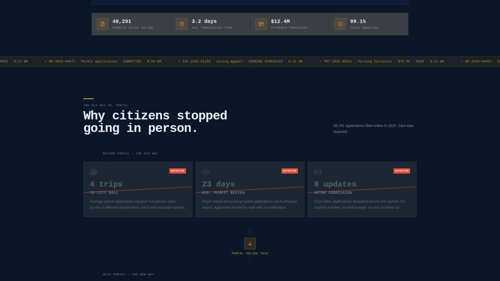
Citizens expect services online, but most government landing pages fail them. They look outdated, bury key actions under unclear navigation, and offer no real feedback after submission. This template replaces that experience with a structured, trustworthy interface that shows results instead of making promises.
- Long wait times and repeated office visits are replaced by visible progress indicators and real timestamps on every card
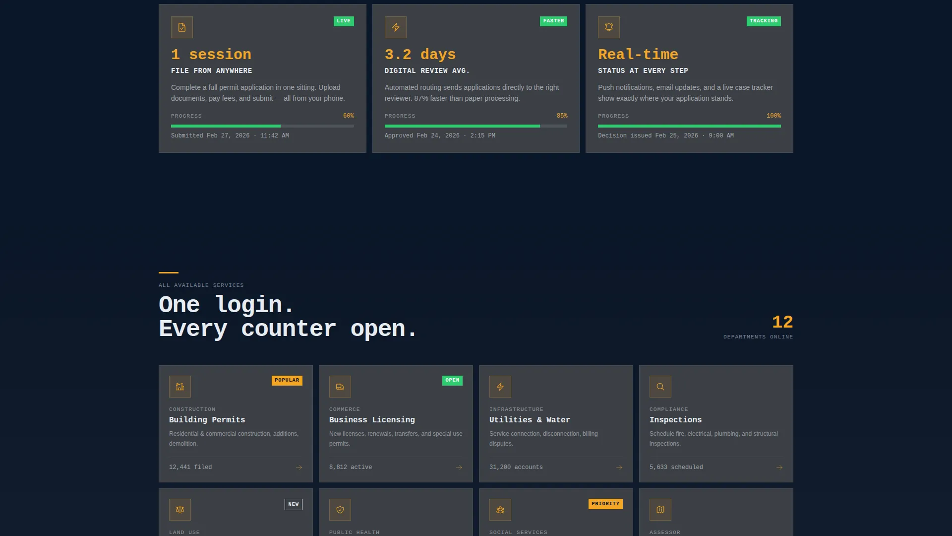
- Users have no way to track where their permit or case stands, so the template surfaces status badges, color-coded milestones, and receipt numbers throughout the page
- A scattered set of disconnected offices is consolidated into one modular service grid where a single login covers utilities, licensing, inspections, and appeals
What you get with this template
You get a fully structured government portal landing page with every section pre-designed and ready to customize. The layout is built on a modular card grid so each service block is visually consistent and easy to expand or reorder.
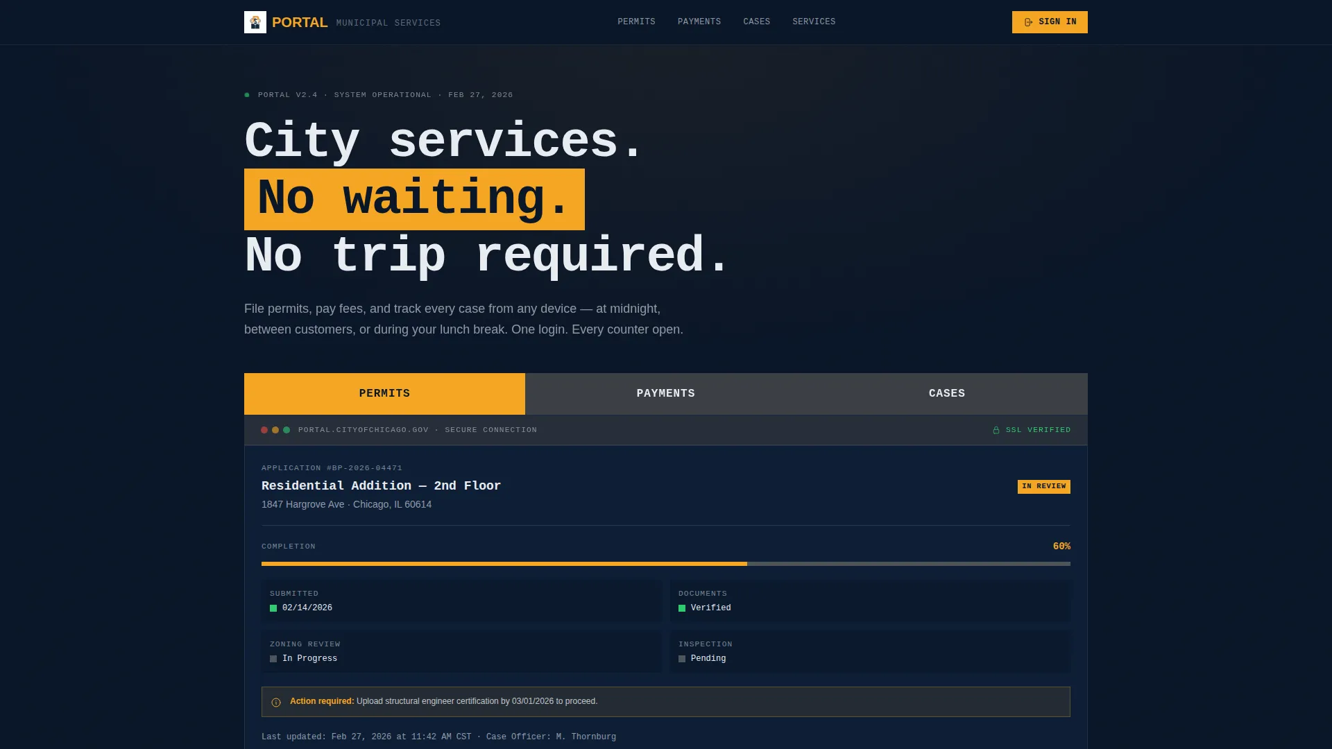
- A Feature Tab Switcher header showing live interface previews for Permits, Payments, and Cases with an active amber highlight state
- A three-row Problem-to-Solution scroll arc that walks users from civic frustration to resolved transactions using real card-based previews
- A persistent App Download call to action with a platform selector for iOS and Android, a QR code panel, and a secondary web login link
Feature list
This section covers the core built-in components and design decisions that make Portal ready to deploy for a government digital services context.
Feature Tab Switcher Header
Three oversized brutalist tabs labeled Permits, Payments, and Cases span the top of the viewport. Each tab switches to a different interface preview below it. The active tab shifts to amber, and the preview panel shows a real screen state: a permit application at 60% completion, a timestamped payment receipt, or a case tracker with color-coded milestones.
Problem-to-Solution Scroll Arc
The page scrolls through two mirrored card rows. The first row shows the old experience using stark white text on navy with crossed-out icons. The second row replaces each frustration with a resolved portal state including amber progress bars and real timestamps. This contrast structure builds trust before any call to action appears.
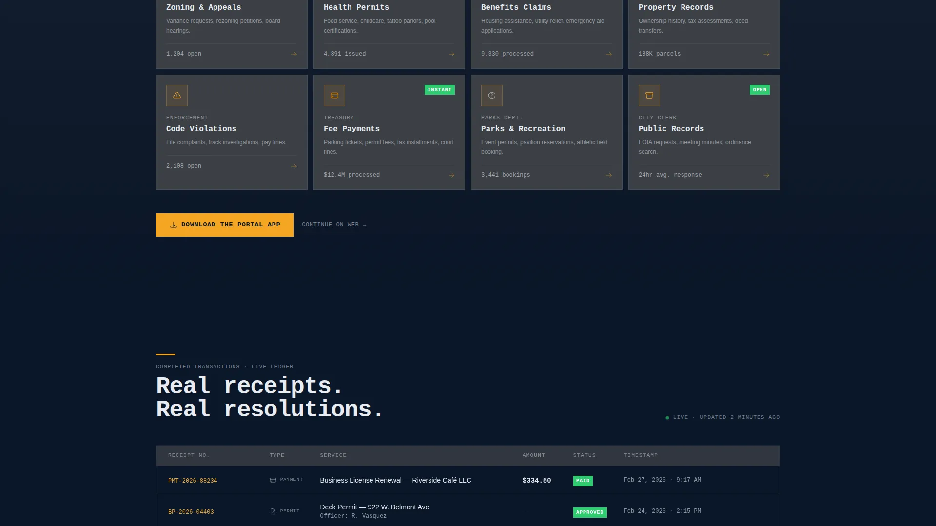
Modular Service Grid
A full card grid covers every available municipal service including utilities, licensing, inspections, and appeals. Every card shares the same structure, icon slot, and typographic hierarchy. The visual repetition teaches users that one portal login replaces a dozen separate offices.
Persistent App Download Bar
On mobile, a bottom bar pins the primary call to action to the screen at all times. On desktop, the same call to action repeats after every second card row. Tapping opens a platform selector with iOS and Android options and a QR code for instant scanning.
Bold Brutalist Card System
Cards sit on a deep navy background like granite slabs. Edges are sharp and unrounded. Generous gutters separate each module. The card surface uses reinforced concrete gray, body text uses civic white, and the amber accent is reserved strictly for buttons, status badges, and active interaction states.
Monospaced Typographic System
All type is monospaced and sized for legibility at a distance, matching the visual weight of courthouse signage. No stock photography is used anywhere. The interface itself is the visual content, making the page feel like a working product rather than a marketing brochure.
Page sections overview
| Section | Purpose |
|---|---|
| Tab Switcher Header | Previews Permits, Payments, and Cases with live interface states |
| Problem Card Row | Displays the old civic experience with crossed-out friction indicators |
| Solution Card Row | Resolves each problem with portal-based outcomes and real timestamps |
| Full Service Grid | Lists every available municipal service in a uniform modular card layout |
| App Download Bar | Drives the primary conversion with platform selector and QR code |
| Secondary Web Link | Offers a browser-based login path for desktop users |
Design & branding system
The visual identity is built on a Midnight Blue color system that communicates institutional authority without feeling cold or inaccessible. Every color in the palette has a strict role, which keeps the interface readable and consistent across every card module.
- Deep institutional navy (#0A1628) as the dominant background, concrete gray (#3B3F45) on card surfaces, and civic white (#E8ECF1) for body text and dividing rules
- High-visibility amber (#F5A623) used exclusively for buttons, status badges, active tab states, and progress indicators to draw the eye to interactive elements
- Monospaced typography at large scale throughout, with sharp unrounded card edges and generous gutters that give each module breathing room and reinforce the brutalist grid structure
Mobile & speed optimization
The template is designed with a mobile-first service context in mind. Citizens access government services at all hours, often from phones, so the layout adapts cleanly to smaller viewports without losing the card grid structure or conversion flow.
- The persistent bottom bar pins the App Download call to action to the screen on mobile so it is always reachable without scrolling
- The card grid reflows naturally to a single column on smaller screens while preserving icon, label, and status badge hierarchy within each service card
- The QR code panel and platform selector surface immediately on tap so the handoff from browser to app requires as few steps as possible
How this template helps you convert
The page earns its call to action by showing completed work before asking for anything. Every scroll section adds evidence that the portal is already functioning, which removes doubt before the user reaches a decision point.
- The Feature Tab Switcher opens with three real interface previews showing a permit at 60% progress, a payment receipt with a timestamp, and a case tracker with resolved milestones, so the very first impression is proof of capability.
- The Problem-to-Solution arc pairs every civic frustration directly with a portal resolution, building a logical case for the download by the time the first call-to-action bar appears.
- The persistent App Download bar and the repeated desktop call to action ensure the conversion point is always visible, and the secondary web login link captures users who prefer to stay in a browser.
Other information about this template
Portal is a strong fit for any municipal department, civic technology team, or government contractor looking to demonstrate a modern digital service experience to stakeholders or end users. The template is built as a landing page and does not include multi-page routing or backend service connections out of the box.
- The modular card grid can be expanded with additional service cards without breaking the visual system, making it easy to grow the service catalog over time
- The brutalist design direction is intentional and purposeful; it signals institutional seriousness while using color contrast and typographic scale to keep navigation obvious
- This template works well as a presentation asset or pilot concept for agencies building a case for a digital government portal investment
Theme
Bold Brutalist
Creative direction
Problem→Solution Arc
Color system
Midnight Blue
Style
Card Grid (Modular)
Direction
App Download
Page Sections
Feature Tab Switcher Header
Problem-to-solution Scroll Arc
Modular Service Card Grid
Persistent App Download Call to Action
Bold Brutalist Card System
Monospaced Typographic System
Related questions
Who is this landing page template designed for?
Does this template include real backend connections for permit or payment processing?
Can I add more service cards to the modular grid?
How does the app download flow work in this template?
Can this template be adapted for a private-sector client portal project?


