Advanced Veterinary Software Comparison Website Template
Triage is a veterinary workflow automation landing page template built around a comparison table layout. It targets practice managers, associate veterinarians, and multi-location hospital groups who need one clear screen to manage appointments, lab results, pharmacy orders, and discharge notes. The design uses a Data Command visual identity to make every efficiency claim impossible to ignore.
by Rocket studio
Quick summary
Triage is a single-page landing page template for a veterinary workflow automation platform. It connects appointment queues, lab results, pharmacy dispensing, and discharge notes into one automated pipeline. The design leads with stat-bar numbers, anchors trust with a detailed comparison table, and closes with a lead-capture form that promises a personalized efficiency audit.
Who this template is for
This template is built for veterinary businesses that need to prove their value quickly and capture qualified leads from a skeptical, data-driven audience.
- Practice managers who are buried in patient information management system data entry and need a faster path to operational clarity
- Associate veterinarians losing significant time per patient to redundant charting across disconnected tools
- Multi-location hospital groups tracking revenue leakage from no-shows and unbilled procedures
What problem this template solves
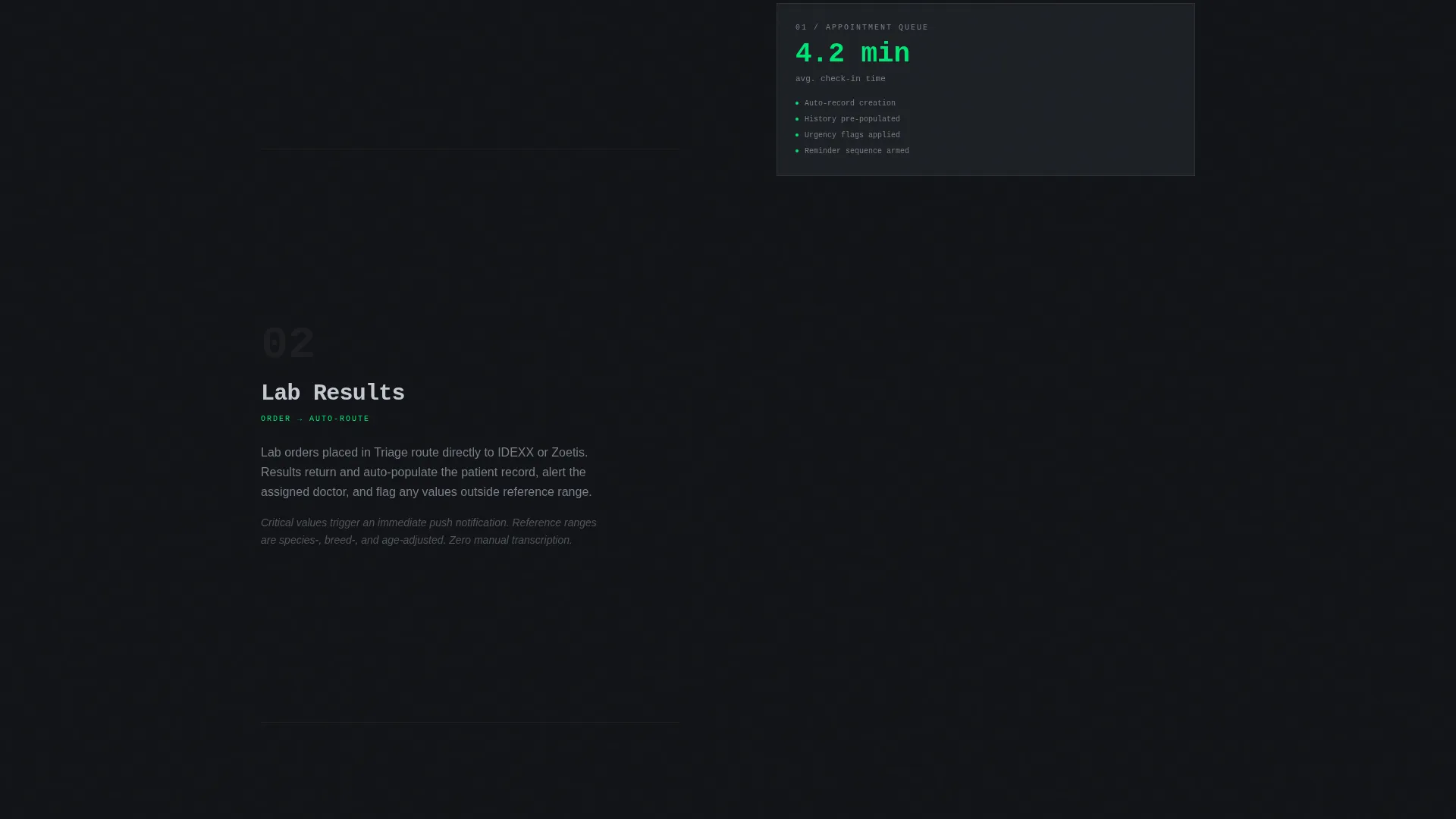
Veterinary teams often toggle between multiple software tabs to complete a single patient workflow. That fragmentation wastes time, creates billing gaps, and makes it nearly impossible to manage a full caseload without dropping something.
- No single view of the caseload means staff are always context-switching instead of treating patients
- Redundant charting and manual billing entry cause both staff frustration and revenue loss
- Prospective buyers cannot see the financial impact of switching, so conversion stalls before the conversation starts
What you get with this template
This template gives you a full-featured, conversion-focused landing page layout that does the selling through data before it ever asks for contact information.
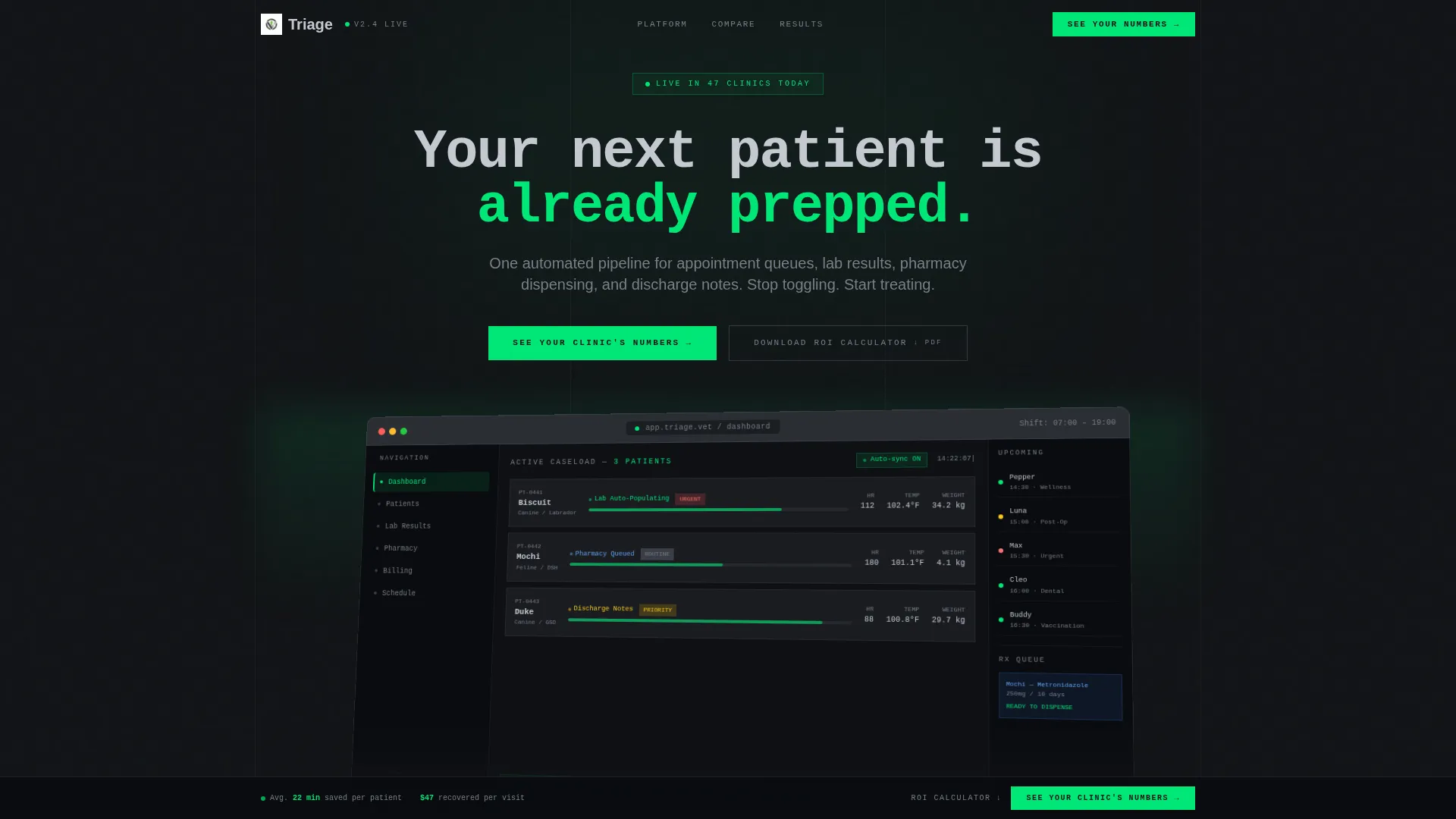
- A full-width product screenshot header showing the dashboard mid-shift, with active workflows, a live lab panel, a queued pharmacy order, and color-coded urgency flags
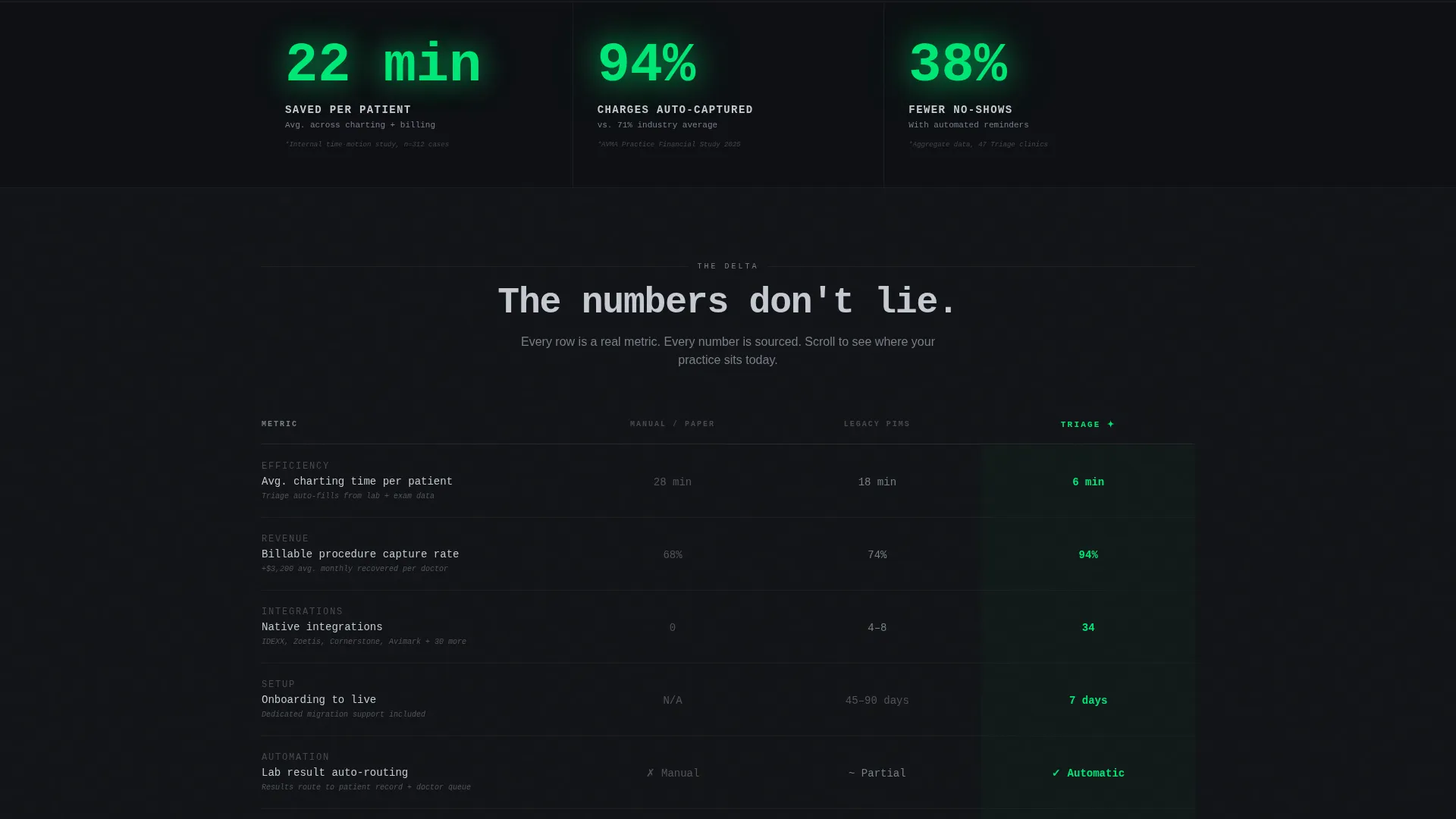
- A horizontal stat bar with oversized green numerals showing average minutes saved per patient, percentage of charges auto-captured, and reduction in no-shows
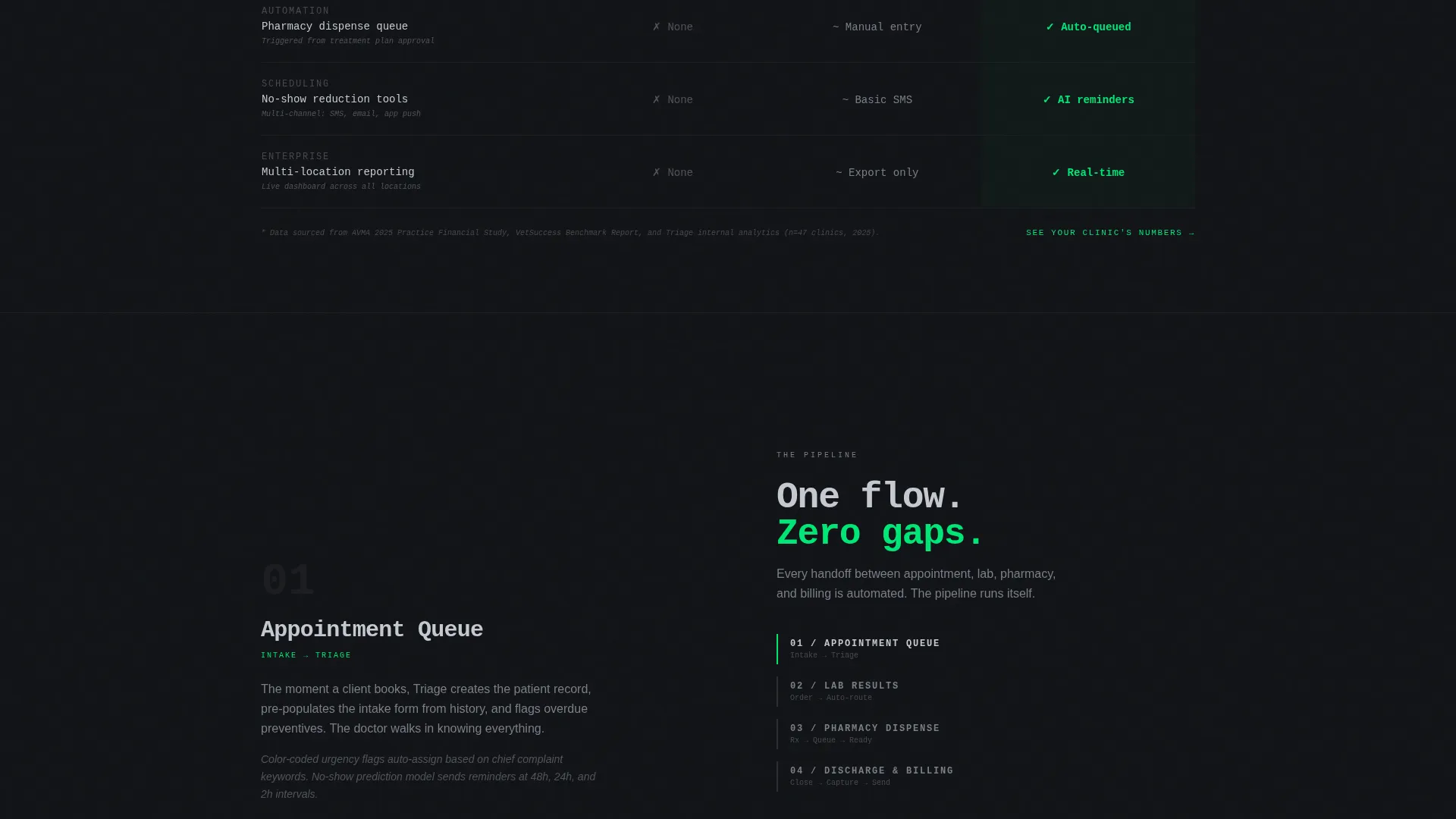
- A structured comparison table with rows for charting time, billing accuracy, integration count, and onboarding days, comparing manual processes, legacy systems, and the platform directly
- A lead generation form collecting clinic name, doctor count, current system in use, and work email, plus a secondary gated download path for an ROI calculator
Feature list
This template combines visual impact with structured persuasion across every section. Each component earns its place by moving a hesitant buyer one step closer to a decision.
Stats-First Impact Bar
Three oversized metrics open the page before any explanation appears. Average minutes saved per patient, percentage of charges auto-captured, and reduction in no-shows are rendered in status-green numerals that stop the scroll and establish credibility immediately.
Scroll-Animated Comparison Table
The comparison table is the anchor of the page. Rows cover charting time, billing accuracy, integration count, and onboarding days. Each row reveals left to right on scroll, making the performance delta between manual workflows, legacy systems, and the platform visually undeniable.
Product Screenshot Hero
The header uses a pixel-sharp, full-width dashboard screenshot on an isometric tilt against a deep cockpit-black background. Three patients are shown in active workflows, making the platform feel live and credible rather than staged.
Dual Lead Capture Paths
The primary call to action, "See Your Clinic's Numbers," appears beneath the header and locks into a sticky bar after the comparison table scrolls past. A secondary path offers a gated ROI calculator PDF for visitors who are not yet ready to speak with the team.
Hospital Group Case Study Block
The page closes its narrative with a multi-location hospital group case study showing monthly revenue recovered. This escalates the story from individual efficiency gains to organization-wide return on investment.
Sticky Conversion Bar
After the comparison table, a slim sticky bar activates and keeps the primary call to action in view throughout the rest of the scroll. It removes friction at the moment buyer intent is highest.
Page sections overview
| Section | Purpose |
|---|---|
| Dashboard Screenshot Header | Establishes product credibility with a live-state visual |
| Stat Impact Bar | Opens with three proof metrics before any narrative |
| Comparison Table | Shows measurable delta across three workflow tiers |
| ROI Calculator Download | Captures early-stage leads with a gated asset |
| Case Study Block | Proves multi-location revenue impact with real numbers |
| Lead Generation Form | Collects clinic details and routes to a personalized audit |
| Sticky call to action Bar | Keeps the primary action visible after the table |
Design & branding system
The visual identity follows a Data Command theme. Every color and spacing decision serves function over decoration, giving the page the feel of a surgical suite: controlled, deliberate, and completely focused.
- Color palette built on deep cockpit black (#121417), woven graphite (#2A2D34), clinical instrument silver (#C5C9D1), and status-green (#00E676) reserved exclusively for active states, toggles, and confirmation indicators
- No lifestyle photography and no illustrations; the product dashboard screenshot is the only hero image, keeping every pixel purposeful
- Typography and layout use matte surfaces and high-contrast numerals to guide the eye through stats, table rows, and form fields without visual noise
Mobile & speed optimization
The template is structured so that every conversion element scales cleanly from desktop to smaller screens, keeping the stat bar, comparison table, and sticky call to action readable at any viewport width.
- The comparison table is designed to remain scannable on mobile, with row-level scroll reveals that work on touch devices
- The sticky conversion bar is slim by design, taking minimal screen real estate while staying visible throughout the scroll on all device sizes
How this template helps you convert
The page is engineered to prove the math before asking for anything. Each section builds on the last to move a skeptical buyer from awareness to action.
- The stat bar delivers immediate proof of value, giving buyers a number to hold before they have read a single sentence of copy, which lowers resistance to continuing the scroll
- The comparison table replaces vague claims with concrete row-by-row numbers, making the switch decision feel rational and low-risk rather than a leap of faith
- The dual call-to-action structure meets buyers where they are: those ready to act click through to the personalized audit, while those still evaluating download the ROI calculator, keeping both segments in the funnel
Other information about this template
This template is category-specific and built around veterinary workflow automation as its core use case. It is not a generic software landing page adapted to fit the niche.
- The form dropdown for current system in use includes Cornerstone, Avimark, eVetPractice, and an open-ended other option, reflecting real practice environments
- The template style is Comparison Table, which is particularly effective for markets where buyers are actively comparing legacy tools against newer platforms
- The Data Command theme and Carbon Fiber color system were selected specifically because they communicate precision and clinical seriousness without feeling cold or inaccessible
- The ROI calculator gated download is a secondary conversion path designed to reduce bounce for visitors who are not yet at the decision stage
Theme
Data Command
Creative direction
Stats-First Impact
Color system
Carbon Fiber
Style
Comparison Table
Direction
Lead Generation
Page Sections
Stats-first Impact Bar
Scroll-animated Comparison Table
Product Screenshot Hero
Dual Lead Capture Paths
Hospital Group Case Study Block
Sticky Conversion Bar
Related questions
Who is this landing page template designed for?
Can I customize the comparison table rows and columns?
What information does the lead generation form collect?
Is this a single-page template or a multi-page website?
Does the template include the scroll-reveal animation for the comparison table?



