Local Optometry Software Professional Website Template
Optic is a hub-and-spoke landing page template built for an optometry social media management platform. It combines a glassmorphic dashboard aesthetic with a feature-matrix layout, anchor navigation, and a freemium trial conversion flow. Practice managers, independent optometrists, and ophthalmology marketing teams get a single polished page that turns their content chaos into a clear, scheduled workflow.
by Rocket studio
Quick summary
Optic is a single-page, anchor-navigated landing page template designed for an optometry social media management platform. It opens with a full-width product screenshot, walks visitors through key features in frosted-glass modules, and guides them toward a 14-day free trial with a progressive two-step signup form.
Who this template is for
This template is built for optometry-focused software products that need a conversion-driven landing page. It speaks directly to the people managing social content for eye care practices.
- Practice managers running two or more clinic locations from one shared login
- Independent optometrists whose current social presence relies on outdated stock photography
- Ophthalmology group marketing coordinators stepping into a role with no handover documentation
What problem this template solves
Most eye care practices have no structured system for publishing social content, responding to patient reviews, or measuring what actually works. Marketing momentum stalls between appointment rushes, and nothing gets posted consistently.
- Content ideas pile up but never get scheduled or branded properly
- Google reviews sit unanswered while competitors build stronger local trust
- There is no single view connecting the content calendar, review queue, and performance data
What you get with this template
You get a fully structured hub-and-spoke landing page that pins an anchor navigation bar after scroll and walks visitors through every core feature in its own dedicated section. Each section is self-contained and scannable.
- A hero section with a full-width isometric product screenshot and a primary trial call-to-action
- Five spoke sections covering Calendar, Content, Reviews, Analytics, and AI Captions, each with a zoomed product screenshot and a three-column comparison grid
- A progressive signup form, a live demo booking path, and a sticky mobile call-to-action bar
Feature list
This section describes the functional components built into the Optic template.
Anchor Navigation Bar
The navigation bar pins to the top of the page after the visitor scrolls past the hero. Each link jumps directly to its spoke section: Calendar, Content, Reviews, Analytics, and AI Captions. This keeps long-page exploration fast and intentional.
Hero Product Screenshot
The header renders a full-width dashboard screenshot at a slight isometric tilt on a frosted glass card. The screenshot shows a live content calendar, a branded reel thumbnail, a review-response queue, and a green "Published" badge. It communicates the product's real interface before a single word of feature copy is read.
Feature Matrix Spoke Sections
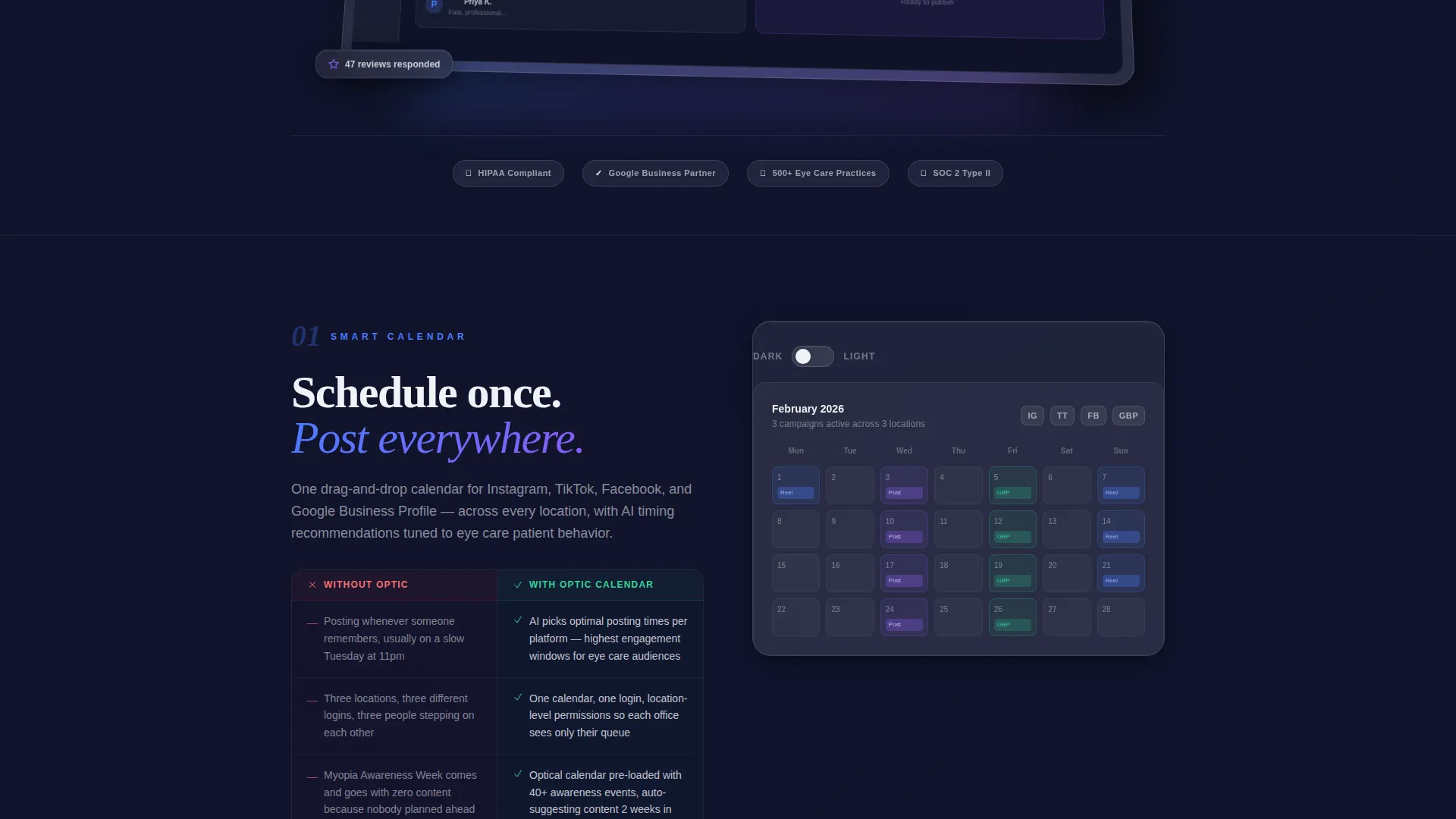
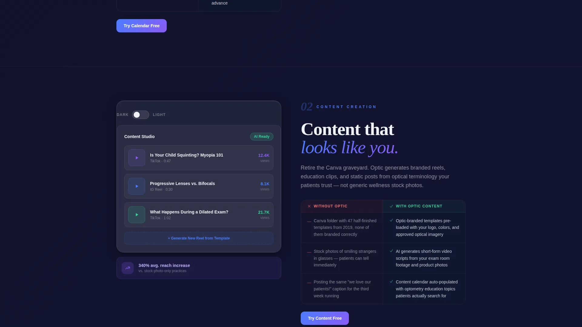
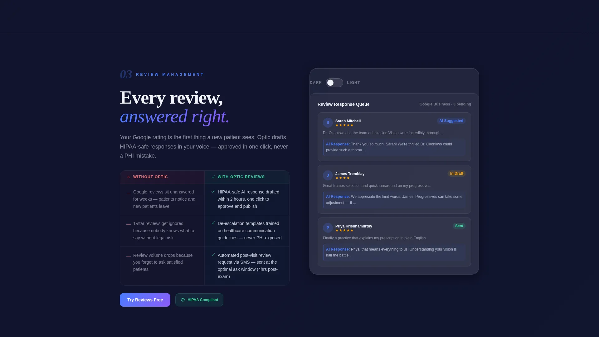
Each spoke section is a frosted glass module containing a zoomed-in screenshot of that specific feature. A three-column comparison grid contrasts the practice's current manual process with what the platform automates. The left column diagnoses the pain; the right column presents the fix.
Light and Dark Mode Feature Toggles
Each spoke section ends with an interactive toggle that switches the featured screenshot between light mode and dark mode. Visitors interact with the product before signing up, turning passive reading into active product exploration.
Progressive Two-Step Signup Form
The signup form collects only an email address and practice name on the first screen. The second screen, revealed after the initial click, asks for number of locations and current social platforms. This lowers the friction of the first commitment and qualifies leads in the second step.
Live Demo Booking Path
A secondary conversion option, labeled "See It With Your Brand," lets visitors book a demo call. The prompt describes the sales team pre-loading the prospect's actual Google Business Profile into the dashboard before the call, making the demo personal and immediately relevant.
Page sections overview
| Section | Purpose |
|---|---|
| Hero Header | Introduce the product with a dashboard screenshot and primary trial call-to-action |
| Anchor Nav Bar | Pin feature navigation to the top after scroll for fast section jumping |
| Calendar Spoke | Show the content calendar feature with a comparison grid and mode toggle |
| Content Spoke | Present content creation and scheduling with a zoomed screenshot and grid |
| Reviews Spoke | Highlight the Google review response queue and HIPAA-safe template workflow |
| Analytics Spoke | Display competitor benchmarking and performance dashboards with comparison grid |
| AI Captions Spoke | Demonstrate AI caption suggestions trained on optical terminology |
| Trial Signup Form | Collect email and practice name in step one, qualify leads in step two |
| Demo Booking Path | Offer a live demo with the prospect's own brand data pre-loaded |
| Sticky Mobile Bar | Keep the primary trial call-to-action reachable at the bottom on mobile |
Design & branding system
The visual identity follows a Dashboard Pro theme built on a glassmorphic color system. Every element sits on its own luminous plane, giving the page a clinical sharpness that feels native to a software product.
- Core palette: deep optical black (#0D0F1A) as the page canvas, frosted panels at 12% white opacity over gradient washes of iris blue (#4A7CFF) and retinal violet (#8B5CF6), crisp clinical white (#F0F2F8) for all body and headline typography
- Accent usage: lens-flare green (#34D399) appears only on active states, toggle confirmations, and the "Published" success badge, keeping it visually significant every time it appears
- Typography sits in clean white above frosted glass cards, and all product screenshots are rendered with diffused shadows cast onto the dark canvas below
Mobile & speed optimization
The template is structured with mobile conversion in mind. The layout adapts the hub-and-spoke format for smaller screens without losing the product-screenshot clarity that makes the page work.
- A sticky bottom bar on mobile keeps "Start Your 14-Day Free Trial" visible throughout the entire scroll journey
- Spoke sections restack vertically so the zoomed product screenshot and comparison grid remain readable on narrow viewports
How this template helps you convert
The page is built around a freemium-to-trial conversion strategy with two distinct paths running in parallel. Every section earns the next click before asking for credentials.
- The primary path leads visitors from the hero call-to-action through interactive feature toggles and into the two-step signup form, reducing drop-off by deferring the deeper qualification questions to step two.
- The secondary path offers a personalized live demo booking, giving high-intent visitors a lower-pressure option that still captures their contact details and qualifies their practice size.
Other information about this template
This template is purpose-built for the optometry software category and carries design decisions that reflect the clinical, precision-focused world of eye care. A few additional details worth knowing before you use it.
- The AI Captions spoke references caption suggestions trained on optical terminology, making the language feel native to eye care rather than generic healthcare
- HIPAA-safe review response templates are referenced in the Reviews spoke, which is a relevant detail for practices evaluating compliance-conscious platforms
- The comparison grids escalate in complexity as the visitor scrolls, moving from simple scheduling into competitor benchmarking dashboards by the time they reach Analytics
- The "See It With Your Brand" demo path is a notable secondary conversion element that pre-loads the prospect's Google Business Profile data for a personalized sales call
- The page metaphor throughout, from the glassmorphic panels to the "fresh pair of progressives" headline direction, ties the visual experience directly to the optometry context

Theme
Dashboard Pro
Creative direction
Feature Matrix
Color system
Glassmorphic
Style
Hub & Spoke (Anchor Nav)
Direction
Freemium/Trial
Page Sections
Pinned Anchor Navigation
Isometric Hero Dashboard Screenshot
Three-column Feature Comparison Grid
Light and Dark Mode Toggle
Progressive Two-step Signup Form
Personalized Demo Booking Path
Related questions
What type of page structure does this template use?
Who is the intended audience for this landing page template?
How does the conversion flow work on this template?
Can visitors interact with the template before signing up?
What makes the design feel specific to optometry?



