Healthcare Software & SaaS Booking Website Template
Triage is a scroll-reveal healthcare booking landing page built for software that replaces front-desk chaos with a single calm dashboard. The template uses a Carbon Fiber visual identity, animated data cards, a live appointment counter, and a progressive sign-up form to turn clinical scheduling pain into confident trial conversions.
by Rocket studio
Quick summary
Triage is a single-page, scroll-reveal landing page template designed for healthcare booking software. It moves visitors through a structured narrative: from the industry's scheduling crisis, through aggregate outcome data, to a live product walkthrough, ending at a progressive free-trial form. The visual identity is precise, data-forward, and built to feel clinical without feeling cold.
Who this template is for
This template is built for teams launching or repositioning healthcare scheduling software in a competitive market. It speaks directly to the buyers who feel the daily cost of broken front-desk workflows.
- Office managers at multi-provider practices who need to justify a software switch to leadership
- IT directors at regional hospital networks evaluating scheduling tools at scale
- Solo practitioners still toggling between paper calendars and multiple disconnected apps
What problem this template solves
Scheduling software is a crowded space. A generic product page rarely communicates the real cost of inaction. This template reframes the conversation around measurable frustration and documented outcomes.
- Double-bookings, no-shows, and hold-music complaints damage patient retention and staff morale
- Buyers need hard numbers, not feature lists, before they trust a new platform
- Standard sign-up forms create friction that pushes hesitant buyers away before they convert
What you get with this template
You get a fully structured, single-page scroll-reveal layout that takes visitors on an evidence-led journey from problem awareness to confident sign-up. Every section is pre-built and purposeful.
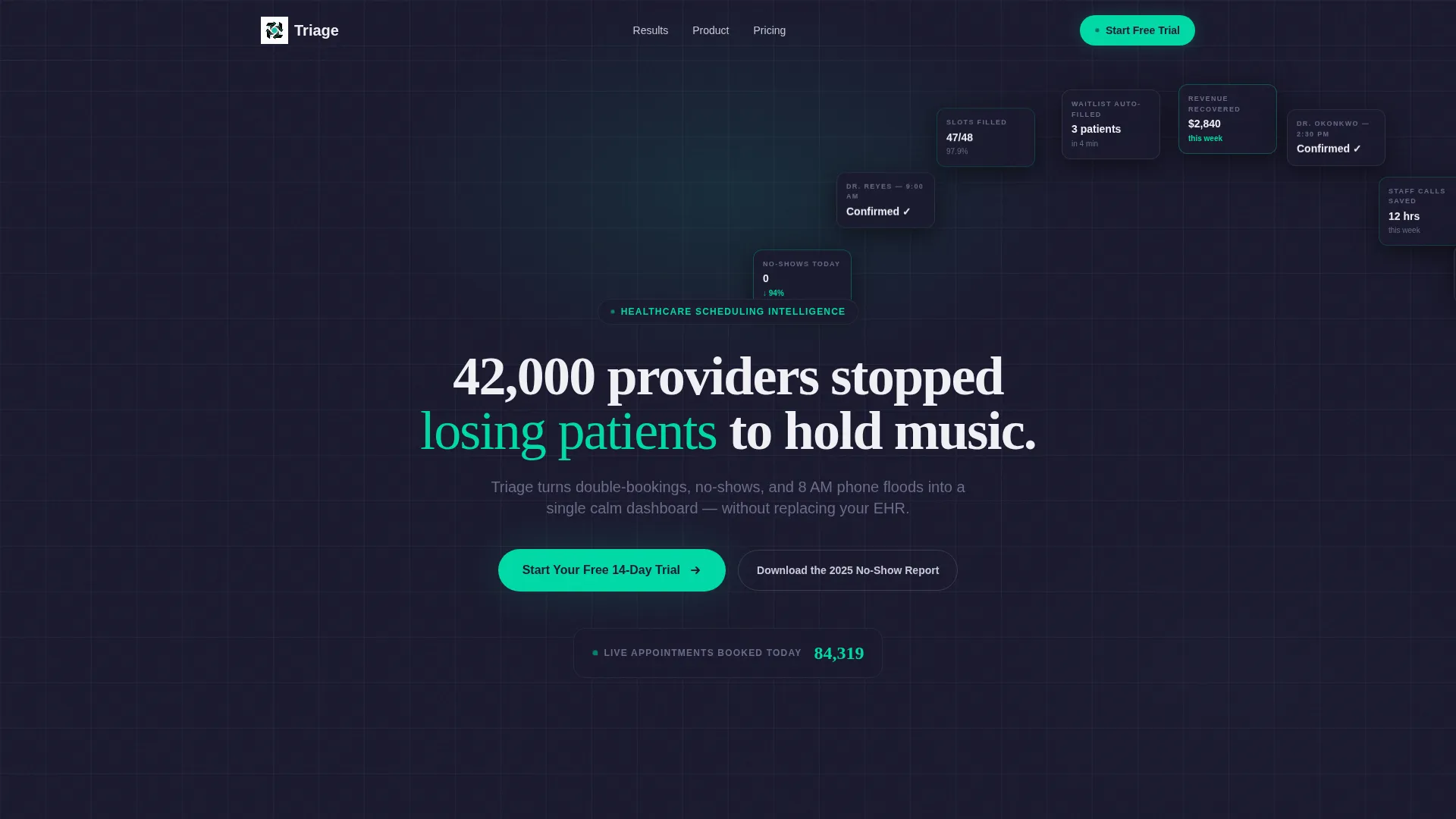
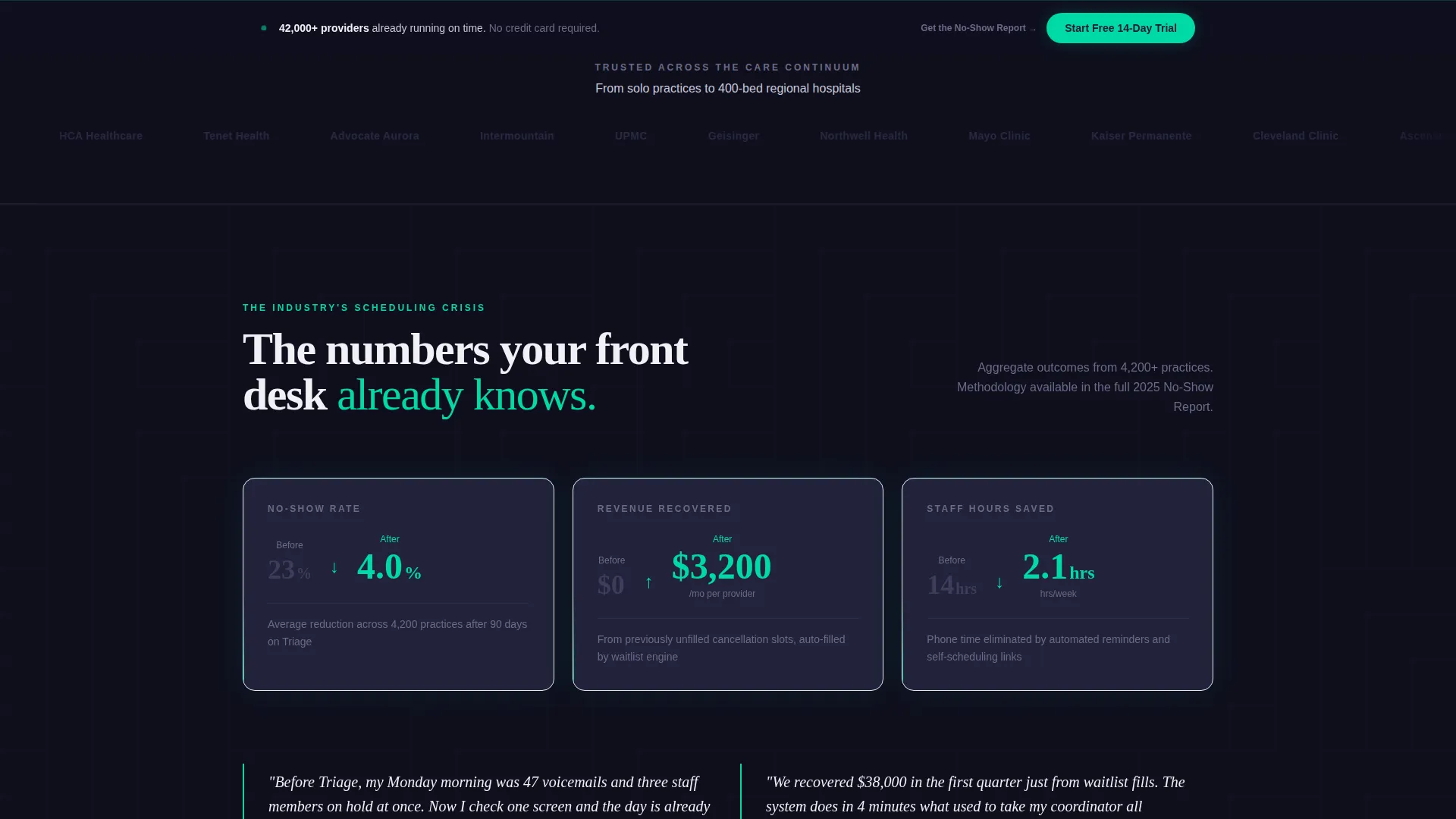
- A dynamic Logo Bar header with a live animated appointment counter in pulse-monitor teal
- Industry-report-style data cards with animated statistics that trigger on scroll entry
- A three-step progressive trial form plus a secondary lead-capture path for a gated PDF report
Feature list
This template packages a specific set of front-end presentation components designed to build trust and drive trial sign-ups.
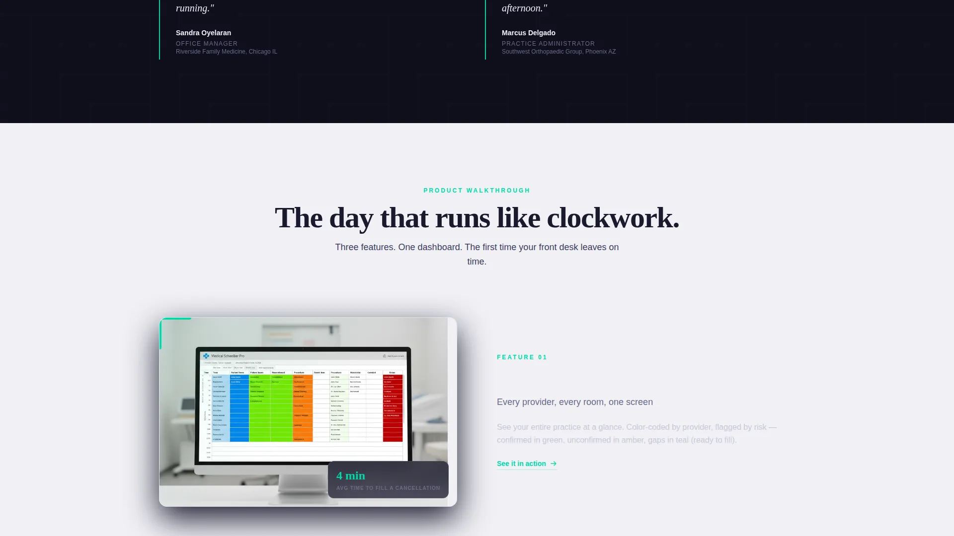
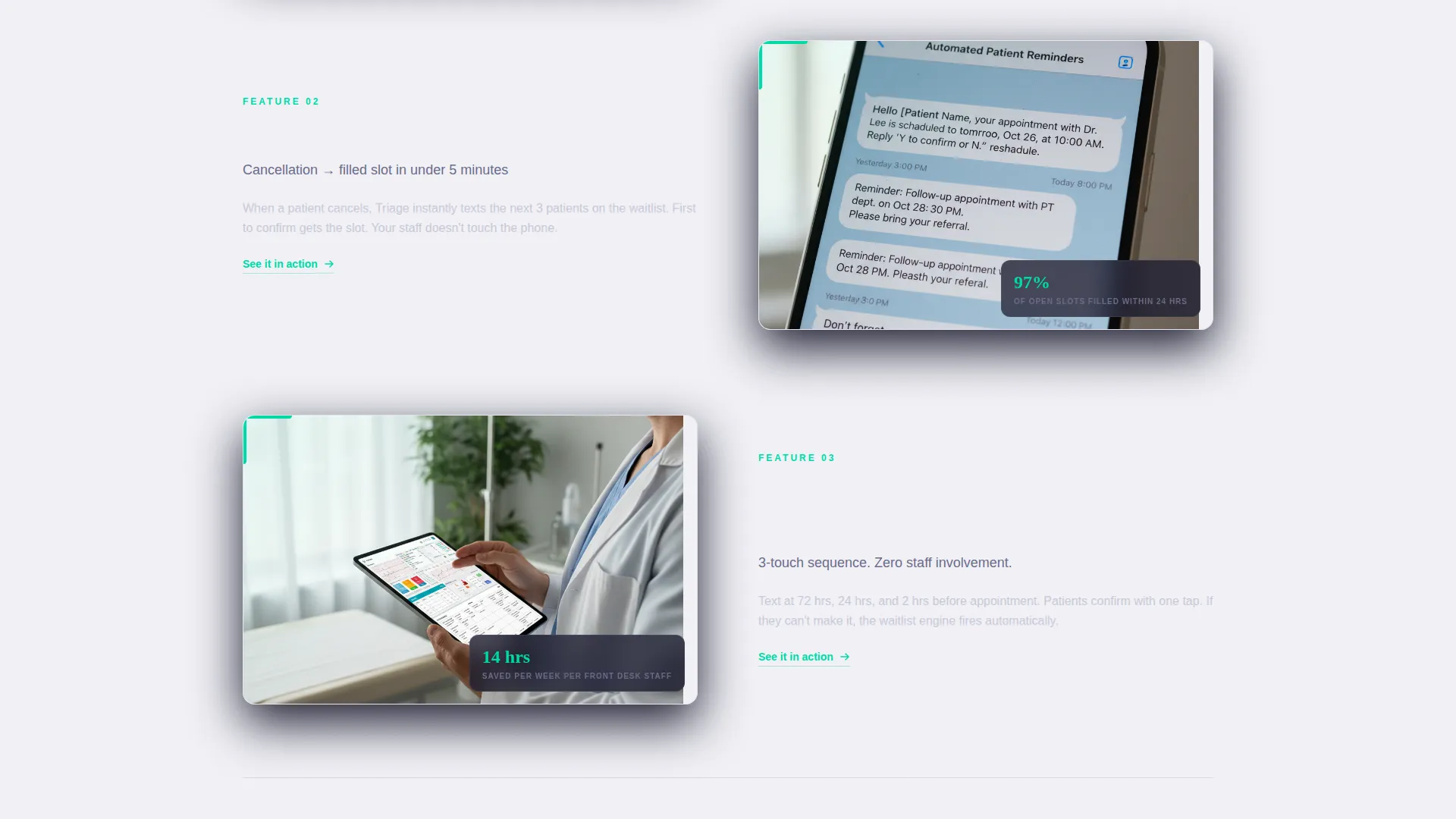
Scroll Reveal Data Cards
Each card surfaces a specific metric: average no-show rates before and after adoption, revenue recovered per provider per month, and staff hours saved weekly. Numbers animate into frame as the visitor reaches them, styled as teal digits ticking upward like vitals on a monitor.
Animated Logo Bar Header
The header opens with a horizontal ribbon of healthcare system and clinic network logo placeholders scrolling with frictionless momentum. Each logo renders in monochrome graphite against carbon black. A live appointment counter animates upward in pulse-monitor teal directly below, giving the section a sense of real-time activity.
Progressive Three-Step Trial Form
The primary conversion form is intentionally low-friction. Step one asks only for a work email. Step two asks for practice size. Step three collects the Electronic Health Record (EHR) system from a dropdown. This staged approach reduces drop-off by asking for more detail only after initial commitment.
Fixed Viewport call to action Strip
After the second scroll reveal, a "Start Your Free 14-Day Trial" call-to-action button locks to the bottom of the viewport. It stays visible throughout the rest of the page, so the conversion path is always one tap or click away without interrupting content consumption.
Secondary Lead Capture Path
A "Download the 2025 No-Show Report" module captures visitors who are convinced by the data but not yet ready to trial. It gates the full PDF behind name and email, creating a secondary funnel entry point from the same page.
Testimonial Pull-Quote Blocks
Named office manager testimonials are woven between the data cards. They ground the statistics in human experience, balancing the clinical precision of the numbers with direct quotes that speak the buyer's language.
Page sections overview
| Section | Purpose |
|---|---|
| Logo Bar Header | Builds instant credibility with provider logos and a live counter |
| Headline Block | States the core value proposition in one sterile-white headline |
| Problem Data Card | Surfaces industry no-show and scheduling loss statistics |
| Testimonial Pull-Quote | Anchors first data set in a named office manager's words |
| Outcome Data Cards | Animates revenue and time-saved metrics on scroll entry |
| Product user interface Walkthrough | Auto-plays interface preview as it enters the viewport |
| Secondary Testimonial | Reinforces outcomes with a second named practitioner quote |
| Free Trial Form | Collects work email, practice size, and EHR system in three steps |
| PDF Lead Capture | Converts report-curious visitors via name and email gate |
| Fixed call to action Strip | Keeps the primary trial button visible after second scroll reveal |
Design & branding system
The template uses a Carbon Fiber color system that feels like the brushed-metal casing of a high-end medical device: engineered, zero-ornament, and trust built into the material itself.
- Deep carbon black (#1A1A2E) and sterile-field white (#F0F0F5) alternate as section backgrounds to create breathing room between data-dense areas
- Surgical-instrument graphite (#3D3D5C) handles secondary text, dividers, and logo treatments
- Pulse-monitor teal (#00D9A6) is reserved exclusively for calls to action, live data points, and micro-animations to preserve its visual signal strength
Mobile & speed optimization
The Dynamic Motion theme and scroll-reveal interactions are structured to remain intentional and controlled across screen sizes.
- Scroll-triggered animations are set to activate on viewport entry, keeping the experience coherent on both desktop and mobile displays
- The fixed call to action strip is designed to sit cleanly at the bottom of the viewport on mobile without obscuring critical content
- The progressive form flow works well on smaller screens by presenting one focused step at a time
How this template helps you convert
The page is engineered around a specific buyer psychology: show the cost of the problem before presenting the product, then make sign-up feel inevitable rather than pressured.
- The data-first scroll narrative positions the software as the logical conclusion of an industry problem, so visitors arrive at the trial form already persuaded rather than still skeptical.
- The progressive form reduces perceived commitment by starting with just a work email, lowering the psychological barrier at the most critical drop-off point.
- The secondary PDF lead capture ensures that visitors who leave without trialing are not lost. They exit with a gated asset and a valid email in the funnel.
Other information about this template
This template is a strong fit for healthcare technology marketing teams working within a defined go-to-market sprint. It is also well-suited to agency teams building launch assets for health-tech clients.
- The template style is Scroll Reveal (Progressive), meaning each section enters the viewport with a deliberate motion cue rather than loading all at once
- The creative direction follows an Industry Report format, giving the page the authority tone of a research-backed brief rather than a standard product brochure
- The Freemium/Trial landing page direction means every structural decision, section order, and call to action placement is optimized toward a low-friction trial sign-up
- The header concept is a Logo Bar, a pattern commonly used by enterprise software products to establish social proof before the visitor reads a single line of body copy
- The theme is Dynamic Motion, which means the page's interactivity is part of its credibility signal: a product claiming to bring order to chaos should itself feel precise and controlled
Theme
Dynamic Motion
Creative direction
Industry Report
Color system
Carbon Fiber
Style
Scroll Reveal (Progressive)
Direction
Freemium/Trial
Page Sections
Scroll Reveal Data Cards
Animated Logo Bar Header
Progressive Three-step Trial Form
Fixed Viewport Call to Action Strip
Secondary PDF Lead Capture
Named Testimonial Pull-quotes
Related questions
Who is this template designed for?
How does the three-step progressive form work?
What is the secondary conversion path on this page?
What does the fixed call to action strip do?
What visual theme does this template use?


