Vitals — Cardio Training Landing Page Template
Pulse is a bento grid landing page template built for a gym and fitness club member app. It uses a dark Data Command visual theme to present real-time workout metrics, including heart rate zones, volume load tracking, and progressive overload data. The layout guides visitors from a single provocative question to a full interactive dashboard view, driving freemium trial signups.
by Rocket studio
Quick summary
Pulse is a single-page bento grid template designed for a gym and fitness club member app. It opens with a bold problem statement, then unfolds into an interactive dashboard preview showing live workout data. The design uses a deep void-and-violet color system to make every metric feel urgent and alive. The primary goal is freemium trial conversion.
Who this template is for
This template is built for fitness app teams and gym technology founders who need a landing page that speaks directly to serious, data-driven gym members. It works best when the product itself is the visual hero.
- Fitness app developers launching a gym member tracking product to a motivated, metrics-focused audience
- Gym operators and software teams wanting to show real integrations like class schedules and equipment check-in
- Marketers running freemium or free-trial campaigns who need a focused, low-friction signup flow
What problem this template solves
Most fitness app landing pages rely on stock photography and vague benefit statements. They fail to show the product in action, and they ask for too much commitment before a visitor understands the value. Pulse solves this directly.
- Visitors leave before converting because the page does not demonstrate the actual product experience
- Generic layouts cannot reflect the precision that data-obsessed gym members expect from a tracking app
- Long signup flows create friction before the user has seen enough to commit
What you get with this template
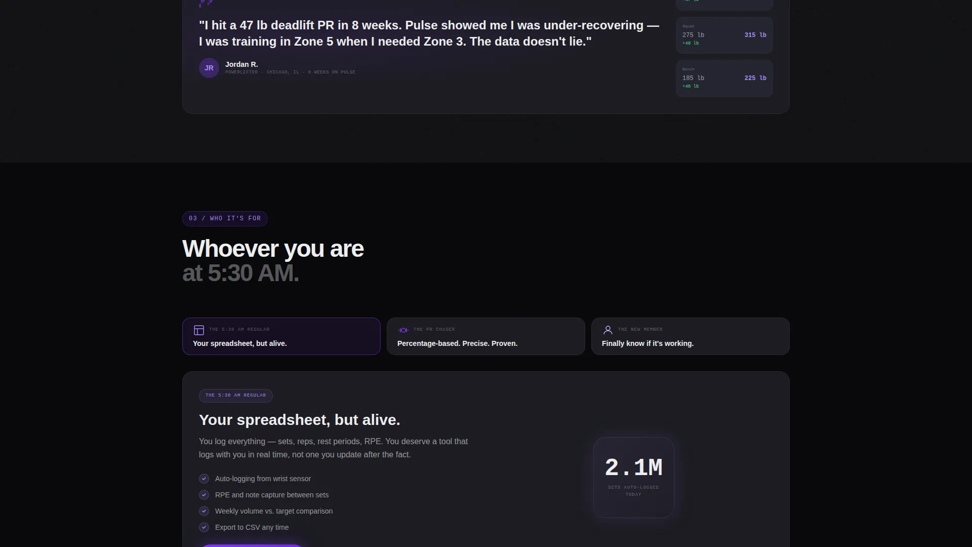
You get a complete, conversion-focused landing page structured around a Problem to Solution creative arc. Every section has a defined role, and the layout uses bento grid cards to break a complex app into digestible, scannable proof points.
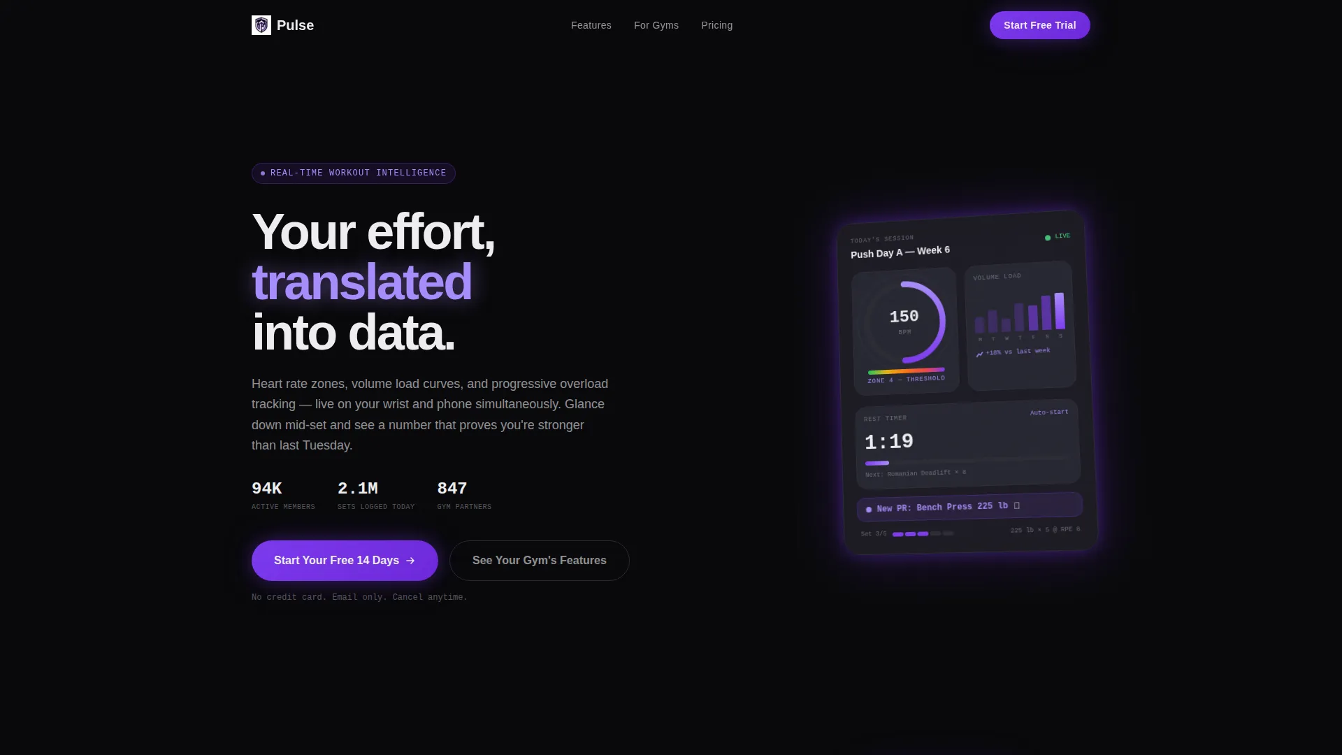
- A pixel-perfect dashboard header showing a live mid-workout session with heart rate, volume load, a set timer, and a personal record badge
- An interactive bento grid where each card addresses a specific user frustration, with hover animations revealing each feature in action
- A pinned freemium call-to-action and a secondary gym-discovery path that reduces signup hesitation
Feature list
This template is built around a set of deliberate design and structural choices. Each feature below is grounded directly in the template brief.
Animated Dashboard Header
The header recreates the app's main screen at a slight angle against a void black background. It displays a circular heart rate gauge pulsing at 156 BPM in violet, a weekly volume load bar chart, a live set timer counting down from 90 seconds, and a personal record notification badge. Micro-animations keep every metric visually active.
Problem-to-Solution Bento Grid
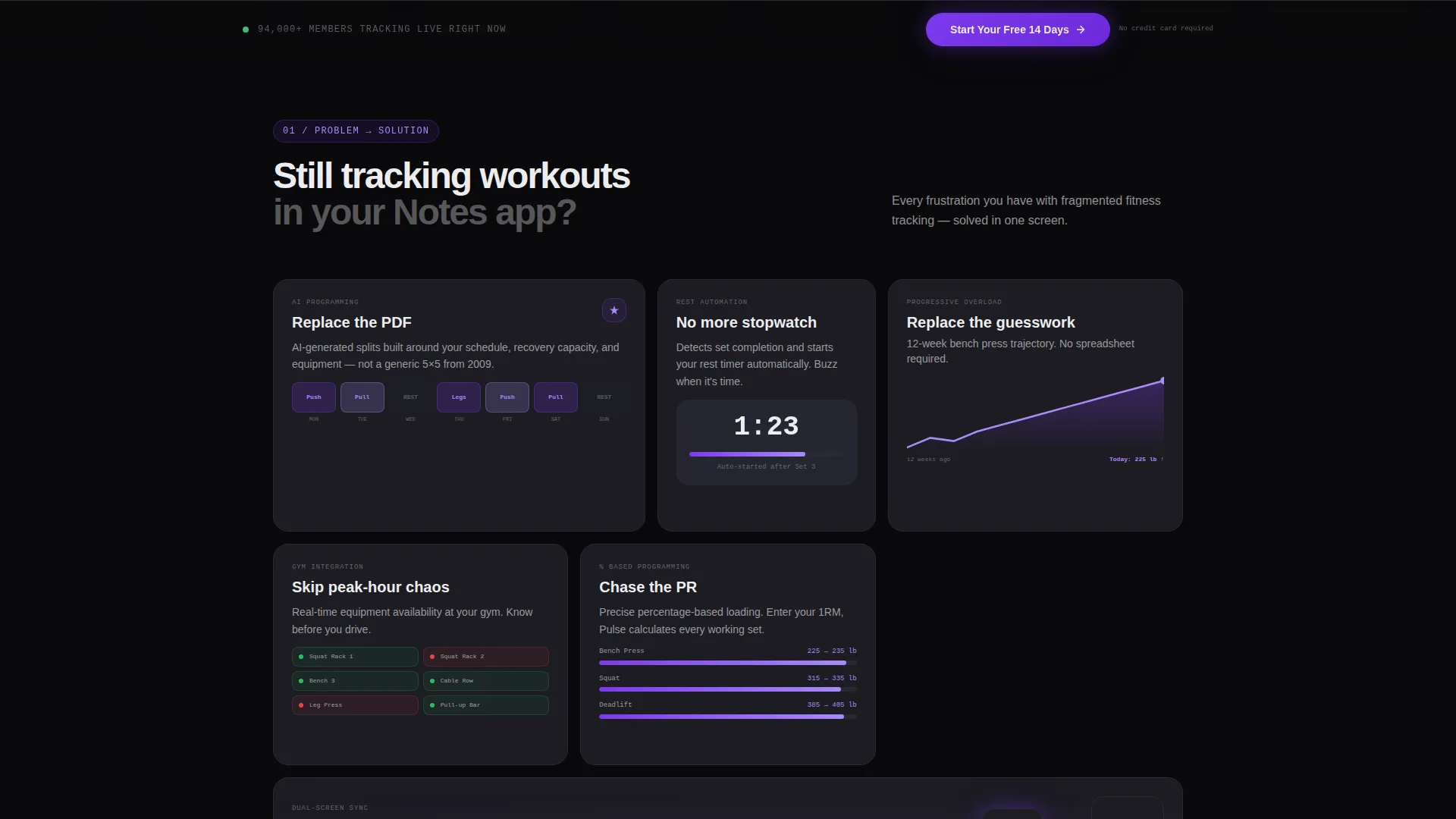
The page opens with a single provocative tile asking "Still tracking workouts in your Notes app?" As the visitor scrolls, that tile shatters into a full bento grid. Each card targets a specific pain point: AI-generated workout splits, rest timer automation, progress graphs, and gym equipment availability.
Interactive Hover Animations per Card
Every bento grid tile includes a hover state that triggers a mini-animation of the feature in action. This lets visitors experience the product behavior before they ever sign up, making the value tangible rather than abstract.
Consolidating Scroll Animation
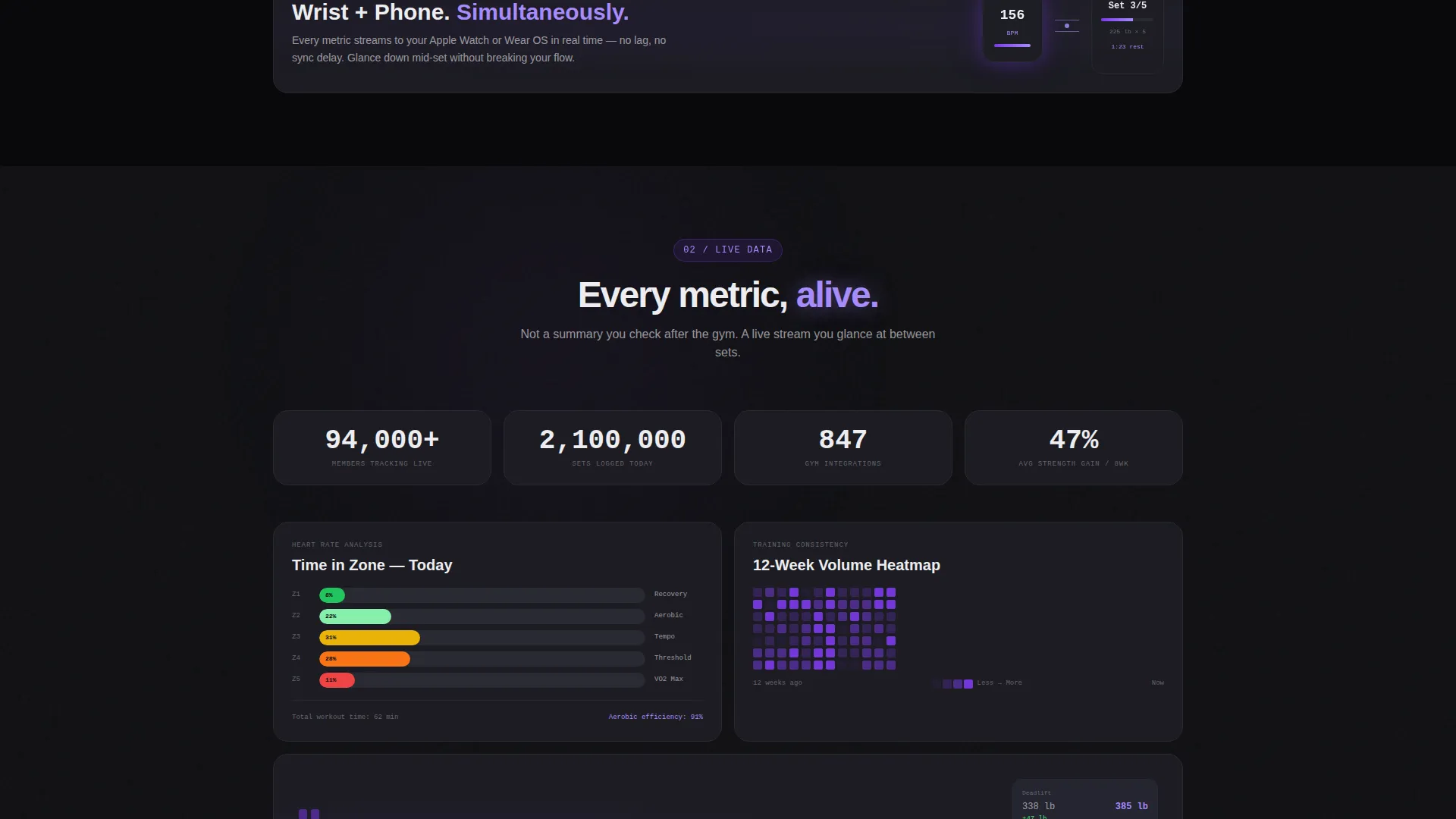
As the visitor scrolls further, the fragmented bento grid tightens and the individual cards consolidate into a single unified dashboard view. This visual metaphor reinforces the core product promise: Pulse replaces scattered tools with one integrated experience.
Pinned Freemium Call-to-Action Bar
After the first scroll, a call-to-action bar pins to the bottom of the viewport. The primary button reads "Start Your Free 14 Days" in electric lilac against void black. It stays visible throughout the page without interrupting the content flow.
Gym Discovery Secondary Path
A secondary conversion path lets visitors type their gym's name to preview which integrations are already live at their location. This includes class schedules, equipment check-in, and trainer booking. It directly addresses the "will this work at my gym" hesitation before the visitor reaches the signup step.
Page sections overview
| Section | Purpose |
|---|---|
| Dashboard Hero Header | Showcases app user interface with live workout metrics and personal record badge |
| Problem Provocation Tile | Opens with a single bento card that challenges the visitor's current habit |
| Bento Feature Grid | Expands into cards solving specific user frustrations with hover animations |
| AI Splits Card | Highlights AI-generated workout programming as a replacement for generic plans |
| Rest Timer Card | Demonstrates automated rest timer replacing manual phone stopwatches |
| Progress Graphs Card | Shows visual progress data replacing guesswork and manual logging |
| Equipment Availability Card | Addresses gym peak-hour crowding with live equipment status |
| Grid Consolidation Section | Animates cards merging into one unified dashboard view |
| Pinned Trial call to action Bar | Keeps the free 14-day trial button visible after first scroll |
| Gym Discovery Path | Lets visitors preview gym-specific integrations before committing |
| Minimal Signup Step | Collects only email and gym name; defers goal setup to in-app onboarding |
Design & branding system
The visual identity follows a Data Command theme built around a Void and Violet color system. The palette evokes a dimly lit gym at midnight where the only light source is a phone screen glowing against a rubber floor. Every color choice reinforces the feeling of clinical precision and digital intensity.
- Core palette: true void black (#09090B) for backgrounds, deep ultraviolet (#7C3AED) for primary accents, muted graphite (#1C1C22) for card surfaces, electric lilac (#A78BFA) for data highlights, and chalk-white (#EDEDF0) for body text
- Typography and data elements are designed to stay legible at high information density, keeping metrics readable even when multiple data points appear in a single card
- The product interface itself serves as the hero visual; no stock photography is used anywhere in the template
Mobile & speed optimization
The bento grid layout is structured to adapt across screen sizes without losing the visual logic of the card-based design. The consolidating scroll animation and pinned call-to-action bar are designed to work on both wrist-sized and phone-sized viewports, reflecting the dual-device nature of the app itself.
- Bento grid cards reflow to maintain readability and tap-target clarity on smaller screens
- The pinned call-to-action bar remains accessible throughout the mobile scroll experience without covering primary content
- Micro-animations and hover states are scoped to avoid overwhelming smaller device rendering contexts
How this template helps you convert
Pulse is built around a single conversion goal: getting a motivated gym member to start a free 14-day trial with minimal friction. Every structural decision supports that outcome.
- The Problem to Solution arc qualifies visitors emotionally before asking them to act, making the signup feel like a natural next step rather than a cold request
- The gym discovery path removes the most common pre-signup objection by showing real integrations at the visitor's actual gym before they enter any personal details
- The minimal first-step signup form, asking only for email and gym name, lowers the perceived commitment and pushes complexity into the onboarding flow inside the app
Other information about this template
This template is part of the Technology category, specifically aligned with the Industry Mobile Apps subcategory and the Gym and Fitness Club Member App niche. It is a single-page bento grid landing page, not a multi-page website. The template style, theme, and conversion direction were matched from a verified intersection of design and niche context fields.
- Template style: Bento Grid, matched to the Data Command theme and Void and Violet color system
- Conversion direction: Freemium and free-trial focused, with a 14-day trial as the primary offer
- The two-step onboarding model, collecting only email and gym name first, is intentional and built into the template structure
- Goal selection and fitness level inputs are deferred to in-app onboarding, keeping the landing page form minimal
- The template is category-matched under Technology, Industry Mobile Apps, and the Gym and Fitness Club Member App niche intersection
Theme
Data Command
Creative direction
Problem→Solution Arc
Color system
Void & Violet
Style
Bento Grid
Direction
Freemium/Trial
Page Sections
Animated Dashboard Header
Problem-to-solution Bento Grid
Interactive Card Hover Animations
Consolidating Scroll Animation
Pinned Freemium Trial Button
Gym Discovery Conversion Path
Related questions
What kind of product is this template designed for?
How does the bento grid layout work on this page?
What does the signup flow collect from visitors?
Can visitors check which features are available at their gym?
Is this template suitable for a dark-themed fitness brand?



