AI for Senior Care Reviews Website Template
Vitals is a bento grid landing page template built for AI-powered senior care analytics platforms. It speaks directly to operations directors, compliance officers, and portfolio managers overseeing multi-facility senior living groups. With a dark Slate & Sky visual identity, a live dashboard preview header, and a sharp comparison section, this template turns complex operational data into a compelling case for change.
by Rocket studio
Quick summary
Vitals is a single-page bento grid template designed for predictive senior care analytics platforms. It opens with a full-width dashboard preview, moves through industry-report-style data sections, and closes with a direct conversion form. The layout speaks to operations leaders who need confidence, not clutter.
Who this template is for
This template is built for technology companies offering AI-driven analytics tools to the senior living industry. It targets buyers with operational authority and data fluency.
- Operations directors managing 12 to 60 senior living communities who need a faster, clearer way to communicate platform value
- Compliance officers responsible for state audit readiness who want to see how a dashboard replaces reactive spreadsheet prep
- Private equity portfolio managers who have recently acquired a regional senior care chain and need immediate facility-level visibility
What problem this template solves
Senior care operations teams are drowning in fragmented, after-the-fact data. Incident logs sit in spreadsheets. Staffing gaps surface only after something goes wrong. Families ask questions that should already have answers. A legacy reporting stack cannot predict a fall on Hall C before it happens.
- Disconnected tools create blind spots across fall frequency tracking, medication variance, sleep pattern erosion, and staffing coverage
- Audit preparation happens in a scramble rather than as a continuous readiness posture
- Decision-makers lack a single view that connects resident outcomes to operational risk in real time
What you get with this template
This template delivers a fully structured, single-page layout that makes a predictive analytics platform feel credible and urgent at the same time. Every section is built to move a skeptical operations leader toward a demo request.
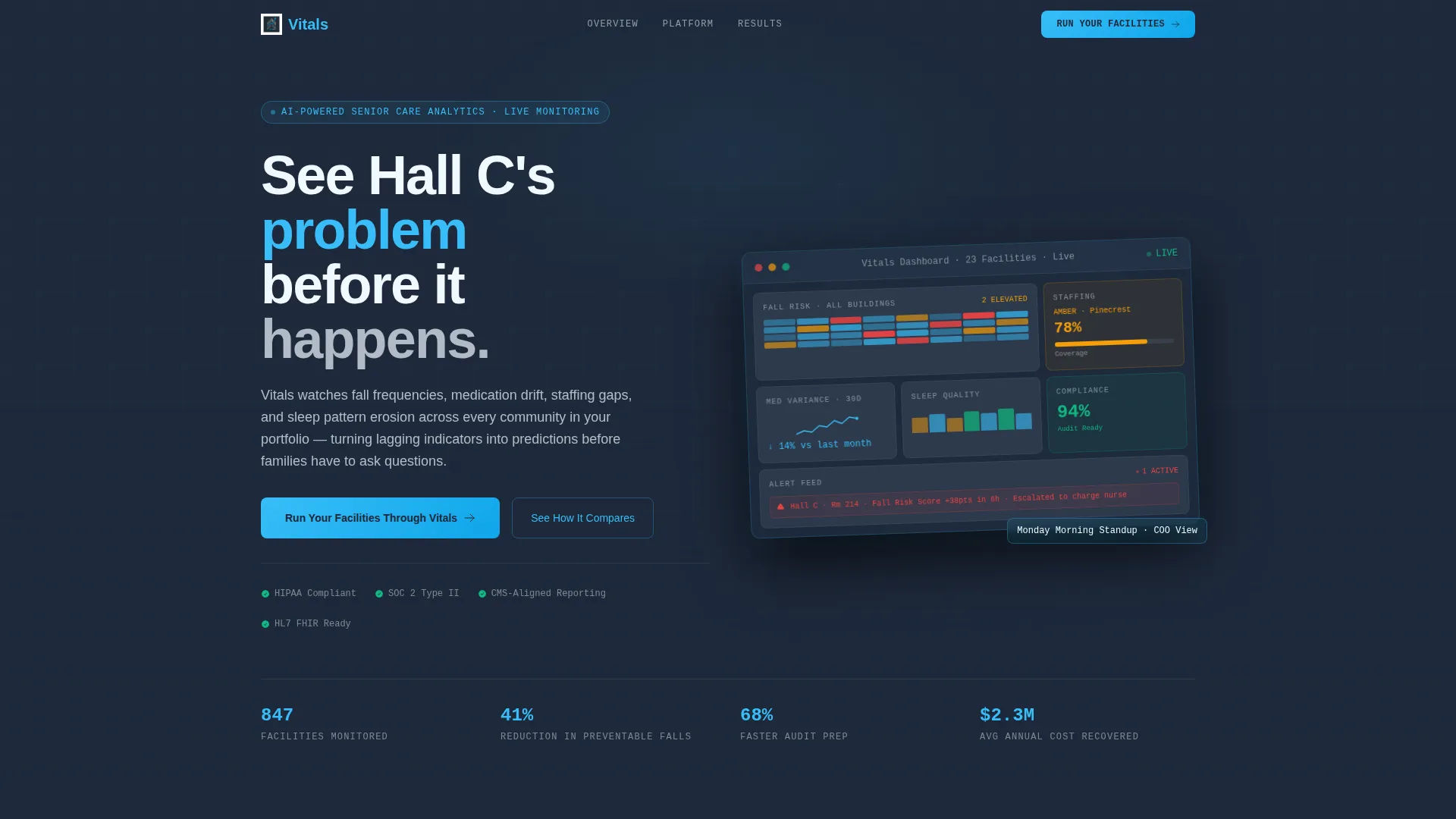
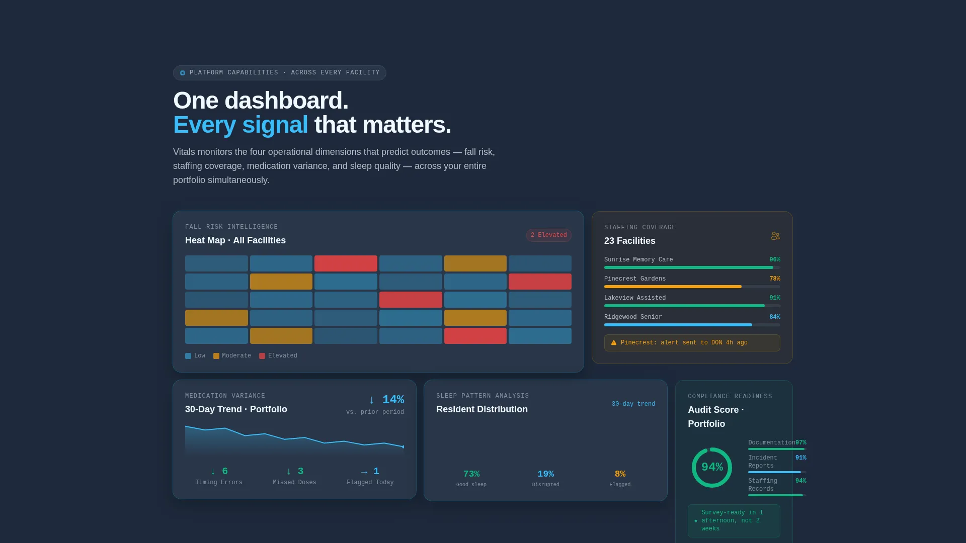
- A full-width dashboard preview header showing six bento tiles including a fall-risk heat map, staffing coverage gauge, medication variance trend, sleep quality distribution, compliance score, and live alert feed
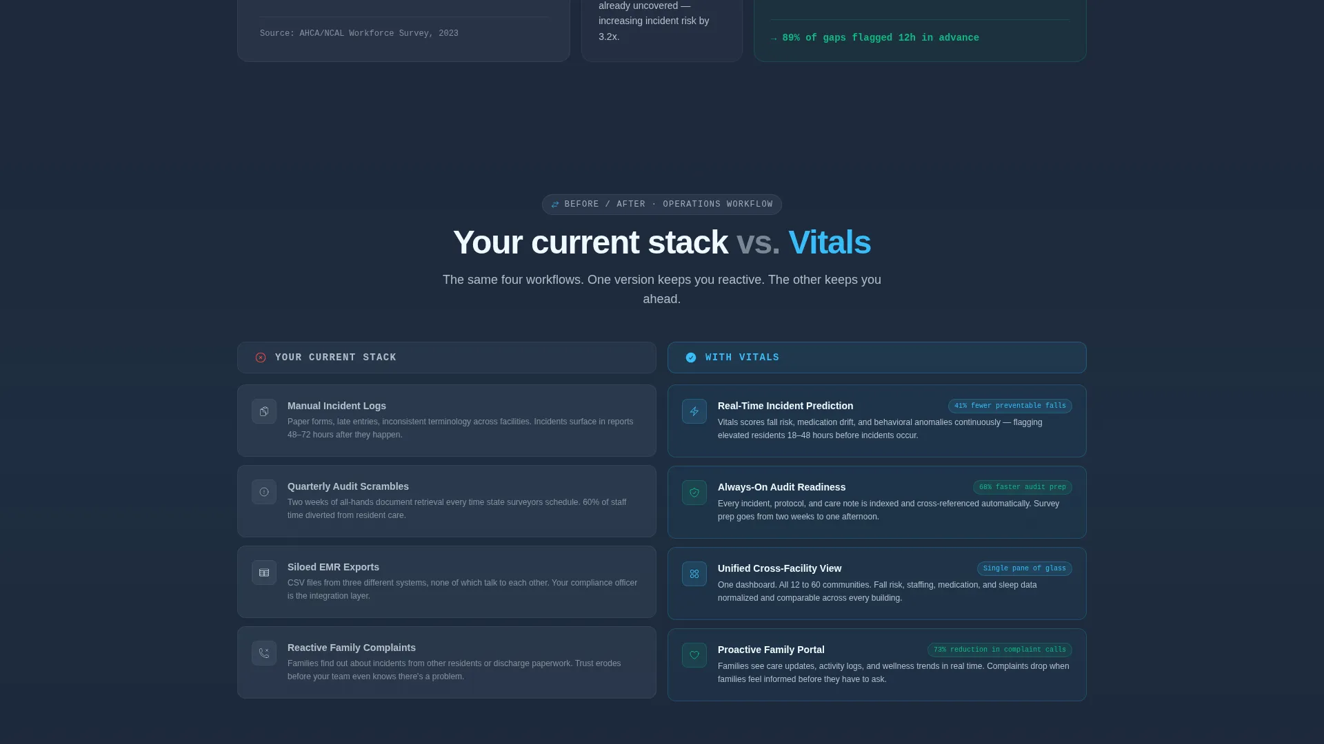
- A sticky comparison section contrasting current manual workflows with live dashboard outcomes, including cited improvement figures such as 68% faster audit prep and 41% reduction in preventable falls
- A dual-call to action conversion block with a primary form asking for facility count and primary pain point, plus a secondary ghost button to download a senior care operations benchmark report
Feature list
This template is built around purpose-designed sections and layout patterns that reflect how senior care technology buyers actually evaluate platforms.
Bento Grid Layout System
The template uses a dynamic bento grid that reshuffles its tile arrangement section by section. Sometimes two wide cards flank a tall one. Sometimes four equal tiles appear side by side. The shifting rhythm prevents visual fatigue and keeps scrolling feel exploratory rather than formulaic.
Live Dashboard Preview Header
The header renders a full-width, pixel-accurate product screenshot floating on the slate background with a subtle lift shadow. The composition shows a multi-facility overview with six distinct data tiles visible at once, giving visitors an immediate feel for the platform's scope before reading a single word of copy.
Industry Report Content Sections
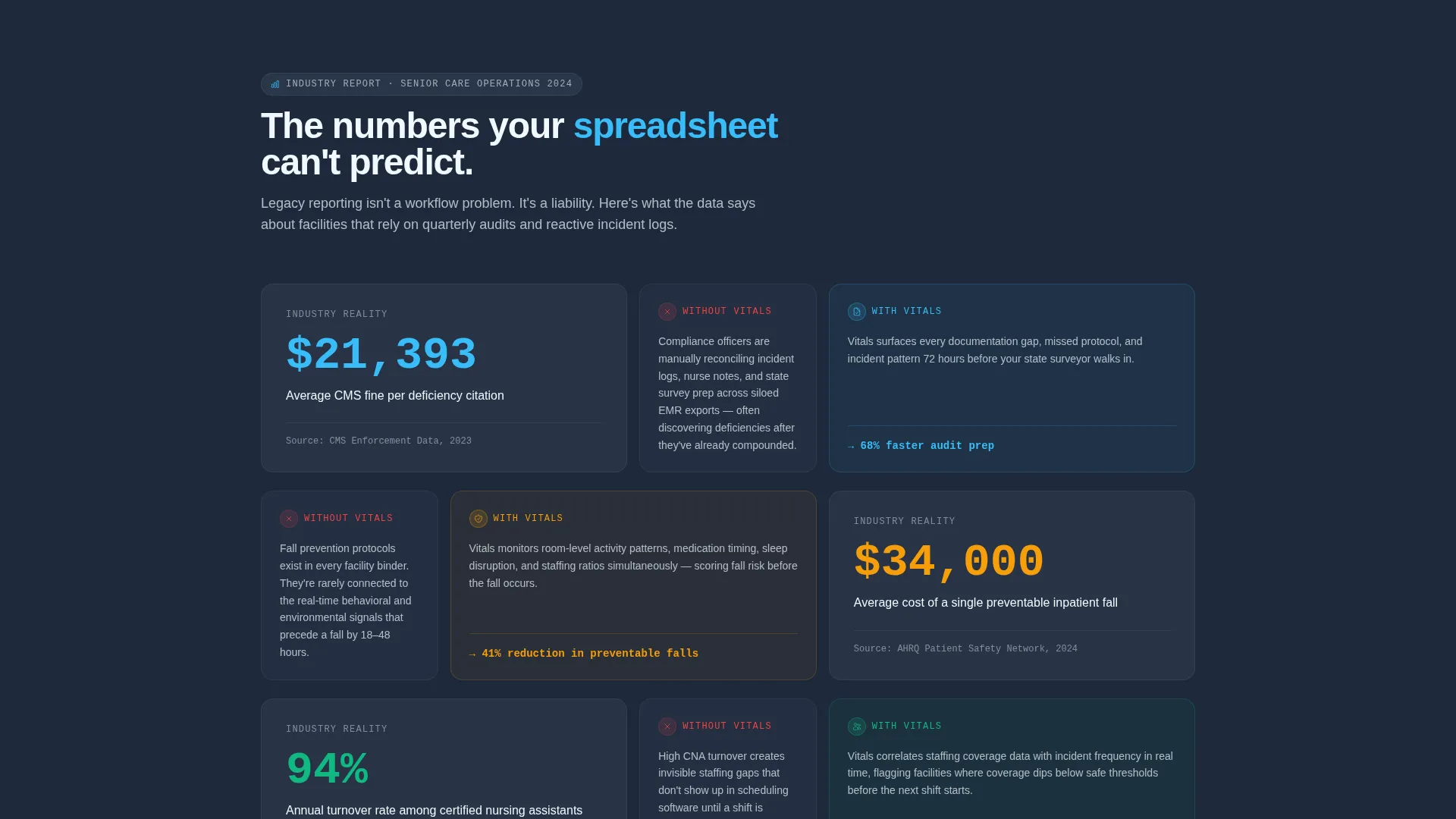
Each scroll section pairs a hard statistic about senior care operations with a direct dashboard response. Facts about average state fines per deficiency, the annual cost of preventable falls, and staff turnover correlation to incident rates appear cited, then immediately connected to the platform capability that addresses them.
Comparison and Versus Section
A sticky two-column bento layout divides the current operational reality from the platform-enabled future. The left column titled "Your Current Stack" uses muted graphite cards to list manual incident logs, quarterly audit scrambles, siloed electronic medical record exports, and reactive family complaints. The right column titled "With Vitals" renders the same workflows as glowing sky blue dashboard tiles with real metric improvements attached.
Dual-Path Conversion Block
The primary call to action, "Run Your Facilities Through Vitals," uses a short three-field form asking for number of facilities, primary pain point from a dropdown, and a work email. A secondary ghost button captures leads who are not ready to demo by offering a downloadable senior care operations benchmark report.
Slate and Sky Color System
The entire template runs on a four-value palette. Deep operational slate for primary backgrounds, mid-tone graphite for card surfaces, clinical sky blue for every metric, spark line, and interactive element, and soft cloud white for text contrast and breathing room. The result reads like a hospital-grade monitor at a calm, authoritative register.
Page sections overview
| Section | Purpose |
|---|---|
| Dashboard Preview Header | Opens with a floating multi-facility screenshot to establish platform credibility immediately |
| Industry Stats Block | Pairs hard senior care statistics with specific dashboard responses section by section |
| Bento Feature Tiles | Showcases fall risk, staffing, medication, sleep, and compliance data in reshuffling grid layouts |
| Comparison Versus Section | Contrasts current manual stack with live dashboard outcomes using a sticky two-column bento layout |
| Metrics Improvement Row | Highlights cited figures including 68% faster audit prep and 41% fall reduction in sky blue |
| Dual call to action Block | Captures demo-ready leads with a three-field form and secondary benchmark report download |
Design & branding system
The visual identity follows a Startup Velocity theme built entirely on the Slate & Sky color system. Every design decision prioritizes operational legibility over decorative flair.
- Deep operational slate (#1E293B) for primary page backgrounds, mid-tone graphite (#475569) for card and tile surfaces, clinical sky blue (#38BDF8) for all data highlights and interactive elements, and soft cloud white (#F0F9FF) for text and negative space
- The floating dashboard screenshot uses a subtle angled composition and lift shadow, creating the feel of leaning over a screen during a morning standup rather than viewing a static promotional image
- Sky blue carries every spark line, metric value, and clickable element so data points read as active signals rather than decorative labels
Mobile & speed optimization
The bento grid layout is structured to translate naturally from desktop to smaller viewports. Tile arrangements that shift on desktop condense into clean stacked sequences on mobile without losing the section-by-section rhythm.
- Reshuffling bento tile groups adapt to narrower widths so the comparison section and conversion form remain readable and actionable on any screen size
- The dashboard preview header image is compositionally balanced to retain visual impact even when scaled down from a full-width desktop presentation
How this template helps you convert
This template is engineered around two conversion paths: a direct demo request and a report download for leads who need more time. The layout builds trust before asking for anything.
- The industry report content structure earns credibility section by section by grounding every platform claim in a cited operational statistic, so by the time visitors reach the form they have already absorbed the business case
- The dual-path conversion block removes the binary demo-or-leave decision by offering a benchmark report download as a soft entry point, capturing contact details from buyers who are still in the evaluation phase
Other information about this template
This template is designed to work within a broader senior care technology marketing context. It can support platform teams building their first high-intent landing page or replacing an existing product page that relies on generic software visuals.
- The template style is classified as Bento Grid, and the creative direction follows an Industry Report format, making it well-suited for platforms that lead with data authority rather than brand storytelling
- The Startup Velocity theme signals forward-looking technology credibility, which resonates with the private equity and multi-facility operations audience described in the brief
- The Comparison/Versus landing page direction is particularly effective in markets where buyers are actively switching from legacy manual workflows and need to see the contrast made explicit
Theme
Startup Velocity
Creative direction
Industry Report
Color system
Slate & Sky
Style
Bento Grid
Direction
Comparison/Versus
Page Sections
Dynamic Bento Grid Layout
Floating Dashboard Preview Header
Industry Report Content Sections
Sticky Comparison Section
Dual-path Conversion Block
Related questions
Who is this landing page template designed for?
Can I replace the dashboard preview image with my own product screenshot?
How does the dual-call to action conversion block work?
Does the comparison section support custom workflow labels?
Is this template suitable for a platform still in early launch?



