Data & Analytics Pricing & Packages Website Template
Viz is a dynamic data visualization landing page template built around an interactive comparison engine. It lets visitors benchmark animation support, render speed, embed options, and pricing side by side, then watch live micro-demos prove the difference. Designed for data journalists, product managers, and analytics leads who need charts that move, not static exports.
by Rocket studio
Quick summary
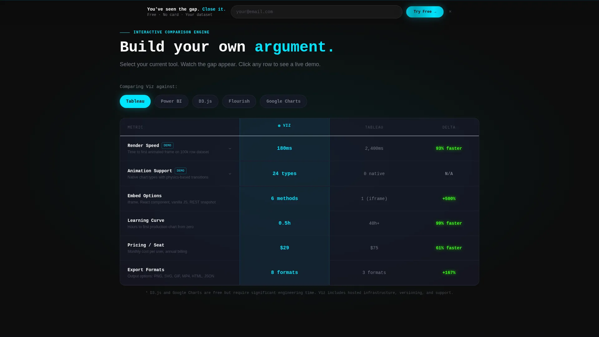
Viz is a single-page comparison landing page template for a browser-based data visualization tool. Visitors pick a competing tool from a dropdown and instantly see a head-to-head table across key criteria. Every row in that table can expand into a live animation demo. The page is built to let the data prove the argument before anyone asks for a sign-up.
Who this template is for
This template is built for teams and individuals who present data for a living and need a page that earns trust fast. If your audience compares tools before they commit, this layout speaks directly to that behavior.
- Data journalists working tight deadlines who need election-night dashboards and shareable embeds ready fast
- Product managers building board decks that use animated charts instead of static screenshots
- Analytics leads tired of exporting flat images from legacy tools and ready to show stakeholders something better
What problem this template solves
Most data tool pages talk about features without showing them. Visitors who are actively comparing options leave before they convert because nothing proves the difference. This template flips that dynamic by putting the comparison in the visitor's hands from the first scroll.
- Static feature lists do not convince a buyer who is already using a competing product
- Visitors in research mode need a reason to stop comparing and start acting
- A demo buried at the bottom of a long page loses attention before it can do its job
What you get with this template
You get a fully structured comparison landing page with a live interactive widget at its center. Every section builds on the gap the comparison table opens, moving the visitor from curiosity to conviction.
- An interactive tool-versus-tool comparison widget with a dropdown selector and a populated results table
- Row-level micro-demo panels that play animated chart examples side by side when a visitor clicks any comparison row
- A sticky conversion bar with an email field and a file-drop zone that accepts comma-separated value (.csv) or spreadsheet (.xlsx) files
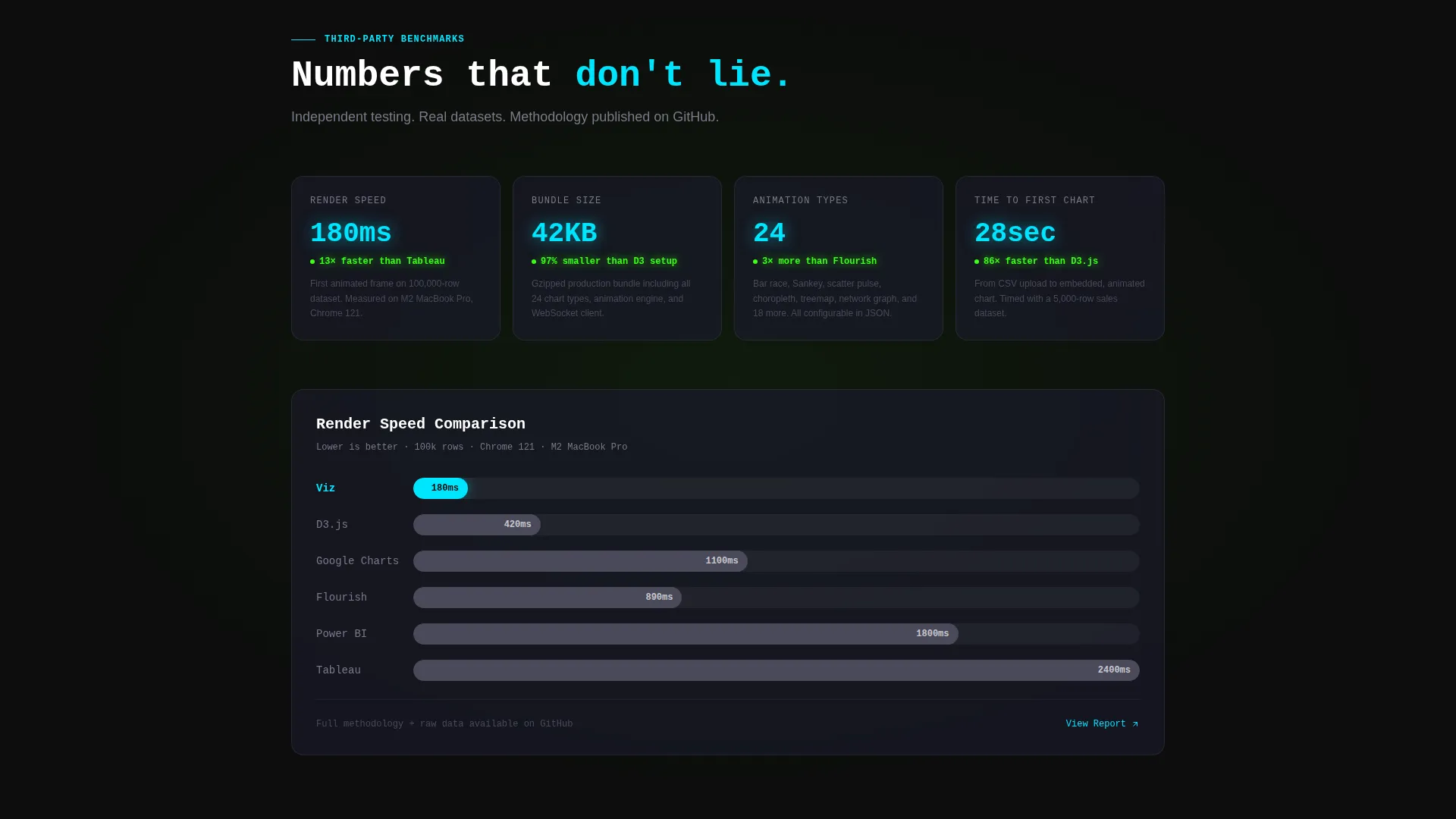
- A secondary gated path offering a benchmark report for visitors still in research mode
Feature list
This section covers the core functional and design components built into the Viz landing page template.
Interactive Comparison Widget
Visitors choose their current tool from a dropdown and instantly see a populated versus table. Columns cover render speed, animation support, embed options, learning curve, pricing per seat, and export formats. The widget builds the visitor's argument for them without requiring any scrolling or reading.
Row-Level Animation Micro-Demos
Every row in the comparison table is clickable. Clicking "animation support," for example, triggers a side-by-side panel. One side shows a static chart from a competing tool; the other shows the same data set rendered as a racing bar chart, a flowing Sankey diagram, or a particle-driven scatter plot inside Viz.
Sticky Conversion Bar
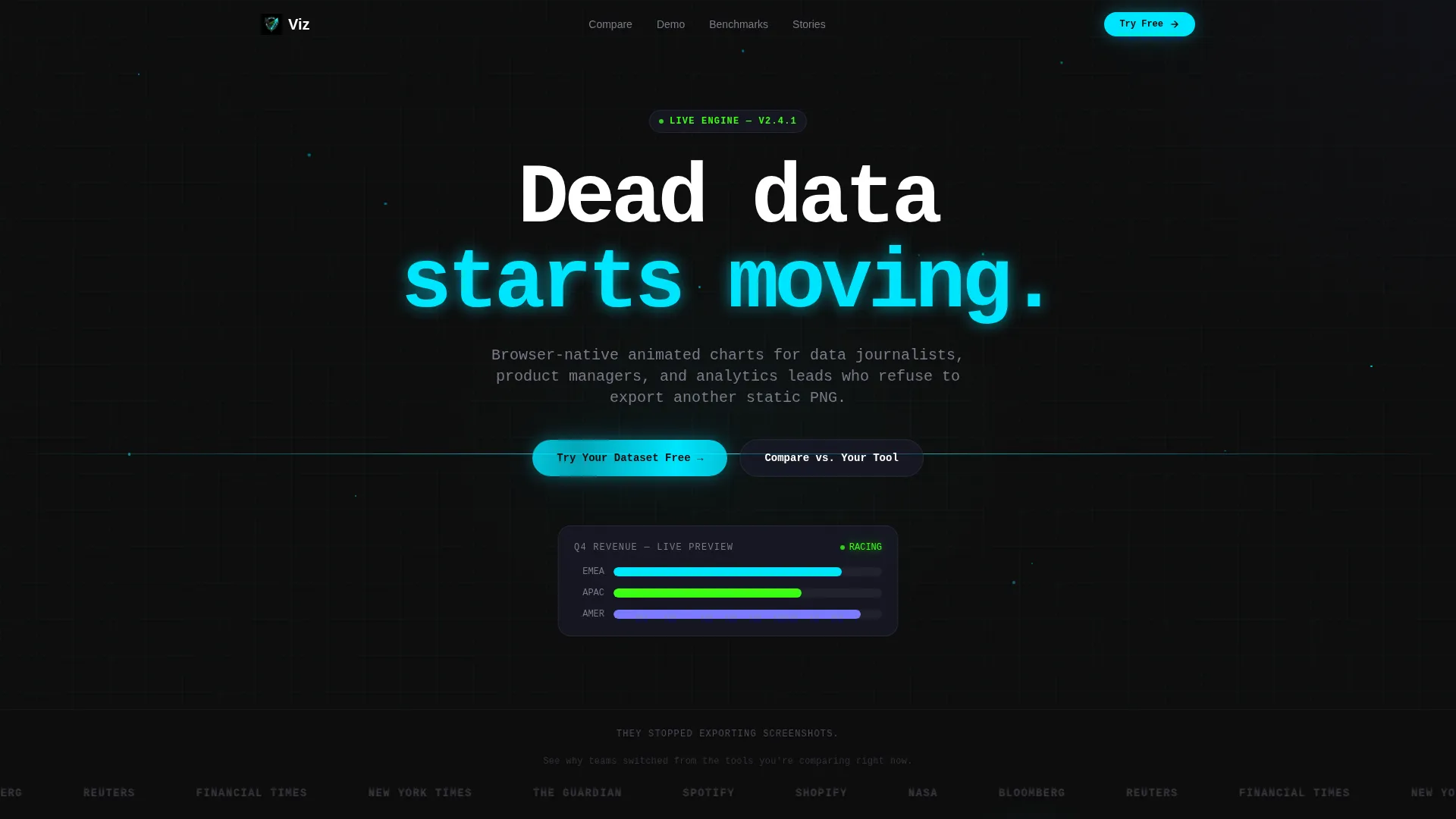
After a visitor interacts with the comparison widget, a slim carbon-black sticky bar appears at the top of the viewport. It carries a single email field, a file-drop zone for.csv or.xlsx uploads, and the primary call-to-action button labeled "Try Your Dataset Free."
Logo Bar with Motion Effect
The header opens with a horizontal ribbon of monochrome brand marks rendered in titanium against carbon black. A left-to-right motion blur animates across the ribbon, implying data in transit. Above the ribbon sits a single headline in 56-pixel white monospace type.
Dual Conversion Path Design
The page supports two distinct visitor intents at once. Active buyers are funneled toward the free dataset trial. Visitors still in research mode are offered a gated benchmark report behind an email capture form. Neither path interrupts the other.
Page sections overview
| Section | Purpose |
|---|---|
| Logo Bar Header | Establish credibility with recognizable brand marks and a bold opening headline |
| Comparison Widget | Let visitors build a live head-to-head table against their current tool |
| Row Micro-Demos | Show animated versus static chart examples triggered by clicking any comparison row |
| Sticky call to action Bar | Capture high-intent visitors with a persistent email field and file-drop zone |
| Benchmark Report Gate | Convert research-mode visitors with a gated email capture for the full report |
Design & branding system
The visual identity follows a Dynamic Motion theme using a Carbon Fiber color system. Every color decision is intentional, echoing the instrument panel of a high-performance vehicle at night.
- Backgrounds stay in the deep carbon black (#0D0D0D) to woven graphite (#1A1A2E) range, keeping the focus on data and motion
- Body text renders in titanium mid-gray (#4A4A5A) or white, while electric cyan (#00E5FF) fires on hover states, toggle switches, and active comparison columns
- Signal green (#39FF14) appears exclusively on positive-delta indicators inside the comparison table, so every bright pixel carries meaning
Mobile & speed optimization
The template is designed with a lean, interaction-first structure that supports fast loading even with animated elements on screen. The layout adapts to smaller viewports without losing the core comparison experience.
- The sticky conversion bar remains functional and visible on mobile, keeping the primary call-to-action accessible at every scroll depth
- The comparison widget and micro-demo panels are structured to reflow cleanly on narrower screens so the interactive core of the page stays usable
How this template helps you convert
The page earns the click by letting visitors prove the difference themselves. Every design and layout decision is pointed at reducing resistance and increasing conviction before any form appears.
- The comparison widget gives visitors agency immediately. They select their own tool, see their own numbers, and build their own case for switching, no sales copy required.
- The micro-demo panels transform an abstract claim like "better animation support" into a visible, felt experience. Seeing the same data set go from flat to cinematic is the conversion moment.
- The dual call to action structure meets visitors where they are. High-intent visitors get a frictionless trial entry point. Research-mode visitors get a report worth their email address.
Other information about this template
This template sits at the intersection of the Technology category, the Data and Analytics subcategory, and the Data Visualization Tool niche. It is purpose-built for comparison-driven buying journeys in that space.
- The template style is a Comparison Table layout, optimized for the Comparison/Versus landing page direction
- The header concept is a Logo Bar, a proven social-proof pattern for tools with recognizable clients
- The creative direction follows a Calculator/Tool First approach, meaning the interactive widget leads before any narrative copy asks for attention
- The Dynamic Motion theme and Carbon Fiber color system are production-ready as designed, requiring no additional color customization to match the intended brand mood

Theme
Dynamic Motion
Creative direction
Calculator/Tool First
Color system
Carbon Fiber
Style
Comparison Table
Direction
Comparison/Versus
Page Sections
Interactive Tool Comparison Widget
Row-level Animation Micro-demos
Sticky Call to Action Bar with File Drop
Logo Bar with Motion Blur Header
Dual Conversion Path Structure
Related questions
Can I edit the list of tools in the comparison dropdown?
Do the animated chart micro-demos come pre-built?
Is the sticky conversion bar usable on mobile?
What file formats does the file-drop zone accept?
Is this template suited for tools outside data visualization?



