Data Visualization Course Landing Page Template
Viz is a single-page data visualization course landing page built around a playful geometric visual identity and a multi-step skill-assessment form. It guides mid-career analysts, marketing coordinators, and career-switchers from a messy-data diagnosis straight to a personalized course tier. A comparison table, step-by-step module previews, and two distinct conversion paths make the decision feel obvious before checkout ever appears.
by Rocket studio
Quick summary
Viz is a data visualization course landing page that turns visitor self-doubt into confident enrollment. A three-step header form acts as both hook and product demo, a mid-page comparison table separates course tiers by skill ambition, and a secondary lead-capture path collects emails from visitors who are not yet ready to buy. Every section is purposeful and conversion-oriented.
Who this template is for
This template is built for course creators and educators selling data visualization training to working professionals. It resonates most when the audience already works with data but struggles to communicate it visually.
- Mid-career analysts who currently screenshot spreadsheet charts into presentation slides
- Marketing coordinators who sense a story in their numbers but lack the tools to tell it
- Career-switchers who want a polished portfolio project to open new professional doors
What problem this template solves
Most online course landing pages ask visitors to trust a syllabus. This template flips that approach. It makes visitors diagnose their own skill gap first, so by the time they reach pricing they already feel the need. The comparison table then lets them self-select by ambition rather than budget.
- Visitors leave course pages without converting because they cannot identify which tier fits them
- Generic enrollment calls to action feel premature before the visitor has felt the value
- Lead capture is lost when visitors are curious but not yet ready to commit financially
What you get with this template
You get a fully structured, single-page landing page that moves a visitor from confused to enrolled through a carefully sequenced experience. Each section carries a specific job, and nothing is decorative without purpose.
- A three-step interactive header form that functions as a live product preview
- A tier comparison table with skill-level rows for self-selection
- A secondary lead-capture path gating a downloadable cheat sheet behind email only
Feature list
This template includes a set of purpose-built components that work together across the full visitor journey.
Interactive Multi-Step Skill Assessment Header
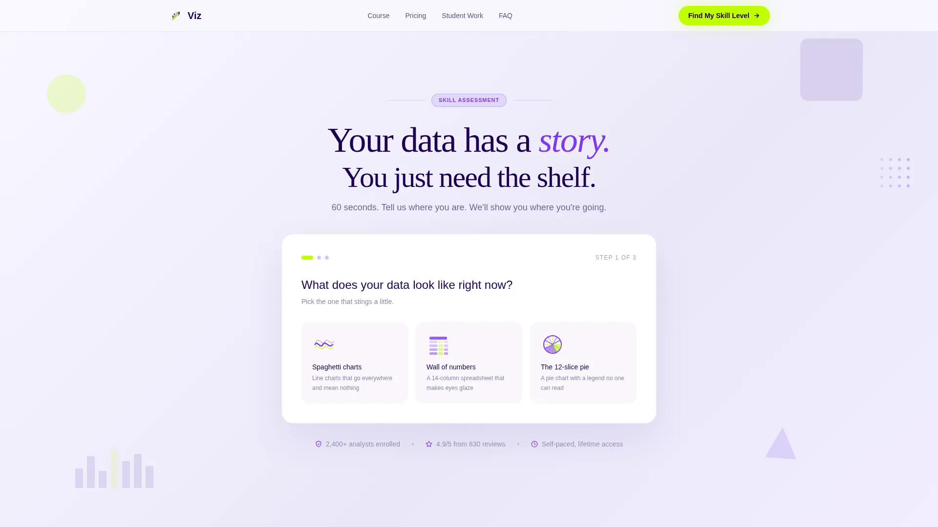
The header is a three-question form framed as a canvas exercise. Step one asks visitors what their data looks like right now, presenting geometric icon choices. Step two asks what they need to build. Step three captures an email address with a personalized learning-path promise. Each step advances with a shelf-drag animation that mirrors the course's own teaching style.
Tier Comparison Table
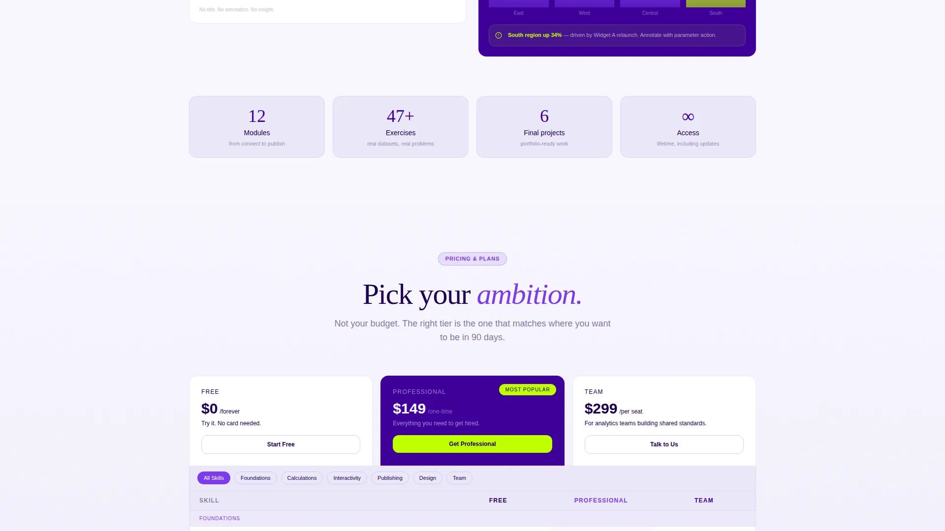
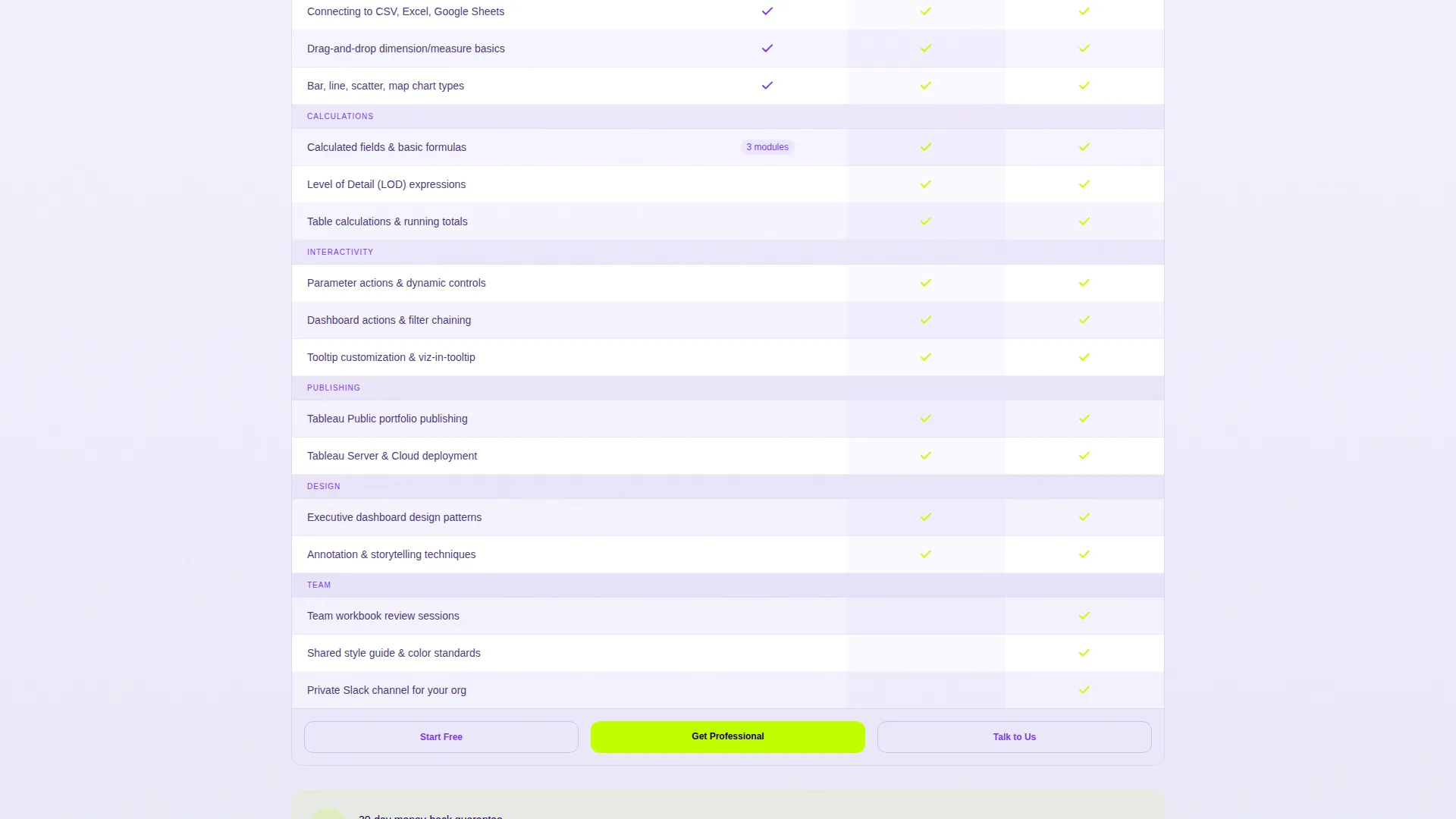
A structured three-column table places the Free, Professional, and Team tiers side by side. Each row maps to a specific skill such as level-of-detail expressions, parameter actions, or publishing workflows. Geometric checkmarks and indigo cell shading make differences scannable at a glance. Visitors self-select by recognizing the skills they want, not just the price they are willing to pay.
Step-by-Step Module Previews
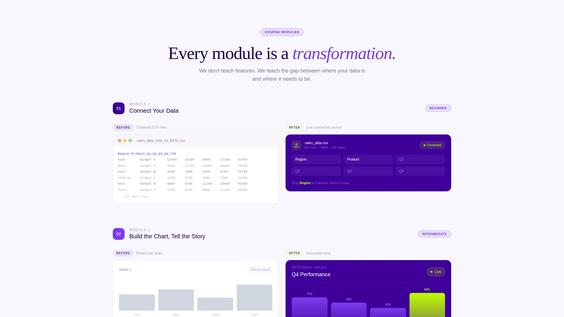
Scrolling past the header, each content section renders a course module as a before-and-after data transformation. Early sections show a raw file becoming a connected data source. Later sections show multi-dashboard projects with interactivity. The visual escalation makes the visitor feel the distance between their current state and the course outcome.
Sticky Quiz call to action Bar
After a visitor scrolls past forty percent of the page, a sticky bottom bar re-surfaces the primary call to action: "Find My Skill Level." The bar persists without obstructing content, keeping the assessment entry point available throughout the browsing session.
Secondary Lead-Capture Path
A "Download the Free Viz Cheat Sheet" offer sits alongside the primary enrollment path. It gates a PDF resource behind email only, capturing leads who are still in the research phase. This ensures the page works for visitors at different stages of the buying decision.
Personalized Quiz Results Page
After completing the three-step assessment, visitors land on a results page that delivers a recommended course tier pre-selected. The friction between diagnosis and checkout collapses because the visitor arrives at pricing with a specific recommendation already in place.
Page sections overview
| Section | Purpose |
|---|---|
| Header Assessment Form | Opens with skill-gap diagnosis and captures email |
| Raw Data Module | Shows a CSV transforming into a connected source |
| Chart Refinement Module | Demonstrates a default chart becoming a polished story |
| Tier Comparison Table | Lets visitors self-select by skill ambition |
| Advanced Projects Module | Escalates stakes with multi-dashboard interactivity |
| Quiz Results Page | Delivers personalized tier recommendation |
| Cheat Sheet Capture | Secondary email lead collection for undecided visitors |
| Sticky call to action Bar | Persistent enrollment prompt after scroll depth |
Design & branding system
The visual identity follows a Playful Geometric theme built on an Electric Indigo color system. The palette feels like a dark-mode dashboard where a single neon accent line draws the eye precisely where action is needed.
- Deep workspace indigo (#3D0099) anchors backgrounds and section dividers; bright violet (#7C3AED) fills interactive cards and tier badges; chalk-white (#F8F7FF) carries body text and table cells
- High-voltage chartreuse (#BFFF00) fires on every interactive moment: calls to action, progress indicators, and hover states
- Geometric shapes rearrange and snap into clean visualizations as the form progresses, making the design itself a demonstration of the course promise
Mobile & speed optimization
The layout is designed to remain readable and functional across screen sizes. The step-by-step scroll structure and sticky call to action bar adapt naturally to smaller viewports.
- The three-step form collapses gracefully on mobile without losing its animated shelf-drag feedback
- The comparison table is structured to allow horizontal scrolling on narrow screens so all three tiers remain accessible
- Sticky bottom bar positioning accounts for mobile browser chrome so the call to action remains visible and tappable
How this template helps you convert
The page is engineered around a quiz and assessment conversion model. Every design and copy decision funnels the visitor toward one of two outcomes: enrollment or email capture.
- The multi-step header form earns the visitor's email by delivering a personalized learning path, making the first conversion feel like a service rather than a sales ask.
- The comparison table resolves tier indecision by anchoring each row to a concrete skill rather than a price point, so visitors arrive at checkout with a specific plan already chosen.
Other information about this template
This template was designed specifically for the Tableau and data visualization online course niche, where learners often need to understand their current skill level before they can commit to a program. The page structure reflects that reality at every scroll depth.
- The template style is Comparison Table, making it well suited for any course that offers multiple enrollment tiers
- The creative direction follows a Step-by-Step Guide pattern, which mirrors how data visualization skills are actually built in practice
- The header concept is a Multi-Step Form, a format that consistently reduces bounce on skill-based course pages by making the visitor an active participant from the first second
- The landing page direction is Quiz and Assessment, which is particularly effective in the data skills training market where learners are motivated by self-diagnosis
- This template is part of the Education and Training category, subcategory Online Skill Courses, and is purpose-matched to the Tableau and data visualization course niche
Theme
Playful Geometric
Creative direction
Step-by-Step Guide
Color system
Electric Indigo
Style
Comparison Table
Direction
Quiz/Assessment
Page Sections
Interactive Multi-step Skill Assessment Header
Tier Comparison Table
Step-by-step Module Preview Sections
Sticky Quiz Call-to-action Bar
Secondary Lead-capture Path
Personalized Quiz Results Page
Related questions
Who is this landing page template designed for?
Can I use this template for a course with multiple pricing tiers?
How does the header form work as a conversion tool?
What happens after a visitor completes the quiz?
Is there a way to capture leads from visitors who are not ready to enroll?



