Community Nonprofit Engagement Landing Page Template
Pulse is a sharp, dark-themed nonprofit feedback campaign landing page built for grant managers, volunteer coordinators, and executive directors who need survey response rates they can prove to funders. It pairs live-animating email previews with flip-card template galleries, animated response-rate metrics, and a streamlined three-field lead capture modal to convert visitors into trial signups fast.
by Rocket studio
Quick summary
Pulse is a single-page, card-grid landing page template purpose-built for nonprofit feedback campaigns. It gives program teams a visually commanding page that communicates a clear message fast, surfaces live email template demos, and drives sign-ups through a sticky call-to-action bar and friction-light modal form. Every section is designed to move a skeptical grant manager toward one action.
Who this template is for
This nonprofit landing page was built for professionals whose funding depends on response rates. If your team spends time chasing incomplete survey data or defending low engagement numbers to a funder, this template gives you a landing page that does the convincing for you.
- Grant managers and program directors who need 60% or higher response rates to satisfy funder reporting requirements
- Volunteer coordinators running post-program exit interviews and debrief pulse survey campaigns
- Executive directors building the case for their next funding cycle with concrete feedback data
What problem this template solves
Most nonprofit landing page designs for feedback campaigns bury the point. Visitors arrive, read a wall of text, and leave without completing the survey form. The pulse survey template solves this by making the value of participating immediately obvious. Visitors should understand the purpose and value of a feedback request within three to five seconds, and this template is structured around that goal.
- Low response rates caused by cluttered, slow-loading, or confusing survey landing pages
- Weak landing page headlines that fail to communicate urgency or organizational mission in the first moment
- No clear single conversion goal, which splits visitor attention and drops completion rates
What you get with this template
You get a complete, ready-to-deploy nonprofit landing page that is organized around one action: getting the visitor to launch or sign up for a feedback campaign. The template provides a pre-built structure for a high-converting page, streamlining the design process so your team can focus on the message, not the markup.
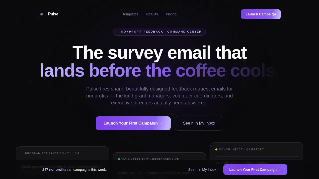
- A dark-glass hero section with three live-animating email preview panels and a primary headline
- A modular card-grid body with a flip-card template gallery, animated response-rate proof rows, and staggered testimonial cards
- A sticky bottom bar with a "Launch Your First Campaign" call to action and a three-field lead capture modal
Feature list
This pulse survey template ships with high-interactivity components that are not common in standard nonprofit landing page kits. Each feature below is built directly from the design brief and present in the final deliverable.
Dark Glass Panel Hero Grid
The hero section uses a bento-style grid of translucent, frosted-glass panels arranged against a void-black background. Each panel shows a different email template mid-render: a satisfaction survey with a glowing violet progress bar at 73%, a volunteer debrief with response bubbles, and a donor impact question with an animating metric. The visual effect gives website visitors the immediate sense of a live command center where feedback is actively flowing.
Flip-Card Email Template Gallery
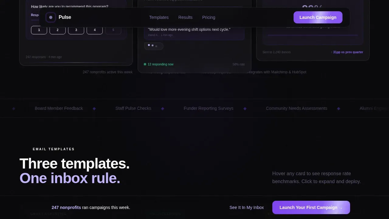
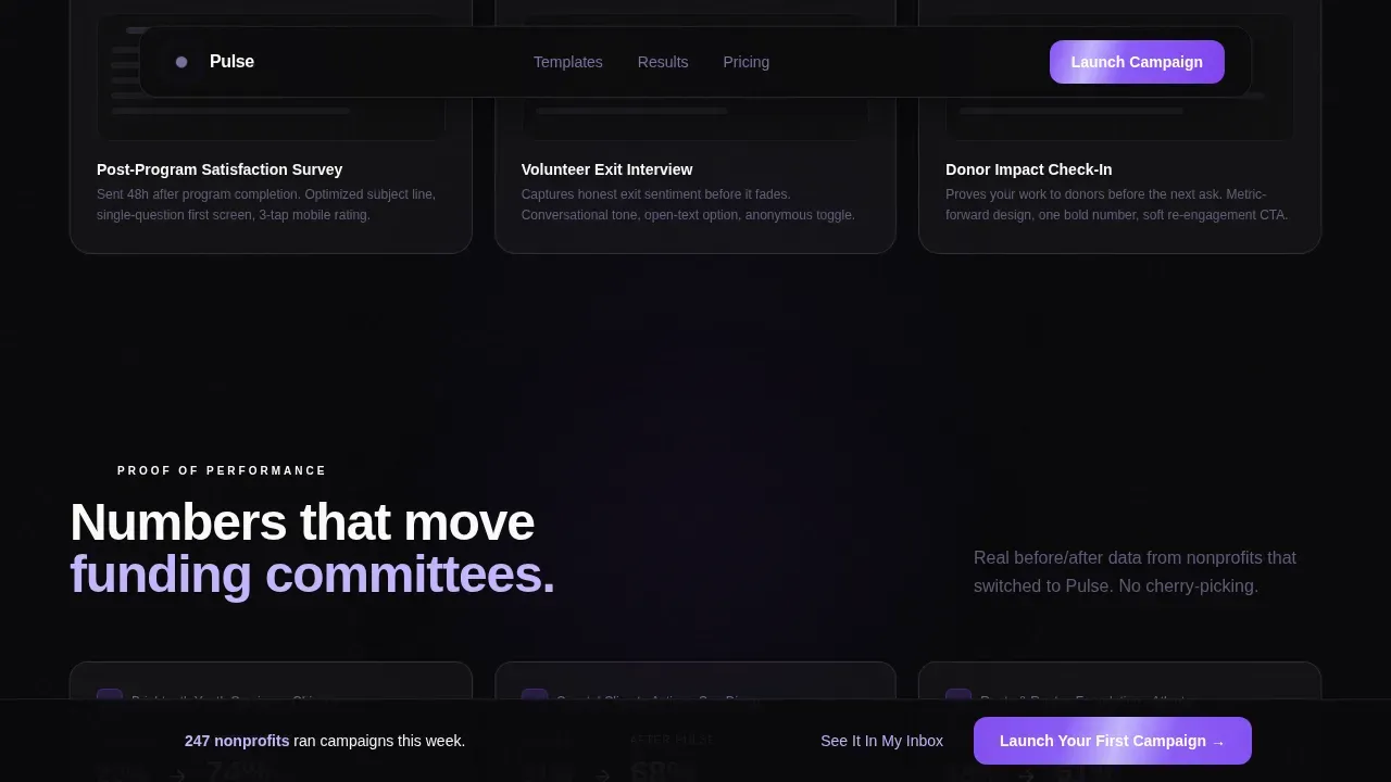
The second section is a row of three interactive email template cards. Visitors hover to flip each card and click to expand the full template view. This lets your audience inspect real pulse survey examples before committing, which builds trust and demonstrates the product's effectiveness without a single word of supporting copy.
Animated Response-Rate Proof Row
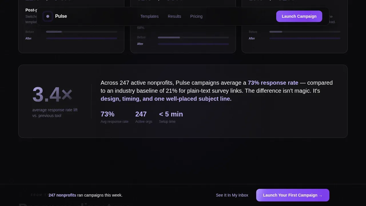
Numbers count up in real time as visitors scroll into this section. Before-and-after case study comparisons sit alongside climbing metrics to show exactly what improvement looks like for a nonprofit organization. The section uses intersection-observer scroll triggers so the animation fires at the right moment, creating a sense of momentum that reinforces the headline message.
Staggered Testimonial Cards
Program directors quote specific percentages. Each testimonial card loads with a staggered fade-up that feels like systems coming online. This social proof section gives visiting grant managers the peer validation they need to complete the sign-up form without hesitation.
Sticky Call-to-Action Bar with Lead Modal
After the second card row, a sticky bottom bar activates with the primary call to action: "Launch Your First Campaign." Clicking opens a streamlined three-field modal collecting organization name, monthly email volume range, and work email. A secondary path, "See It In My Inbox," lets visitors receive a live sample email instantly, capturing the address with zero friction.
Lightweight Single-Row Footer
The footer follows a linear single-row pattern. It keeps other links minimal and avoids pulling visitors toward the main site or away from the conversion goal. The core philosophy of this landing page is a one-to-one attention ratio, and the footer respects that constraint.
Page sections overview
| Section | Purpose |
|---|---|
| Hero Glass Grid | Open with three live email previews and a strong headline to orient visitors in under five seconds |
| Template Gallery Row | Flip-card interaction lets users inspect pulse survey examples before signing up |
| Response Rate Proof | Animated metrics and before-after data demonstrate measurable improvement |
| Testimonial Card Row | Staggered program director quotes with specific percentages provide social proof |
| call to action Bar and Modal | Sticky bar activates after row two; three-field form captures lead with minimal friction |
| Single-Row Footer | Minimal links keep focus on the primary conversion goal |
Design & branding system
The Void and Violet color system makes this nonprofit landing page feel unlike anything else in the sector. Void black dominates the background, ultraviolet pulses through buttons and progress indicators, lavender traces card borders and secondary type, and phosphor white lifts card surfaces just enough to float above the dark. The palette creates a terminal-screen energy that signals precision and confidence to a program director scrolling at 7 AM.
- Colors: void black (#09090B) background, deep ultraviolet (#7C3AED) primary, spectral lavender (#C4B5FD) accent, phosphor white (#FAFAFA) card surfaces
- Typography: DM Sans throughout, clean and modern, paired with tightly written landing page headlines and supporting copy that stays jargon-free
- Visual texture: grain overlay, faint scan lines, mouse-glow effect, and violet edge reflections on glass panels create a layered, luminous depth without adding page weight
Mobile & speed optimization
The template is desktop-first by design, matching the behavior of grant managers who open survey links at their desks early in the morning. That said, mobile friendly rendering is built in as a solid fallback so the landing page remains usable when a volunteer coordinator taps a link on their phone between site visits.
- Intersection Observer handles all scroll-triggered reveals and count-up animations, keeping performance lean without heavy scripting across the full page
- GSAP powers the hero animations only, while the rest of the page relies on CSS animations to minimize render cost on mobile devices
- The card grid reflows cleanly on smaller viewports so every user can access the template gallery, the form modal, and the call-to-action bar regardless of device
How this template helps you convert
Designing an effective landing page for a nonprofit feedback campaign requires a minimalist, high-conversion, and rapid-feedback strategy. This template is built around that principle at every scroll depth. The page focuses visitors on one goal and removes distractions at every point.
- The hero communicates the organization's value in under five seconds using a strong headline, live email previews, and a single primary call to action, so website visitors never have to ask what the page is about or why they should stay.
- The animated response-rate proof row and testimonial section demonstrate real improvement data and give visitors the specific numbers they need to justify signing up, directly addressing the objections a grant manager brings to any new tool before they complete the form.
Other information about this template
This template sits at the intersection of nonprofit email tools and high-conversion landing page design. Below are practical tips and additional context to help your team get the most out of the Pulse sharp nonprofit feedback campaign landing page template.
- The pulse survey template is designed around the principle that survey questions should be concise and directly tied to the campaign's objective, which is why the modal form limits input to three fields and the email templates shown in the gallery use a mix of open-ended and closed-ended questions
- Using a pulse survey regularly helps organizations identify areas for improvement and make timely changes, and this landing page is built to support that cadence by making it fast for any team member to launch a new campaign
- The template includes a progress bar element inside the hero email previews, which research consistently links to higher completion rates; this design tip applies directly to the pulse survey forms your organization will send after sign-up
- Pulse surveys are a powerful tool for understanding employee satisfaction, team well being, and professional growth, and the testimonial section of this template can be customized to reflect those specific use cases for volunteer coordinators tracking work life balance concerns among program staff
- The "See It In My Inbox" secondary conversion path lets visitors receive a live sample email instantly, which is one of the more practical examples of low-friction lead generation available in nonprofit landing page templates today
- There are plenty of tools available to create landing pages; popular options include Leadpages, Instapage, and Unbounce for standalone pages, while Elementor and Beaver Builder are recommended for building on WordPress. This template is a ready-made alternative that removes the need to configure those tools from scratch
- Well-designed nonprofit landing pages can help widen your organization's reach and acquire more donors by converting more visitors who land on the page through paid ads or organic traffic
- The footer uses a single-row pattern with only essential links, keeping other links off the page so visitors are not distracted by routes back to the main site
- A nonprofit running a clean water initiative, a clean drinking water awareness campaign, or any program that depends on honest community feedback can adapt the testimonial and metrics sections to reflect their specific world-facing mission
- Sharing pulse survey results with stakeholders after a campaign demonstrates the impact of the feedback collected, which supports funder trust and helps your organization make the case for money well spent
- This template is a good landing page starting point for any nonprofit business that needs to gather feedback quickly, prove effectiveness to funders, and grow their resources without a large design or development team
Theme
Startup Velocity
Creative direction
Launch Energy
Color system
Void & Violet
Style
Card Grid (Modular)
Direction
Lead Generation
Page Sections
Dark Glass Panel Hero with Live Email Previews
Flip-card Interactive Template Gallery
Animated Response-rate Proof Section
Staggered Testimonial Card Row
Sticky Call to Action Bar with Three-field Lead Modal
Related questions
What type of nonprofit organization is this template best suited for?
How does the three-field modal keep friction low for sign-ups?
Can this template support pulse survey campaigns sent at different frequencies?
Does the template work for teams focused on employee satisfaction and staff well being?
Is this landing page optimized for desktop users?



