SaaS Company Team & Engineering Profiles Website Template
Void is a high-performance SaaS team landing page built on a Tech Glass design system using a Void and Violet color palette. It features a comparison table grid of team member cards, a scrolling logo bar, hover-activated video loops, and a sticky call-to-action bar. It is designed to help fast-moving software companies convert engineering leads, enterprise buyers, and top recruits.
by Rocket studio
Quick summary
Void is a SaaS team landing page template built for software companies that move fast. It opens with a scrolling logo bar, transitions into a structured comparison table of team members, and closes visitors toward a clear action. The design runs on frosted glass panels, absolute void black, and deep orbital violet accents that feel alive in the dark.
Who this template is for
This template is built for high-output software teams who need their people page to do serious work. It speaks directly to the humans on both sides of the hiring or sales conversation.
- Engineering leads and founders evaluating whether a team matches their standards
- Enterprise buyers who need to trust the humans behind the product before they sign
- Top recruits scrolling late at night deciding if this is the company worth the leap
What problem this template solves
Most team pages are static grids of headshots and titles. They say nothing about what a team has actually shipped or why someone should care. Void solves that credibility gap.
- Visitors arrive without context and leave without confidence, costing you recruits and deals
- A flat list of names and roles fails to communicate depth of talent across disciplines
- There is no structured way to compare Engineering, Product, Design, and GTM side by side
What you get with this template
You get a fully structured, single-page team presentation built around a comparison table layout. Every section earns the next scroll.
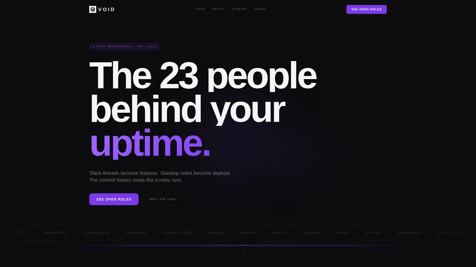
- A scrolling monochrome logo bar that establishes credibility before a single face appears
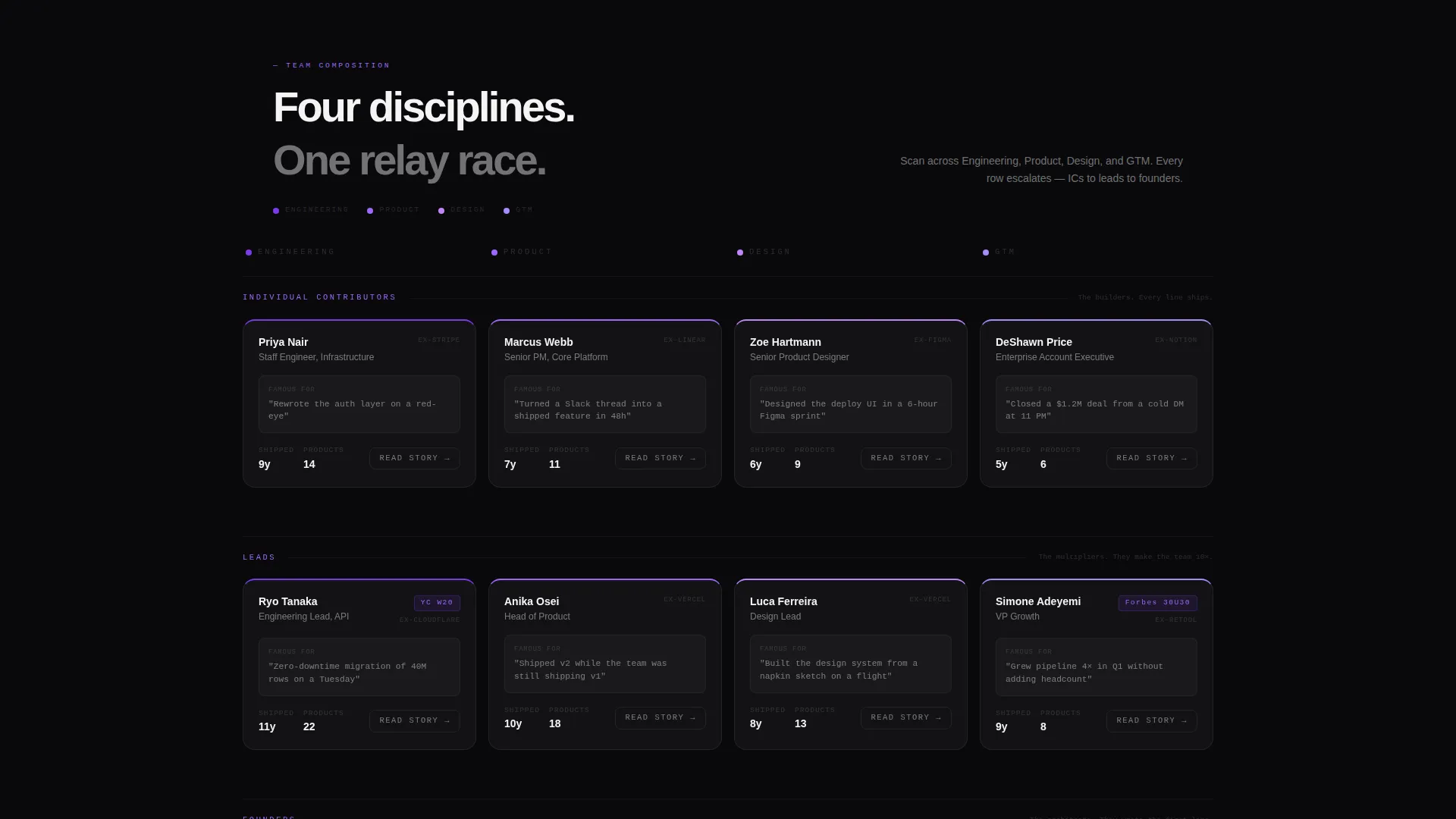
- A comparison table grid of frosted glass team member cards with name, role, years shipped, and a "famous for" tagline
- A sticky violet call-to-action bar that anchors "See Open Roles" after the first row of cards
Feature list
This template delivers a focused set of components, each designed to build trust and drive action through the page.
Scrolling Logo Bar Header
A horizontal ribbon of partner and client logos scrolls with frictionless momentum against the void black background. Logos render in monochrome, letting the companies speak for the team before any face appears. A single violet pulse line below the bar draws the eye naturally downward.
Comparison Table Team Grid
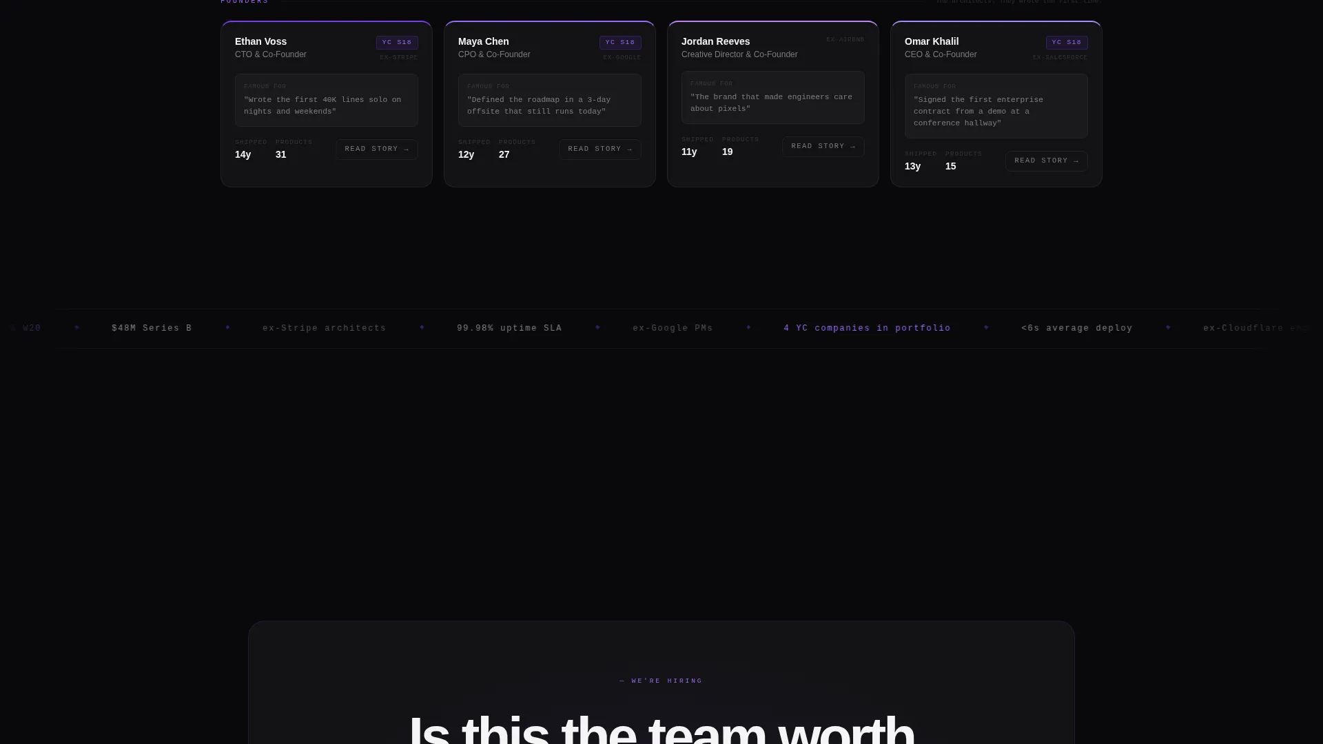
Team members are arranged in columns by discipline: Engineering, Product, Design, and GTM. Each frosted glass card shows name, role, years shipped, and a single "famous for" tagline. Rows escalate from individual contributors to leads to founders, building a rocket-assembly feeling as visitors scroll.
Hover Video Loop Cards
Each team member card reveals a short video loop on hover. The loops show real moments: typing, whiteboarding, laughing mid-standup. This keeps the page dynamic and personal without cluttering the default card view.
Sticky Call-to-Action Bar
A violet sticky bar materializes after the first row of team cards. It anchors the primary call to action, "See Open Roles," in persistent view throughout the rest of the scroll. This keeps the conversion path visible without interrupting the browsing flow.
Per-Card Secondary call to action
Every team member card carries a secondary call to action: "Read Their Story." Each link connects to an individual profile page, giving engaged visitors a direct path deeper into the team narrative.
Frosted Glass Panel System
Cards and user interface elements use a frosted glass treatment with backdrop blur over the void black background. Violet appears only on hover states, active indicators, and thin luminous border lines. Signal white type on dark backgrounds keeps every piece of text legible and sharp.
Page sections overview
| Section | Purpose |
|---|---|
| Logo Bar Header | Establishes client and partner credibility before team faces appear |
| Violet Pulse Line | Draws the eye downward and signals the transition into team content |
| Comparison Table Grid | Displays all team members by discipline in scannable, escalating rows |
| Sticky call to action Bar | Keeps "See Open Roles" visible throughout the full team scroll |
| Member Card calls to action | Links each individual to a deeper profile page via "Read Their Story" |
Design & branding system
The visual identity runs on four core values: deep darkness, quiet precision, violet energy, and glass clarity. Every design decision serves the feeling of a perfectly running system.
- Color palette: absolute void black (#09090B) for backgrounds, deep orbital violet (#7C3AED) for active and hover states, frosted glass panels (#FFFFFF0A with backdrop blur) for cards, and signal white (#F4F4F5) for all primary typography
- Violet appears sparingly and intentionally: hover states, active indicators, and the thin luminous borders that visually separate one team member from the next
- Typography lands in oversized signal white for headings, keeping the hierarchy clear against the dark canvas
Mobile & speed optimization
The template is built to remain readable and functional across screen sizes. The comparison table layout adapts so smaller screens can still scan team cards without losing structure.
- Frosted glass cards use backdrop blur at the component level, keeping layout performance contained to individual panels rather than full-page compositing
- The sticky call to action bar is designed to stay anchored and visible on mobile scroll without covering critical card content
- Hover video loops are scoped to card-level interactions, so they load contextually rather than all at once on page entry
How this template helps you convert
The page is structured as a click-through experience. Every design and content decision pushes visitors toward a specific next action.
- The logo bar opens with social proof from partner and client companies, building trust before visitors invest time reading individual bios. By the time the first card row appears, credibility is already established.
- The escalating comparison table builds density of evidence row by row. After scanning three rows and seeing shipped products, badges, and career-defining roles, the roles page feels like a natural next step, not a cold job board.
- The sticky violet bar keeps "See Open Roles" in peripheral view throughout the entire scroll, so the conversion path is always one tap or click away without requiring a return to the top of the page.
Other information about this template
This template is one page in scope, structured as a section-led landing page rather than a multi-page site. It is designed for teams who want a high-signal presence without building a full careers site from scratch.
- The template style is a Comparison Table layout, making it well suited for any SaaS company team page that wants to organize talent by discipline
- The Tech Glass theme and Void and Violet color system can be adapted to match an existing brand by adjusting the accent color and glass opacity values
- The Launch Energy creative direction means the scroll pacing is intentional: sections escalate in density, so visitors who reach the bottom have already consumed the strongest proof points
- The header concept uses a Logo Bar rather than a hero image, which is a deliberate choice to lead with institutional credibility rather than individual faces
- This template fits within the broader SaaS company website templates category and can serve as a standalone team page linked from a main product site

Theme
Tech Glass
Creative direction
Launch Energy
Color system
Void & Violet
Style
Comparison Table
Direction
Click-Through
Page Sections
Scrolling Logo Bar with Violet Pulse
Comparison Table Team Grid
Hover-activated Video Loops
Sticky Roles Call to Action Bar
Per-card Story Call to Action Links
Frosted Glass Panel System
Related questions
Who is this landing page template designed for?
Can I customize the team member cards with my own content?
How does the comparison table layout organize the team?
When does the sticky call-to-action bar appear on the page?
Can the template link each team member card to a separate profile page?



