Volt - Dynamic Energy CRM Landing Page Template
Volt is a modular, card-grid landing page template built for energy CRM platforms. It targets retail energy providers who need to showcase pipeline visibility, contract tracking, and churn intelligence in one place. The Carbon Fiber color system, Dark Glass Panel header, and Problem-to-Solution Arc layout make it feel like a live command center from the first scroll.
by Rocket studio
Quick summary
Volt is a single-page, card-grid landing page template designed for energy CRM platforms. It uses a Carbon Fiber visual system, a Dark Glass Panel header, and a Problem-to-Solution Arc structure to walk visitors from pain to proof. Every section builds toward the "Run Your Numbers" calculator call to action.
Who this template is for
This template is built for competitive retail energy providers (REPs) and the teams that run them. If your business manages commercial meters, EDI transaction reconciliation, or multi-utility contract renewals, this layout speaks your language directly.
- Energy retail account managers handling thousands of commercial meters
- Operations directors who need EDI transaction visibility at any hour
- C-suite leaders at REPs who want pipeline data without waiting on a developer
What problem this template solves
Energy CRM teams lose time and revenue when their tools are scattered. Spreadsheets, disconnected inboxes, and manual reporting create friction at every stage from enrollment to renewal. This template gives your platform a landing page that names those problems clearly and shows the fix.
- Visitors immediately recognize their own pain in the flip-card pain grid
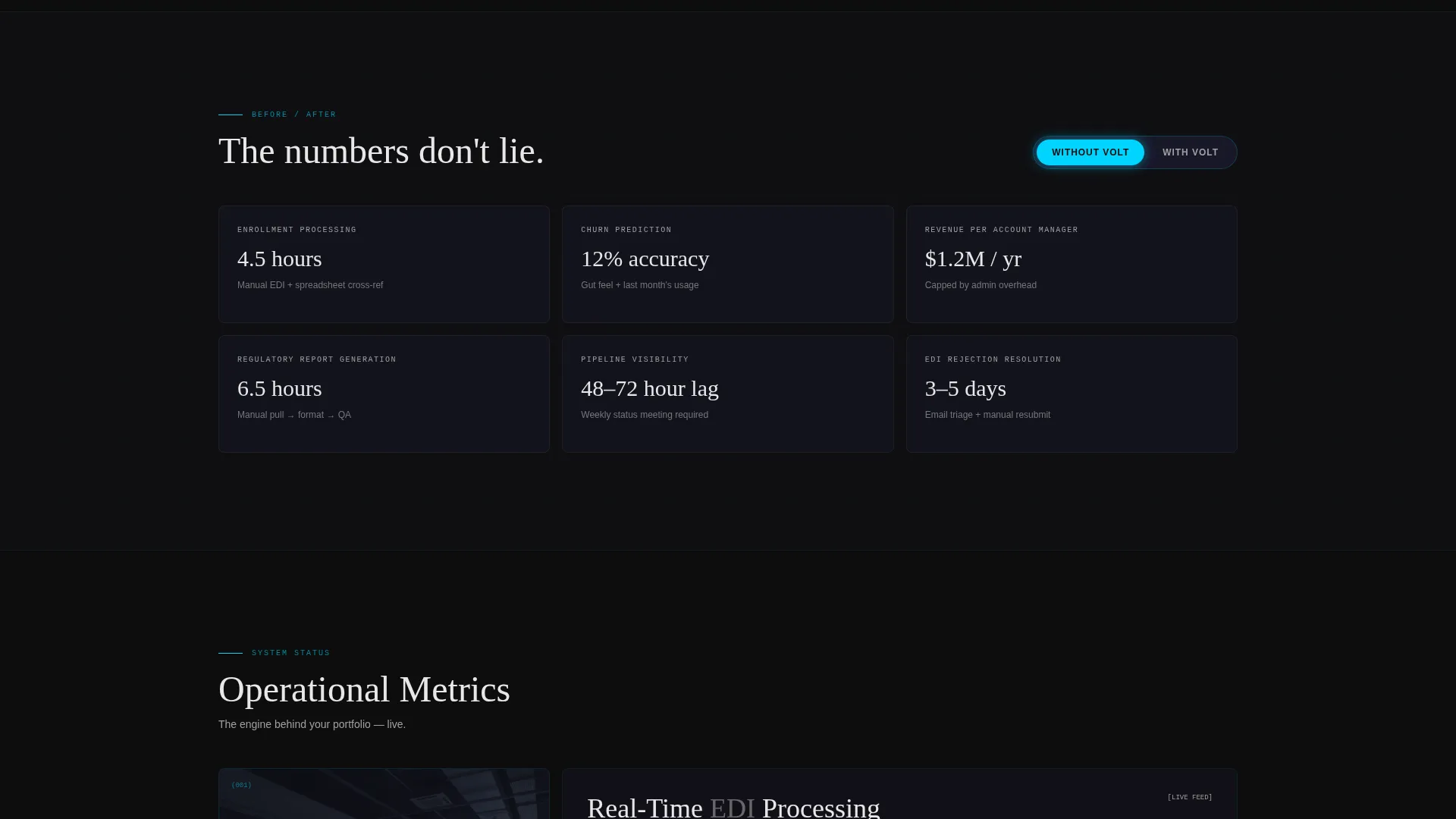
- The "Without Volt / With Volt" toggle makes switching costs visible and concrete
- The built-in calculator converts meter count and headcount into a personal efficiency delta
What you get with this template
You get a fully structured, single-page layout built around modular card components. The design is dark, technical, and purposeful, with no stock photography and no filler copy placeholders.
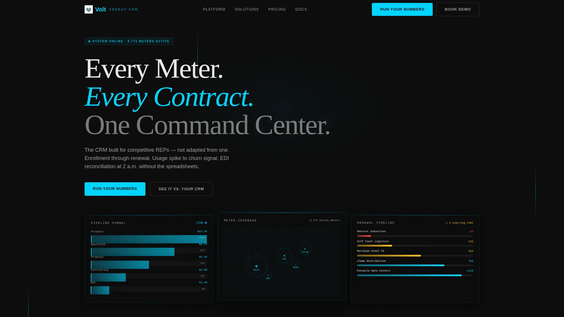
- A three-panel Dark Glass header showing a pipeline funnel, a utility account map, and a contract renewal timeline
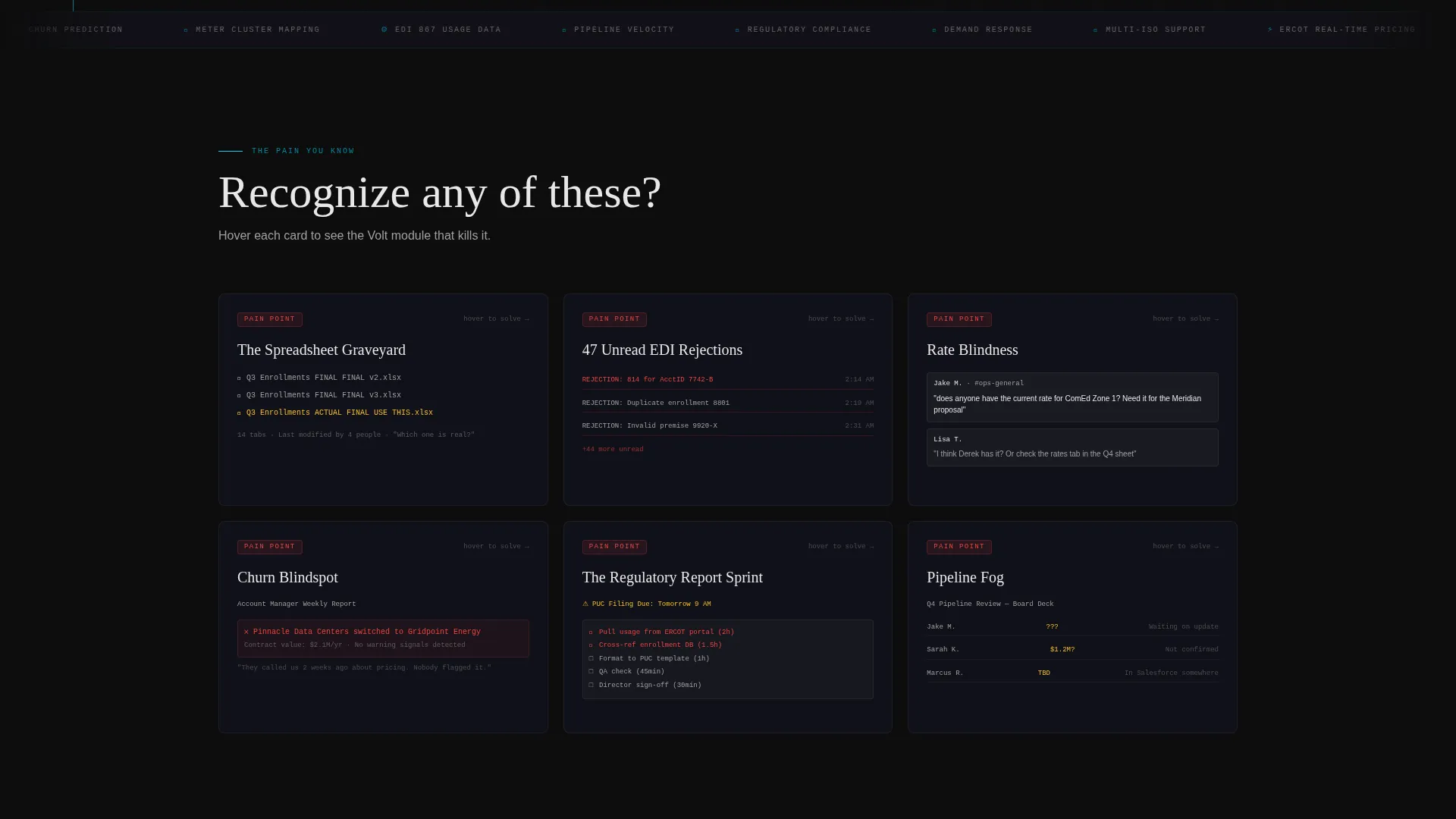
- A hover-triggered flip-card pain grid that maps each problem to a specific CRM module
- A sticky comparison toggle, a self-serve efficiency calculator, and a live comparison table path
Feature list
This template ships with six core layout and interaction systems, each designed for energy CRM conversion.
Dark Glass Panel Header
Three translucent, angled cards float against a pure black background. Each panel displays a different CRM view: a pipeline funnel with live deal values, a utility account map with meter clusters, and a contract renewal timeline with amber expiration warnings. Frosted-glass depth and faint blue edge lighting make the header feel like active software, not a screenshot.
Flip-Card Pain Grid
The first scroll section reveals a card grid of recognized pain points. Each card shows a relatable scene, such as a spreadsheet labeled "Q3 Enrollments FINAL FINAL v2" or an inbox with 47 unread EDI rejection notices. On hover, each card flips to reveal the Volt module that resolves that exact problem, carrying kinetic energy through the animation.
Escalating Stakes Arc
The page structure follows a deliberate Problem-to-Solution Arc. Pain cards escalate from individual frustration to team dysfunction, then to revenue leakage, and finally to competitive disadvantage. The solution cards grow more sophisticated with each scroll depth, ending with a full dashboard that assembles itself card by card.
Sticky Comparison Toggle
A horizontal toggle anchored at the page midpoint lets visitors switch between "Without Volt" and "With Volt" views across every metric card. Metrics covered include enrollment processing time, churn prediction accuracy, revenue per account manager, and days to generate a regulatory report. The toggle makes the value gap impossible to ignore.
Run Your Numbers Calculator
The primary call to action opens a short calculator. Visitors input their meter count, account manager headcount, and current tool (spreadsheet, legacy CRM, or no system). The output is a personalized efficiency delta, so visitors understand their own cost before the platform ever asks for their contact details.
Live CRM Comparison Table
A secondary conversion path labeled "See It Against Your Current CRM" routes visitors to a live, side-by-side comparison table. This path handles visitors who are mid-evaluation and need feature-level contrast rather than a general pitch.
Page sections overview
| Section | Purpose |
|---|---|
| Dark Glass Header | Showcase three live CRM views |
| Pain Card Grid | Surface relatable friction points |
| Flip Reveal Modules | Map each pain to a solution |
| Escalating Stakes Arc | Build urgency across scroll depth |
| Comparison Toggle Bar | Show metric delta side by side |
| Calculator Call to Action | Deliver a personalized efficiency result |
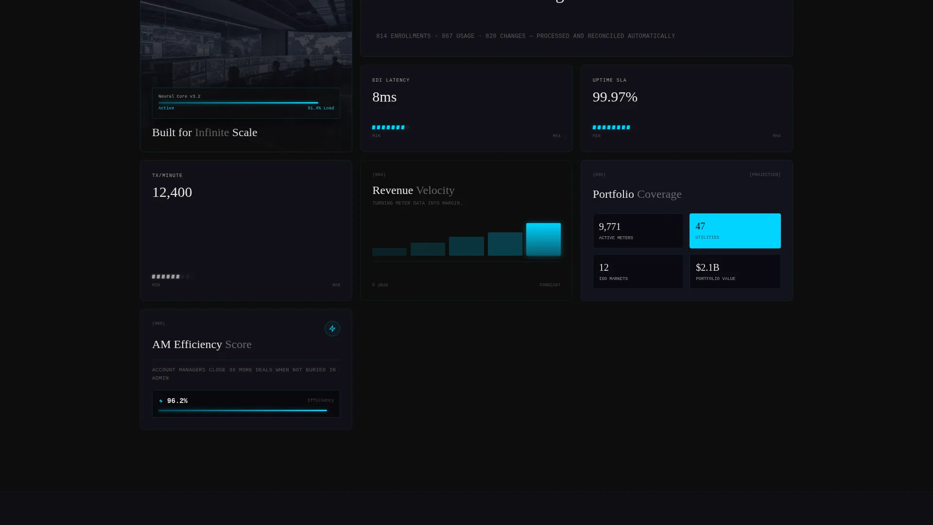
| Dashboard Assembly | Visualize the full product in motion |
| Comparison Table Path | Support mid-funnel evaluation visitors |
Design & branding system
The Carbon Fiber color system anchors every visual decision in this template. Deep cockpit black dominates all backgrounds, while electric arc blue appears only where the interface is active, keeping the palette disciplined and high-contrast.
- Core palette: deep cockpit black (#0D0D0D), woven carbon gray (#1A1A2E), electric arc blue (#00D4FF), and brushed titanium (#A0A0A0)
- Arc blue is reserved for progress bars, toggle states, hover glows, and metric pulses so the page feels like it is processing data live
- Typography and dividers use brushed titanium to keep secondary content readable without competing with the primary data layer
Mobile & speed optimization
The modular card-grid structure scales cleanly across screen sizes. Each card operates as an independent layout unit, so the grid reflows without breaking the visual hierarchy or the interaction logic.
- Flip-card interactions and the sticky toggle are designed to work within a single-column mobile stack
- The dark background system reduces rendering weight compared to image-heavy hero sections
- The calculator and comparison table are self-contained components that load independently of the full page payload
How this template helps you convert
This template is engineered around a Comparison-Versus conversion strategy. Every layout decision earns visitor trust before asking for anything in return.
- The pain grid creates immediate recognition, so visitors feel understood before they read a single feature claim.
- The sticky comparison toggle makes the cost of the visitor's current workflow visible in their own terms, using metrics they already track.
- The calculator delivers a personalized result first, which means the platform has already provided value before the visitor reaches any contact or sign-up prompt.
Other information about this template
This template is categorized under Technology, specifically the Energy Software and SaaS subcategory, with a niche focus on energy CRM platforms. It is styled with a Dynamic Motion theme and built as a Card Grid layout with modular components.
- The template style is Card Grid (Modular), meaning individual sections can be reordered or swapped without redesigning the full page
- The creative direction follows a Problem-to-Solution Arc, a structure well-suited to platforms replacing spreadsheets or legacy tools in regulated industries
- The header concept is Dark Glass Panels, a design pattern that communicates product sophistication without relying on lifestyle imagery
- The landing page direction is Comparison-Versus, making it particularly effective when prospects are actively evaluating competing energy CRM options
Theme
Dynamic Motion
Creative direction
Problem→Solution Arc
Color system
Carbon Fiber
Style
Card Grid (Modular)
Direction
Comparison/Versus
Page Sections
Dark Glass Panel Header
Flip-card Pain and Solution Grid
Sticky Comparison Toggle
Personalized Efficiency Calculator
Escalating Stakes Arc Structure
Live CRM Comparison Table Path
Related questions
Who is this landing page template built for?
Can I use this template if my platform is not fully built yet?
Does the calculator component require backend development?
How does the flip-card pain grid work?
What makes this different from a generic SaaS landing page template?



