Wedding Review Management Comparison Landing Page
Vow is a single-page comparison table landing page built for a wedding vendor review management platform. It pulls scattered reviews from multiple listing sites into one clean dashboard view. The template guides visitors through an interactive plan explorer, a scenario-based recommendation flow, and a frictionless freemium signup path designed to convert curious vendors into active users.
by Rocket studio
Quick summary
Vow is a comparison table landing page template for a wedding review management platform. It gives florists, photographers, DJs, venue managers, and planners one place to see, respond to, and act on every review they receive across multiple listing platforms. The design is clean, data-forward, and built to move visitors from curiosity to signup without friction.
Who this template is for
This template is built for wedding industry professionals who manage their reputation across more than one listing platform. It speaks directly to vendors who feel the pressure of scattered reviews and need a smarter way to respond and grow.
- Solo wedding photographers juggling multiple listing profiles between shoots
- Venue managers watching inquiry rates drop after a single negative review
- Wedding planners who want to prove their track record at a glance
What problem this template solves
Wedding vendors lose bookings because their reviews live on too many platforms at once. Checking each one separately wastes time and makes it nearly impossible to spot patterns or respond quickly.
- Reviews from multiple platforms are impossible to track without a central view
- A single harsh review can suppress inquiries before a vendor even knows it exists
- Vendors with hundreds of happy clients struggle to communicate that social proof clearly
What you get with this template
This landing page template gives you a fully structured, single-page layout designed to present a review management platform with clarity and confidence. Every section is purpose-built to educate, engage, and convert.
- A three-column plan comparison table with Free, Pro, and Enterprise tiers
- An interactive scenario selector that reshuffles the recommended plan based on vendor type
- A dual conversion path: a primary freemium signup and a secondary public review audit lead capture
Feature list
This template packages several carefully considered interactive and visual components into one coherent landing page experience.
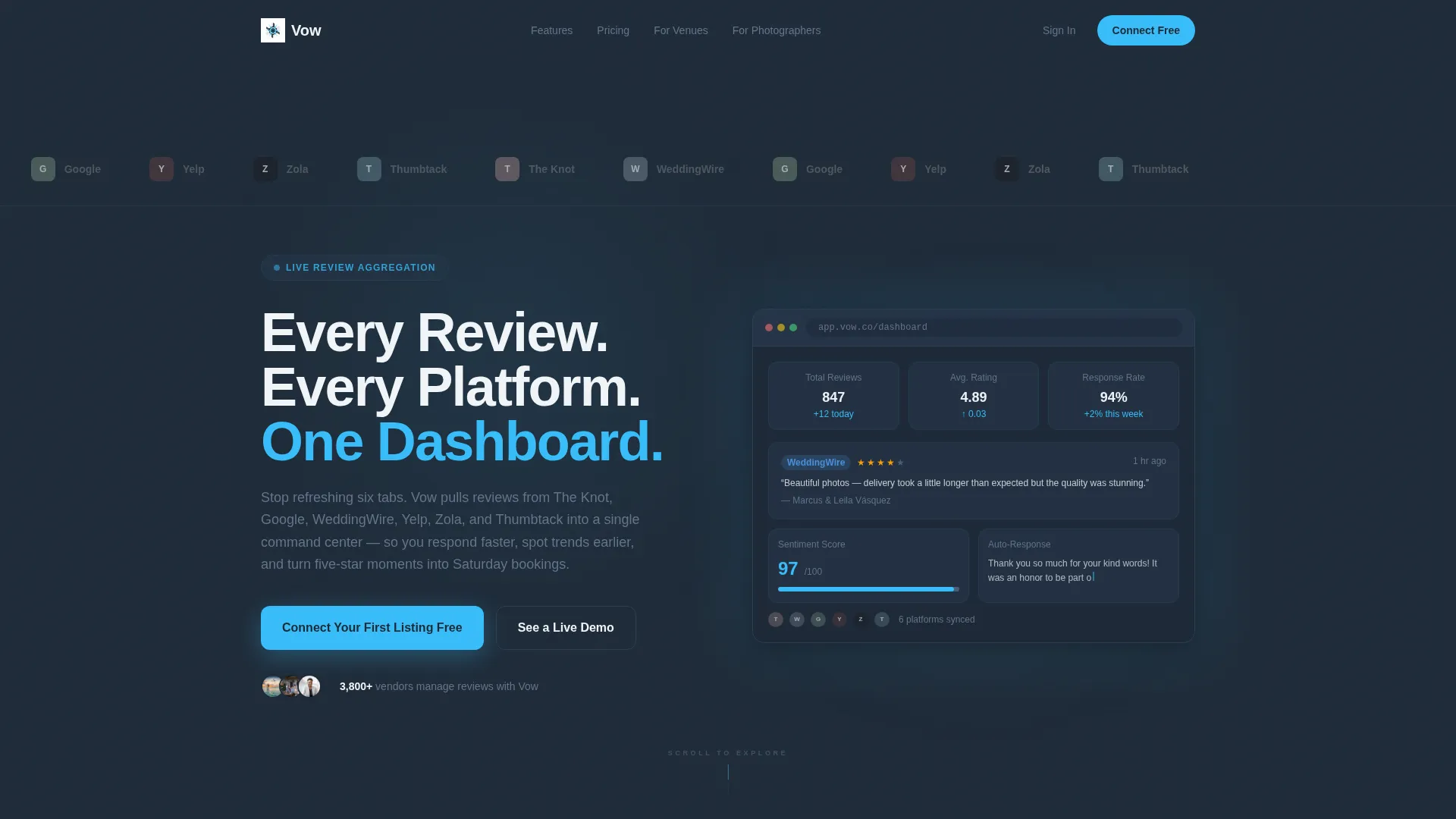
Scrolling Platform Logo Bar
A horizontal ribbon of wedding platform logos drifts slowly across the top of the page. Each logo appears slightly desaturated at rest and blooms to full color on hover, signaling broad platform coverage before the visitor reads a single word.
Interactive Plan Comparison Table
A three-column table lays out Free, Pro, and Enterprise plans side by side. Hovering any feature row triggers a micro-animation showing a miniature dashboard widget that demonstrates that feature in context, so visitors understand the value without needing to imagine it.
Scenario-Based Plan Selector
Visitors choose a profile that matches their situation, such as a photographer with two listings or a planner managing six vendor profiles. The page responds by highlighting the most relevant plan and surfacing a testimonial from that exact vendor type.
Live Product Preview Animation
Beneath the headline, a browser-frame mockup runs a short looping animation. A review card slides in, a sentiment score ticks upward, and a response template auto-populates, giving visitors a credible first glimpse of the actual product experience.
Dual Conversion Entry Points
The primary call to action, "Connect Your First Listing Free," is pinned to the Free plan column and repeated as a floating bar after sixty percent scroll depth. A secondary path, "See Your Review Score," captures leads from hesitant visitors by running an instant public-data audit using just a business name.
Slate and Sky Visual System
The color system uses deep charcoal slate for backgrounds, cool mid-gray for secondary text and borders, open-sky blue for all active and action elements, and soft cloud white for card surfaces. Sky blue appears only where the eye should focus, keeping the layout quiet and data-forward everywhere else.
Page sections overview
| Section | Purpose |
|---|---|
| Platform Logo Bar | Establishes multi-platform credibility at first glance |
| Hero with Animation | Delivers the core promise and a live product preview |
| Plan Comparison Table | Lets visitors evaluate Free, Pro, and Enterprise tiers |
| Scenario Selector | Personalizes plan recommendation by vendor type |
| Testimonial Surface | Validates the platform with peer social proof |
| Floating call to action Bar | Re-engages visitors who have scrolled past sixty percent |
| Review Audit Entry | Captures leads before full account creation |
Design & branding system
The Slate and Sky color system creates a dashboard-style environment that feels confident and data-ready without being cold. Sky blue is used with discipline, appearing only on interactive and action elements so that every call to action registers immediately.
- Deep charcoal slate (#1E2A38) for primary backgrounds and navigation areas
- Open-sky blue (#38BDF8) for toggle switches, active plan columns, progress bars, and all call-to-action buttons
- Soft cloud white (#F0F4F8) for card surfaces and alternating table rows, with cool mid-gray (#64748B) handling secondary text and table borders
Mobile & speed optimization
The layout is structured for a clean mobile reading experience. The comparison table and scenario selector are designed to remain functional and readable at smaller viewport sizes.
- The floating call to action bar activates after sixty percent scroll depth, keeping the conversion path accessible on any screen size
- The scenario selector flow is compact enough to guide mobile visitors without requiring horizontal scrolling or zooming
How this template helps you convert
Every design and layout decision in this template is oriented toward one outcome: turning a curious wedding vendor into a signed-up user.
- The live product animation in the hero section proves the platform works before a single marketing claim is made, reducing skepticism early in the visit.
- The scenario selector removes decision paralysis by recommending the right plan based on the visitor's own situation, then reinforcing it with a relevant peer testimonial.
- The dual conversion path means visitors who are not ready to sign up can still enter through the review audit, giving the platform a lead even before account creation.
Other information about this template
This template is part of a broader Dashboard Pro theme family and is built specifically for the wedding software and software-as-a-service niche. It is a strong fit for founders and product teams launching or repositioning a review management tool in the wedding industry.
- The Dashboard Pro theme is designed for data-heavy platforms that need to communicate clarity and control at a glance
- The Interactive Explorer creative direction is well suited to platforms with tiered pricing, where letting visitors self-select their path reduces friction more than a static sales pitch
- The Freemium and Trial landing page direction pairs naturally with a two-step lead capture strategy: one path for ready buyers and one for visitors who need a proof point first
- The template style is a Comparison Table layout, which is particularly effective when plan differentiation is central to the purchase decision


Theme
Dashboard Pro
Creative direction
Interactive Explorer
Color system
Slate & Sky
Style
Comparison Table
Direction
Freemium/Trial
Page Sections
Scrolling Platform Logo Bar
Interactive Plan Comparison Table
Scenario-based Plan Selector
Live Product Preview in Hero
Dual Conversion Entry Points
Related questions
Can I customize the plan names and feature rows in the comparison table?
Does the scenario selector require any special coding to work?
Is this template suitable for a platform that covers only a few review sites?
Can both conversion paths run at the same time?


