Wedding Email Marketing Landing Page Template
Vow is a modular card-grid landing page template built for wedding industry email marketing services. It opens with an animated live-metrics wall, moves through side-by-side comparison cards, and closes with a sticky three-step audit form. The design channels a SaaS dashboard feel using void black, deep ultraviolet, and phantom lavender to prove campaign performance before showing a single decorative image.
by Rocket studio
Quick summary
Vow is a high-performance, card-grid landing page template purpose-built for promotional wedding email services. It leads with animated performance counters, guides visitors through data-driven comparison cards, and converts with a friction-reduced three-step form. Every section is engineered to build trust through numbers, not aesthetics, making it ideal for any wedding business that sells results.
Who this template is for
This landing page is designed for professionals who sell or manage email campaigns in the wedding industry. If your job depends on getting real responses from real guests, Vow speaks your language directly.
- Wedding planners who need bookings confirmed and vendor timelines coordinated through targeted email outreach
- Venue marketing managers who want bodies in seats at open-house weekends and ceremony tours
- Stationery brands launching seasonal collections of wedding invitations and save-the-date sets
What problem this template solves
Most wedding business owners use generic email templates that were never built for the wedding industry. Those templates ignore the nuance of a love story, the urgency of a wedding day deadline, and the specific expectations couples bring to every message they open. The result is a high bounce rate, low clicks, and zero bookings.
This landing page solves that by making the performance gap impossible to ignore:
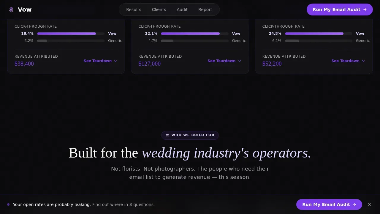
- Side-by-side comparison cards show open-rate differentials, click maps, and revenue attribution so potential clients can see the problem clearly
- A sticky call to action bar with a three-step form captures visitors at peak intent, reducing drop-off and improving completion rates
- A gated benchmark report acts as a lead magnet for visitors who are curious but not yet ready to commit, growing the email list without friction
What you get with this template
You get a complete, ready-to-customize single-page layout that puts data front and center. The template comes packed with sections, components, and interaction states that do the persuasion work before a single conversation happens.
- A live metrics hero wall with animated counters, a modular comparison grid, client-segment cards, a sticky audit form, and a gated report section
- DM Sans body typography paired with Fraunces editorial serif accents across void black, deep ultraviolet, phantom lavender, and signal white
- High-interactivity components including expandable comparison cards, a three-step multi-field form, scroll-fade reveals, counter animations, and a frequently asked question accordion
Feature list
This template delivers a focused set of features drawn directly from its brief. Each one serves a specific conversion purpose on the wedding landing page.
Animated Live Metrics Hero Wall
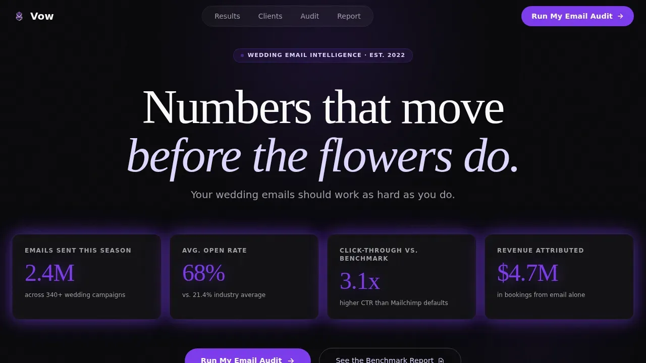
The first thing a visitor sees is a grid of ticking counters: emails sent, average open rate, and click-through benchmarks. Numbers animate upward on page load using GPU-accelerated transforms. There is no hero photo of tulle or flowers, just violet numerals on void black that prove performance immediately and set strong expectations before the visitor scrolls.
Modular Comparison Card Grid
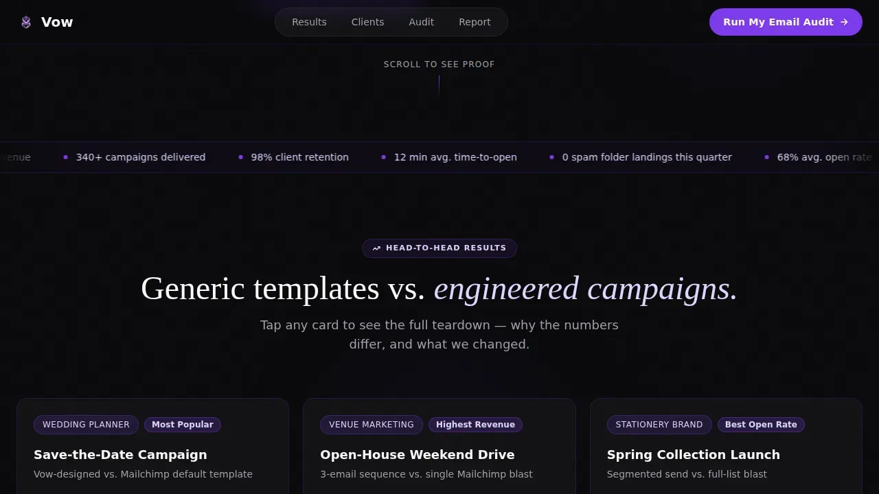
Each card places a generic campaign side by side with a Vow-designed campaign. Visitors can tap to expand any card and see the full case study, including open-rate differentials, click maps, and revenue attribution displayed as clean data visualizations. This format helps potential clients understand exactly why the numbers differ, building an airtight argument card by card.
Sticky Three-Step Audit Form
A violet sticky bar appears after the third comparison card and anchors the primary call to action: "Run My Email Audit." The form captures the visitor's current email service platform, average list size, and next campaign date across three separate steps. Keeping each field on its own step reduces friction and lifts completion rates meaningfully.
Gated Benchmark Report Section
A secondary conversion path sits below the main audit form. Visitors who are not ready to commit can download a benchmark report by entering only their email address. This acts as a lead magnet that captures the curious alongside the convinced, growing the email list without requiring the visitor to exchange more than a single field.
Client Segment Cards
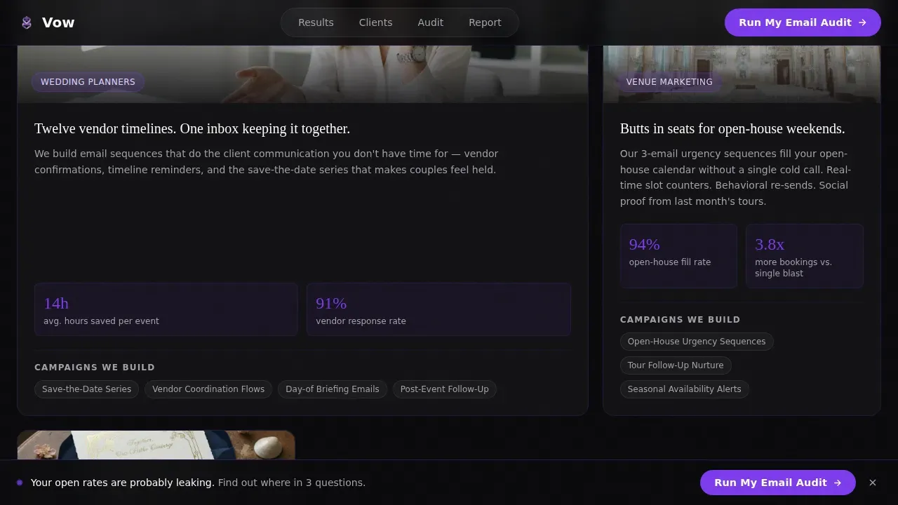
Three asymmetric cards present the template's ideal clients: wedding planners, venue marketing managers, and stationery brands. Each card speaks directly to that segment's core pain, whether that is coordinating guests across a vendor timeline, filling open-house seats, or launching seasonal wedding invitations to a cold list. The layout makes every visitor feel like the page was built for them.
Scroll-Triggered Animation System
Counter animations, slideInBlur transitions, scroll-fade reveals, orbit pulse effects, and the sticky bar all fire through an Intersection Observer pattern. Only GPU-accelerated transforms are used, keeping the site fast and avoiding layout reflow. This animation system creates the electric, real-time feel of watching a send-counter climb the moment after you hit deploy.
Page sections overview
| Section | Purpose |
|---|---|
| Live Metrics Hero | Animated counters prove performance on load |
| Comparison Card Grid | Side-by-side campaign data builds argument |
| Client Segment Cards | Three ICP cards match visitors to use case |
| Sticky Audit call to action Bar | Three-step form captures primary conversion |
| Benchmark Report Gate | Email-only download captures secondary leads |
| Footer Row | Single-row linear footer closes the page |
Design & branding system
Vow runs on a Void and Violet color system that feels like a SaaS dashboard crashed a bridal shower. The palette is data-dense and dark, with violet pulses that glow like notification badges. Every interactive state, including hovers, toggles, and active card borders, fires in deep ultraviolet so the site always feels alive.
- Colors: absolute void black (#09090B) for backgrounds, deep ultraviolet (#7C3AED) for interactive states and accents, phantom lavender (#DDD6FE) for card highlights, and signal white (#FAFAFA) for card surfaces
- Typography: DM Sans handles all body copy and user interface labels for clean readability; Fraunces provides editorial serif weight to headlines and pull quotes, adding personality without breaking the dashboard feel
- Logos, photo treatments, and any brand marks sit inside modular card tiles so you can customize visuals without breaking the grid layout
Mobile & speed optimization
Over 60 percent of web traffic now comes from mobile devices, so this landing page is built desktop-first but fully responsive. A mobile-responsive design improves user experience and supports higher conversion rates across every screen size. Responsive structure also matters for search engines, which prioritize mobile-friendly pages in rankings.
- All call-to-action buttons are sized above 44 by 44 pixels so they remain thumb-friendly on mobile devices and smaller screens
- The animation system uses only GPU-accelerated transforms and an Intersection Observer pattern, targeting a page load time under 3 seconds to reduce bounce rate
- Compress images before uploading to the template to keep load times fast, since even a one-second delay can drop conversions by 7 percent
How this template helps you convert
A high-converting wedding landing page must combine proof with a clear, low-friction path to action. Vow is structured so every scroll deepens the argument and every section points toward one of two conversion outcomes.
- The metrics hero and comparison grid create immediate social proof, building trust with website visitors before they reach the form, so the call to action feels earned rather than rushed
- The sticky three-step audit form removes form-fatigue by spreading fields across separate steps, which keeps completion rates high and reduces the bounce rate among visitors who would otherwise drop off at a long form
- The gated benchmark report gives visitors a second path to exchange value, turning a browsing session into a lead by offering a useful download in exchange for a single email address
Other information about this template
This section covers practical details that help you get the most from the template across planning, setup, and ongoing use.
- The Vow high converting wedding email marketing landing page template is designed to work as a standalone promotional page, not as a contact page or multi-page website
- You can customize colors, swap logos, update photo assets, and replace copy to match any wedding business without rebuilding the layout
- The template is aligned with best practices for landing pages driven by traffic from a google ads campaign, a facebook ad, or a social media post, since its messaging and structure match the promise-to-page consistency that reduces bounce rate
- When you drive traffic from search engines, the minimalist layout and fast load time help retain website visitors who arrive from organic results
- Building relationships with other wedding vendors is easier when you can share a polished, data-backed landing page that explains your services at a glance
- The benchmark report section doubles as a lead magnet, giving potential clients instant access to useful industry data in exchange for their email
- Use bullet points and clear section headers when customizing copy to maintain the skimmable, dashboard-style feel of the original design
- Wedding invitations, save-the-date campaigns, open-house reminders, and ceremony RSVP sequences are all examples of campaigns this landing page is designed to promote
- Building trust with ideal clients starts the moment they land on the page; the metrics wall answers their first question before they think to ask it
- The to do list for setup is short: update the counter stats, swap segment card copy for your three target audiences, and connect your form fields to your preferred collection method
- Regularly update testimonials and data figures so the page reflects current performance and keeps feedback loops visible to new visitors
- Most couples and wedding industry clients respond well to urgency cues; the sticky bar creates a persistent visual nudge that keeps the call to action in view throughout the scroll
- The template supports video embeds inside card tiles for teams that want to add a short explainer or campaign preview, since video can increase engagement significantly
- Use google analytics to track form completion rates and scroll depth so you can make data-driven improvements over time
- The special day context of wedding planning means guests and friends share recommendation links; a fast, credible landing page converts that referral traffic more reliably than a generic site
Theme
Startup Velocity
Creative direction
Stats-First Impact
Color system
Void & Violet
Style
Card Grid (Modular)
Direction
Comparison/Versus
Page Sections
Animated Live Metrics Hero Wall
Modular Comparison Card Grid
Sticky Three-step Audit Form
Gated Benchmark Report Download
Client Segment Asymmetric Cards
Scroll-triggered Animation System
Related questions
Who is the Vow landing page template designed for?
Can I customize the colors and copy in this template?
Does this template work on mobile devices?
What is the purpose of the three-step audit form?
How does the benchmark report section work?



