Voyage — Luxury Resort Landing Page Template
Traverse is a modular card-grid landing page built for a ski resort customer relationship management platform. It combines a high-fidelity dashboard preview header with an interactive feature matrix layout, guiding operations directors, marketing leads, and revenue managers through a unified guest data story, from first lift scan to loyal season-pass renewal, in one visually cohesive click-through experience.
by Rocket studio
Quick summary
Traverse is a single-page, click-through landing page template designed for a ski resort CRM platform. It opens with a striking dashboard preview, flows through a modular card-grid feature matrix, and closes with a clear call to action. Every section is built to help resort teams feel the weight of fragmented data, and the relief of having it unified.
Who this template is for
This template is built for technology companies and SaaS platforms serving the ski and mountain resort industry. It speaks directly to the people managing resort operations at scale.
- Resort operations directors overseeing multiple legacy systems across a single mountain
- Marketing leads who need guest segmentation beyond basic email personalization
- Revenue managers tracking spend patterns, powder-day rebooking rates, and seasonal trends
What problem this template solves
Resort teams often juggle five or more disconnected platforms covering lift access, rental bookings, food and beverage spend, lesson scheduling, and loyalty programs. No single view ties a guest's full journey together. This template makes the case for a unified platform, visually, structurally, and persuasively.
- Visitors immediately see the cost of fragmentation through the feature matrix layout
- Each module card connects to adjacent ones, illustrating how data flows across the platform
- The click-through structure removes form friction and routes qualified visitors to a demo booking page
What you get with this template
This template delivers a complete, production-ready landing page layout for a ski resort CRM platform. Every section is pre-structured so design and content can be dropped in without rebuilding from scratch.
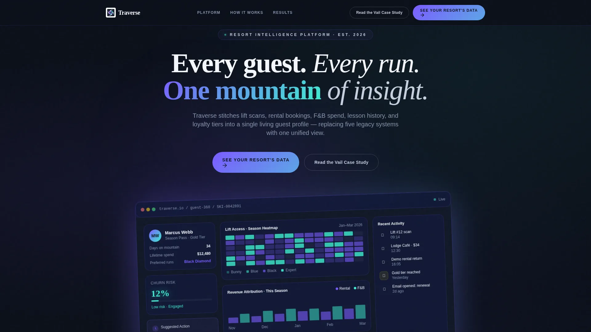
- A high-fidelity dashboard preview header showing a guest-360 profile with lift heatmap, spend timeline, churn score, and next-action card
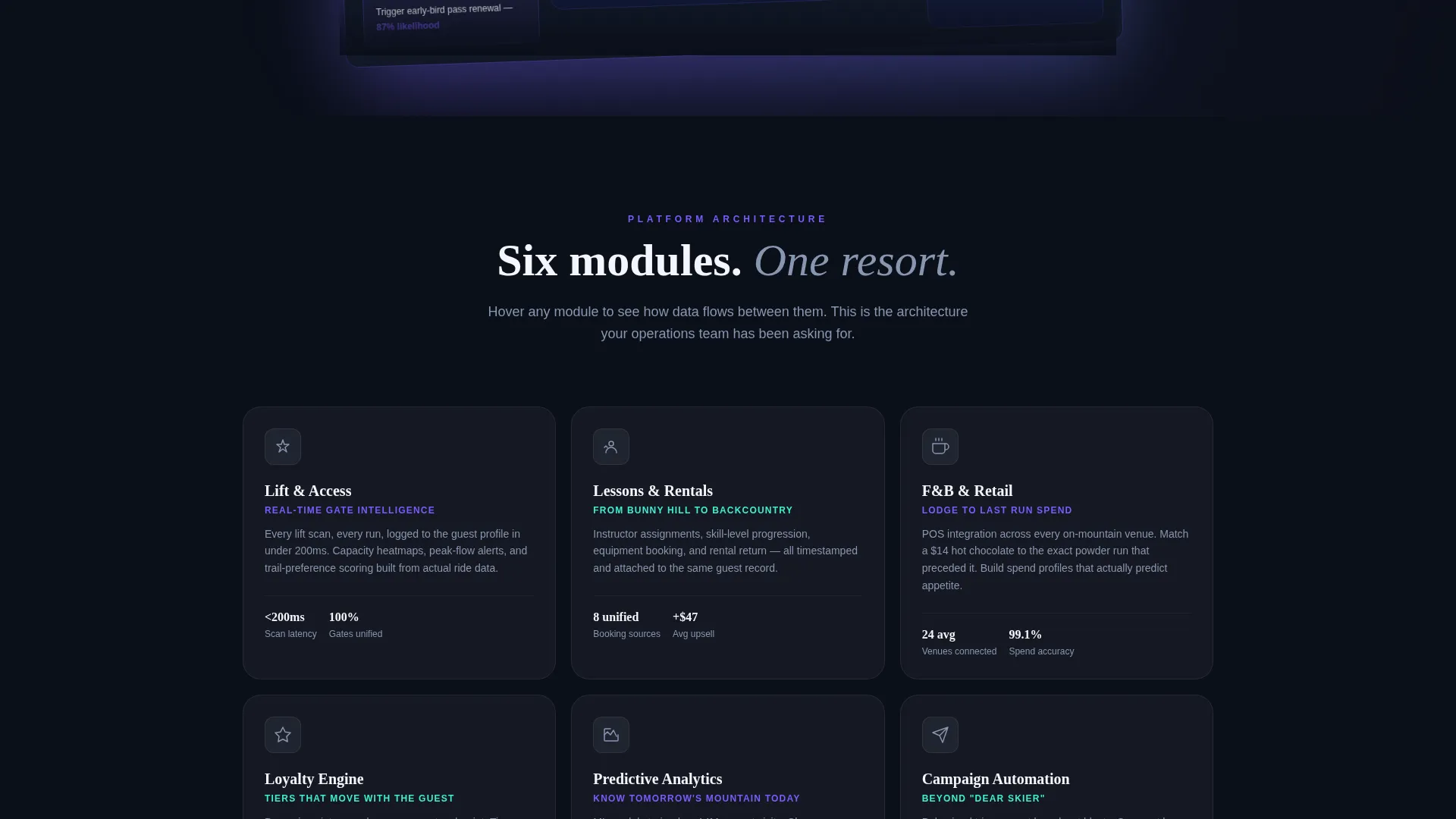
- A modular card-grid feature matrix with six platform module cards and an animated guest-journey break card spanning the full grid width
- A pinned navigation call-to-action button and repeated inline call-to-action placements after every second row of cards
Feature list
This template is built around a tightly sequenced set of design and structural features. Each one serves a specific role in moving resort technology buyers from awareness to action.
Guest-360 Dashboard Header
The header renders a high-fidelity platform screenshot at a three-quarter axis rotation. It shows a realistic skier profile including a lift-access heatmap, a spend timeline, a predictive churn score at 12%, and a suggested next-action card. A soft violet shadow grounds the render without flattening it.
Modular Card-Grid Feature Matrix
Six platform module cards cover Lift and Access, Lessons and Rentals, Food and Beverage and Retail, Loyalty Engine, Predictive Analytics, and Campaign Automation. Hovering any card reveals integration lines that connect it to adjacent modules, letting visitors mentally assemble the full platform architecture as they scroll.
Animated Guest Journey Break Card
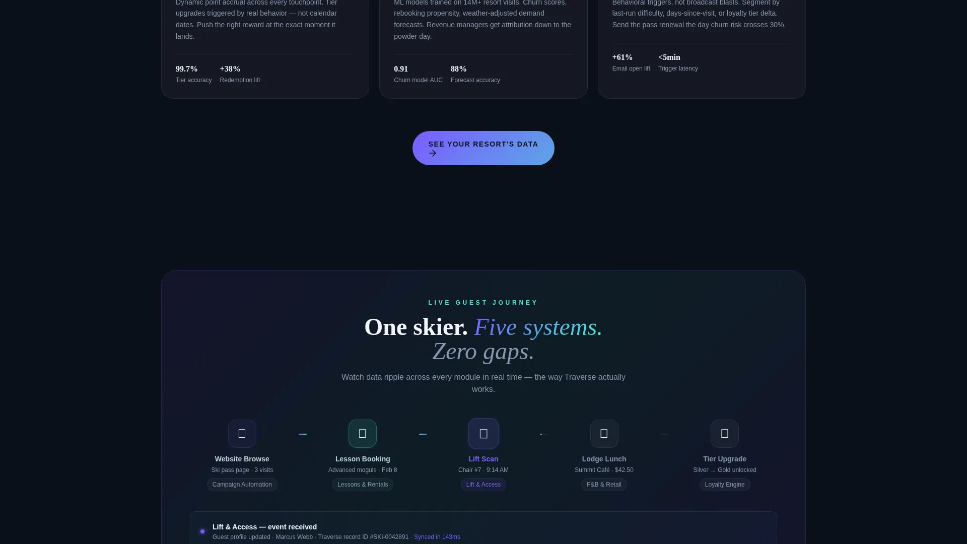
A full-width card spans the grid midway through the feature matrix. It plays a real-time animation tracing a guest's path from website browse through lesson booking, lift scan, lodge lunch, and loyalty tier upgrade. Data ripples across modules in sequence, making the platform's connectivity tangible.
Click-Through Call-to-Action System
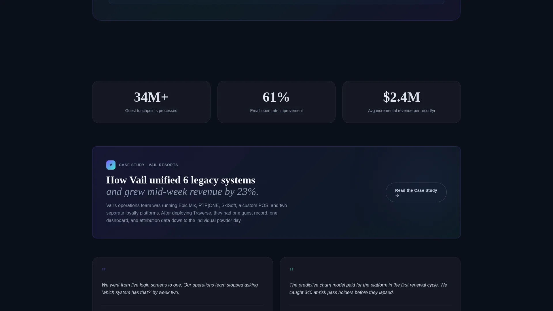
The primary call to action, "See Your Resort's Data," is pinned in the navigation bar and repeated after every second row of cards. A secondary ghost button, "Read the Vail Case Study," offers a lower-commitment path for visitors still comparing options. No form lives on the page itself.
AI Iridescent Hover States
Every interactive element uses a violet-to-teal gradient border on hover. Card surfaces rest on snow-white against a deep navy background, and each hover state pulses with a shifting prismatic gradient that mirrors the feel of a ski goggle lens catching the sun.
Startup Velocity Visual Theme
The layout channels speed and clarity through sharp card geometry, high contrast color pairing, and purposeful white space. The Startup Velocity theme keeps the page feeling technical and ambitious without sacrificing readability or scan speed.
Page sections overview
| Section | Purpose |
|---|---|
| Pinned Nav Bar | Anchors the primary call to action button across all scroll positions |
| Dashboard Preview Header | Introduces the guest-360 concept through a rotated platform screenshot |
| Feature Matrix Grid | Presents six platform modules as interactive, interconnected cards |
| Journey Animation Card | Visualizes live guest data flow across all platform modules |
| Inline call to action Rows | Repeats the demo-booking prompt after every second row of cards |
| Secondary Ghost call to action | Offers a case study path for visitors still in the evaluation stage |
Design & branding system
The visual identity uses an AI Iridescent color system built around four core values. Deep slope-night navy (#0B0F1A) fills the background like a mountain at dusk. Aurora shimmer violet (#7B5CFF) and glacial holographic teal (#3EEFD0) power all gradient interactions, while fresh-snow white (#F4F6FB) surfaces each card cleanly above the dark field.
- The iridescent gradient border (#7B5CFF to #3EEFD0) activates on hover states, giving the modular grid a constellation-like quality
- Card geometry is sharp and structured, with violet shadow cues on the header render adding controlled depth
- The overall palette references the prismatic shift of a ski goggle lens catching direct sunlight, keeping the visual identity specific to the mountain context
Mobile & speed optimization
The card-grid layout is built to reflow cleanly from desktop to mobile viewports. The modular structure means individual cards stack naturally without breaking the visual hierarchy or the feature matrix narrative.
- The pinned navigation call-to-action button remains accessible at all scroll depths on smaller screens
- The three-quarter-axis header render and gradient hover states are designed to adapt to touch interactions without relying on hover-dependent visibility
How this template helps you convert
The page is structured as a click-through landing page, meaning the entire visual and narrative arc builds toward a single action: booking a personalized demo. Every design and layout decision serves that goal.
- The dashboard preview header makes the platform feel real and immediate before a visitor reads a single feature description, lowering skepticism early
- The feature matrix builds cumulative understanding card by card, so by the time a visitor reaches the bottom call to action, clicking through feels like the logical next step rather than a sales commitment
Other information about this template
This template sits inside the Startup Velocity theme family and uses the AI Iridescent color system, which is one of the more distinctive visual identities available for technology-focused landing pages. The combination of deep navy, violet, and teal gives it a strong shelf presence in a marketplace.
- The template is categorized under Technology, specifically the Ski Resort Vertical SaaS subcategory, making it relevant to any mountain resort platform positioning itself as a modern data infrastructure layer
- The Traverse template is designed for a card-grid modular layout style, meaning sections can be reordered or extended without breaking the overall visual system
- The click-through landing page direction means no conversion happens on the page itself, keeping the experience low-pressure and the demo pipeline clean
Theme
Startup Velocity
Creative direction
Feature Matrix
Color system
AI Iridescent
Style
Card Grid (Modular)
Direction
Click-Through
Page Sections
Guest-360 Dashboard Header
Modular Card-grid Feature Matrix
Animated Guest Journey Break Card
Click-through Call to Action Architecture
AI Iridescent Hover System
Related questions
What type of business is this template built for?
Does this template include a contact form or lead capture form?
Can the six feature module cards be edited or reordered?
What makes the header section different from a standard hero?
Is the color system customizable for a different brand palette?



