Voyage - Powerful Travelbuilder Landing Page Template
Voyage is a split-screen travel website builder landing page template built on a Tech Glass visual identity. It targets tour operators, travel bloggers, and destination management companies who need a professional online presence fast. With an Interactive Explorer scroll experience, a Monochrome Steel color system, and a lead-generation flow built in, Voyage turns curious visitors into signed-up builders.
by Rocket studio
Quick summary
Voyage is a single-page, split-screen landing page template for a travel website builder platform. It combines a cool Tech Glass aesthetic with an Interactive Explorer scroll experience designed to pull visitors in and guide them toward signing up. The layout is purposeful, bold, and built for the travel industry from the first pixel.
Who this template is for
This template is designed for businesses and creators in the travel space who need to communicate the value of a drag-and-drop website builder quickly and compellingly.
- Boutique tour operators and destination management companies (DMCs) who need multilingual itinerary pages live before a new season opens
- Solo adventure bloggers and retired travel writers turning a passion project into a real online business
- Travel agencies juggling informal booking channels and ready to upgrade to a polished, professional web presence
What problem this template solves
Travel businesses often struggle to present a professional digital front without a developer on call. A generic template cannot communicate the specific power of a travel-focused builder tool. Voyage solves this by letting the landing page itself become the product demo.
- Visitors arrive, interact with live feature previews, and immediately understand what the builder does
- The two-step lead capture form qualifies prospects by business type and language preference before asking for contact details
- A secondary "See Live Examples" path catches top-of-funnel visitors who are curious but not yet ready to commit
What you get with this template
Voyage delivers a fully structured, single-page layout that functions as both a product showcase and a lead generation engine. Every section is purposefully sequenced to move a visitor from curiosity to conversion.
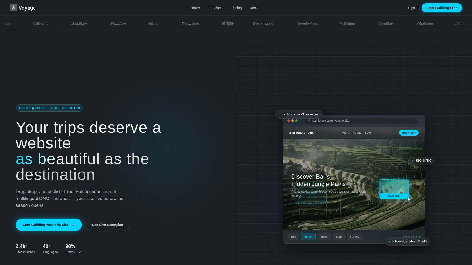
- A split-screen hero with a logo bar, a headline panel, and a live browser mockup showing the builder in action
- An Interactive Explorer scroll flow including a drag-to-reorder itinerary builder, a real-time color-theme picker, and a spinning globe showing multilingual coverage
- A sticky bottom call-to-action bar and a two-step sign-up form that segments leads by business type and language preference
Feature list
This template is built around purposeful interactions and a design system that communicates quality at every scroll depth.
Split-Screen Hero Layout
The 50/50 hero splits the screen between a headline and call-to-action panel on the left and a live browser mockup on the right. The mockup shows a travel site mid-build, with a cursor dragging an image block of turquoise water into place. This immediately communicates what the product does without a single word of explanation.
Interactive Feature Map
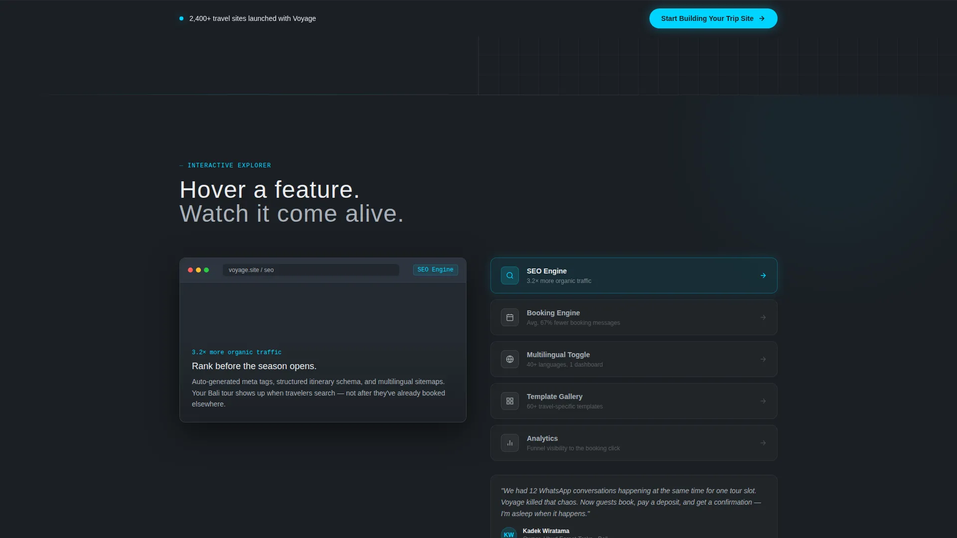
The first scroll fold pairs a template gallery on the left with a live feature map on the right. Hovering a feature node such as the search engine optimization tool, booking engine, or multilingual toggle morphs the left panel into that feature's live demo. Visitors explore the product by interacting with it, not by reading about it.
Logo Bar Integration Ribbon
A horizontal ribbon of travel-brand and integration logos glides in a slow infinite scroll across the top third of the page. All logos are rendered in monochrome chrome so they feel etched into the glass surface. This treatment builds immediate credibility with both technical and non-technical visitors.
Two-Step Lead Capture Form
The primary call-to-action opens a two-step form. Step one asks for business type (tour operator, travel blog, DMC, or other) and preferred website language. Step two collects name, email, and a free-text field asking visitors to describe their dream travel site in one sentence. This segmentation makes every lead more actionable from day one.
Sticky Bottom Call-to-Action Bar
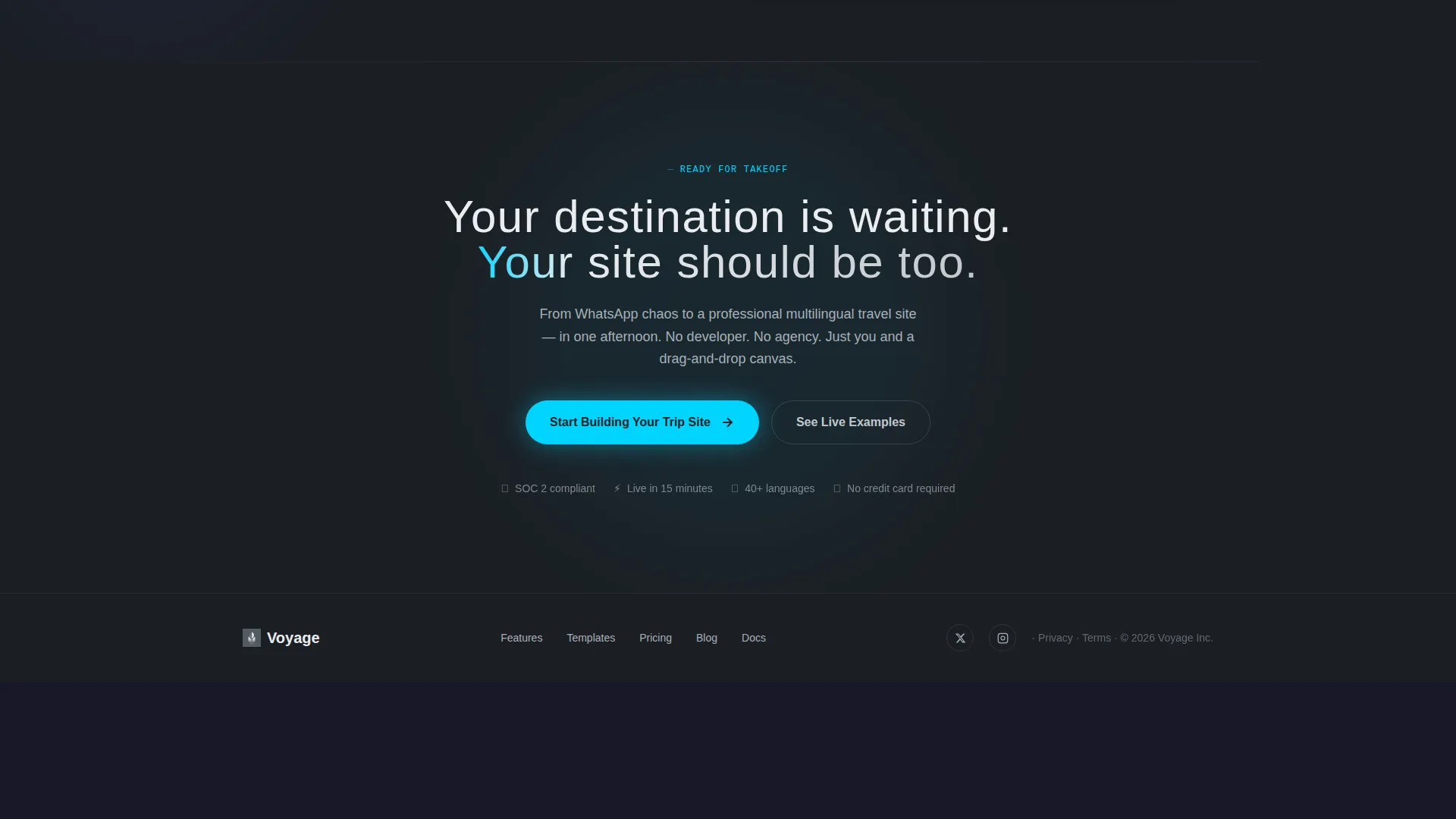
After the second fold, a sticky bottom bar follows the visitor down the rest of the page. It repeats the primary call-to-action, "Start Building Your Trip Site," keeping the conversion path visible at all times without interrupting the scroll experience.
Real-Time Customization Demos
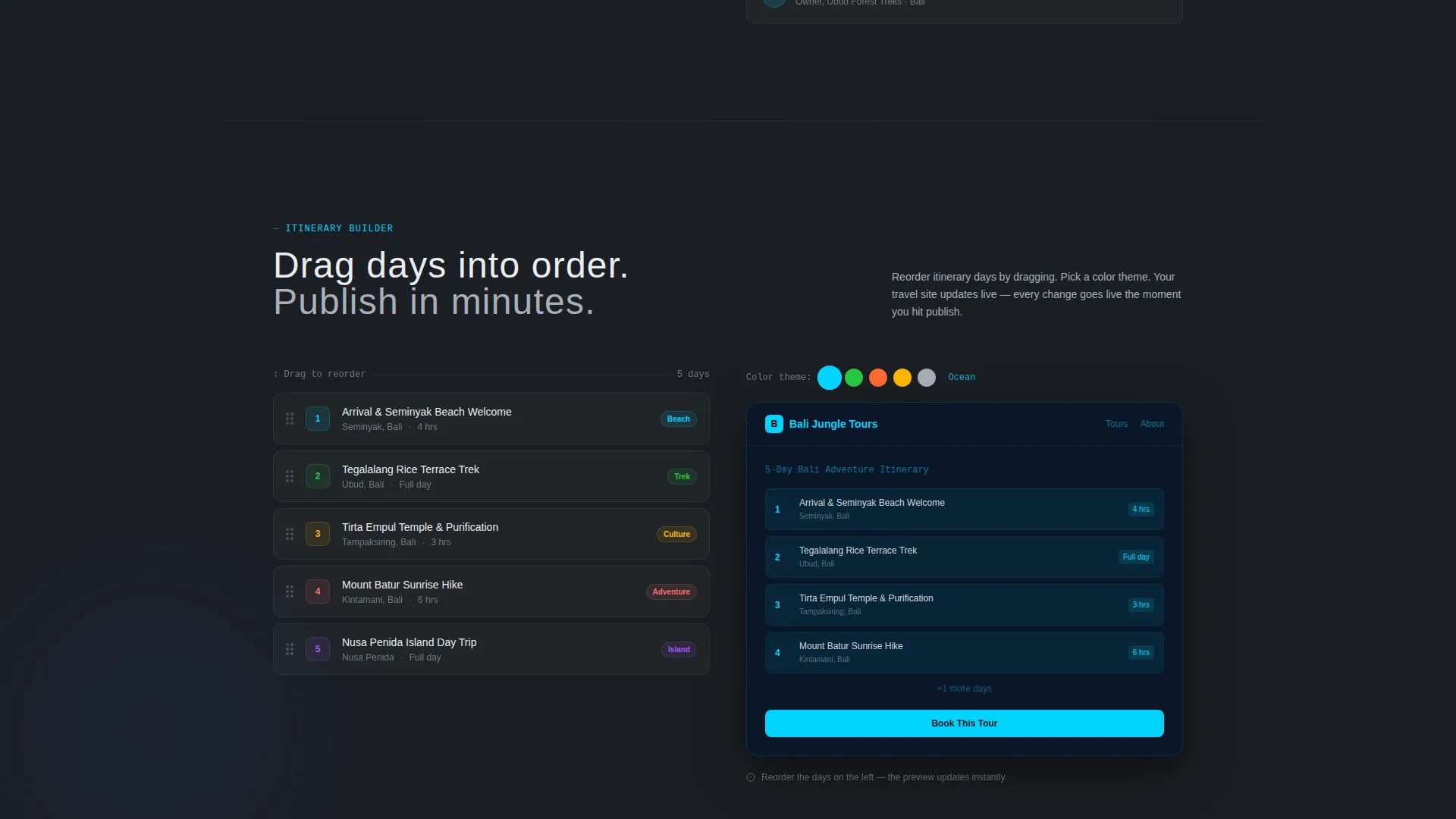
Three interactive demo components show the builder's power in context: a drag-to-reorder itinerary builder, a color-theme picker that repaints a sample travel site in real time, and a spinning globe that lights up multilingual page regions by geography. Together, they make the scroll feel like a product test drive.
Page sections overview
| Section | Purpose |
|---|---|
| Logo Bar Ribbon | Establishes integration credibility through a scrolling monochrome logo strip |
| Split-Screen Hero | Pairs the headline and primary call to action with a live browser mockup |
| Interactive Feature Map | Lets visitors hover feature nodes to trigger live product demos |
| Itinerary Builder Demo | Shows drag-to-reorder functionality in an interactive section |
| Color Theme Picker | Demonstrates real-time site repainting with a live color selector |
| Multilingual Globe | Visualizes regional language coverage through an interactive spinning globe |
| Sticky call to action Bar | Keeps the primary call-to-action visible after the second scroll fold |
| Email-Gated Gallery | Captures top-of-funnel leads behind a curated live-examples gallery |
Design & branding system
Voyage uses a Monochrome Steel color palette that feels like a titanium surface in a dimly lit premium environment. Every color choice is intentional and restraint is the defining principle.
- Core palette: deep gunmetal (#1B1F24) as the dominant background, brushed aluminum (#A8B0B8) for secondary text and inactive elements, and polished chrome white (#EAECEF) for primary text and surface highlights
- A single accent color, electric cyan (#00D4FF), is reserved exclusively for interactive hotspots, active states, and call-to-action elements to maximize visual contrast and guide attention
- Typography uses a thin, wide-tracked sans-serif that feels editorial and modern, with interface edges styled as frosted or smoked glass to reinforce the Tech Glass theme throughout
Mobile & speed optimization
The template is structured with a responsive split-screen layout that adapts gracefully to smaller viewports. Interactive elements are designed so they remain usable and visually coherent on touch devices.
- The split-screen 50/50 layout reflows into a stacked single-column arrangement on mobile, preserving content hierarchy
- Interactive demo components including the itinerary builder and color picker are built to function as tap-driven experiences on smaller screens
- The sticky bottom call-to-action bar is especially effective on mobile, where it remains anchored to the bottom edge and keeps the conversion path one tap away at all times
How this template helps you convert
Every design and layout decision in Voyage points toward one outcome: turning a visitor into a qualified lead.
- The two-step form qualifies leads by business type and language preference before capturing contact details, so every submission carries actionable context for follow-up.
- The secondary "See Live Examples" path offers a lower-commitment conversion option, gating a curated gallery behind just an email address to capture visitors who are not yet ready to build.
- The sticky bottom call-to-action bar ensures the primary sign-up prompt is never more than a glance away, no matter how deep into the interactive scroll experience a visitor travels.
Other information about this template
Voyage is built for a specific intersection: the travel industry and software-as-a-service (SaaS) product marketing. It sits confidently at the crossroads of visual storytelling and conversion design.
- The template is categorized under Technology, specifically Travel Software and SaaS, making it a strong fit for any platform positioning itself as the go-to travel website builder
- The interactive scroll direction is labeled "Interactive Explorer," which means the page actively hands the visitor a control at every section rather than asking them to read passively
- The header concept is a Logo Bar, a recognized trust-building pattern in SaaS landing pages that signals ecosystem depth and partner credibility at first glance
- The lead-generation direction means every section is sequenced to reduce friction and increase the likelihood of a form submission or email capture before the visitor leaves
- The Tech Glass theme and Monochrome Steel color system are well-suited to audiences who value precision tools, from DMCs managing complex multilingual itineraries to bloggers who want their site to look as polished as the destinations they write about
Theme
Tech Glass
Creative direction
Interactive Explorer
Color system
Monochrome Steel
Style
Split Screen (50/50)
Direction
Lead Generation
Page Sections
Split-screen Hero with Live Mockup
Interactive Feature Map with Hover Demos
Scrolling Logo Integration Bar
Two-step Segmented Lead Form
Real-time Customization Demos
Sticky Bottom Call-to-action Bar
Related questions
Who is the Voyage template designed for?
How does the two-step lead capture form work?
What makes the Interactive Explorer scroll experience different?
Can I update the color scheme to match my brand?
Is the sticky call-to-action bar always visible on the page?



