Bold Brutalist White-Label WMS Landing Page Template
A split-screen landing page template built for white-label Warehouse Management System products. Raw, monospaced metrics fill the left panel while a live-branded dashboard demo fills the right. Bold brutalist design, glassmorphic cards, and interactive module toggles let visitors experience ownership of the product before they ever click a call to action.
by Rocket studio
Quick summary
This landing page template is purpose-built for white-label WMS products. A 50/50 split-screen hero leads with live-ticking operational numbers on the left and a real-time rebrand preview on the right. Visitors interact with color pickers, module toggles, and integration selectors as they scroll, making the product feel like theirs before they reach the call to action.
Who this template is for
This template speaks directly to the people selling warehouse software under their own brand. It communicates function, speed, and margin in a language logistics buyers trust.
- Third-party logistics (3PL) operators reselling fulfillment technology who need to land enterprise clients fast
- Enterprise resource planning (ERP) vendors and logistics software-as-a-service (SaaS) founders adding a warehouse management module to their product stack
- Development teams who want a bold, pre-built landing page they can customize and ship without a long design cycle
What problem this template solves
Warehouse software buyers are skeptical. They have seen too many polished marketing pages that hide weak products behind stock photography. This landing page takes the honest route: raw numbers, exposed grid, and a live rebrand demo that lets the product speak for itself.
- Visitors leave generic software landing pages without understanding what the product actually does
- 3PL operators and SaaS founders lose deals because their white-label product looks like everyone else's
- Teams waste months building a bespoke landing page when a battle-tested template gets them to market faster
What you get with this template
You get a fully structured, single-page layout designed to push qualified visitors into a self-serve sandbox. Every section has a clear job, and the interactive design layers build conviction as visitors scroll down the page.
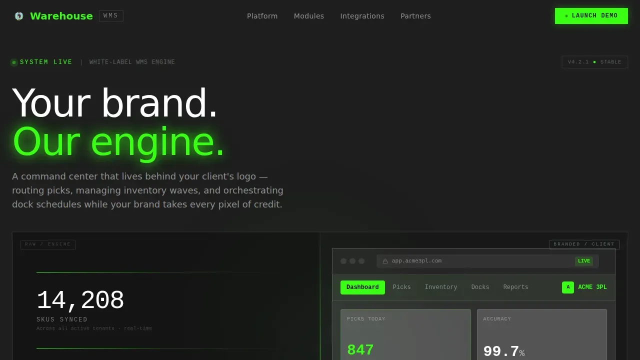
- A split-screen hero section with live-ticking metrics on the left and a branded dashboard preview on the right
- Three interactive scroll sections: a live color rebrander, a module toggle builder, and an integration pipeline selector
- A social proof section, a sticky call-to-action bar, and a linear single-row footer
Feature list
This template ships with a focused set of features that serve one goal: converting logistics buyers into sandbox clicks.
Split-Screen Metrics Hero
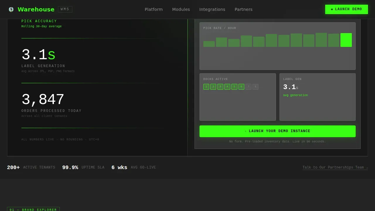
The hero opens with a bold 50/50 layout. The left panel stacks raw, monospaced data blocks: SKU counts, pick accuracy rates, and label generation times. The right panel mirrors the same dashboard reskinned in a fictional client brand, landing the value proposition before a word of body text is read.
Live Interactive Rebrander
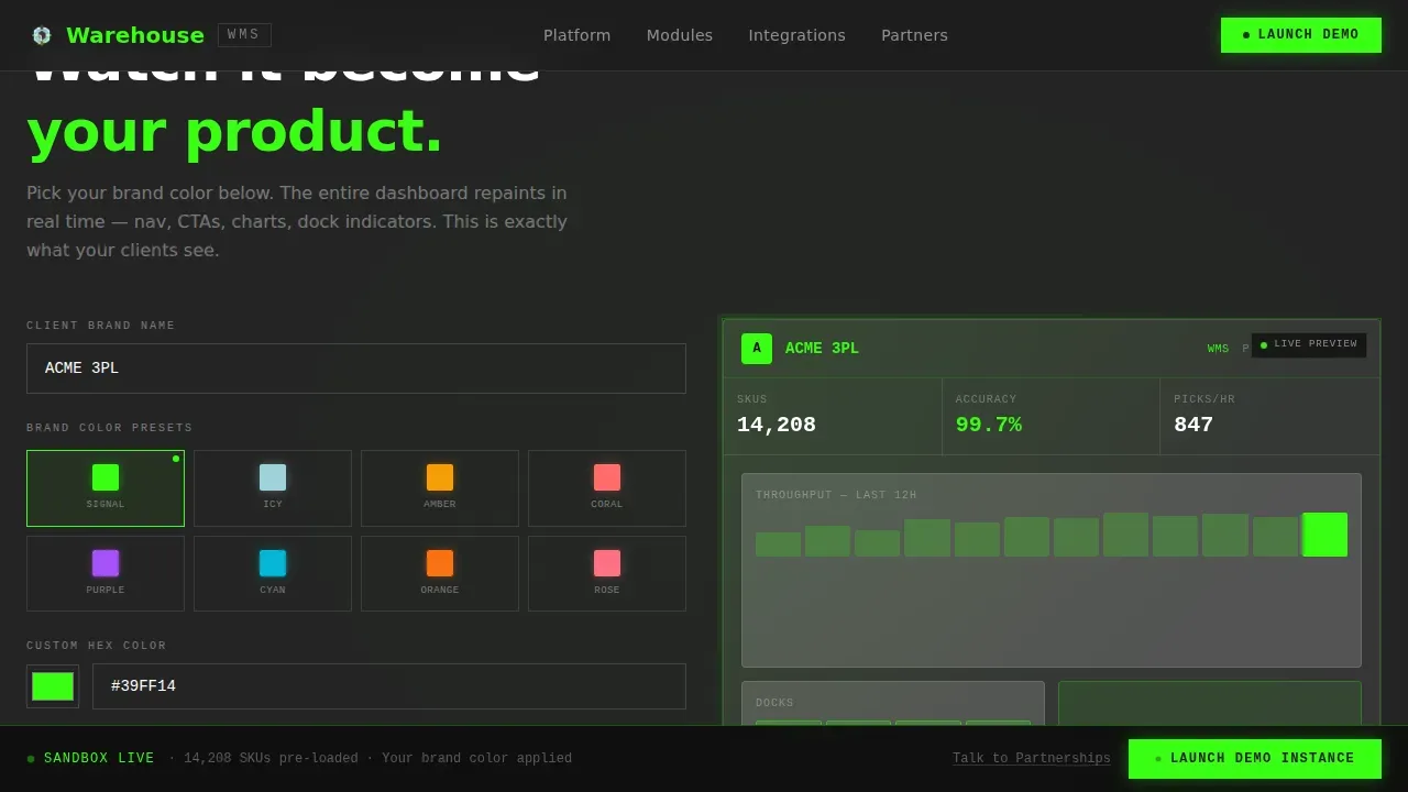
Visitors pick a brand color and watch the right-panel dashboard reskin in real time. This section makes the product feel personal. By the time they finish choosing colors, visitors have already mentally placed their logo on the product.
Module Toggle Builder
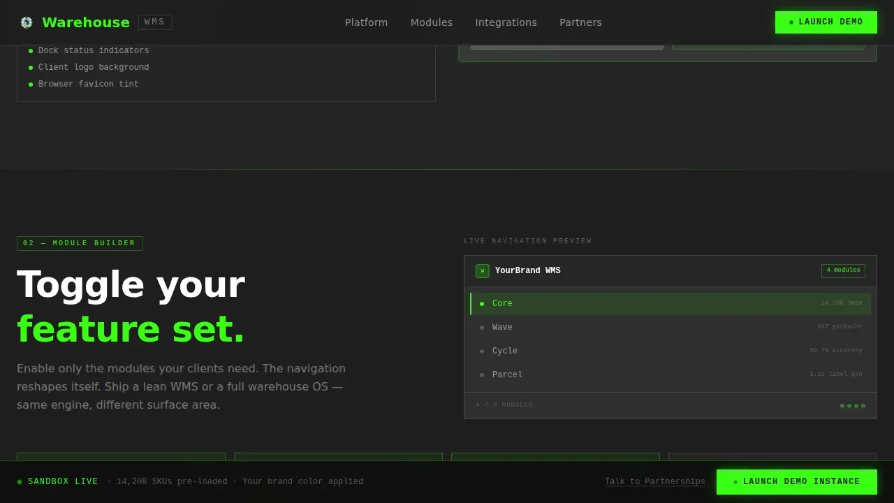
A brutalist slab section lets visitors switch wave planning, cycle counting, and yard management modules on and off. The navigation reshapes itself with each toggle, giving an honest, tactile description of the platform's flexible module structure.
Integration Pipeline Selector
Visitors choose a connection point and watch mock data flow through the pipeline. The section communicates that this WMS product can slot into existing business systems without a complex re-architecture process.
Sticky Call-to-Action Bar
A signal-green "Launch Your Demo Instance" button appears inside the hero's right panel and reappears as a sticky bar after the second scroll section. A secondary text link offers an enterprise-focused partnership conversation for buyers who need more before touching keys.
Social Proof and Throughput Section
Operator metrics, named client segments, and throughput numbers build trust before the final call to action. The design keeps this section visually consistent: glassmorphic cards floating over a concrete-charcoal background, keeping the page honest and direct.
Page sections overview
| Section | Purpose |
|---|---|
| Split-Screen Hero | Metrics wall left, live branded demo right |
| Interactive Rebrander | Color picker reskins dashboard live |
| Module Toggle Builder | Toggle WMS modules, reshape navigation |
| Integration Pipeline | Select connector, watch mock data flow |
| Social Proof and call to action | Throughput numbers, sandbox call to action |
| Linear Footer | Single-row links and brand anchor |
Design & branding system
The design language is Bold Brutalist filtered through a Glassmorphic color system. High contrast surfaces, stark typography, and exposed structure signal technical capability to logistics professionals who value function over decoration.
- Color palette: poured-concrete charcoal (#1E1E1E) as the base, frosted-panel white at 12% opacity for glass cards, signal green (#39FF14) for live data pulses, and icy translucent blue (#A0D2DB) tinting floating panels
- Typography: JetBrains Mono for all numerical data and code-style text; Manrope for headings and body text, keeping every label easy to read at a glance
- The template is fully rebrandable: swap placeholder logos, colors, and domain labels to match any client brand without touching the underlying layout structure
Mobile & speed optimization
The template is designed desktop-first, matching how 3PL operators and SaaS founders actually evaluate enterprise software tools. The layout is optimized for large screens where split-screen design and side-by-side panel comparisons deliver full impact.
- Interactive sections use client-side components only where interactivity is required, keeping static sections lean and fast-loading
- Brutalist design avoids heavy image assets and complex graphic layers, which supports faster page loading times compared to visually dense alternatives
- The responsive structure scales cleanly for users who open the landing page on smaller screens, keeping all core content accessible
How this template helps you convert
The conversion strategy in this template is built into the experience itself. Visitors are not asked to trust a description; they are shown the product working in their brand before any form or commitment appears.
- The hero section earns attention immediately: high contrast numbers and a live branded panel communicate the entire value proposition in the first viewport, making visitors want to keep scrolling
- The interactive rebrander and module builder deepen ownership as visitors move down the landing page, so by the time the sticky call-to-action bar appears, the product already feels familiar and trustworthy
- The frictionless click-through model routes visitors directly to a self-serve sandbox with pre-loaded inventory data, removing the barrier that forms and sales calls add to the process
Other information about this template
This template sits in the white-label enterprise software category and is purpose-built for the WMS niche. Below are additional details useful for developers, partners, and buyers evaluating this product for their portfolio.
- The warehouse bold brutalist white label wms landing page template is one of the few landing page designs in this category that puts interactive rebranding at the center of its sales process
- Developers can add custom code and extend the integration selector section to store additional connector types without disrupting the overall layout
- The straightforward layout allows users to easily find information, making the WMS product appear easier to use and manage from first impression
- The template saves significant time on development since it ships as a pre-built, structured landing page with no complex graphics to source or rebuild
- This type of landing page is ideal for promoting high-efficiency 3PL services or warehouse SaaS products in a crowded market where most competitors rely on polished, homogenous designs
- The unique raw aesthetic of brutalist design separates a WMS product from competitors and resonates with logistics professionals who prefer honest, function-first marketing
- The design is future proof: bold structure and minimal visual dependencies mean the landing page stays clean and relevant as product features evolve
- Portfolio buyers and white-label resellers can use this template to sell branded WMS landing pages to multiple operator clients from a single reusable source
Theme
Bold Brutalist
Creative direction
Interactive Explorer
Color system
Glassmorphic
Style
Split Screen (50/50)
Direction
Click-Through
Page Sections
Split-screen Metrics Hero
Live Interactive Rebrander
Module Toggle Builder
Integration Pipeline Selector
Sticky Click-through Call to Action
Social Proof and Throughput Display
Related questions
Can I fully rebrand this landing page template with my own logo and colors?
Does this landing page template include forms for lead capture?
Is this template suitable for a 3PL operator or only for SaaS founders?
How technical does my team need to be to customize this template?
What makes this landing page different from standard software marketing templates?



