Specialist Data & Analytics Pricing & Packages Website Template
Warehouse is a scroll reveal landing page template built for data warehouse platforms. It opens with a live Cost and Performance Estimator, then progressively reveals a feature matrix as the visitor scrolls. The Bold Brutalist design uses gunmetal, concrete gray, sky blue, and chalk white to communicate raw technical authority and drive engineers toward a free-tier signup.
by Rocket studio
Quick summary
Warehouse is a single-page landing page template for data warehouse platforms targeting data engineers, analytics leads, and technology executives. It combines a brutalist visual identity with a scroll-driven feature reveal, a live performance estimator in the header, and a persistent call-to-action bar that drives visitors to a free-tier signup without collecting a form submission on the page itself.
Who this template is for
This template is built for teams selling high-performance data warehouse infrastructure to technical buyers. It speaks the language of engineers and engineering leaders who evaluate tools on proof, not promises.
- Data engineers and analytics leads who manage complex ingestion pipelines and query workloads
- Technology executives and cloud architects monitoring cloud compute spend and query performance
- Data platform startups and scale-ups positioning against established warehouse providers
What problem this template solves
Technical product landing pages often fail with engineering audiences because they lean on marketing language instead of measurable evidence. This template solves that mismatch by anchoring the page in the visitor's own numbers from the first second.
- Engineers distrust vague claims and leave pages that do not show real performance data quickly
- Analytics teams need to justify migration costs internally, so projected savings must be visible upfront
- Procurement conversations stall when competitive comparisons arrive too early before the product earns credibility
What you get with this template
You get a fully structured, single-page landing page template designed around progressive disclosure and conversion momentum. Every section is sequenced to build technical trust before asking for a click.
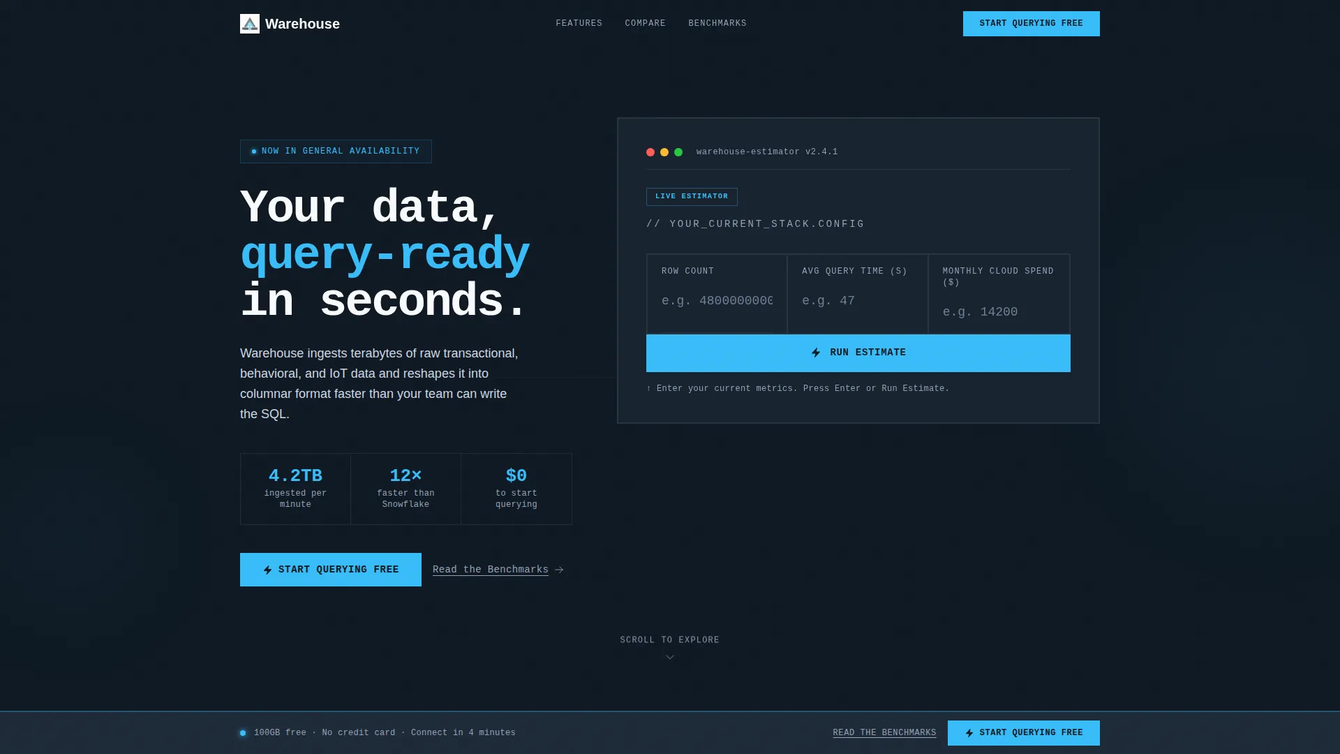
- A header estimator section with three raw input fields and an animated sky-blue results bar showing projected query speed, compression ratio, and monthly savings
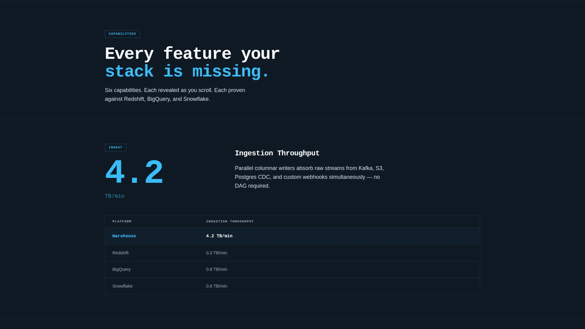
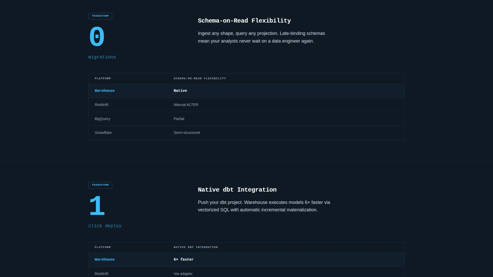
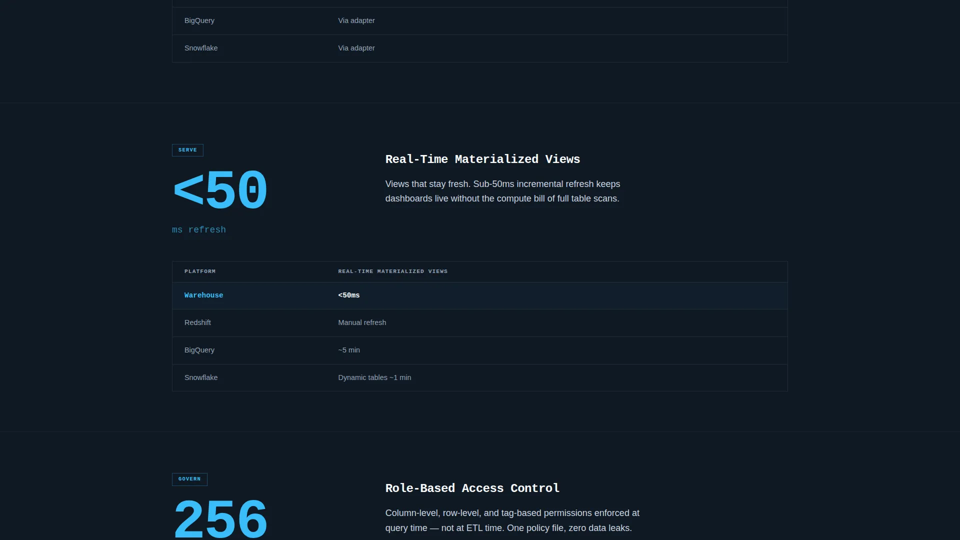
- A scroll-driven feature matrix where concrete-gray slabs reveal one capability at a time, each carrying a single oversized metric and a two-line explanation
- A persistent bottom-viewport call-to-action bar that appears after the third scroll reveal and carries estimator inputs as URL parameters to pre-configure the signup page
Feature list
This template is built around specific, prompt-backed components that work together to move technical visitors from curiosity to commitment.
Live Cost and Performance Estimator
The header contains a brutalist input form with three fields: current row count, average query time, and monthly cloud spend. When the visitor submits their numbers, a single sky-blue bar animates across the screen displaying projected query speed, storage compression ratio, and estimated monthly savings. No stock imagery, no decorative graphics.
Scroll Reveal Feature Matrix
As the visitor scrolls, concrete-gray slabs slide apart to reveal one platform capability at a time. Each slab shows a single metric in oversized monospaced type with a brief two-line explanation beneath it. The pacing is deliberate and architectural, giving each capability space to land before the next one appears.
Progressive Competitive Comparison
Comparison columns against competing warehouse platforms fade into view only after the feature they support has already been revealed. This sequencing ensures visitors absorb the capability first and then see the competitive evidence, rather than being handed a comparison table cold.
Persistent Call-to-Action Bar
After the third scroll reveal, a sky-blue "Start Querying Free" bar pins to the bottom of the viewport. It stays visible as the visitor continues reading, creating a low-friction path to signup without interrupting the scroll experience.
URL Parameter Handoff
The primary call-to-action click carries the visitor's estimator inputs as URL parameters. The linked signup page can use those values to pre-configure the visitor's instance, reducing friction at the point of commitment.
Secondary Benchmark Link
A text-based secondary call to action labeled "Read the Benchmarks" routes engineers to a technical whitepaper. It gives technically curious visitors a credible path to deeper proof without pulling them off the conversion funnel entirely.
Page sections overview
| Section | Purpose |
|---|---|
| Header Estimator | Captures visitor inputs and shows personalized performance projections |
| First Reveal Slab | Introduces ingestion throughput with an oversized metric |
| Second Reveal Slab | Presents schema-on-read flexibility with supporting context |
| Third Reveal Slab | Highlights native dbt integration as a key workflow capability |
| Fourth Reveal Slab | Surfaces real-time materialized views with a benchmark figure |
| Fifth Reveal Slab | Covers role-based access as a governance feature |
| Sixth Reveal Slab | Presents compliance posture with a concise two-line explanation |
| Competitive Comparison | Fades in column-by-column after each feature has landed |
| Persistent call to action Bar | Pins "Start Querying Free" to the viewport bottom after third reveal |
Design & branding system
The visual identity follows a Bold Brutalist direction built around the Slate and Sky color system. The palette is described in the brief as feeling like a server room with one window, cold steel and humming racks until a blade of daylight cuts across the floor.
- Background slabs use deep gunmetal (#1E2A38) in heavy, unbroken blocks, with poured-concrete gray (#4A5568) for reveal panels and structural dividers
- Open-sky blue (#38BDF8) appears exclusively on interactive elements, data highlights, hover states, and call-to-action components, keeping it visually electric through scarcity
- Typography sits in chalk white (#F8FAFC), using monospaced typefaces for metrics, estimator fields, and terminal-style outputs, and a clean sans-serif for body copy and explanatory text
Mobile & speed optimization
The scroll reveal structure and heavy typographic blocks are designed to translate cleanly across viewport sizes. The template is structured for lightweight rendering given its no-photography, no-illustration visual direction.
- All section reveals are based on scroll position, which keeps the initial page load free of heavy image assets or complex render-blocking resources
- Monospaced and sans-serif typefaces are applied as system-compatible choices, reducing custom font load overhead
- The persistent call-to-action bar is viewport-pinned, ensuring it remains accessible on both desktop and mobile scroll experiences
How this template helps you convert
This landing page is designed around a single conversion goal: getting the visitor to click "Start Querying Free" and land on the signup page with their context already loaded. Every structural choice reinforces that path.
- The estimator at the top of the page personalizes the experience immediately, giving the visitor a projected savings figure before they have read a single feature claim, making the primary call to action feel earned rather than premature
- The scroll reveal rhythm builds technical credibility progressively, so by the time the persistent call-to-action bar appears, the visitor has already absorbed six capability proofs and a competitive comparison, reducing the perceived risk of clicking
- The URL parameter handoff removes a friction layer at signup by pre-configuring the visitor's instance from their estimator inputs, shortening the gap between click and first meaningful product interaction
Other information about this template
This template is part of a broader category of high-intent technical landing pages designed for data infrastructure products. It is well suited to platform teams positioning in the modern data stack ecosystem.
- The template's feature matrix structure naturally supports platforms competing against cloud-native warehouse services, including established providers in the columnar storage and massively parallel processing space
- The whitepaper secondary link pattern is a recognized conversion approach in developer-focused go-to-market strategies, where proof documents carry significant influence with engineering evaluators
- The URL parameter handoff pattern is particularly effective for product-led growth motions where the signup page experience benefits from pre-loaded context
Theme
Bold Brutalist
Creative direction
Feature Matrix
Color system
Slate & Sky
Style
Scroll Reveal (Progressive)
Direction
Click-Through
Page Sections
Live Cost and Performance Estimator
Scroll Reveal Feature Matrix
Progressive Competitive Comparison
Persistent Viewport Call-to-action Bar
URL Parameter Handoff to Signup
Secondary Technical Whitepaper Link
Related questions
Does this template include a signup form on the page?
Can I customize the estimator fields and result metrics?
How does the scroll reveal animation work?
Who is the secondary "Read the Benchmarks" link intended for?
Is this template suitable for a product-led growth go-to-market motion?



