Defense Contractor & Military Advanced Professional Website Template
Warfighter is a modular card grid landing page built for military training and simulation companies. It opens with a metrics wall of operational proof, walks visitors through capability spaces, and closes with a direct partnership path. The template targets program managers, defense integrators, and allied training commands looking for a credible, mission-ready web presence.
by Rocket studio
Quick summary
Warfighter delivers a tactical, data-forward landing page for military training and simulation organizations. The page leads with live-formatted operational metrics, then guides visitors through modular capability cards arranged like rooms in a simulation complex. Every section is built to qualify serious buyers and move them toward a capability brief request or past performance download.
Who this template is for
This template is built for organizations operating at the intersection of defense technology and live training delivery. If your audience reads requirements documents before they read marketing copy, this page is designed for them.
- Program managers at defense acquisition offices writing requirements and evaluating contractor qualifications
- Defense prime contractors and integrators seeking subcontractor partnerships on indefinite delivery, indefinite quantity task orders
- Allied nation training commands modernizing legacy ranges with synthetic environment overlays
What problem this template solves
Most defense contractor websites look like corporate brochures. They bury operational proof behind stock photography and generic mission statements. Serious buyers, the kind who carry clearances and sign contracts, need to see credibility in the first ten seconds.
- Generic layouts fail to communicate technical depth to acquisition-savvy audiences
- No clear qualification path leaves program managers without a fast way to assess fit
- Soft visual styles undermine the authority that defense simulation companies have earned in the field
What you get with this template
You get a complete single-page layout engineered for high-stakes B2B engagement in the defense sector. The structure mirrors a facility walkthrough, moving visitors from proof to capability to partnership without a wasted step.
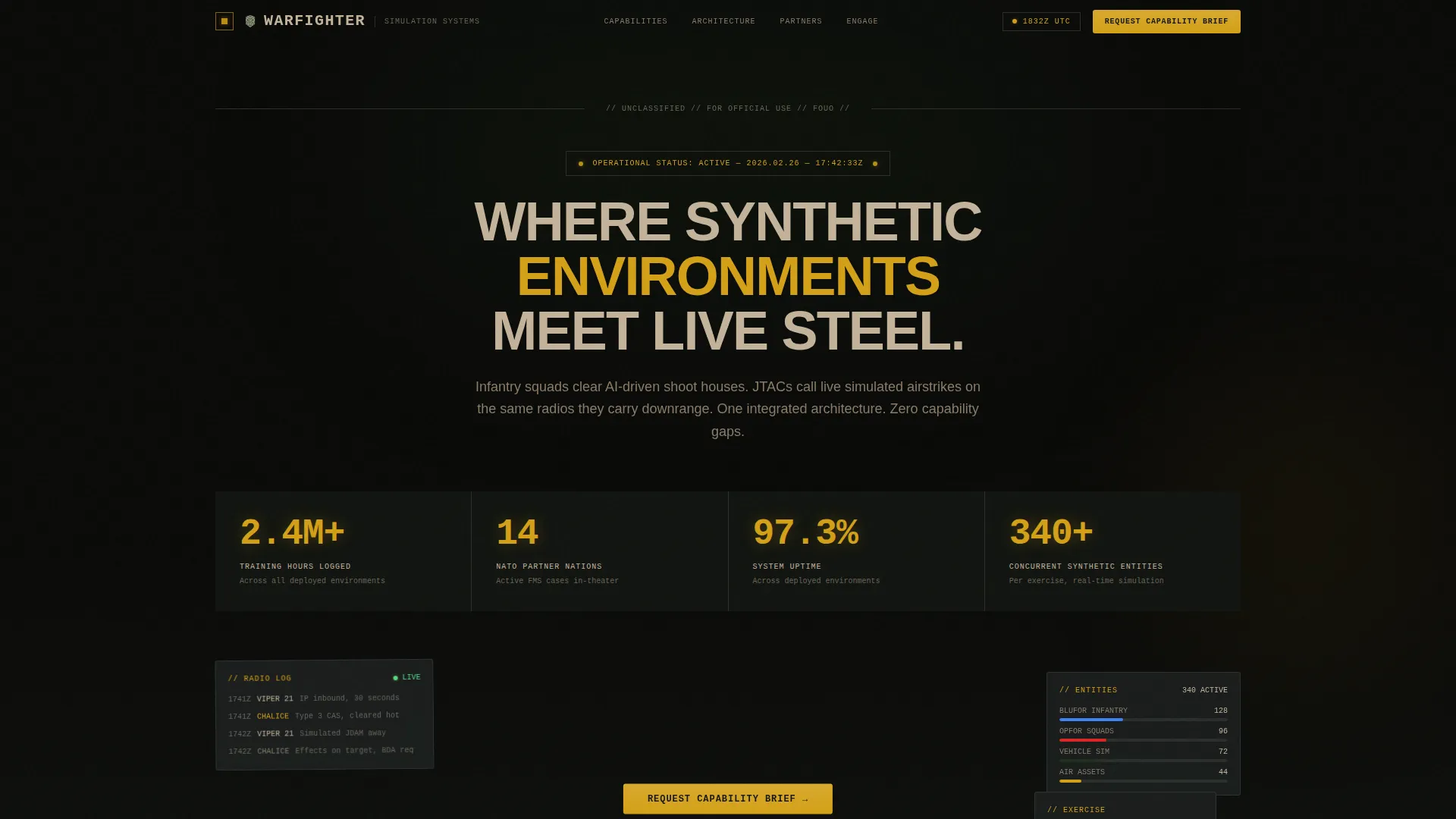
- A dark gunmetal metrics wall header displaying operational figures in monospaced type with mechanical counter animations
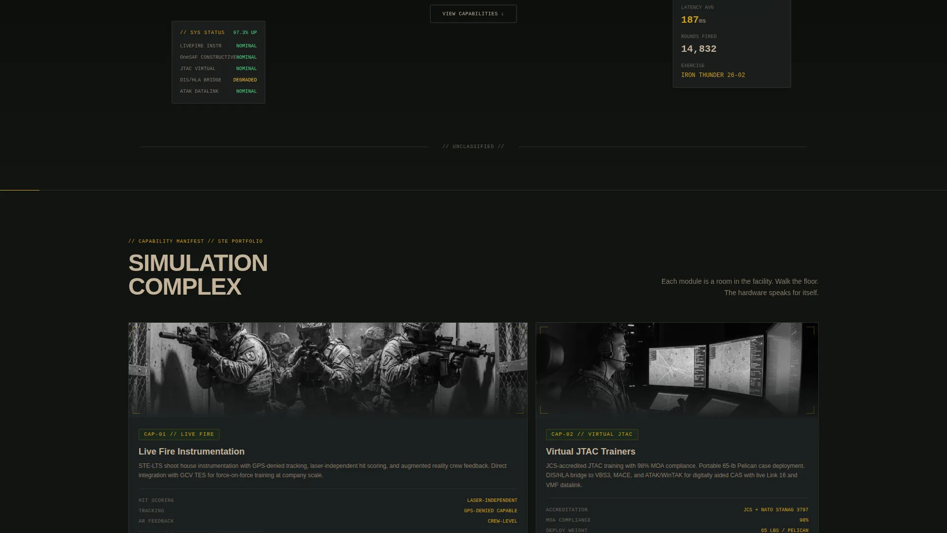
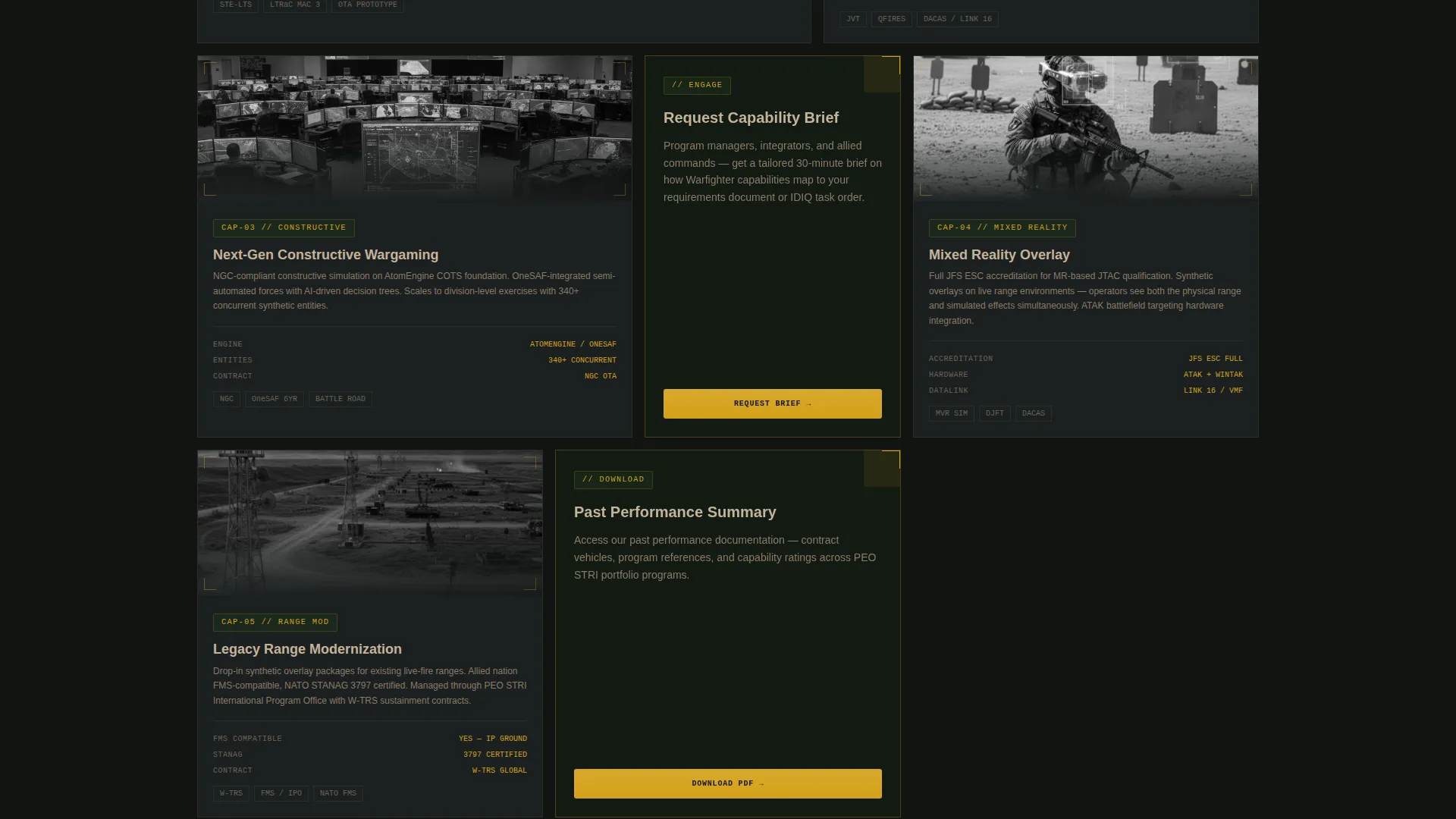
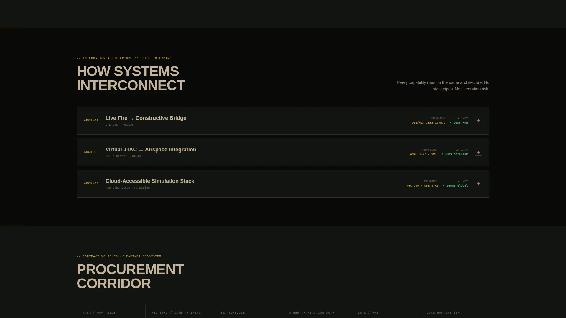
- Three rows of modular capability cards covering live fire instrumentation, constructive wargaming, virtual joint terminal attack controller trainers, system integration architecture, and partner or contract vehicle nameplates
- Two conversion paths: a gated capability brief request form and a lighter-gate past performance summary download
Feature list
This section describes the core built-in components and interaction patterns included in the Warfighter template.
Operational Metrics Header Wall
The header replaces a hero image with a dense grid of live-formatted numbers. Figures like training hours logged, partner nation counts, system uptime rates, and concurrent synthetic entity capacity are displayed in monospaced type against a dark gunmetal field. Subtle mechanical counter animations give the data a live, operational feel without requiring external data feeds.
Modular Capability Card Grid
Cards are laid out in three distinct rows, each serving a different audience need. The first row presents capability spaces photographed through observation window framing. The second row shows integration architecture, with cards that expand on click to reveal technical diagrams. The third row arranges partner logos and contract vehicle identifiers like nameplates on a corridor wall.
Persistent Partnership Call to Action
A signal amber-accented call-to-action module appears on every third card throughout the grid. It reads "Request Capability Brief" and stays visible as the visitor scrolls, creating a consistent conversion touchpoint without interrupting the facility-tour flow.
Capability Brief Request Form
The primary lead capture form collects name, organization, role (program manager, integrator, or end user), contract vehicle of interest, and a free-text field labeled "Describe Your Training Gap." This structure pre-qualifies inquiries before the first conversation.
Past Performance Download Gate
A secondary conversion path offers a past performance summary document behind a lighter gate requiring only email address and organization name. This lower-friction path captures buyers who are not yet ready for a full capability discussion.
Industrial Raw Visual System
The entire layout uses the Forest Trust color system: deep woodland green, gunmetal hull gray, sand terrain tan, and signal amber reserved exclusively for interactive states, hover effects, and live data callouts. Typography is monospaced and utilitarian throughout, matching the tactical operations center aesthetic described in the brief.
Page sections overview
| Section | Purpose |
|---|---|
| Metrics Header Wall | Opens with operational proof in live-formatted numbers |
| Capability Cards Row | Presents training spaces as observable physical environments |
| Integration Architecture Row | Shows system connectivity via expandable technical diagrams |
| Partner and Contract Row | Displays partner logos and contract vehicle identifiers |
| Capability Brief Form | Captures qualified B2B leads with a structured intake form |
| Past Performance Gate | Offers document download behind a lightweight email gate |
Design & branding system
The visual identity follows an Industrial Raw theme executed through the Forest Trust color system. Every color has a strict functional role, and nothing is decorative for its own sake.
- Deep woodland green (#1B2F1B) and gunmetal hull gray (#3B3F42) form the primary backgrounds, evoking a forward operating base at treeline
- Sand terrain tan (#C4B39A) provides midtone contrast for card surfaces and secondary text
- Signal amber (#D4A017) appears exclusively on interactive states, hover effects, and live data callouts, never as decoration
Mobile & speed optimization
The card grid layout is built on a modular system that reflows cleanly across screen sizes. Each card is a self-contained unit, so the layout adapts without breaking the spatial walkthrough logic.
- Modular card structure scales from wide desktop grids down to single-column mobile stacks without losing section hierarchy
- The metrics header uses lightweight monospaced type and CSS-driven counter animations, avoiding heavy media assets in the most visible viewport
How this template helps you convert
The page earns trust before it asks for anything. Operational proof comes first, qualification comes second, and the contact ask comes last. This sequence is intentional and built into the layout.
- The metrics wall delivers immediate credibility to skeptical, data-literate buyers before a single word of marketing copy appears
- The modular card grid walks visitors through capabilities at their own pace, with expandable diagrams giving technical buyers the depth they need to self-qualify
- The dual conversion path, a full brief request for ready buyers and a document download for early-stage researchers, captures leads at two different stages of the procurement cycle
Other information about this template
This template is purpose-built for the defense simulation and synthetic training environment market. It reflects the procurement and evaluation culture of that sector throughout its structure.
- Contract vehicle identifiers such as SEWP (Solutions for Enterprise-Wide Procurement), GSA (General Services Administration) schedules, and Other Transaction Authority agreements are surfaced as visual nameplates in the partner row, signaling acquisition readiness to procurement-focused visitors
- The "Describe Your Training Gap" free-text field is designed to collect unstructured requirement context that program managers are already thinking about, making the intake form feel like a requirements conversation rather than a sales form
- The template suits organizations working with live fire range instrumentation, constructive wargaming environments, virtual joint terminal attack controller training, and synthetic overlay modernization programs
Theme
Industrial Raw
Creative direction
Spatial & Architectural
Color system
Forest Trust
Style
Card Grid (Modular)
Direction
Partnership/B2B
Page Sections
Operational Metrics Header Wall
Modular Three-row Card Grid
Expandable Integration Architecture Cards
Persistent Amber Call-to-action Modules
Structured Lead Capture Form
Past Performance Download Gate
Related questions
Who is the primary audience for this landing page template?
Can I customize the operational metrics displayed in the header?
How does the dual conversion path work?
Can the card grid rows be reordered or expanded?


