E-Commerce Team Command Center & Contributor Overview Website Template
Warroom Data Command is a bento grid landing page template built for e-commerce teams that need one clear view of every contributor's output. It turns a chaotic mix of Slack threads and stale boards into a live, cockpit-style dashboard page. The dark Carbon Fiber design, phosphor green live-data accents, and interactive tile grid make the product pitch feel immediate and credible.
by Rocket studio
Quick summary
This template gives e-commerce operators a war room command center they can present in minutes. Every section is purpose-built for Shopify Plus brand directors, direct-to-consumer founders, and ops managers who need to show stakeholders one version of team performance truth. The bento grid layout, Carbon Fiber color system, and interactive preview header do the selling before a single word is read.
Who this template is for
The template targets operators who manage fast-moving marketing teams and need real time visibility into who is delivering results. It is designed for people who already have the team but lack the scoreboard.
- Shopify Plus brand directors running teams of ten or more people
- Direct-to-consumer founders who have hired multiple media buyers and need clarity on individual performance
- Ops managers and project manager leads drowning in disconnected tools across multiple platforms
What problem this template solves
Most e-commerce teams scatter their data across messaging apps, spreadsheet tabs, and project boards that nobody keeps up to date. That chaos makes strategic planning nearly impossible and leaves leadership guessing about who is actually moving the needle. The war room concept exists precisely to solve this: a dedicated space where every critical signal lives together and communication stays crisp and constant.
- Scattered metrics buried across multiple platforms with no single source of truth
- Invisible accountability where manual reporting hides underperformance until real damage is done
- No clear environment for crisis management when campaigns go wrong and teams need to respond fast
What you get with this template
You get a complete, production-ready bento grid landing page that communicates a focused value proposition from the first pixel. The design and copy structure guide visitors through a Problem to Solution Arc, building understanding and trust before asking for any commitment. Every section is a self-contained tile that can be customized to match your company's real data.
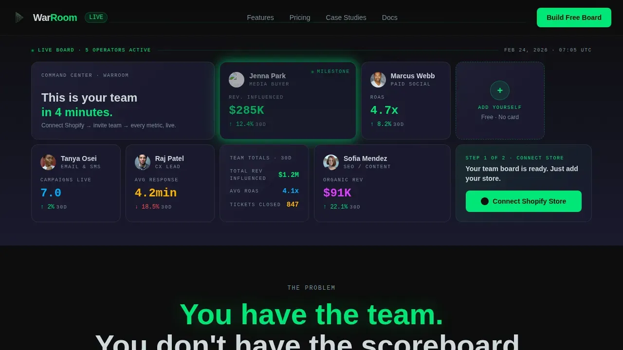
- An interactive header grid with live-styled team member cards, hover-flip sparklines, and a pulsing milestone tile
- A multi-section scrolling narrative that escalates from mild dysfunction to a concrete case study showing $40K wasted on an underperforming media buyer
- A sticky conversion bar and a two-step freemium signup flow that requires no credit card and no complex form
Feature list
This template ships with six core design and interaction capabilities pulled directly from the project brief.
Interactive Bento Hero Grid
The header is a functioning bento grid populated with fictional team member tiles. Each tile shows a name, role, avatar, and one live metric such as revenue attributed, return on ad spend, or campaigns live. Visitors hover any tile to flip it and reveal a thirty-day sparkline. One tile pulses green to signal a milestone just reached. The grid breathes, numbers increment, and the space feels like a live product rather than a static screenshot.
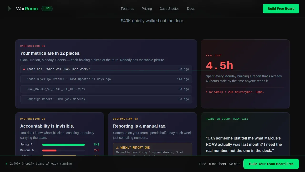
Problem to Solution Scroll Arc
Immediately below the hero, a stark phosphor green sentence names the core pain. Each bento section that follows introduces one layer of dysfunction paired with a live-styled user interface fragment showing the product's answer. The stakes escalate from mild annoyance to a concrete case study. By the final row, the tiles reassemble into a complete team dashboard, and the visitor realizes they have been watching the product build itself section by section.
Freemium Conversion Flow
The primary call to action appears first inside the header grid as a blank tile labeled "+ Add Yourself." It then anchors a sticky bottom bar after the second scroll section. Clicking opens a two-step flow: connect a Shopify store via an OAuth button with no form fields, then invite a first team member by email. No credit card, no plan selection, and the free tier supports up to five team members.
Carbon Fiber Design System
The visual identity uses a four-color Carbon Fiber palette: deep cockpit black (#0D0D0D) for backgrounds, woven carbon gray (#1A1A2E) for panel tiles, phosphor green (#00E676) for live-data accents, and cool titanium (#B0BEC5) for secondary text and divider lines. Typography pairs Plus Jakarta Sans for headers with JetBrains Mono for metrics and data labels. The environment feels engineered and zero-decoration, which builds immediate credibility with technical operations audiences.
High-Fidelity Animation Layer
The template includes metric increment counters, tile flip three-dimensional transitions, a pulse glow on milestone tiles, sparkline draw animations on hover, and scroll-linked section reveals using IntersectionObserver logic. All motion runs on GPU-accelerated transforms to keep the experience smooth. The animation layer is what makes the product demo feel real rather than illustrated.
Case Study Stakes Tile
A dedicated bento tile presents a concrete example: a twelve-person brand that wasted $40,000 on a media buyer whose return on ad spend was half the team average. This tile uses real numbers and a ROAS comparison bar to make the cost of invisible accountability tangible. Positioned at the midpoint of the scroll, it functions as the emotional turning point that makes the solution feel urgent rather than optional.
Page sections overview
| Section | Purpose |
|---|---|
| Interactive Hero Grid | Live team tiles with metrics, sparklines, and milestone pulse to demonstrate the product immediately |
| Pain Statement Row | Single phosphor green sentence names the core problem; sets the tone for the scroll arc |
| Dysfunction Bento Tiles | Three tiles covering scattered metrics, invisible accountability, and manual reporting pain points |
| Solution user interface Fragments | Asymmetric bento tiles each embed a live-styled interface answer to each dysfunction |
| Case Study Tile | $40K media buyer story with ROAS comparison to escalate stakes and build urgency |
| Final Assembly Section | All tiles reassemble into a complete team dashboard to show the product outcome visually |
| Sticky Conversion Bar | Persistent bottom bar with primary call to action anchored after the second scroll section |
| Footer Row | Linear single-row footer with minimal links and brand mark |
Design & branding system
The Carbon Fiber design system is built for operators who trust precision over decoration. Every color choice has a functional role: backgrounds create depth, panel tiles separate content, phosphor green marks what is alive, and titanium carries supporting copy. The result is a visual infrastructure that feels like a cockpit dashboard rather than a marketing page.
- Color palette: #0D0D0D backgrounds, #1A1A2E panel tiles, #00E676 phosphor green for live-data accents, #B0BEC5 titanium for labels and dividers
- Typography: Plus Jakarta Sans for all headings and body copy, JetBrains Mono for all metrics and data labels to create a clear data culture signal
- Layout: asymmetric bento grid with flexible tile sizes; larger tiles for hero and case study, smaller tiles for individual team cards and metric snippets
Mobile & speed optimization
The template is desktop-first by design, reflecting the reality that brand directors and ops managers do most of their research at a desk. However, the bento grid layout is fully responsive and adapts to smaller screens so that the key data points and calls to action remain accessible on any device. All animations use GPU-accelerated transforms to keep motion smooth without blocking the main thread.
- The bento grid reflows into a stacked single-column layout on mobile, keeping calls to action thumb-friendly and forms simplified to one action per step
- The sticky conversion bar persists across scroll on all screen sizes, ensuring the primary call to action is never more than a glance away
- Images and decorative elements are kept minimal by design, supporting faster load times and reducing bounce risk on slower connections
How this template helps you convert
The page earns the click rather than demanding it. The interactive header lets visitors experience the product before they read a single line of copy. By the time the sticky bar appears, the visitor has already identified their own team's pain inside the dysfunction tiles and watched the solution assemble itself in real time.
- The hero grid functions as an interactive product demo, letting users explore live tile behavior and understand the platform's value through direct interaction rather than passive reading, which builds trust before any commitment is requested.
- The Problem to Solution Arc escalates from relatable annoyance to a data-driven case study with real dollar figures, creating a sense of urgency that makes the free tier feel like an obvious low-risk next step.
- The two-step freemium flow removes every friction point: no credit card, no plan decision, and no lengthy form, so clicking "Build Your Team Board Free" feels like continuing an experience rather than starting a sales process.
Other information about this template
This template reflects established principles from agile marketing operations and digital war room research. Companies that identify performance gaps early avoid the kind of waste the case study highlights. The war room concept, as a dedicated space for rapid decision-making, has been validated across project management, crisis management, and marketing operations contexts.
- The war room environment thrives on focus: everything that does not serve the mission is a distraction, a principle baked into the template's single-call to action structure and stripped navigation
- Successful companies use the war room model to coordinate complex operations across multiple platforms, and this template communicates that concept visually before the visitor reads a word
- According to Forrester, 60% of marketers cite the ability to understand and predict customer behavior as their primary competitive advantage; the template's data command framing speaks directly to that passion for insight
- As artificial intelligence tools become more common in back-office processes, successful companies find that culture and data infrastructure matter more than the technology itself; this template's design reinforces a data-first culture signal from the first screen
- The warroom data command ecommerce team page landing page template is suited to teams that want to launch fast, iterate on their conversion approach, and present a credible, high-fidelity product story without a custom design project
- Real time data visibility is critical in any high-stakes environment; the template's live-metric tiles and sparkline animations communicate that speed-of-insight concept to visitors at a glance
- The template supports strategic planning conversations by giving leadership a shareable, client-ready page that reflects real operational thinking rather than generic marketing copy


Theme
Data Command
Creative direction
Problem→Solution Arc
Color system
Carbon Fiber
Style
Bento Grid
Direction
Freemium/Trial
Page Sections
Interactive Live-data Hero Grid
Problem to Solution Scroll Arc
Sticky Freemium Conversion Bar
Carbon Fiber Visual Identity
High-fidelity Animation System
Case Study Stakes Tile
Related questions
Who is this template designed for?
Can I customize the team tile data and colors?
Does the interactive preview require a live backend to work?
How does the two-step signup flow work in this template?
Is this template suitable for crisis management or incident response use cases?


