Security Guard Vertical SaaS Directory Website Template
Watchpoint is a hub-and-spoke security guard analytics dashboard landing page built for regional security directors. It combines a Feature Tab Switcher header, five animated spoke sections, and a persistent app-download call to action. The dark, electric-indigo design feels like a live control room, turning patrol routes, incident reports, and checkpoint scans into real-time operational intelligence.
by Rocket studio
Quick summary
Watchpoint is a single-page, anchor-navigated landing page template for a security guard analytics dashboard. It is built around live-data motion design, a Feature Tab Switcher header, and five deep-dive spoke sections. The page guides regional security directors from first impression to app download, letting every animated panel serve as hands-on product proof.
Who this template is for
This template is built for security technology teams and SaaS founders targeting operational security buyers. It speaks directly to decision-makers who run large guard forces and need a landing page that matches the urgency of their work.
- Regional security directors managing fifty or more guards across corporate campuses, hospital networks, or logistics yards
- Security software teams that need a polished, conversion-focused landing page for an analytics or patrol-tracking product
- Product marketers who want motion-driven storytelling to show a complex dashboard without a live demo environment
What problem this template solves
Security operations buyers are skeptical. They have seen too many static product pages that promise real-time visibility and deliver a stock-photo slideshow. This template solves the credibility gap by making the page itself perform like the product.
- Security directors currently learn about missed patrols from angry client emails, not live alerts; this template frames that pain immediately
- Static landing pages cannot convey the speed or depth of a live dashboard; the animated panels here do that job without requiring a real backend
- Generic SaaS templates fail to signal domain authority; every design choice here, from the phosphor-green status badges to the radar-sweep color logic, speaks the language of operational security
What you get with this template
You get a fully structured, single-page hub-and-spoke layout with anchor navigation, five spoke content sections, and a motion-forward visual system designed for a dark-screen control-room atmosphere.
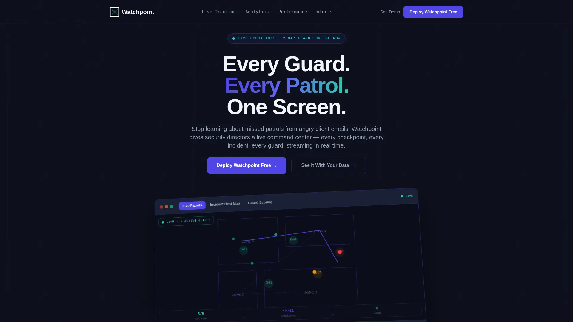
- A Feature Tab Switcher header with three crossfading dashboard states: Live Patrols, Incident Heat Map, and Guard Scoring
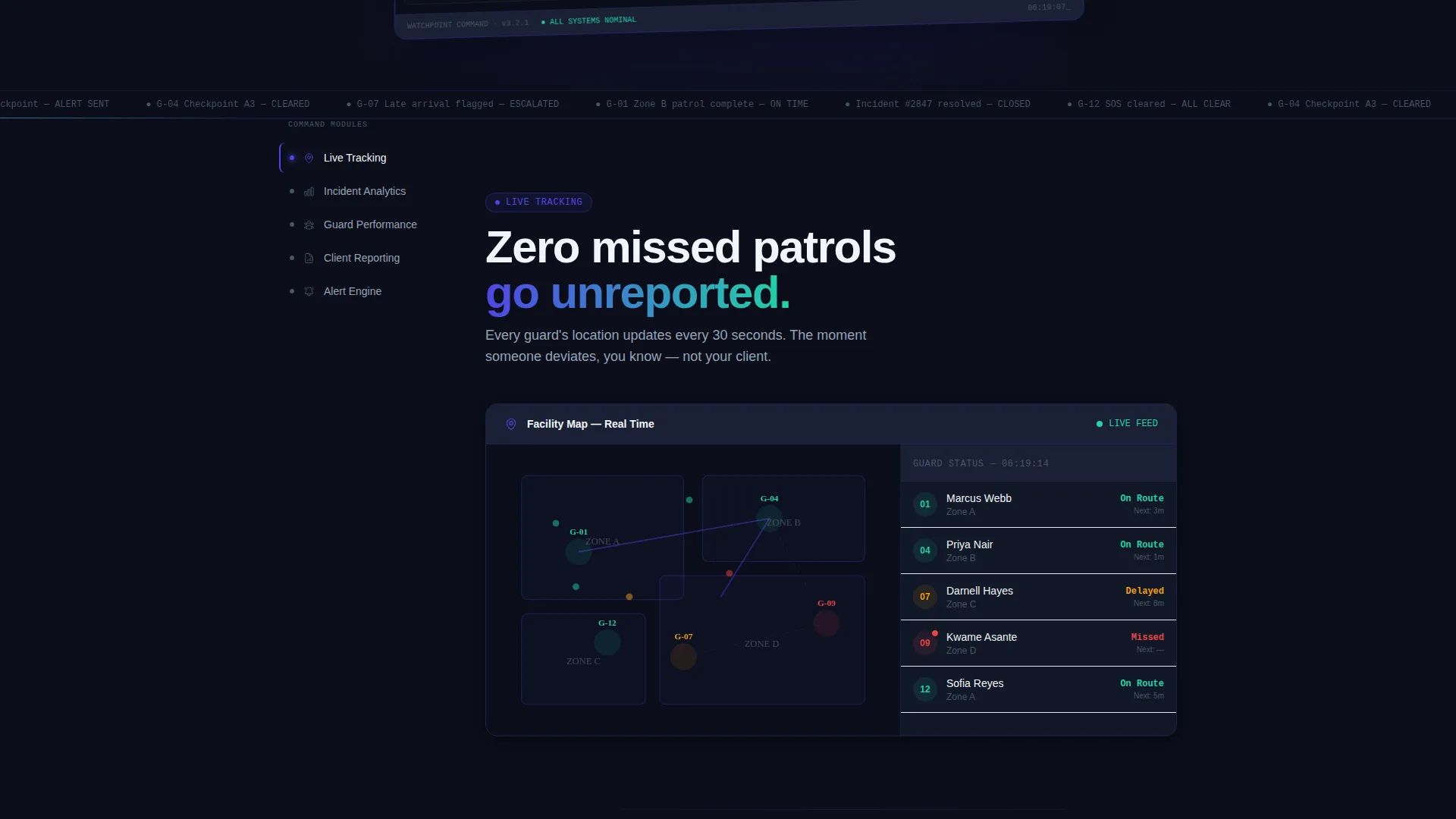
- Five anchor-linked spoke sections covering Live Tracking, Incident Analytics, Guard Performance, Client Reporting, and Alert Engine, each opening with a bold metric and an animated dashboard panel
- A dual-path conversion system with a primary "Deploy Watchpoint Free" call to action, a platform selector for iOS, Android, and Web Console, and a secondary "See It With Your Data" demo booking flow
Feature list
This template ships with purpose-built components that work together to simulate operational intelligence and drive app downloads.
Feature Tab Switcher Header
Three clickable tabs sit above an angled browser-frame mockup. Each tab triggers a smooth crossfade to a distinct dashboard state: patrol-route dots, a thermal incident heat map, or guard performance cards with sparklines. The mockup floats on the dark background with a soft indigo ambient glow beneath it.
Animated Hub Navigation Rail
A sticky left-rail navigation anchors the five spoke sections. Visitors can jump by clicking or scroll naturally through the sequence. The rail keeps orientation clear at every scroll depth without interrupting the motion-forward experience.
Self-Building Dashboard Panels
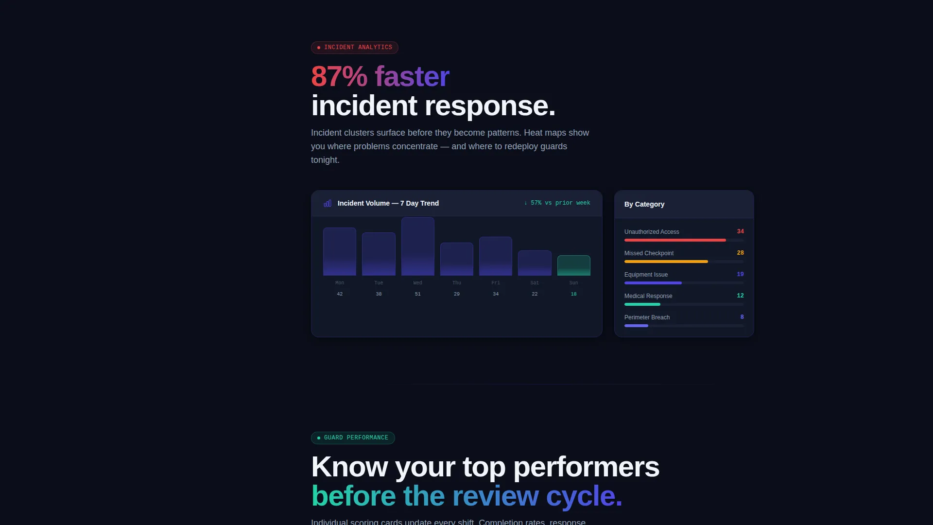
Each spoke section opens with a single bold metric paired with an animated panel. Charts draw themselves, numbers count up, and status badges flip from gray to phosphor green on entry. The motion mimics live data refreshing so the page behaves like a working product.
Dual-Path Conversion System
The primary call to action triggers a platform selector followed by a single work-email field. The secondary path links to a demo booking flow with a facility-type selector and guard-count range input. Both paths appear in the header and as a persistent bottom bar on mobile.
Incident Heat Map Visualization
The header's second tab state renders a thermal-style overlay where incident clusters bloom in indigo-to-red gradients. This visualization communicates geographic incident density without needing real data, giving security buyers an immediate sense of the product's analytical depth.
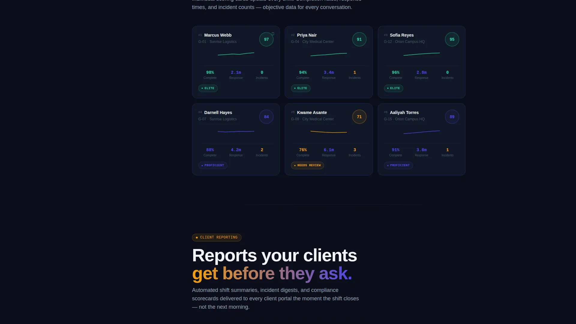
Guard Performance Scoring Cards
The Guard Scoring tab and the Guard Performance spoke section display individual guard cards with completion percentages and response-time sparklines. Buyers can see exactly how the product surfaces accountability data at the individual level.
Page sections overview
| Section | Purpose |
|---|---|
| Feature Tab Header | Showcases three live dashboard states with crossfade animation |
| Hub Nav Rail | Anchors all five spoke sections for quick access |
| Live Tracking Spoke | Demonstrates real-time patrol-route monitoring with bold metric |
| Incident Analytics Spoke | Shows heat-map clustering and incident-response data |
| Guard Performance Spoke | Displays individual guard scoring cards and sparklines |
| Client Reporting Spoke | Highlights automated reporting capability for end clients |
| Alert Engine Spoke | Presents the proactive alerting system with status indicators |
| Primary call to action Block | Drives app download with platform selector and email field |
| Demo Booking Path | Secondary conversion via facility-type and guard-count selector |
| Mobile Bottom Bar | Persistent download call to action for mobile visitors |
Design & branding system
The visual identity follows a Dynamic Motion theme built on an Electric Indigo color system. Every color choice is intentional and signal-driven, nothing is decorative.
- Core palette: deep operations black (#0B0E1A) as the base, electric indigo (#4F46E5) for active states and data lines, phosphor green (#22D3A7) for positive-status indicators, and cool slate (#94A3B8) for secondary text and inactive interface elements
- The ambient glow beneath the header mockup and the pulsing indigo across interactive states create a radar-sweep feel, as if each color earns its brightness against the dark void
- Motion is treated as a system-level signal: animations mimic live-data refresh behavior rather than decorative transitions, keeping the visual language consistent from header to final call to action
Mobile & speed optimization
The template is designed so the control-room experience translates cleanly to smaller screens without losing the operational atmosphere.
- The persistent bottom bar keeps "Deploy Watchpoint Free" always reachable on mobile, removing friction at the point of conversion
- Spoke sections reflow for vertical scrolling, and animated panels are sequenced to trigger on entry so they remain impactful on a phone screen without requiring simultaneous rendering
- The hub navigation rail adapts for touch, allowing visitors to tap directly to any of the five spoke sections without losing the anchor-based orientation
How this template helps you convert
Every structural and motion decision in this template is aimed at reducing skepticism and building enough trust to earn an app download before the visitor reaches the call-to-action block.
- The Feature Tab Switcher lets visitors interact with three distinct dashboard views in the first scroll, creating an immediate sense of product depth and giving buyers something to explore rather than just read.
- Each spoke section opens with a single bold metric such as "87% faster incident response," giving security directors a concrete, scannable reason to keep reading before the animated panel loads its full proof.
- The dual-path conversion design respects different buyer readiness levels: those ready to act can deploy immediately, while those who need more confidence can book a guided demo with relevant context fields already built in.
Other information about this template
This template is categorized under Technology, specifically within the Security Guard Vertical SaaS subcategory, targeting the Security Guard Analytics Dashboard niche. It is built as a hub-and-spoke anchor-nav landing page using the Dynamic Motion theme and Electric Indigo color system, with a Feature Matrix creative direction and a Feature Tab Switcher header concept.
- The landing-page direction is App Download, making every section and motion element accountable to a single conversion goal
- The intersection match between the hub-and-spoke template style, the Feature Tab Switcher header, and the security guard analytics niche is what makes this template feel native to the operational security buyer rather than adapted from a generic SaaS layout
- Template customization is straightforward: swap the bold metrics, update the facility-map graphics, replace placeholder guard performance data, and point the call-to-action form to your actual download or demo endpoint
Theme
Dynamic Motion
Creative direction
Feature Matrix
Color system
Electric Indigo
Style
Hub & Spoke (Anchor Nav)
Direction
App Download
Page Sections
Feature Tab Switcher Header
Animated Hub Navigation Rail
Self-building Dashboard Panels
Dual-path Conversion System
Incident Heat Map Visualization
Guard Performance Scoring Cards
Related questions
Who is this landing page template designed for?
Do I need real dashboard data to use this template?
Can I change the spoke sections to match my product's feature set?
How does the dual-path conversion system work?



