Watt - Powerful Energyanalytics Landing Page Template
Watt is a split-screen energy analytics landing page template built for SaaS platforms that turn raw utility data and IoT sensor feeds into actionable intelligence. The Dashboard Pro theme pairs deep void black with electric indigo and phosphor green to recreate the focused clarity of a live operations control room. It is designed to convert facility managers, sustainability leads, and energy consultants into signups.
by Rocket studio
Quick summary
Watt is a single-page, split-screen landing page template for energy analytics platforms. It follows a Problem→Solution Arc, pairing pain points on the left panel with live dashboard proof on the right. The Electric Indigo color system and animated header create immediate visual authority, while repeating call-to-action placements guide visitors toward a free energy audit signup.
Who this template is for
This template is built for teams selling or marketing energy analytics software to professional buyers. The layout and messaging speak directly to people who manage energy data at scale.
- Operations directors at multi-site retail chains monitoring demand charges
- Sustainability leads at universities tracking Scope 2 emissions targets
- Energy consultants managing multiple client portfolios from a single interface
What problem this template solves
Energy analytics platforms face a trust gap. Potential customers arrive skeptical, armed with spreadsheets and inflated utility bills, unsure whether another tool will actually cut through the noise. A generic SaaS landing page cannot close that gap.
- Visitors cannot see dashboard value until they have already signed up
- Pain points like hidden demand charges and missed rebate windows go unnamed on most templates
- No visual proof of clarity means no motivation to act before the next billing cycle
What you get with this template
You get a complete, single-page landing page layout structured around a scrolling problem-and-solution narrative. Every visual and copy decision in the template is calibrated to serve an energy analytics use case.
- A 50/50 split-screen layout pairing problem visuals with live dashboard fragments
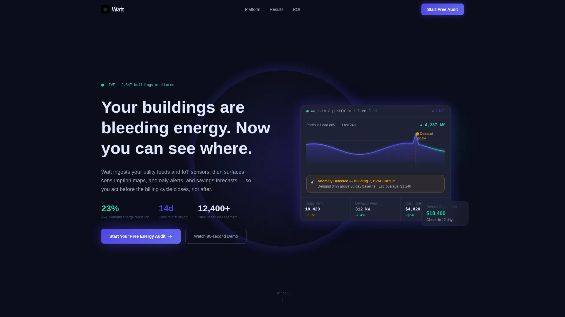
- An animated dark full-bleed header with a pulsing real-time load curve and anomaly spike
- Repeating primary call-to-action buttons and a sticky secondary bar linking to a live demo
Feature list
This template includes purpose-built layout sections and interactive design components drawn directly from the energy analytics brief.
Animated Dark Header with Glow Effect
The header fills the full viewport with deep void black (#0B0E1A). A softly glowing dashboard fragment sits at center, featuring an indigo-gradient load curve, ticking kilowatt-hour counters, and an amber anomaly spike. After two seconds, a headline types itself onto the screen, signaling a live, data-rich product from the first moment.
50/50 Split-Screen Scroll Narrative
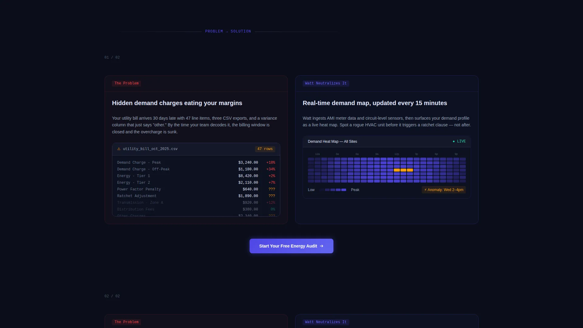
Each scroll section divides the viewport evenly. The left panel presents the problem, including chaotic utility bills, overlapping data exports, and red variance numbers. The right panel simultaneously reveals the Watt dashboard interpreting that same data into clean trend lines and ranked action items, creating a tension-and-relief rhythm as the visitor scrolls.
Escalating Problem and Solution Pairs
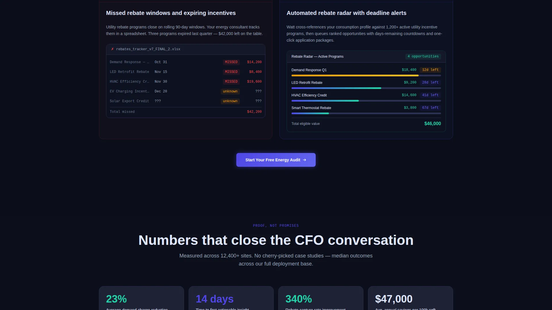
The scroll arc escalates stakes progressively. Hidden demand charges, missed rebate windows, and compliance deadlines appear on the left as individual beats. Each beat is answered on the right by the corresponding platform feature that neutralizes it, keeping the visitor engaged through the full page.
ROI Calculator Section
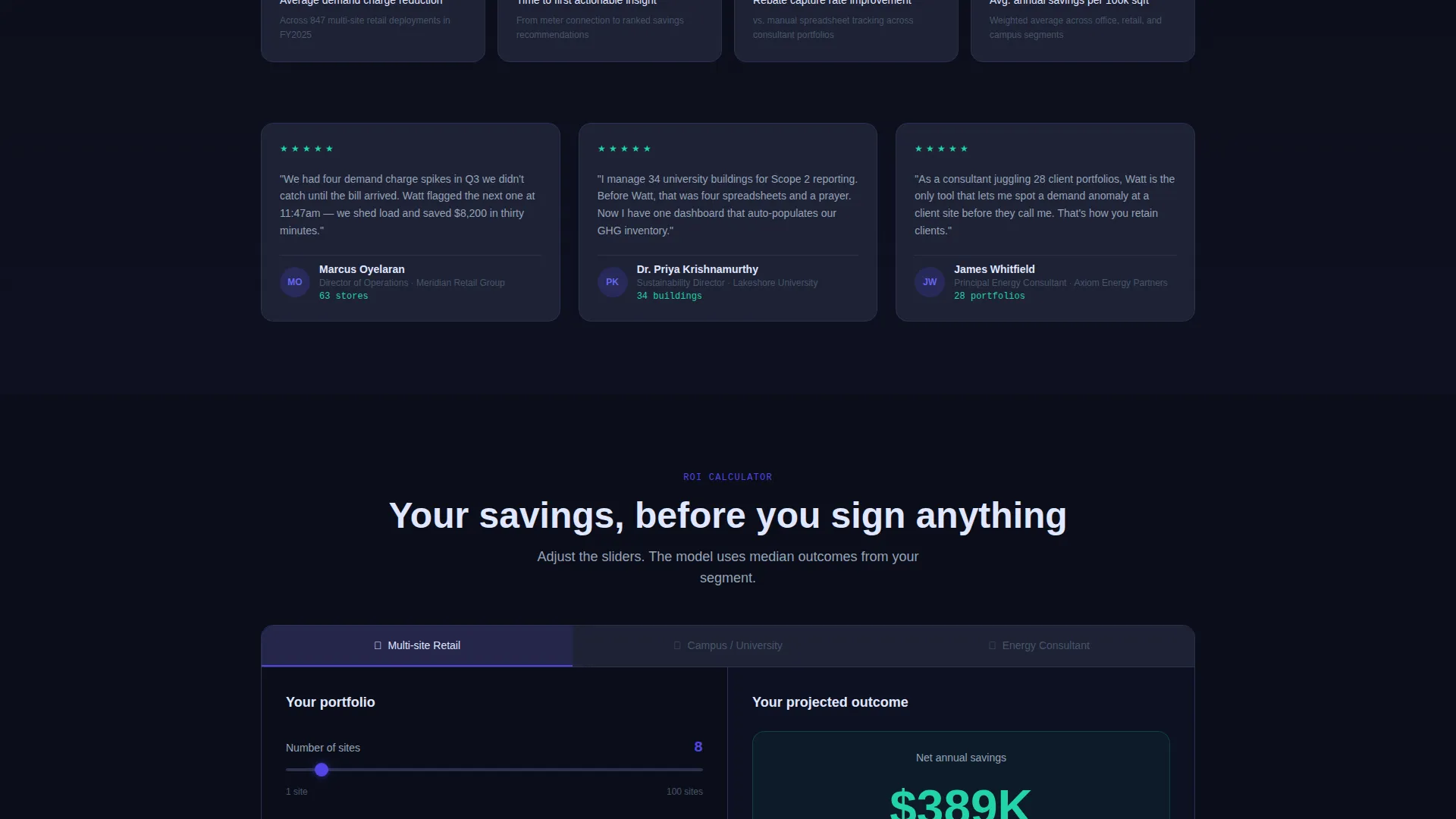
The final section collapses both panels into a single full-width return-on-investment calculator. It anchors the page's value argument with real numbers, showing figures such as an average 23% reduction in demand charges and a 14-day time-to-insight, turning a visual narrative into a quantified business case.
Repeating Click-Through Call-to-Action System
The primary call-to-action button, "Start Your Free Energy Audit," appears first in the glowing header and repeats after every problem-and-solution pair. A sticky secondary bar at the bottom of the page persists throughout the scroll, offering "See It With Your Data" as a lower-commitment entry point linking to an interactive demo.
Dashboard Pro Visual Components
Chart fragments, consumption maps, anomaly alert indicators, and savings forecast panels are embedded as live user interface elements within the layout. These components let visitors evaluate the product's clarity before they sign up, replacing static screenshots with animated proof.
Page sections overview
| Section | Purpose |
|---|---|
| Dark Header Hero | Hooks with animated load curve and typed headline |
| Problem Panel Left | Visualizes chaotic utility data and billing pain |
| Solution Panel Right | Shows Watt dashboard resolving the same data |
| Demand Charges Pair | Escalates hidden cost stakes and feature response |
| Rebate Windows Pair | Highlights missed savings and platform detection |
| Compliance Deadlines Pair | Raises regulatory urgency and dashboard answer |
| Full-Width ROI Calculator | Quantifies savings with real benchmark numbers |
| Sticky Demo Bar | Persists at bottom linking to interactive demo |
Design & branding system
The template follows a Dashboard Pro theme built around an Electric Indigo color system. Every color decision has a specific job: backgrounds recede, interactive elements glow, and success states read instantly.
- Deep void black (#0B0E1A) anchors all backgrounds; cool slate (#1E2235) surfaces card panels
- Electric indigo (#4F46E5) radiates from charts, buttons, and interactive hotspots across the layout
- Phosphor green (#22D3A7) is reserved exclusively for positive-delta indicators and success states; amber (#F59E0B) marks anomaly alerts; body text uses blue-white (#E0E7FF) for high contrast against dark backgrounds
Mobile & speed optimization
The template layout is designed with responsive behavior in mind, ensuring the split-screen structure adapts cleanly across screen sizes. Animated components are contained within the layout system to support smooth rendering.
- Split-screen panels reflow to stacked single-column layout on smaller viewports
- Animated header elements and pulsing chart fragments are scoped to avoid layout shifts on mobile
How this template helps you convert
The layout is engineered around a single goal: moving a skeptical facility manager from "I have spreadsheets" to "I want the free audit." Every structural decision supports that journey.
- The animated header creates immediate proof of product clarity before any copy is read, reducing bounce from visitors who need to see before they believe.
- The repeating call-to-action system ensures that no matter where a visitor stops scrolling, a conversion point is within view, with the sticky demo bar providing a low-friction alternative for visitors not yet ready to commit.
Other information about this template
This template is categorized under Technology, specifically within the Energy Software and SaaS subcategory. It is purpose-built for the energy analytics dashboard niche and aligns with the intersection of Dashboard Pro theme, Electric Indigo color system, Split Screen layout style, and Click-Through landing page direction.
- The Intersection Match Score for this template is 13, reflecting strong alignment between theme, niche, and layout direction
- The template is structured as a single landing page and is not intended as a multi-page website build
- The creative direction follows a Problem→Solution Arc, a narrative format well suited to convincing buyers who arrive with existing tools and need clear differentiation before committing
Theme
Dashboard Pro
Creative direction
Problem→Solution Arc
Color system
Electric Indigo
Style
Split Screen (50/50)
Direction
Click-Through
Page Sections
Animated Dark Header with Glow Effect
50/50 Split-screen Scroll Layout
Escalating Problem and Solution Pairs
Full-width ROI Calculator Section
Repeating Call-to-action System
Live Dashboard User Interface Fragments
Related questions
Who is this template designed for?
Can I customize the color system and branding?
What makes the split-screen layout effective for energy software?
Does the template include working ROI calculator functionality?
Is this template a single landing page or a multi-page website?



