Watt - Powerful Energybuilder Landing Page Template
Watt is a split-screen landing page template built for energy companies that need a conversion-ready web presence fast. Designed with a Tech Glass aesthetic and an iridescent color system, it pairs a live wireframe view with a finished site preview. Solar installers, utility providers, and EV charging networks can showcase their offer and capture leads without writing a single line of code.
by Rocket studio
Quick summary
Watt is a bold, single-page template for energy businesses that need to launch fast and convert hard. Its 50/50 split-screen layout pairs raw wireframe sketches with polished, published-site previews. Three industry tabs let visitors flip between Solar, Utility, and EV Charging contexts instantly. Every section leads with a hard number, followed by visual proof on the opposite panel.
Who this template is for
This template is built for energy-sector teams who need a professional landing page without a long development cycle. Whether you are a one-person solar operation or a growing utility brand, the layout works out of the box.
- Solar installers who have outgrown a basic website builder and need a lead-generation machine
- Mid-size utility providers rebranding after deregulation and looking for a credible digital presence
- EV charging networks that need location-specific pages deployed faster than new infrastructure goes live
What problem this template solves
Energy businesses often lose leads because their websites feel outdated, load slowly, or fail to communicate value before a visitor leaves. Watt is designed to close that gap immediately.
- Visitors leave generic energy sites before reading a single benefit, so Watt leads with stats that stop the scroll
- Side-by-side comparisons make the performance gap between a competitor's site and yours impossible to ignore
- Switching between Solar, Utility, and EV Charging contexts used to require separate pages or separate agencies
What you get with this template
You get a fully structured, single-page layout built around the idea that proof comes before persuasion. Every section is pre-wired for maximum impact with minimal editing.
- A Feature Tab Switcher header with three glass-morphic tabs that restructure both sides of the split viewport simultaneously
- A Stats-First scroll rhythm with oversized lead statistics on the left and animated comparison graphics on the right
- A sticky comparison table and dual call-to-action setup that keeps the primary offer visible throughout the entire page
Feature list
This section describes the core built-in components that ship with the Watt template.
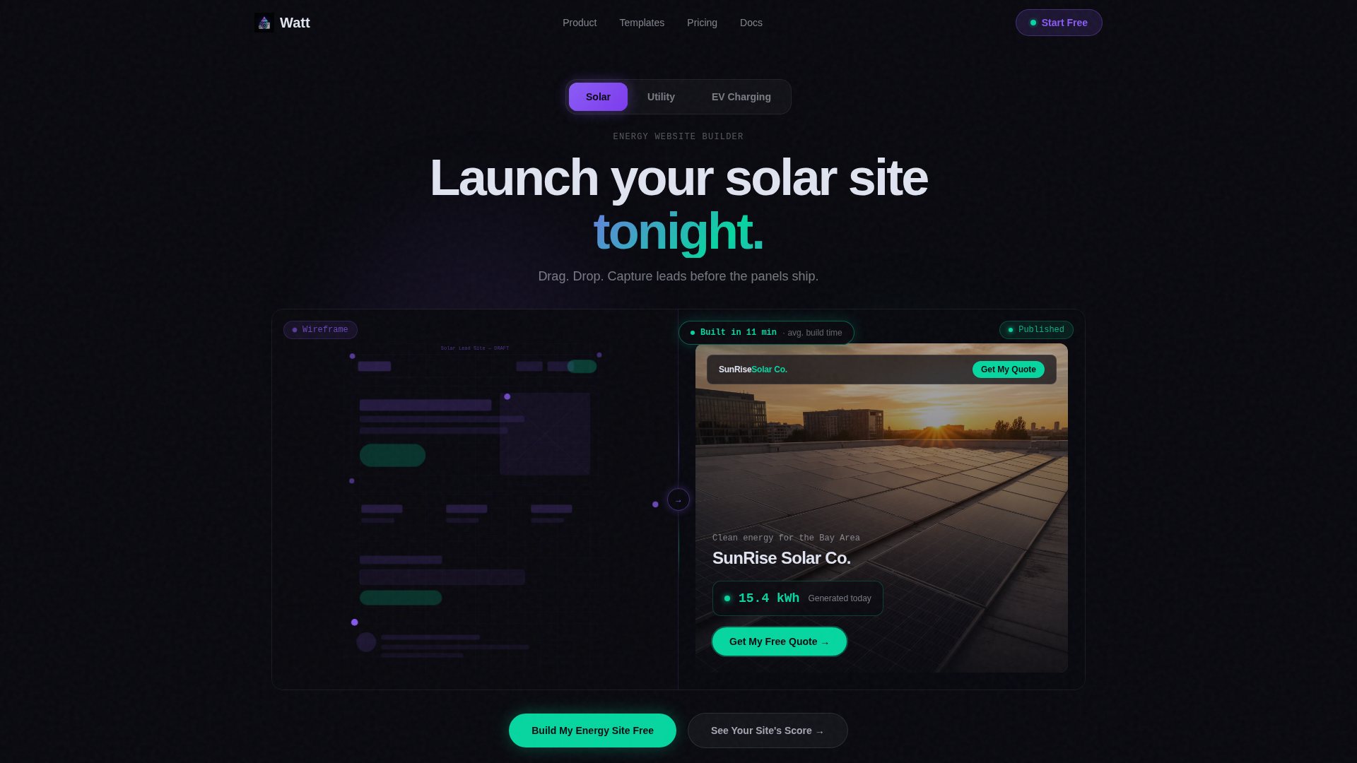
Split-Screen Tab Switcher Header
Three tabs labeled Solar, Utility, and EV Charging sit centered above a 50/50 viewport. Clicking any tab swaps both the wireframe skeleton on the left and the finished site preview on the right simultaneously. A stat badge in the corner updates to reflect the active vertical, for example showing "Built in 11 minutes."
Live Wireframe and Preview Panels
The left panel shows a faintly glowing node-and-grid-line wireframe in prismatic violet. The right panel shows the corresponding published site, complete with a hero image, a live kilowatt-hour counter ticking upward, and a pulsing cyan call-to-action button. Both panels update in sync when a tab is selected.
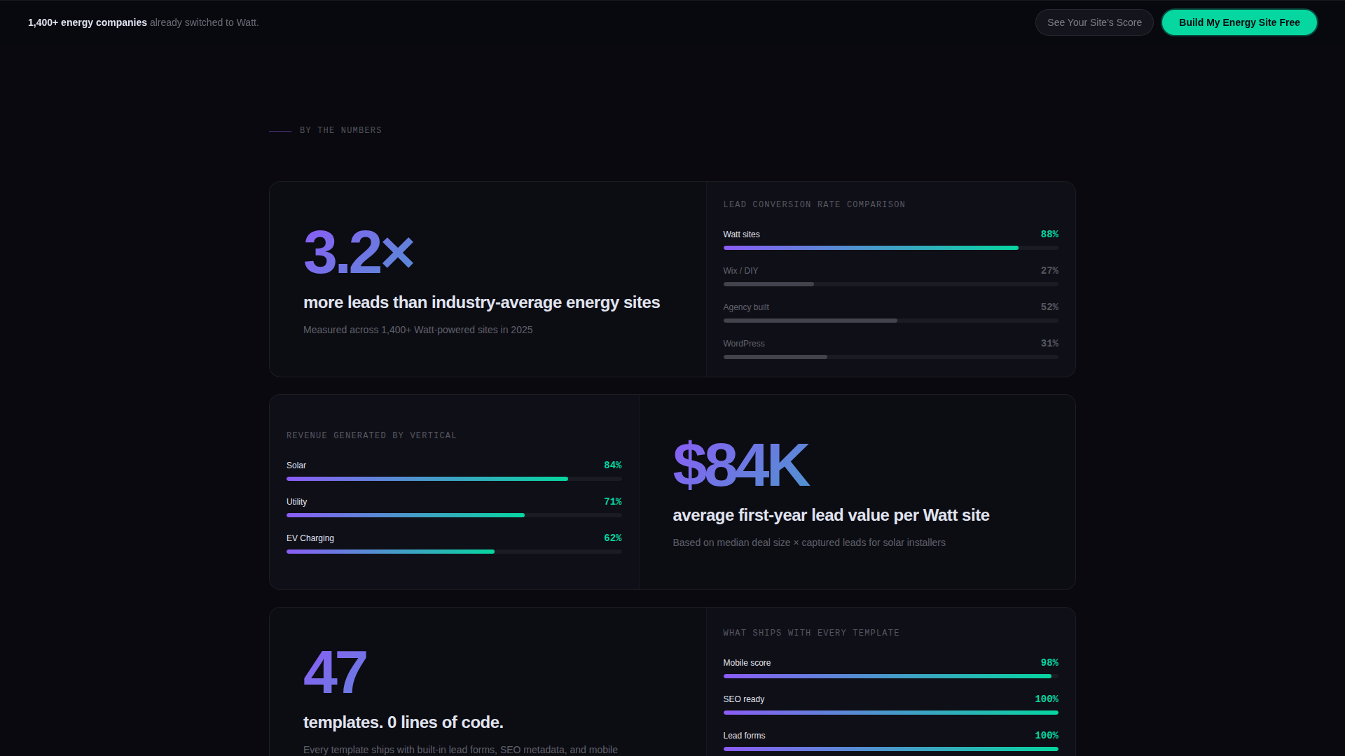
Stats-First Scroll Sections
Each scroll stop opens with a hard, oversized statistic before any explanatory copy arrives. Examples include "3.2 times more leads than industry-average energy sites" and "47 templates, 0 lines of code." The alternating left-right rhythm keeps the eye moving and the stakes escalating from speed to revenue to competitive urgency.
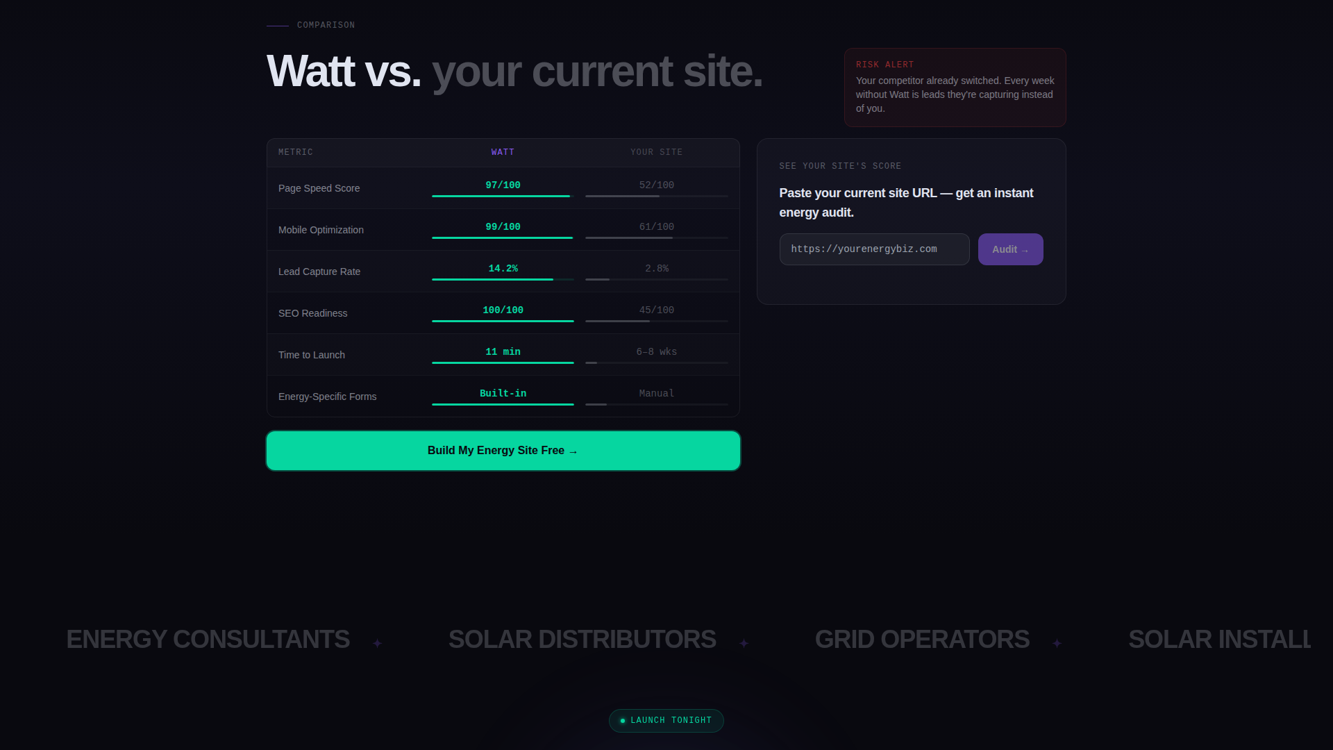
Side-by-Side Comparison Table
A structured spec table pits the Watt template against a visitor's current site across four rows: page speed, mobile score, lead capture rate, and search engine optimization readiness. Each row animates the performance gap in real time, making the deficit visible before the call to action appears.
Dual Call-to-Action System
The primary call to action, "Build My Energy Site Free," is pinned below the comparison table and repeats in a sticky bar once the visitor scrolls past it. A secondary path, "See Your Site's Score," opens a single-field input where visitors enter their current URL to receive an instant audit result.
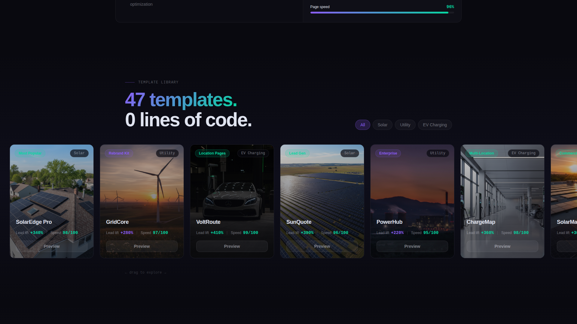
Scrollable Template Gallery Panel
One section pairs the stat "47 templates, 0 lines of code" on the left with a scrollable template gallery on the right panel. Visitors can browse available energy site layouts without leaving the page, giving them a concrete sense of the product before signing up.
Page sections overview
| Section | Purpose |
|---|---|
| Tab Switcher Header | Lets visitors switch between Solar, Utility, and EV Charging contexts with synchronized split-screen previews |
| Wireframe Preview Split | Shows raw site skeleton beside a finished published site to demonstrate the build process visually |
| Lead Stats Block | Opens the scroll with "3.2 times more leads" in oversized type beside an animated comparison graph |
| Template Gallery Split | Pairs the "47 templates" stat with a scrollable gallery panel for immediate product browsing |
| Speed and Revenue Stats | Escalates stakes through "Launch tonight," revenue figures, and competitive urgency messaging |
| Comparison Spec Table | Animates a row-by-row performance gap between Watt and a visitor's current site |
| Sticky call to action Bar | Keeps "Build My Energy Site Free" visible after the visitor scrolls past the comparison section |
| URL Audit Input | Single-field secondary path that returns a personalized site score to make the gap feel personal |
Design & branding system
The visual identity follows a Tech Glass theme powered by an AI Iridescent color system. The palette feels like looking through a tinted smart-glass window at night: dark and still until motion triggers a shimmer of color.
- Core colors: void black (#09090F) for backgrounds, frosted glass (#E0E4F0 at 60% opacity) for cards and floating panels, prismatic violet (#8B5CF6) for structural elements like the wireframe grid, and shifting cyan (#06D6A0) reserved for live data displays and hover states
- Cards and panels use frosted translucency to float above the dark background without obscuring depth
- Iridescent accents appear only on interactive or animated elements, such as pulsing buttons, ticking counters, and cursor-responsive hover states
Mobile & speed optimization
The split-screen layout is structured to reflow cleanly on smaller screens without losing the visual contrast that drives engagement. Heavy animations are scoped to elements that benefit most from motion.
- The 50/50 viewport stacks vertically on mobile so each panel fills the full screen width in sequence
- Animated elements such as the comparison graph and the kilowatt-hour counter are isolated to avoid blocking the main content render
- The sticky call-to-action bar is sized and positioned for thumb-friendly tapping on mobile devices
How this template helps you convert
Every design decision in Watt is pointed toward a single outcome: getting an energy business visitor to take action before they navigate away.
- The Stats-First layout leads with credibility before asking for anything, so visitors arrive at the call to action already persuaded by hard numbers and live visual proof.
- The comparison table makes the cost of inaction concrete by showing a real-time performance gap between Watt and a visitor's existing site, removing ambiguity before the primary call to action appears.
- The dual call-to-action system captures both ready-to-commit visitors and research-mode visitors, the sticky bar for the former and the URL audit path for the latter.
Other information about this template
Watt is designed to serve the energy website builder niche specifically, not as a generic technology template adapted after the fact. Every layout decision reflects the real sales cycle of energy businesses.
- The template style is Split Screen (50/50), making it suitable for comparison-driven or demo-forward landing pages in any technology or software-as-a-service context
- The creative direction is Stats-First Impact, meaning headline statistics anchor every section before supporting copy or visuals follow
- The header concept is a Feature Tab Switcher, which makes it easy to serve multiple verticals from a single page without duplicating the full layout
- The conversion direction is Comparison/Versus, a proven structure for software products that need to displace an incumbent solution
- The color system is AI Iridescent with a Tech Glass theme, giving the page a premium, technology-forward feel that matches the expectations of energy sector decision-makers
Theme
Tech Glass
Creative direction
Stats-First Impact
Color system
AI Iridescent
Style
Split Screen (50/50)
Direction
Comparison/Versus
Page Sections
Split-screen Tab Switcher Header
Live Wireframe and Preview Panels
Stats-first Scroll Rhythm
Animated Comparison Spec Table
Dual Call-to-action System
Scrollable Template Gallery Panel
Related questions
Can this template support multiple energy verticals on one page?
Do I need to write code to customize this template?
What is the split-screen layout and why does it matter for energy sites?
Who is the primary audience for this template?
How does the URL audit feature work?