Wavelength — Comms Landing Page Template
Uplink is a hub-and-spoke telecommunications client portal landing page built for teams that manage networks, tickets, billing, and analytics in one place. The dark Tech Glass design, anchor navigation, and section-by-section micro-animations give visitors a full product tour before they ever sign up. A free trial call-to-action and embedded interactive demo lower the barrier to entry.
by Rocket studio
Quick summary
Uplink is a single-page telecommunications client portal landing page template. It uses a dark Carbon Fiber color system, anchor navigation with five spoke sections, and a staged reveal structure that walks visitors through every core portal capability. The layout converts on a freemium trial model with a repeating call-to-action and an embedded self-guided demo.
Who this template is for
This template is purpose-built for telecommunications businesses that serve enterprise clients and need to communicate portal value fast. It speaks directly to the people who evaluate and approve tools like this.
- Regional telecom account managers who oversee hundreds of enterprise contracts at once
- IT directors who need real-time outage visibility before an escalation reaches the executive level
- Finance teams reconciling usage charges across dozens of branch office locations
What problem this template solves
Telecom portals often fail to earn sign-ups because visitors cannot tell what the product does until they are already inside it. This template solves that by showing the product working before asking for any commitment.
- Visitors arrive at a polished, high-fidelity dashboard screenshot and immediately understand the scope of the portal
- Each anchor section reveals one focused capability, building confidence module by module
- The embedded interactive demo lets undecided visitors click through real screens without entering credentials
What you get with this template
You get a complete, ready-to-customize single-page layout that covers every stage of the visitor journey from first impression to sign-up. Every structural decision is already made.
- A full hub-and-spoke anchor navigation with five labeled spoke sections: Network, Tickets, Billing, Analytics, and Integrations
- A conversion flow built around a freemium trial model, with a repeating primary call-to-action and an expandable single-field email form
- A Tech Glass visual identity using the Carbon Fiber color system, applied consistently across all panels, cards, and interactive elements
Feature list
This template ships with six core design and structural features drawn directly from the brief.
Full-Width Dashboard Header
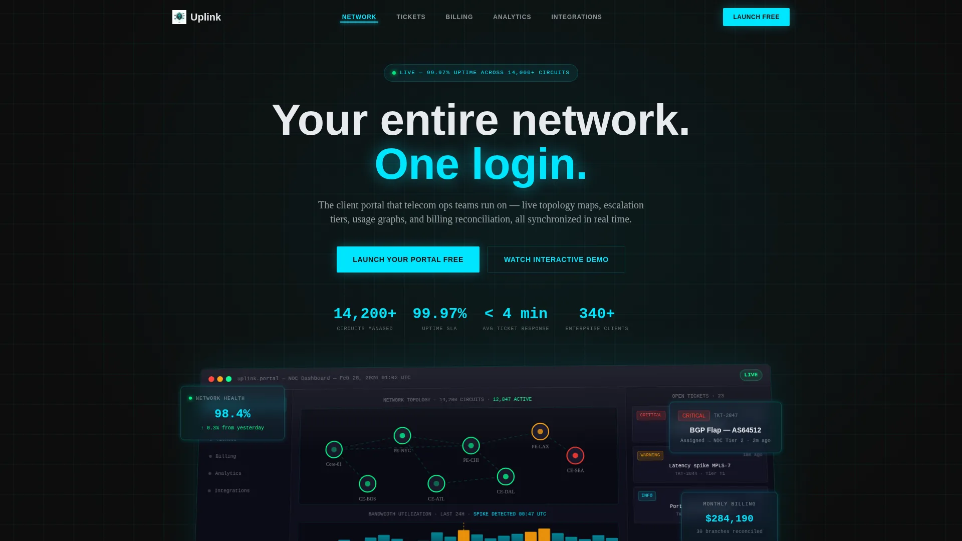
The header opens with a pixel-perfect product screenshot of the portal in its richest state. It shows a live network topology map with green node indicators, an open ticket sidebar with three escalation tiers, and a usage graph mid-spike. The screenshot sits on a subtle isometric tilt with a Tech Glass reflection across its top edge.
Hub and Spoke Anchor Navigation
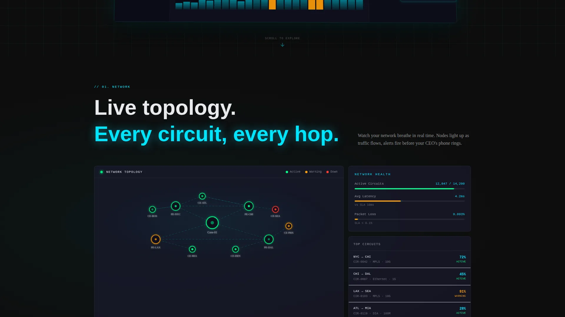
A sticky anchor navigation bar pins to the top of the page and links to five spoke sections: Network, Tickets, Billing, Analytics, and Integrations. This structure lets visitors jump directly to the capability they care about most without scrolling through unrelated content.
Section-Level Micro-Animations
Each spoke section triggers a themed entrance animation as it enters the viewport. Nodes connect, tickets resolve, invoices stack, and graphs climb on cue. The animations are controlled and purposeful, reinforcing what each module does at the exact moment a visitor reads about it.
Freemium Trial Conversion Flow
The primary call-to-action, "Launch Your Portal Free," appears at the hub and repeats after every spoke section. A single email field expands on focus to reveal a company name field and an estimated seat count field, reducing friction while capturing useful qualification data.
Embedded Self-Guided Demo
An interactive demo is embedded mid-page so visitors who are not yet ready to sign up can click through five real portal screens. This gives hesitant buyers a low-commitment way to experience the product and builds purchase confidence before the final call-to-action appears.
Carbon Fiber Visual System
The color system uses deep carbon black for backgrounds, woven graphite for cards and panels, signal-pulse cyan for all interactive elements and live-data accents, and status-bar white for body typography. The result is a layered, engineered aesthetic that matches the technical expectations of the target audience.
Page sections overview
| Section | Purpose |
|---|---|
| Hero Header | Anchor the first impression with the full-width dashboard screenshot and headline |
| Network Spoke | Showcase the real-time network topology map and node status indicators |
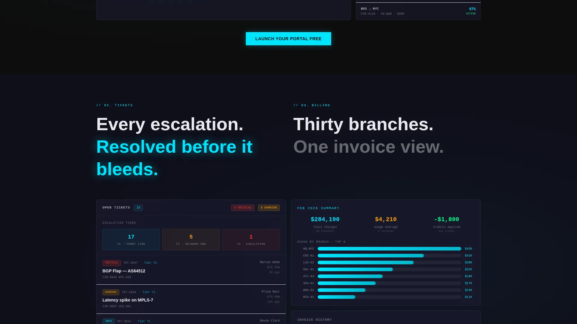
| Tickets Spoke | Demonstrate the ticket management sidebar and three-tier escalation view |
| Billing Spoke | Present the usage charge reconciliation and billing cycle summary panels |
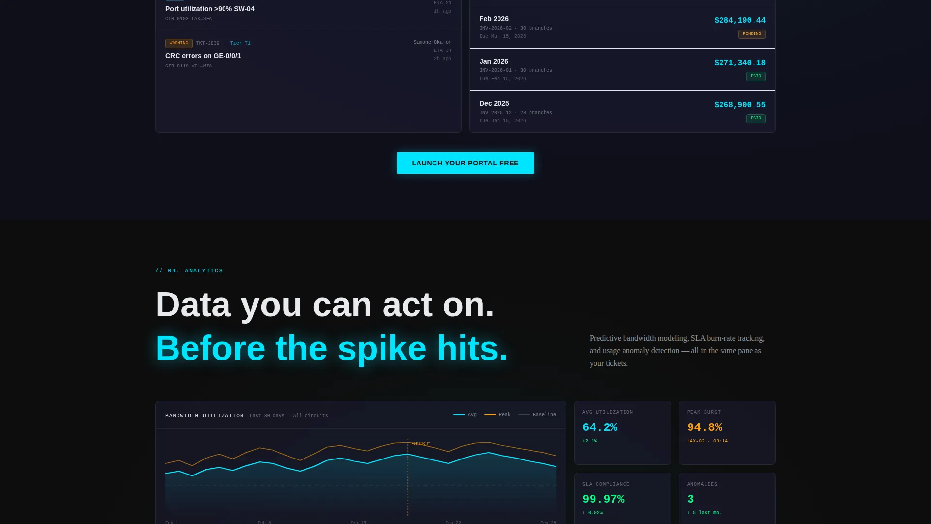
| Analytics Spoke | Display the usage graphs, mid-spike data visuals, and trend indicators |
| Integrations Spoke | Highlight the integration capability and ecosystem connection points |
| Interactive Demo | Let visitors click through five portal screens without signing up |
| Final call to action Block | Close with the repeating free trial call-to-action and expandable form |
Design & branding system
The Tech Glass theme creates a cockpit-at-night atmosphere where every element feels purposeful and lit. The Carbon Fiber palette is applied with a strict hierarchy so nothing competes with the live-data accents.
- Deep carbon black (#0D0D0D) dominates all section backgrounds, creating depth without distraction
- Woven graphite (#1A1A2E) lifts cards and panels just enough to feel layered against the black
- Signal-pulse cyan (#00E5FF) fires exclusively on interactive elements, call-to-action buttons, and live-data accents, while status-bar white (#E8EAED) keeps body text clean and readable
Mobile & speed optimization
The template is structured to translate its layered desktop cockpit feel to smaller screens without losing hierarchy or readability. Spoke sections reflow naturally into a vertical scroll.
- The sticky anchor navigation adapts to a compact bar on mobile, keeping all five section links accessible without crowding the screen
- Micro-animations are scoped to individual sections, so they trigger only when each section enters view rather than loading all at once
How this template helps you convert
The conversion strategy is baked into the structure. Every design and layout decision moves the visitor closer to the free trial sign-up.
- The hero screenshot and headline establish immediate product credibility, so visitors understand the portal's scope within the first few seconds of landing on the page.
- The embedded interactive demo removes the biggest objection for hesitant buyers by letting them experience five real screens without entering an email address or committing to anything.
- The repeating "Launch Your Portal Free" call-to-action after each spoke section catches visitors at the exact moment they finish evaluating each capability, rather than making them scroll back to the top to sign up.
Other information about this template
This template is designed for telecommunications businesses operating in competitive enterprise markets where first impressions are evaluated by technically sophisticated buyers. A few additional details worth noting:
- The template style is Hub and Spoke with Anchor Navigation, making it well-suited for portal products that have multiple distinct feature areas to communicate
- The header concept is a Product Screenshot, which is particularly effective for software and portal products because it shows the real interface rather than abstract illustrations
- The creative direction is Launch Energy, meaning each section is intentionally paced to build momentum as the visitor scrolls, similar to a staged product reveal
- The freemium and free trial landing page model used here is a proven structure for telecommunications software because it removes the price objection before it forms
- This template can support customization of all color values, headline copy, screenshot assets, and form field labels to match a specific portal product or brand identity
Theme
Tech Glass
Creative direction
Launch Energy
Color system
Carbon Fiber
Style
Hub & Spoke (Anchor Nav)
Direction
Freemium/Trial
Page Sections
Full-width Dashboard Hero Screenshot
Sticky Hub and Spoke Anchor Nav
Controlled Section Micro-animations
Freemium Trial Conversion Flow
Embedded Self-guided Interactive Demo
Carbon Fiber Color System
Related questions
Who is this landing page template designed for?
Can I replace the dashboard screenshot with my own product image?
Does this template include the interactive demo functionality?
How many call-to-action placements does this template include?
Can I change the five anchor navigation labels?



