Wayfare - Exclusive Travel Landing Page Template
Wayfare is a bento grid landing page template built for travel membership sites that surface hidden fares, mistake pricing, and points-multiplier routes. It opens with an interactive savings calculator, then cascades into member-versus-retail comparison blocks. The dark Dashboard Pro aesthetic and amber deal badges create urgency from the first scroll.
by Rocket studio
Quick summary
Wayfare is a single-page bento grid template designed for members-only travel fare services. It leads with a live-feel savings calculator, then builds a layered comparison story between member pricing and public retail fares. The Slate and Sky color system and dark glass panel header give it the atmosphere of a real-time flight operations dashboard.
Who this template is for
This template is built for operators who run subscription-based travel intelligence products. It speaks directly to an audience of deal-obsessed travelers who treat points like currency.
- Founders and product teams launching a travel fare membership site
- Travel deal curators who need to show insider value versus public booking tools
- Points and miles communities converting loyal followers into paying subscribers
What problem this template solves
Most travel sites try to inspire. This template does the opposite: it proves. Visitors who land here already know flights exist; what they need is immediate evidence that your membership surfaces fares they cannot find on their own.
- Generic hero images fail to justify a subscription fee before the visitor leaves
- Retail booking comparisons are buried or absent, making the value gap invisible
- There is no interactive hook to show personalized savings in the first five seconds
What you get with this template
You get a complete single-page layout that earns the subscription click through accumulating evidence rather than persuasion alone. Every section is purpose-built to close the insider-versus-outsider gap.
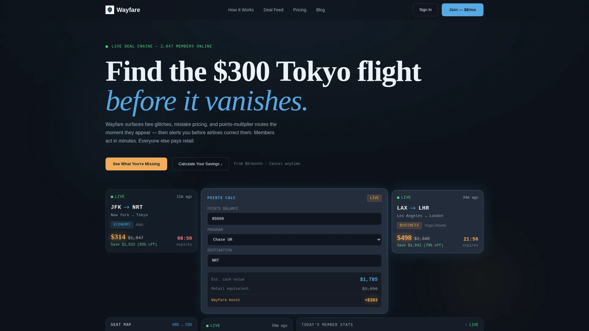
- A bento grid header filled with dark glass panel deal tiles, route codes, slashed prices, and a central savings calculator
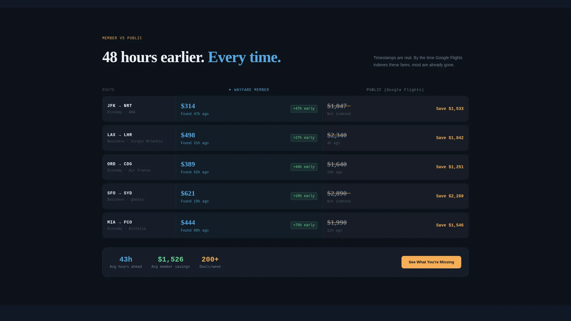
- A cascading comparison scroll that stacks member fares against public results with timestamps and route-level data
- A gated deal preview section and two distinct call-to-action paths tied to the primary membership offer
Feature list
The template is structured around a core set of functional and visual components derived directly from the brief.
Interactive Savings Calculator Card
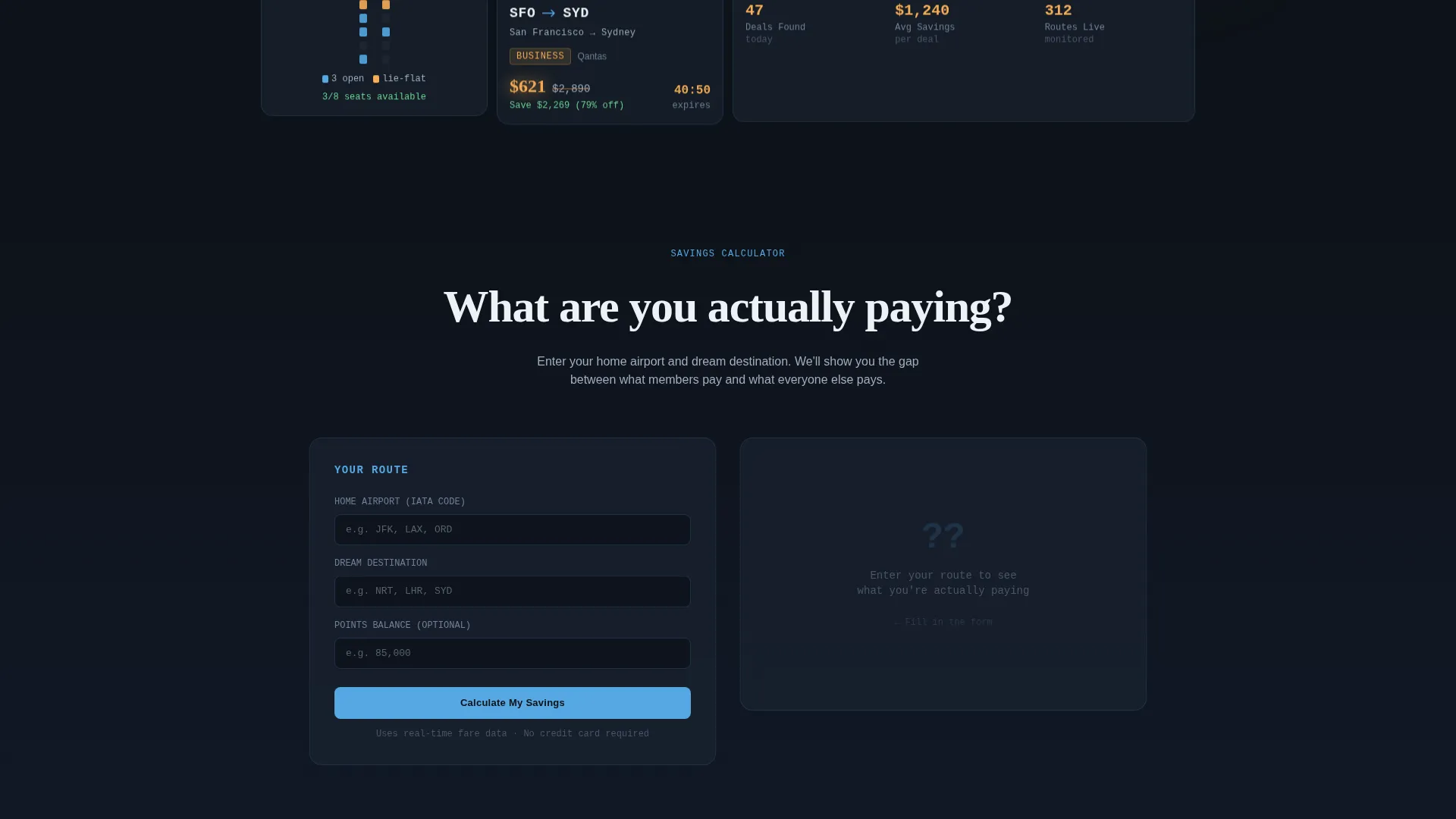
The top card in the bento header lets visitors enter a home airport, a dream destination, and a current points balance. It returns an instant split-data comparison: member price rendered in sky blue, retail price in muted slate, and the difference highlighted in departure-board amber. The calculator is loaded and ready before the visitor reads a single line of body copy.
Dark Glass Panel Header
The header is a wall of frosted, translucent bento cards floating over a near-black background. Each card displays a live-looking deal tile: route codes in bold monospace type, slashed prices with savings percentages, a points-transfer calculator mid-equation, and a seat-map fragment showing open lie-flat availability. Edge lighting on each panel mimics airport terminal screens at night.
Member-versus-Retail Comparison Grid
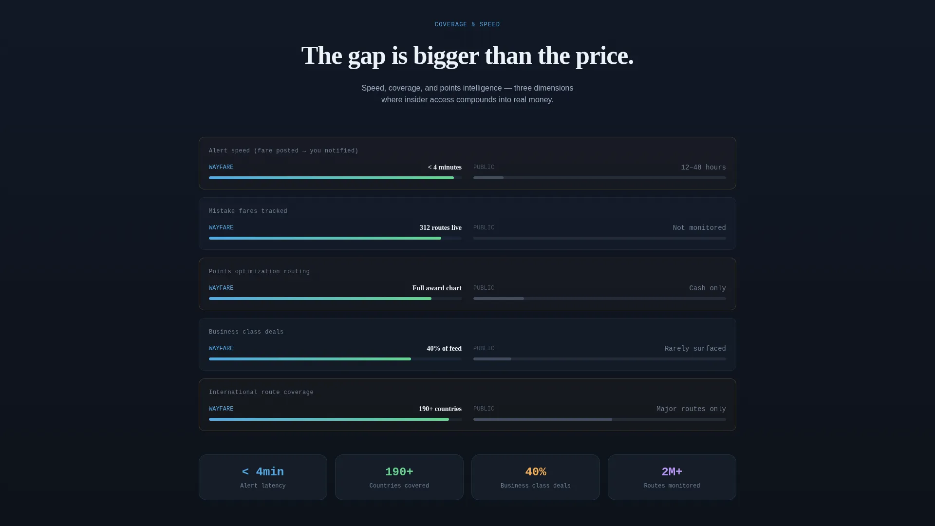
Below the header, the bento grid cascades into side-by-side versus blocks. Member deal feeds are shown alongside public booking results with timestamps that prove the member fare was live 48 hours earlier. Each row deeper adds another comparison layer covering alert speed, route coverage, and points optimization.
Gated Deal Preview with Micro-Form
The primary call-to-action gates a live preview of the top five deals behind a short email-and-home-airport form. This micro-form converts curiosity into a qualified lead while showing enough of the product to make withholding feel urgent rather than frustrating.
Departure-Board Amber Deal Badges and Countdown Timers
Live deal badges and countdown timers are styled in departure-board amber (#F6AD55) against dark surfaces. Every amber element signals that something is active right now, reinforcing scarcity without resorting to generic sales language.
Dual Call-to-Action Architecture
Two conversion paths run in parallel. The primary call-to-action reads "See What You're Missing" and drives toward the gated deal preview. The secondary path, "Calculate Your Savings," anchors back to the header calculator and resolves with a membership price comparison card and the closing offer: "Unlock Member Fares at $8 per month."
Page sections overview
| Section | Purpose |
|---|---|
| Bento Header Grid | Opens with frosted deal tiles and the central savings calculator |
| Calculator Result Card | Displays split member-versus-retail savings output in color-coded data |
| Comparison Feed Row | Shows member deal feed beside public results with live timestamps |
| Alert Speed Block | Compares how early members receive fare alerts versus public discovery |
| Route Coverage Block | Visualizes member route depth against standard search engine results |
| Points Optimizer Row | Demonstrates points-multiplier route value versus retail booking cost |
| Gated Deal Preview | Reveals top five deals behind an email and home-airport micro-form |
| Membership Offer Card | Closes the page with the $8 per month unlock call-to-action |
Design & branding system
The visual identity runs on a Dashboard Pro theme using the Slate and Sky color system. The palette is built to feel like a business-class cabin after lights-out: dark surfaces glowing with small, important data.
- Core surfaces use deep cockpit slate (#1B2432) and instrument-panel charcoal (#2D3748), with contrail white (#EDF2F7) for text and dividers
- Altitude sky (#56A8E2) highlights member-favorable data points; departure-board amber (#F6AD55) marks live deal badges and countdown timers
- Typography pairs bold monospace route codes for data tiles with a clean sans-serif for body copy, keeping the dashboard reading experience intact
Mobile & speed optimization
The bento grid layout is structured to reflow naturally across screen sizes. Travelers check fares on phones at odd hours, so the template is designed with compact, touch-friendly card sizing in mind.
- Bento cards stack vertically on small screens, preserving the data-forward hierarchy without requiring horizontal scrolling
- The calculator card remains the first interactive element visible on mobile, maintaining the tool-first conversion sequence
- Amber badges and countdown timers retain visual priority on all viewports so urgency cues are never lost in the reflow
How this template helps you convert
The page is engineered so that every additional scroll produces more evidence, not more persuasion copy. Conversion happens because visitors prove the value to themselves before the call-to-action appears.
- The calculator delivers a personalized savings number in the first viewport, making the $8 per month membership fee feel immediately absurd against even one captured deal.
- The cascading comparison grid builds a timestamp-backed record of member advantage, so by the time visitors reach the gated preview form, skepticism has already been eroded by data.
- The dual call-to-action architecture captures two intent levels: visitors ready to sign up and visitors who need one more proof point, ensuring neither group leaves without a conversion opportunity.
Other information about this template
This template is a strong fit for travel content creators who want to move their audience from free newsletter readers to paying members. It is also well-suited for points and miles communities that already have an engaged following and need a structured page to anchor a monetization launch.
- The template style is Bento Grid, and the theme is Dashboard Pro, making it visually distinctive in a category dominated by photo-heavy travel blogs
- The creative direction is Calculator and Tool First, meaning the interactive element leads the page rather than sitting below a long introductory section
- The landing page direction is Comparison and Versus, meaning every structural block is designed to widen the perceived gap between member access and public availability
- Color system reference: Slate and Sky with departure-board amber as the primary accent for urgency-driven elements
Theme
Dashboard Pro
Creative direction
Calculator/Tool First
Color system
Slate & Sky
Style
Bento Grid
Direction
Comparison/Versus
Page Sections
Interactive Savings Calculator Card
Dark Glass Panel Bento Header
Cascading Comparison Grid
Gated Deal Preview Form
Amber Deal Badges and Countdown Timers
Dual Call-to-action Architecture
Related questions
What kind of travel business is this template designed for?
Can I customize the calculator card to reflect my actual membership pricing?
Does the template include the bento grid layout structure out of the box?
How does the dual call-to-action work within the single-page flow?



