Waypoint - Intelligent Travel Analytics Landing Page Template
Waypoint is a travel analytics landing page template built for commercial leaders in airlines, hotel groups, and travel-tech companies. It combines a live booking-revenue calculator, visceral before-and-after comparison sections, and a Void and Violet dashboard aesthetic to turn a visitor's own numbers into the most persuasive argument on the page.
by Rocket studio
Quick summary
Waypoint is a single-page, dashboard-style landing page template for travel analytics platforms. It opens with an interactive revenue estimator, then walks visitors through a series of escalating comparisons that make the cost of slow, siloed data feel real. The design channels a dark cockpit aesthetic: void black backgrounds, electric violet live metrics, and plasma lilac chart lines.
Who this template is for
This template is built for travel-tech businesses that need to convert skeptical, data-literate buyers. It speaks directly to the professionals who own revenue decisions and need proof before they commit.
- Heads of commercial strategy at mid-size airlines who need real-time demand signals across every Online Travel Agency (OTA) and Global Distribution System (GDS) feed
- Revenue managers and commercial leaders at regional hotel groups fighting for OTA price parity
- Travel-tech Vice Presidents whose boards require clear attribution on every marketing dollar spent
What problem this template solves
Revenue managers in travel typically see their data after the opportunity has already passed. Reports arrive 48 hours late. Channel data lives in separate spreadsheets. Anomalies go undetected until a quarterly review confirms the loss.
- Delayed, siloed reporting means pricing and promotional decisions are made on stale information
- No single view across flight searches, hotel bookings, and ancillary spend makes pattern recognition nearly impossible
- Marketing spend lacks clear attribution, making it hard to defend budgets or optimize campaigns in real time
What you get with this template
You get a complete, conversion-focused landing page built around a "show the visitor their own numbers" philosophy. Every section is designed to make the gap between old tools and Waypoint feel obvious and urgent.
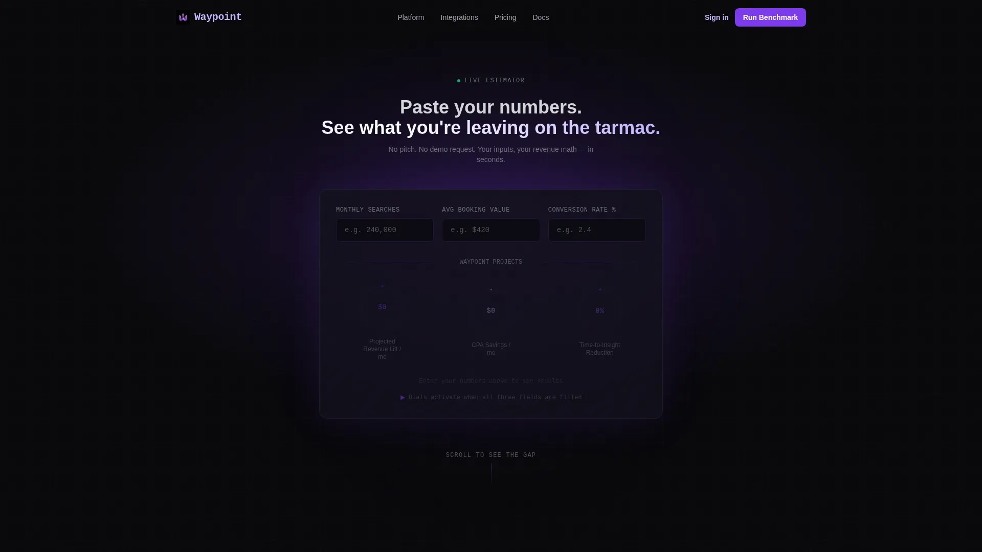
- An interactive booking-revenue estimator in the header that takes monthly search volume, average booking value, and current conversion rate, then displays three animated output dials
- A multi-section comparison engine that pairs static, muted "status quo" panels against live, animated Waypoint alternatives
- A sticky call-to-action bar, a competitor feature-comparison grid, and two distinct conversion paths built into the page structure
Feature list
This template is built around functional components that do the selling before a single feature bullet is listed.
Live Booking-Revenue Calculator
The header calculator accepts three visitor inputs: monthly search volume, average booking value, and current conversion rate. It then animates three output dials showing projected revenue lift, cost-per-acquisition savings, and time-to-insight reduction. The result panel includes the primary call-to-action button.
Escalating Comparison Sections
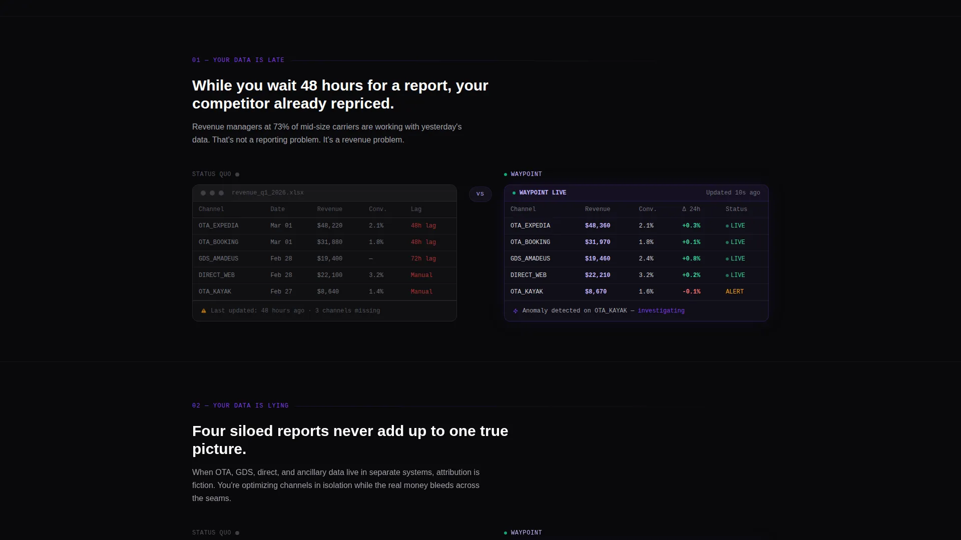
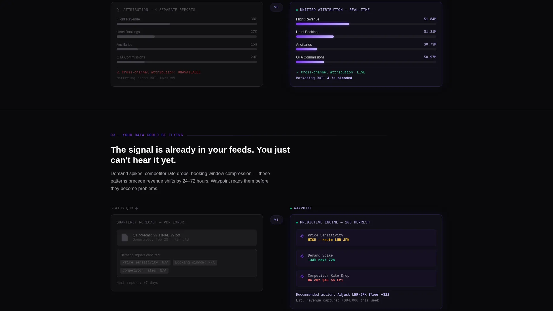
A sequence of versus panels progresses from "your data is late" through "your data is lying" to "your data could be flying." Each section places a muted, spreadsheet-era left panel beside a live, animated Waypoint right panel. The contrast grows more visceral with each scroll step.
Sticky Benchmark Call-to-Action Bar
After the third comparison section, a sticky bar appears at the bottom of the viewport. It carries the primary call-to-action and stays visible as the visitor continues scrolling, keeping the conversion path always within reach.
Two-Field Conversion Form
Clicking the primary call-to-action opens a focused form with two fields: work email and monthly booking volume. If the visitor used the calculator, the booking volume field pre-fills automatically, reducing friction at the moment of highest intent.
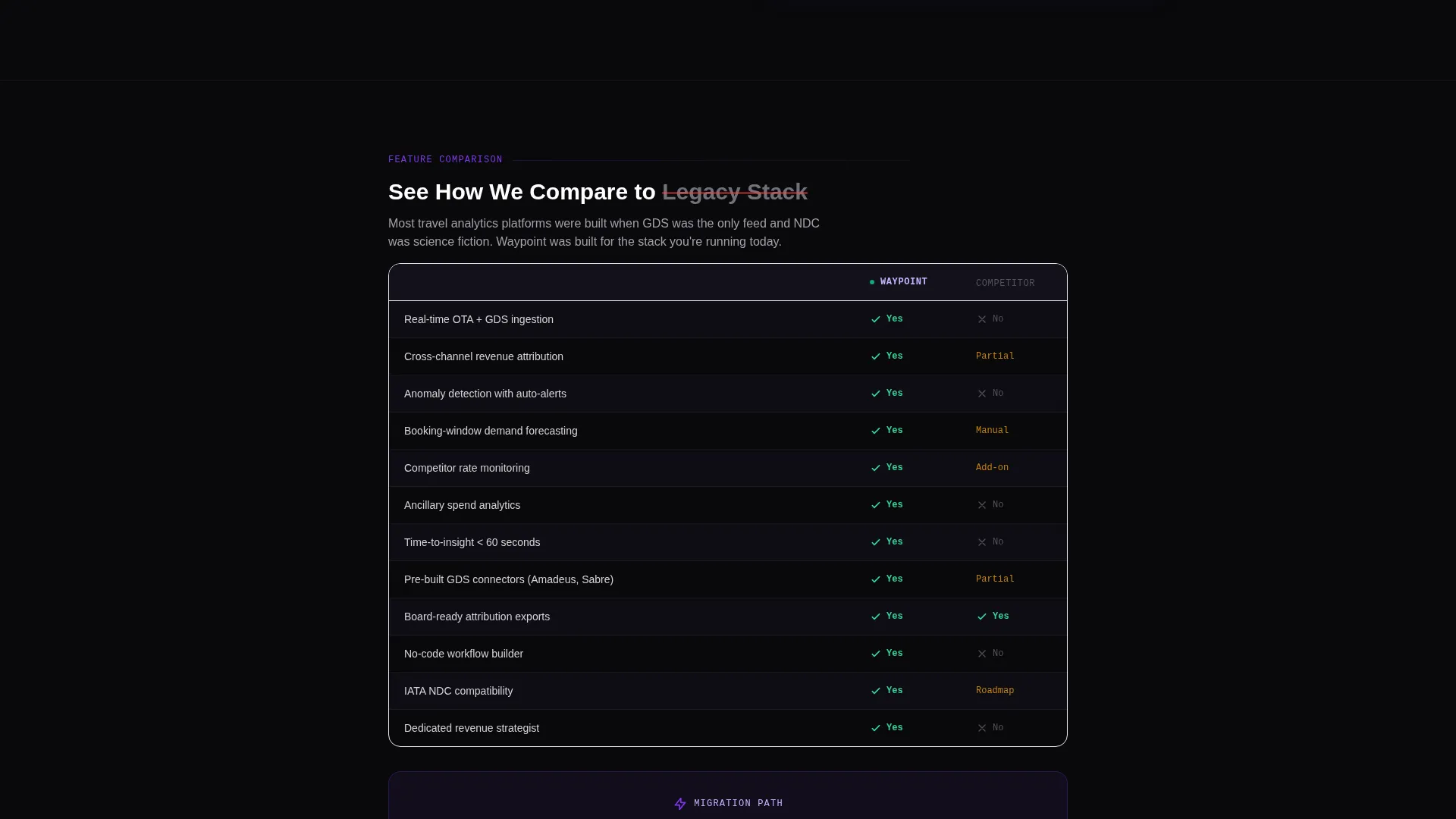
Competitor Feature-Comparison Grid
A secondary conversion path labeled "See How We Compare" leads to a detailed feature-by-feature grid. The grid ends with its own call-to-action: "Switch in a Sprint," giving comparison-minded buyers a clear next step.
Void and Violet Dashboard Aesthetic
The template's visual system uses absolute void black for backgrounds, electric violet for every actionable element and live metric, and plasma lilac for chart lines and secondary labels. The result is a dark, instrument-panel hierarchy that keeps data readable at a glance.
Page sections overview
| Section | Purpose |
|---|---|
| Dark Header Calculator | Hosts the interactive revenue estimator inside a radial violet glow |
| Calculator Results Panel | Displays animated output dials and the primary call-to-action |
| Comparison Section One | Contrasts 48-hour report lag with real-time ticking metrics |
| Comparison Section Two | Shows siloed channel data versus a unified live dashboard |
| Comparison Section Three | Escalates to anomaly alerts and animated Waypoint panels |
| Sticky call to action Bar | Keeps the benchmark call-to-action visible after section three |
| Competitor Feature Grid | Provides a side-by-side feature comparison with a closing call-to-action |
| Two-Field Form Modal | Captures work email and monthly booking volume to start the benchmark |
Design & branding system
The visual identity is built on a Void and Violet color system that feels like staring through a telescope at a single brilliant data point in total darkness. Every color has a specific role, so the visual hierarchy never wavers.
- Absolute void black (#09090B) and deep interstellar (#13111C) handle all backgrounds and card depth layers, while electric violet (#7C3AED) marks every actionable element and live metric
- Plasma lilac (#C4B5FD) traces chart lines and secondary labels, and it pulses on hover states and live-data moments to signal interactivity without disrupting the dark atmosphere
- The overall creative direction is Calculator and Tool First, with a dark full-bleed header and a soft radial violet glow that frames the estimator as the centerpiece of the page
Mobile & speed optimization
The template's layout is structured for clarity on any screen size. The dashboard-style grid and comparison panels are designed to reflow cleanly so the data hierarchy stays intact whether a visitor is on a laptop or a mobile device.
- The comparison panels are built as side-by-side columns that can stack vertically on smaller screens without losing the visual contrast between status quo and live-data states
- The sticky call-to-action bar is positioned to remain usable on mobile viewports, keeping the conversion path accessible throughout the scroll experience
How this template helps you convert
Waypoint is built on a single insight: the visitor's own numbers are the most persuasive argument. The page is structured to make that argument before it ever names a feature.
- The calculator in the header immediately quantifies what the visitor's current setup is costing them in projected revenue, acquisition spend, and reporting lag, giving the primary call-to-action a specific dollar-denominated reason to exist.
- The escalating comparison sections create increasing discomfort by visualizing the gap between a visitor's implied status quo and a live-data alternative, so by the third section the call-to-action feels like a relief rather than a request.
- The two-path conversion structure serves both impulsive and deliberate buyers: the sticky bar catches high-intent visitors quickly, while the competitor grid converts the detail-oriented buyers who need to see a full feature breakdown first.
Other information about this template
This template is built under the Startup Velocity theme, which prioritizes forward momentum in layout pacing, color energy, and interactive density. It is designed for the Travel Analytics Dashboard niche within the broader Travel Software and SaaS subcategory.
- The template style is Dashboard and Data Grid, making it well-suited for platforms that need to communicate analytical depth and data richness at a glance
- The single-line hero statement above the calculator reads "Paste your numbers. See what you're leaving on the tarmac," setting a direct, no-fluff tone that aligns with a commercially focused audience
- This template works as a standalone landing page for product launches, paid campaign destinations, or investor-facing demos where a quick, high-impact impression is the goal
Theme
Startup Velocity
Creative direction
Calculator/Tool First
Color system
Void & Violet
Style
Dashboard/Data Grid
Direction
Comparison/Versus
Page Sections
Interactive Booking-revenue Estimator
Escalating Versus Comparison Engine
Sticky Benchmark Call to Action Bar
Pre-filled Two-field Form
Competitor Feature-comparison Grid
Related questions
Who is the ideal buyer for this template?
Can I use this template without a working calculator backend?
What are the two conversion paths included in this template?
How does the form pre-fill feature work?
Is this template suitable as a paid advertising landing page?



