Webhook - Highconverting & Landing Page Template
Hookpoint is a split-screen landing page template built for webhook and integration documentation platforms. It pairs a dark-mode product screenshot on the left with a sharp technical headline on the right, then guides visitors through a filterable platform directory, live reliability metrics, payload inspection, and a CLI download call-to-action. Every section earns the next click with harder, rarer data.
by Rocket studio
Quick summary
Hookpoint is a single-page, split-screen landing page template designed for webhook and API documentation platforms. It opens with a real product screenshot as the hero, walks visitors through ecosystem data and architecture diagrams, and closes with a CLI download prompt. The layout respects technical readers by leading with depth before asking for action.
Who this template is for
This template is built for teams and creators who publish technical integration documentation and need a landing page that earns developer trust fast.
- Backend engineers who need a clear reference for webhook endpoints, payload schemas, and event delivery behavior
- Product managers mapping data flows across multiple software-as-a-service tools and needing a shareable documentation hub
- DevOps leads evaluating platform reliability before committing to a callback-based architecture
What problem this template solves
Most documentation landing pages bury the useful content behind marketing copy. Developers arrive, scan for payload details or reliability data, find none, and leave. Hookpoint solves this by making the product itself the hero and putting technical depth front and center.
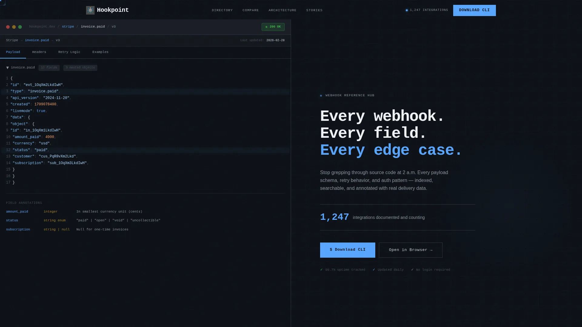
- Visitors land on a real webhook payload tree, not an illustration, so trust is established before a single word is read
- The filterable platform directory and reliability metrics answer evaluation questions that developers actually ask at decision time
- The page structure guides skeptical, time-short engineers from overview to deep data to a single clear download action without friction
What you get with this template
You get a fully structured, section-led landing page built around the Directory and Discovery theme. Every section has a clear job, and the visual system is consistent from header to call-to-action.
- A 50/50 split-screen header with a dark-mode product screenshot on the left and a monospaced headline block on the right
- An animated integration counter, a filterable platform directory, live reliability metrics, a deep-dive comparison table, architecture diagrams, and user-submitted integration stories with code snippets
- A primary CLI download call-to-action with platform detection toggle for macOS, Linux, and Windows, plus a secondary web reader option
Feature list
This section describes the key functional and visual components included in the Hookpoint template.
Split-Screen Hero Layout
The header divides into two equal halves. The left half renders a dark-mode documentation interface showing a real webhook payload tree, expandable JSON nodes, a 200-status badge, and breadcrumb navigation. The right half holds a monospaced headline and an animated counter tracking documented integrations.
Filterable Platform Directory
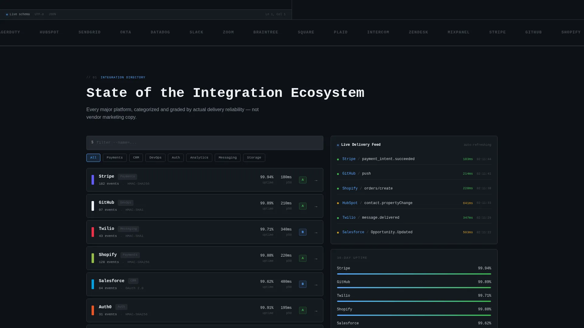
A categorized directory of platforms sits in the left panel of the state-of-integrations dashboard. Visitors can filter entries by category, authentication type, and event volume to quickly find the platforms relevant to their stack.
Live Reliability Metrics Panel
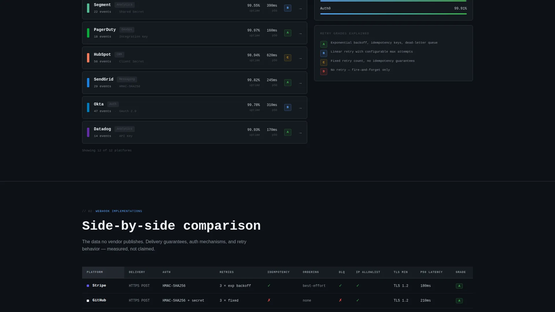
The right panel of the dashboard displays uptime percentages, average delivery latency figures, and retry behavior grades for each listed platform. This data-forward section answers the reliability questions developers ask before building on a webhook-based system.
Deep-Dive Comparison Table
A scroll section presents a side-by-side comparison of competing webhook implementations. It gives technical evaluators the structured data they need to make informed architecture decisions without leaving the page.
Architecture Diagram Section
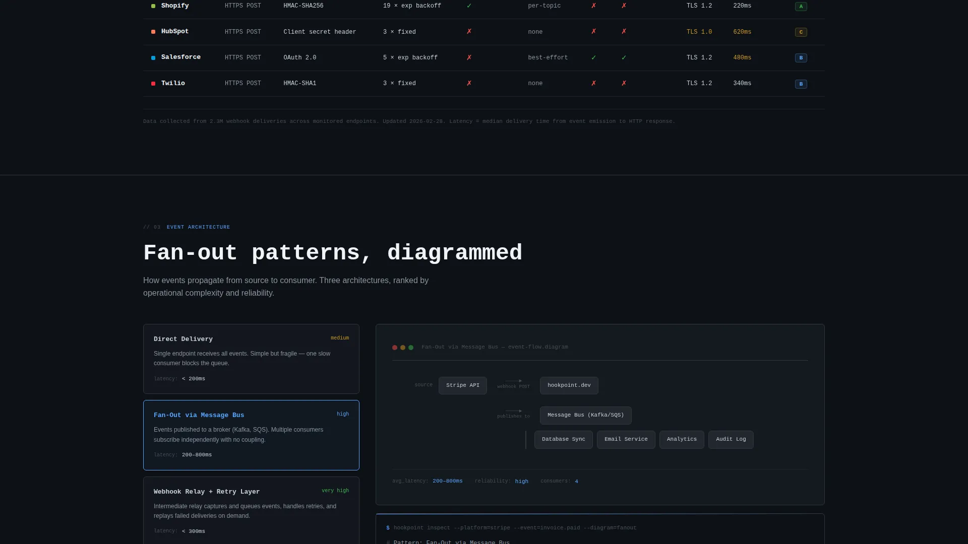
Event fan-out pattern diagrams are included as a dedicated scroll section. These visuals show how events propagate across systems, supporting both learning and technical validation use cases.
CLI Download Call-to-Action
The primary conversion section features a "Download the CLI" prompt with a platform-detection toggle covering macOS, Linux, and Windows. A one-line install command is displayed inline for direct copying. A secondary "Open in Browser" path serves visitors who prefer the web reader.
Page sections overview
| Section | Purpose |
|---|---|
| Split-Screen Header | Establish product credibility with a real payload screenshot and headline |
| Animated Integration Counter | Signal platform breadth with a live ticking integration count |
| State-of-Integrations Dashboard | Show filterable platform directory alongside live reliability metrics |
| Comparison Table | Enable side-by-side evaluation of competing webhook implementations |
| Architecture Diagrams | Illustrate event fan-out patterns for technical validation |
| Integration War Stories | Build trust with real user-submitted code snippets and delivery experiences |
| CLI Download call to action | Drive app download with platform toggle and a copyable install command |
Design & branding system
The visual identity follows a Monochrome Steel color system that communicates engineered precision. Every color choice carries functional weight, and the palette deliberately removes warmth and decoration in favor of contrast and clarity.
- Core colors are deep gunmetal (#1B1F23) for backgrounds, brushed alloy (#8B949E) for secondary text and borders, and bright terminal white (#F0F3F6) for primary text
- A single signal-blue accent (#58A6FF) is reserved exclusively for interactive elements and live status indicators, making clickable and active states immediately identifiable
- Typography uses a monospaced typeface for headlines and code elements, reinforcing the technical documentation identity throughout the page
Mobile & speed optimization
The template is designed so that the split-screen structure and data-dense sections remain navigable on smaller viewports. The layout priorities are clarity and readability at every screen size.
- The 50/50 split-screen header is built to reflow cleanly so the product screenshot and headline stack logically on narrow screens
- Code snippets, inline install commands, and the platform-detection toggle are sized and spaced for touch interaction without losing technical legibility
How this template helps you convert
The page is structured so that visitors accumulate trust and evidence before they ever see a download prompt. By the time the call-to-action appears, the case is already made.
- The hero section uses a real product screenshot as proof of depth, so skeptical engineers form a positive first impression based on actual content rather than promises
- The filterable directory, reliability metrics, and comparison table answer the specific technical questions developers use to qualify a tool, removing the friction that kills developer conversions
- The CLI download section closes with a platform-aware, one-line install command that removes the last step between interest and action
Other information about this template
This template is part of a broader collection of high-converting, niche-specific landing page templates built for technical and developer-facing products. It is a strong fit for any team publishing webhook documentation, integration reference material, or API event catalogs.
- The Industry Report creative direction means content escalates in depth as the visitor scrolls, rewarding sustained attention with progressively rarer data
- The template style is classified as Split Screen (50/50), Directory and Discovery theme, with an App Download landing-page direction and a Product Screenshot header concept
- The page type is a single landing page, making it straightforward to deploy as a standalone destination for a documentation tool or developer utility
Theme
Directory & Discovery
Creative direction
Industry Report
Color system
Monochrome Steel
Style
Split Screen (50/50)
Direction
App Download
Page Sections
Split-screen Hero with Product Screenshot
Filterable Platform Directory
Live Reliability Metrics Panel
Deep-dive Comparison Table
Architecture Diagram Section
Platform-aware CLI Download Call to Action
Related questions
Who is this landing page template designed for?
What does the split-screen header include?
What is the primary call-to-action on this landing page?
Can I populate the platform directory and reliability metrics with my own data?
What color system and typography does this template use?



