Help Center & Knowledge Base Professional Website Template
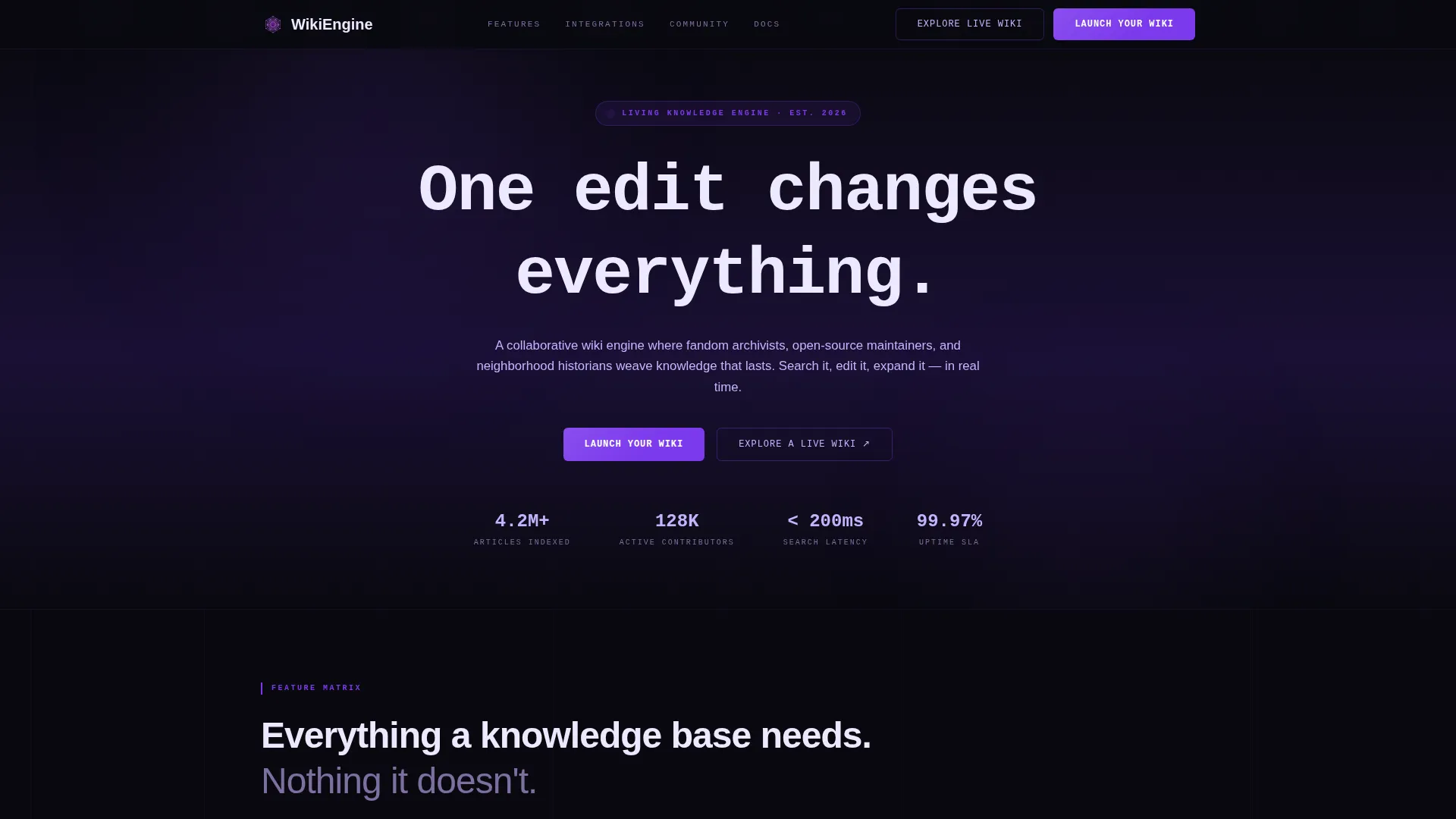
Wikiengine is a split-screen community wiki landing page template built on a Dashboard Pro theme with a Void and Violet color system. It features a scrolling logo bar, a character-by-character headline animation, and a persistent Feature Matrix layout. The design guides visitors from a single edit all the way to governing a large-scale knowledge base, then directs them to sign up.
by Rocket studio
Quick summary
Wikiengine is a single-page community wiki landing page template. It uses a 50/50 split-screen layout, a void-black and electric-violet palette, and a Feature Matrix scroll experience. The page opens with a scrolling logo ribbon and a typewriter headline, then walks visitors through every major platform capability before presenting a clear call to action.
Who this template is for
This template is built for teams and individuals who want to launch a community-driven knowledge base and need a landing page that communicates platform depth quickly.
- Open-source project maintainers who need to document APIs and technical workflows for contributors
- Fandom communities and independent archivists who catalog episode guides, lore, or historical records
- Neighborhood groups, nonprofits, and knowledge-sharing collectives building shared reference libraries
What problem this template solves
Most wiki platform pages either look like plain documentation or rely on generic SaaS hero images. Neither approach shows visitors what a real, living knowledge base actually feels like to use.
- Visitors leave before they understand the platform's true editing, search, and governance capabilities
- No visual proof of the product means no trust, and no trust means no signups
- The gap between "wiki tool" and "scalable community brain" is never bridged on the page
What you get with this template
You get a fully structured, single-page landing page layout ready to present a community wiki platform with confidence. Every section is designed to move the visitor from curiosity to commitment.
- A sticky top bar and repeated in-page call-to-action buttons that funnel visitors toward signup without requiring a form
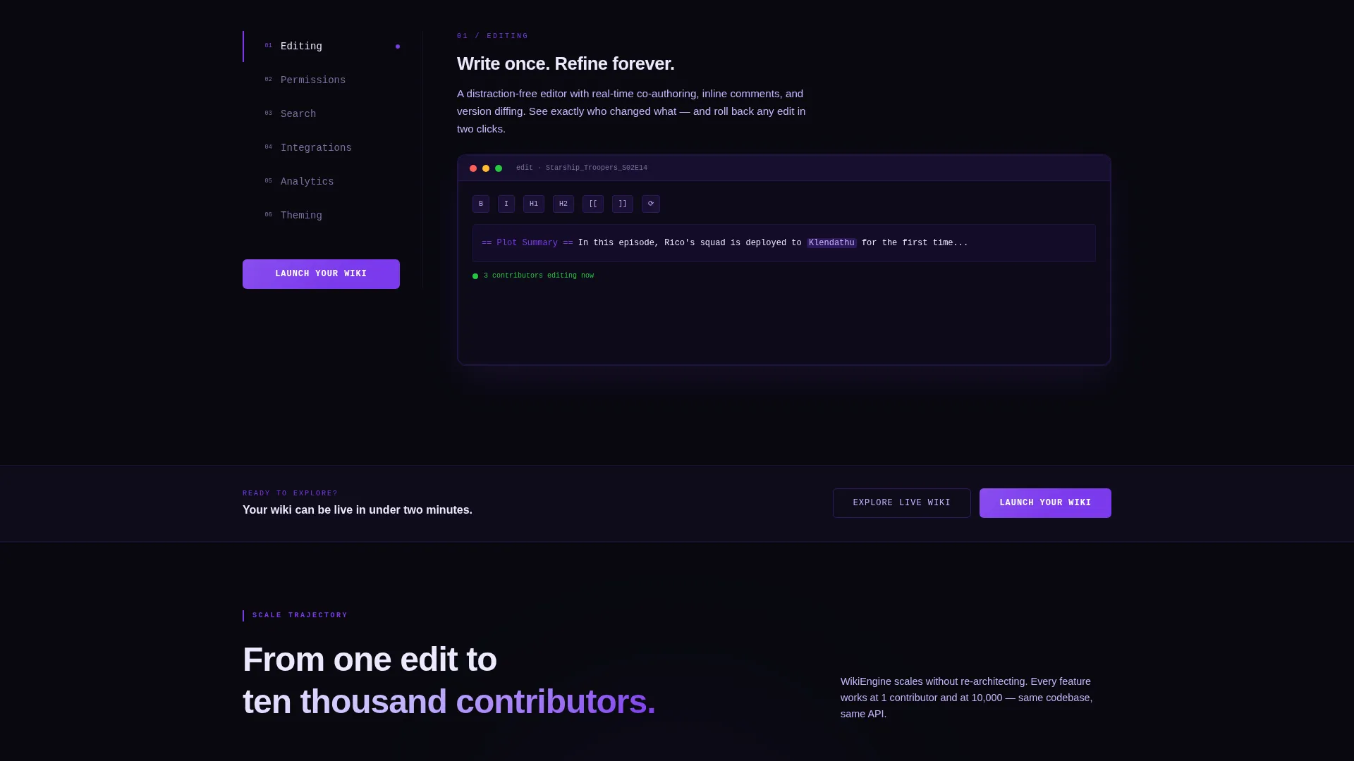
- A persistent left-panel navigation column paired with a right-panel feature display that swaps content as visitors scroll or click
- A scrolling logo ribbon header and a monospaced, character-by-character headline animation that establish ecosystem credibility from the first second
Feature list
This template covers the full visitor journey from first impression to final click. Below are the core built-in capabilities.
Scrolling Logo Bar Header
A horizontal ribbon of community and integration logos loops in a slow, infinite scroll against the void background. The bar establishes ecosystem breadth immediately, before the visitor reads a single word of body copy.
Character-by-Character Headline Animation
The monospaced headline "One edit changes everything." fades in one character at a time on page load. The effect sets the platform's mission in a single line while reinforcing the code-editor visual identity.
Persistent Feature Matrix Layout
The left panel stays fixed as a navigation column listing capability categories such as editing, permissions, search, integrations, analytics, and theming. The right panel updates as the visitor scrolls or clicks each category.
Escalating Scope Narrative
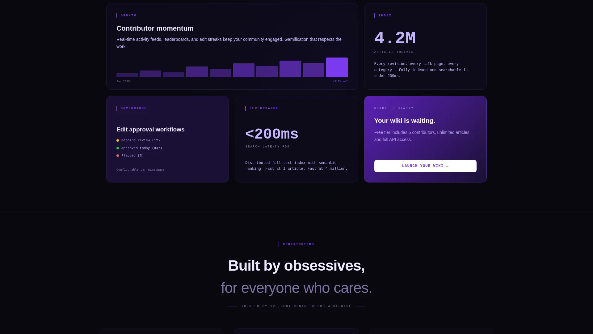
The feature rows are sequenced to grow in scale. The scroll journey moves from a single person editing one page all the way to ten thousand contributors governing a shared knowledge base, making the platform's power feel tangible.
Sticky Call-to-Action Bar
A "Launch Your Wiki" button sits in the sticky top navigation and reappears after every third feature row. A secondary ghost-outline button labeled "Explore a Live Wiki" opens a demo instance in a new tab.
Live-Styled user interface Mockups
Each feature row pairs a tight prose description with a dashboard-style user interface mockup rendered in the violet-on-void palette. The mockups look like real product screenshots, giving visitors a preview of the actual interface.
Page sections overview
| Section | Purpose |
|---|---|
| Sticky Top Bar | Keeps the primary call-to-action always visible while scrolling |
| Logo Ribbon Header | Scrolling ecosystem logos establish platform credibility |
| Typewriter Headline | Animates the platform mission statement character by character |
| Left Navigation Column | Persistent panel listing all capability categories for quick access |
| Feature Matrix Rows | Pairs prose descriptions with live-styled user interface mockups per feature |
| Escalating Scope Rows | Sequences feature reveals from single user to large-scale governance |
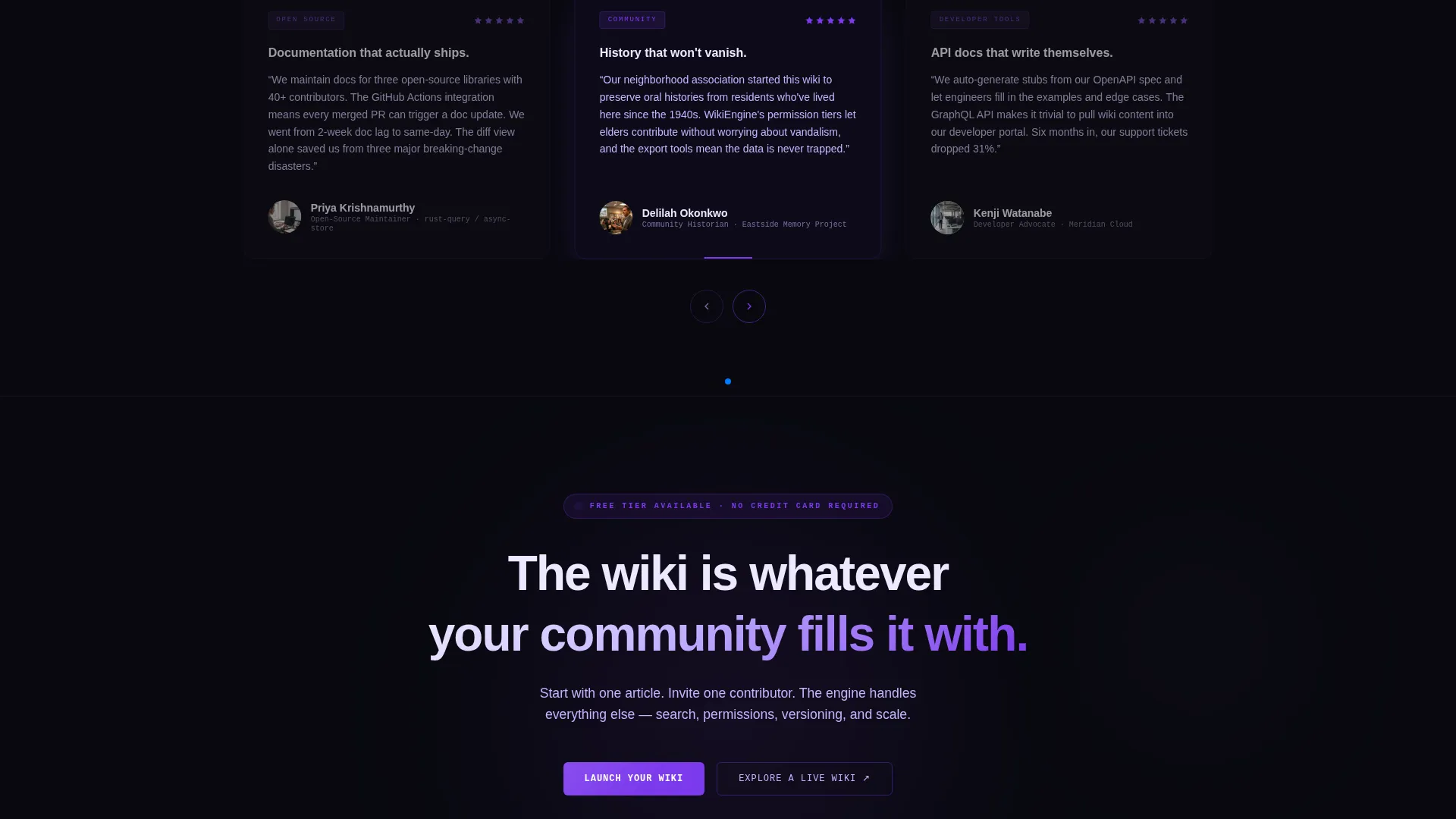
| Inline call to action Repeats | "Launch Your Wiki" button repeated after every third feature block |
| Ghost Button Demo Link | Secondary button routes to a live wiki demo in a new tab |
Design & branding system
The visual identity is built around the Dashboard Pro theme and a Void and Violet color system. Every design decision reinforces the feeling of a code editor running at midnight.
- Backgrounds stay in the void range using absolute void black (#09090F) and deep interstellar purple (#1A1035), keeping the canvas dark and focused
- Electric violet (#7C3AED) is used exclusively on interactive surfaces and hover states, so every glow signals a link, a button, or a door into deeper content
- Phosphor lilac (#C4B5FD) handles body text and secondary labels, ensuring readability against the dark backgrounds without breaking the palette
Mobile & speed optimization
The template layout is designed with responsiveness in mind. The split-screen structure adapts so that the feature matrix remains readable and navigable on smaller screens.
- The sticky call-to-action bar remains accessible at all viewport sizes, keeping the primary conversion path available throughout the scroll
- The persistent left navigation column collapses gracefully on narrow screens so the feature content stays the focal point
How this template helps you convert
The page is built around a click-through conversion goal. Every design and copy decision reduces friction and builds trust before asking for anything.
- The scrolling logo bar and dashboard-style user interface mockups provide visual proof of platform capability before any claim is made in text, so visitors arrive at the call to action already convinced.
- The "Launch Your Wiki" button appears in the sticky bar and repeats after every third feature row, keeping the signup path visible without interrupting the feature discovery experience.
- The secondary "Explore a Live Wiki" ghost button gives hesitant visitors a low-commitment next step, reducing drop-off among people who want to explore before committing.
Other information about this template
This template is a strong fit for community wiki platforms that want to position themselves alongside established tools in the wiki and documentation ecosystem.
- The logo bar is designed to accommodate icons from projects like MediaWiki, Git, Markdown, Discord, and other wiki ecosystem tools, reinforcing familiarity with builders who already work in these environments
- The template sits within the Documentation and Support category, specifically targeting the Help Center and Knowledge Base subcategory and the Community Wiki niche
- The void-and-violet palette and monospaced typography make it visually distinct from typical SaaS landing pages, which helps it stand out in markets where most competitors use bright, minimal designs
- The no-form conversion model means every click goes directly to a signup or demo flow, keeping the page clean and the intent clear
Theme
Dashboard Pro
Creative direction
Feature Matrix
Color system
Void & Violet
Style
Split Screen (50/50)
Direction
Click-Through
Page Sections
Scrolling Ecosystem Logo Bar
Typewriter Headline Animation
Persistent Feature Matrix Panel
Escalating Scope Storytelling
Sticky and Repeated Call-to-action
Live-styled Dashboard User Interface Mockups
Related questions
Does this template include a signup form on the page?
Can I update the scrolling logo bar with my own integration icons?
Is the Feature Matrix layout flexible enough for fewer capability categories?
Who is this community wiki landing page template designed for?
What visual style does this template use?



