Nonprofit Organization Reviews Website Template
Witness is a scroll-reveal nonprofit landing page built on a Tech Glass visual identity. It leads with animated stat counters, progresses through layered testimonial cards, and closes with two strategically placed calls to action. Designed for nonprofit communications directors, development officers, and grant writers, it turns impact data into a luminous, evidence-first story that earns funder trust before asking for anything.
by Rocket studio
Quick summary
Witness is a single-page, scroll-reveal template that transforms nonprofit testimonials into a high-contrast digital showcase. It opens with an interactive testimonial card, builds conviction through animated counters and progressive case studies, and guides visitors toward a free trial through two well-timed calls to action. Every visual choice reinforces credibility over sentiment.
Who this template is for
This template is built for nonprofit professionals who need to show funders and partners that impact is measurable, not anecdotal. It speaks directly to people who live inside annual reports, grant applications, and donor campaigns.
- Nonprofit communications directors building social proof frameworks for donor audiences
- Development officers who need persuasive, data-led testimonial pages for annual reports
- Grant writers presenting evidence of organizational impact to institutional funders
What problem this template solves
Most nonprofit testimonial pages lead with emotion and bury the numbers. That approach loses credibility with data-driven funders and major donors who need proof before they trust a narrative. Witness reverses that order.
- Stat counters appear before any story, establishing aggregate proof immediately
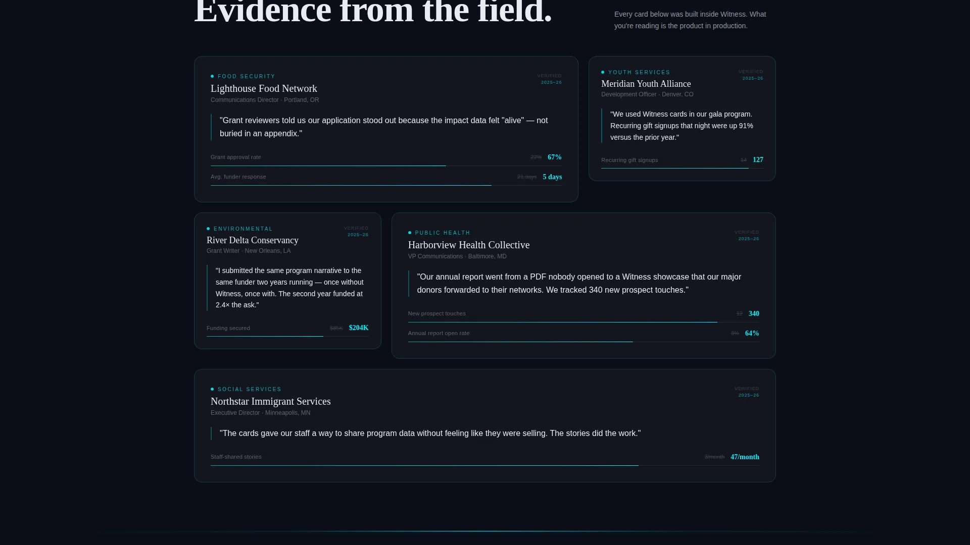
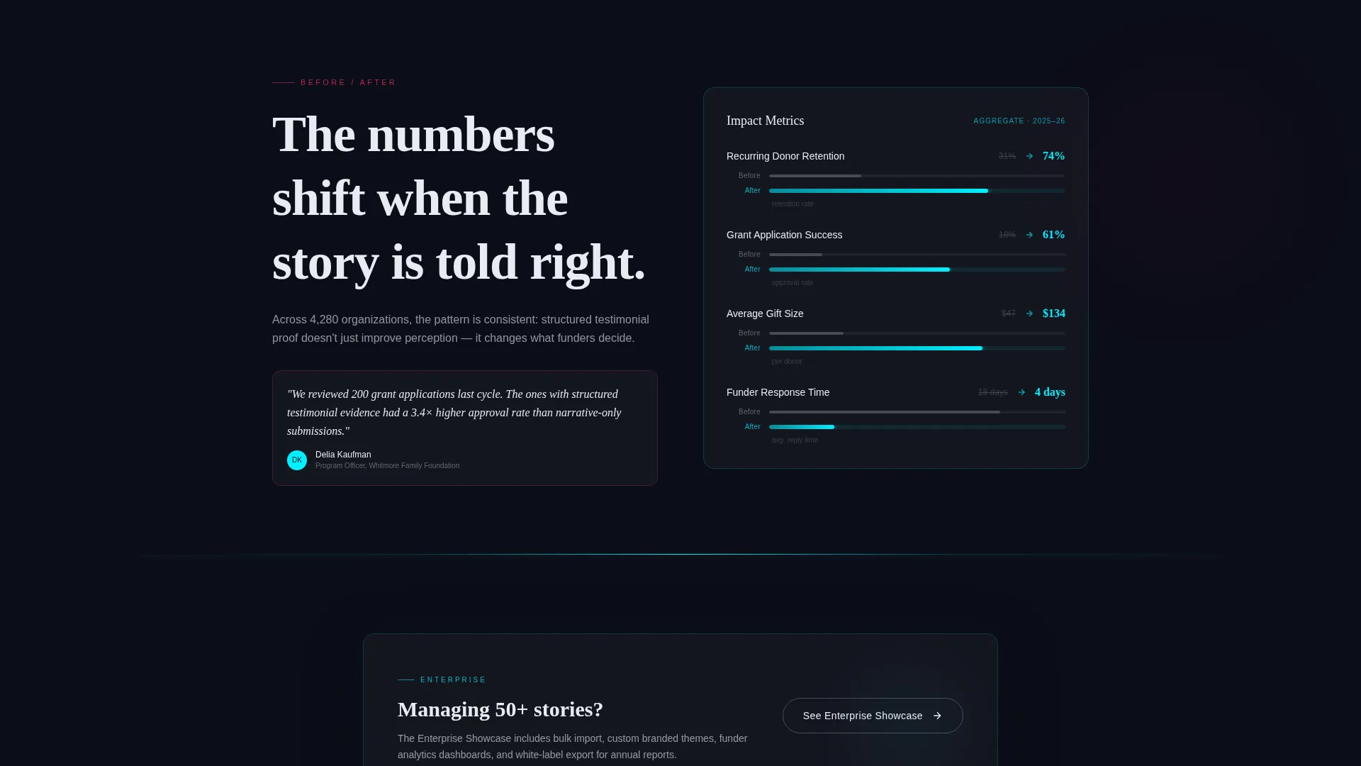
- Each testimonial escalates from a single quote to a full case study with before-and-after data
- The free-tier call to action is earned by letting visitors interact with the product first
What you get with this template
You get a fully structured scroll-reveal landing page that leads visitors from raw numbers through layered testimonial evidence to a conversion moment. The layout is opinionated and purposeful, not generic.
- An interactive header card visitors can drag, rotate, and flip to explore live stat counters
- A progressive testimonial flow that moves from single quotes to video snippets to case study panels
- Two conversion touchpoints: a floating pill call to action and a bottom-panel form asking only for organization name, role, and email
Feature list
This section outlines the core built-in capabilities of the Witness template as designed in the source brief.
Interactive Rotating Testimonial Card
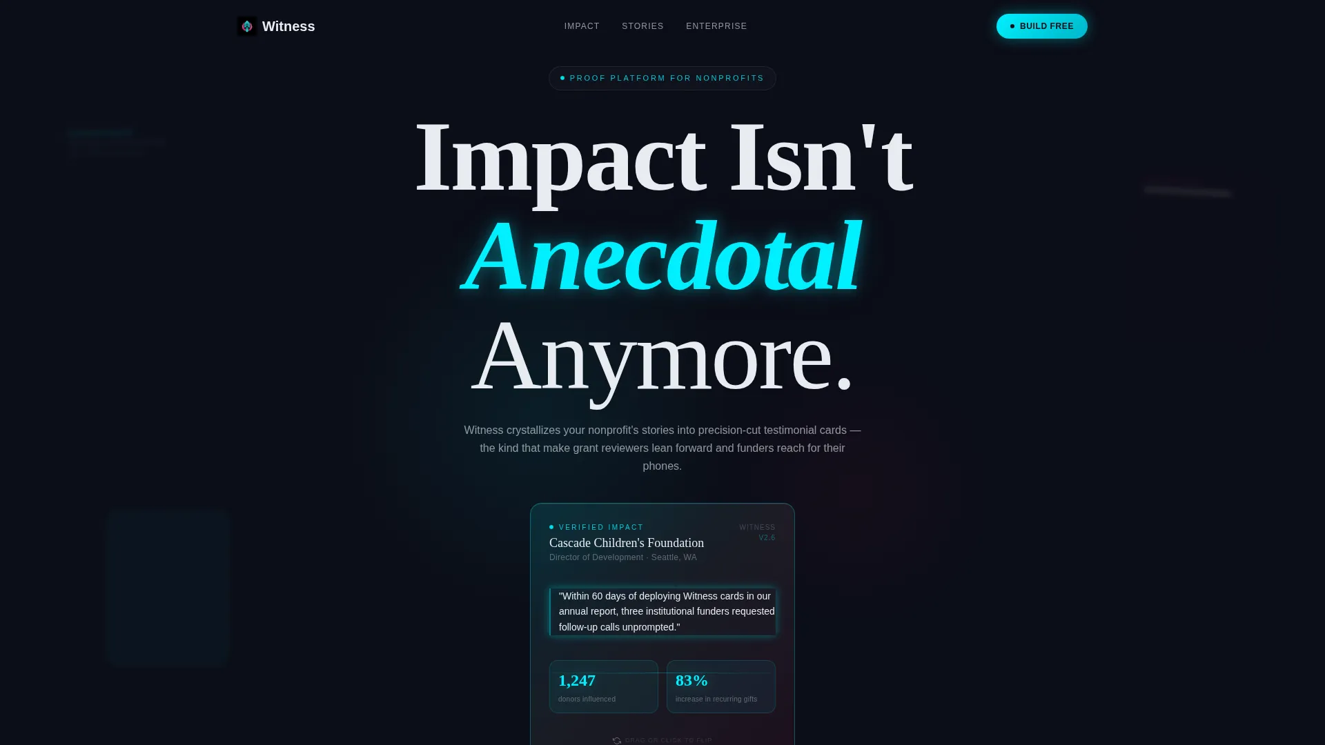
The header centers a translucent, beveled testimonial card on a void-black background. Visitors can drag to rotate it and click to flip it. When flipped, stat counters animate from zero to real figures, making the product's value tangible before any scroll.
Stats-First Number Wall
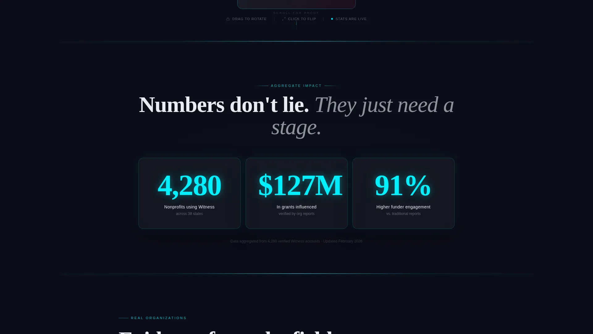
Immediately below the header, three oversized counters in electric cyan tick upward to represent aggregate impact across all featured nonprofits. Numbers land before the first story resolves, establishing quantitative proof as the page's opening argument.
Progressive Scroll-Reveal Testimonial Flow
Each scroll section escalates in depth. A single quote resolves first, followed by a video snippet panel, a full case study block, and a comparative before-and-after data visualization. Glass dividers catch light between sections, reinforcing the specimen-in-crystal visual metaphor.
Floating and Anchored Call-to-Action Placement
A floating pill labeled "Build Your First Testimonial Free" appears after the third scroll section. A second instance anchors the page bottom inside a dark glass panel. Both placements reduce friction by arriving only after the visitor has already seen proof.
Dual Conversion Paths
The primary path leads to a three-field free-tier sign-up form. A secondary link, "See Enterprise Showcase," connects organizations managing fifty or more testimonial stories to a full-featured demo reel. Both paths serve different stages of buyer readiness.
Parallax Depth and Glass Dividers
Blurred secondary cards drift in parallax behind the header card, implying a library of proof just out of focus. Between scroll sections, glass dividers catch ambient light as they pass, keeping the page dynamic without adding visual noise.
Page sections overview
| Section | Purpose |
|---|---|
| Interactive Header Card | Opens with a rotatable, flippable testimonial card with live animated counters |
| Stats Number Wall | Displays three aggregate impact counters in electric cyan before any story appears |
| First Testimonial Card | Resolves from blur on scroll, slides in from the right as the first narrative proof point |
| Video Snippet Panel | Escalates proof depth with a video-format testimonial block |
| Full Case Study | Presents a detailed organizational story with supporting context |
| Before-and-After Data | Visualizes comparative impact data side by side for maximum evidence weight |
| Floating call to action Pill | Triggers a free-tier sign-up prompt after the third scroll section |
| Bottom Glass Panel | Anchors the final call to action with a three-field form inside a dark glass container |
Design & branding system
The design language is Tech Glass with an Acid Digital color palette. Every surface is lit from within against a deep-space void background, creating contrast that keeps long-form text readable without softening the atmosphere.
- Void black (#0B0D17) forms the background; electric cyan (#00F0FF) highlights stat counters and border strokes; hot magenta (#FF2D6B) activates on hover states and selected testimonial cards; phosphor white (#E8ECF1) carries all body text
- Translucent card surfaces use beveled cyan edges and layered glass refraction effects, with no stock photography anywhere on the page
- The overall palette is described in the brief as synthetic and urgent, referencing a neon sign reflected in a rain-slicked sidewalk
Mobile & speed optimization
The scroll-reveal structure and parallax effects are designed for a progressively revealed experience. The template is built to work within a single-page flow, keeping layout complexity manageable across screen sizes.
- Progressive reveal animations are section-by-section, reducing the visual load at any single scroll position
- The three-field sign-up form is intentionally minimal, reducing friction on smaller screens where form fatigue is highest
- Glass panel components use layered CSS-style depth rather than heavy image assets, keeping the visual system lightweight by design
How this template helps you convert
Witness is structured so that every persuasion layer is earned before the next one appears. Conversion is a byproduct of the evidence architecture, not a separate sales pitch.
- The interactive header card puts the product directly in the visitor's hands before any copy asks for trust, making the free-tier offer feel low-risk and already validated
- The stats-first scroll order means that by the time the primary call to action appears, the visitor has already processed aggregate proof, individual stories, and comparative data, making the decision feel logical rather than pressured
Other information about this template
Witness is part of a broader category of nonprofit organization website templates designed for technology-forward communications teams. It fits naturally within a digital fundraising or grant-reporting workflow.
- The template style is Scroll Reveal (Progressive), meaning content appears in deliberate sequence rather than all at once on load
- The header concept is classified as Interactive Preview, a pattern where the product itself is demonstrated inside the page header before any sign-up is requested
- The creative direction follows a Stats-First Impact approach, prioritizing quantitative proof ahead of emotional narrative throughout the scroll sequence
- The landing-page direction targets a Freemium/Trial model, with the free tier covering three styled testimonial cards and basic analytics, and the enterprise path serving organizations with fifty or more stories
Theme
Tech Glass
Creative direction
Stats-First Impact
Color system
Acid Digital
Style
Scroll Reveal (Progressive)
Direction
Freemium/Trial
Page Sections
Interactive Rotating Testimonial Card
Stats-first Number Wall
Progressive Scroll-reveal Testimonial Flow
Dual Conversion Touchpoints
Enterprise and Free-tier Dual Paths
Parallax Depth and Glass Dividers
Related questions
Who is this template designed for?
Does this template include real testimonial data?
Can I use this template if my organization has only a few testimonials?
What does the free tier include?
Is the interactive header card part of the template or a separate component?



