Coworking Digital Presence Provider Directory Website Template
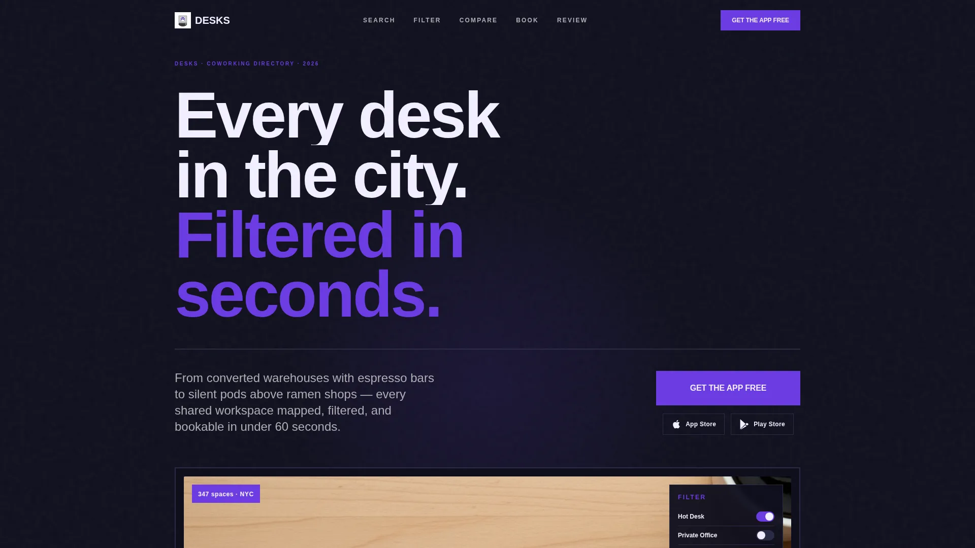
Workspace - Electric Coworking is a bold brutalist landing page template built for coworking directory and listing sites. It maps shared workspaces across a city using a hub-and-spoke anchor navigation layout, drives app downloads with a live mini-filter widget, and delivers a raw, high-confidence visual identity powered by an electric indigo color system.
by Rocket studio
Quick summary
Workspace - Electric Coworking is a single-page, anchor-nav landing page template for coworking directories. It showcases every workspace type in a city, from open hot desks to private offices, through five focused content sections. The design is bold brutalist with an electric indigo palette, and every element pushes toward one outcome: the app download.
Who this template is for
This template is built for teams running coworking directory and listing platforms. It speaks directly to the people those platforms serve, while giving the product team a confident, conversion-ready front door.
- Freelance designers and independent workers hunting day passes or flexible desk options between gigs
- Startup founders comparing month-to-month leases across multiple city neighborhoods
- Remote employees working with a coworking stipend who need to quickly find and compare spaces
What problem this template solves
Coworking directories often look generic. They fail to communicate depth, variety, or trust before asking for the install. This template solves that problem head-on by proving the product's value before the ask arrives.
- Visitors arrive with no context and leave before exploring; the oversized product screenshot and live filter widget stop that drop-off cold
- Users need proof that the directory is genuinely comprehensive before they commit to a download
- The page must work for multiple distinct user types without feeling watered down or unfocused
What you get with this template
You get a fully structured, single-page landing page with a hub-and-spoke anchor navigation system and five named spoke sections. Every component is designed to be self-contained and easy to customize.
- A bold brutalist layout with a full electric indigo color system, heavy grotesque typography, and a concrete-and-chalk visual identity
- A sticky anchor navigation bar with five single-word labels: Search, Filter, Compare, Book, and Review
- A live mini-filter widget mid-scroll that returns real listing counts, plus paired App Store and Play Store download badges with a sticky bottom call-to-action bar
Feature list
This template delivers focused, prompt-backed features. Each one is designed to earn visitor trust and move them toward the app download.
Anchor Navigation Bar
A sticky hub navigation pins to the top on scroll. It uses five blunt single-word labels: Search, Filter, Compare, Book, and Review. Each label jumps the visitor to its dedicated spoke section instantly.
Product Screenshot Header
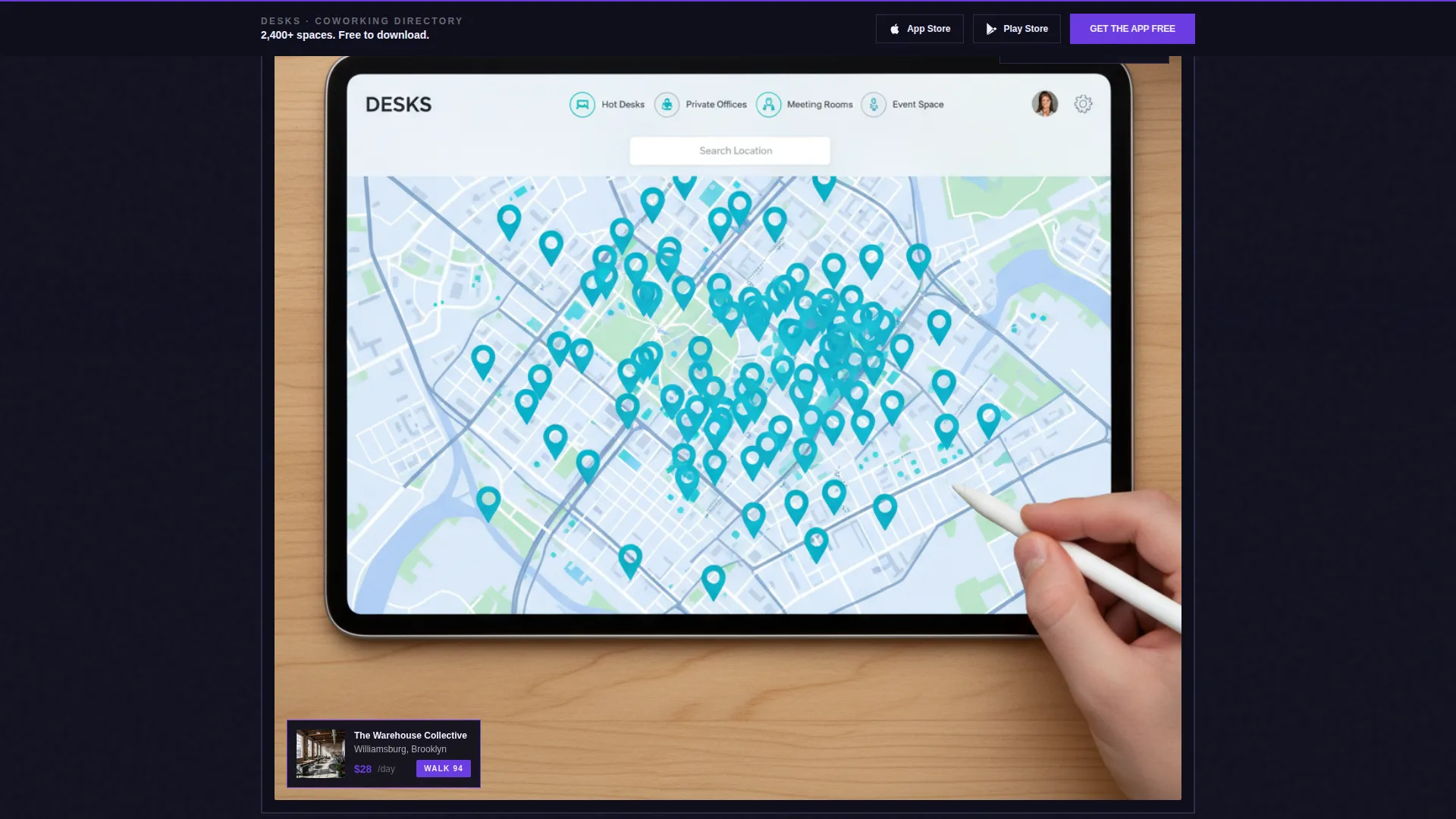
The header centers a raw app map screenshot on a thick charcoal plinth. The image shows real pins across a city grid, a half-open filter drawer with workspace type toggles, and a pulled-up listing card with a photo, price, and walk-score badge.
Hub-and-Spoke Content Blocks
Each spoke section is a self-contained brutalist exhibit block. It includes oversized typography, a cropped user interface detail, and a short focused paragraph. Every block isolates one capability so the visitor always knows exactly where they are.
Live Mini-Filter Widget
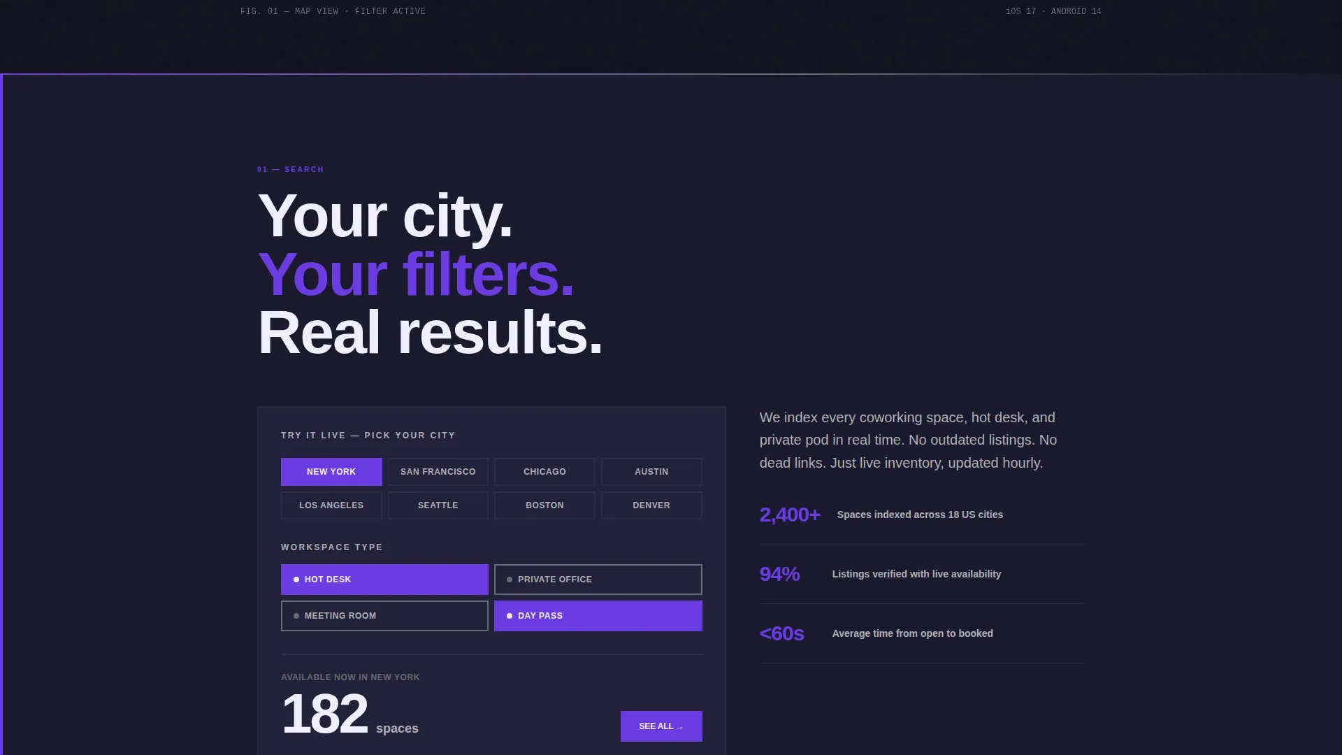
A mid-scroll interactive widget lets visitors filter by their city and returns real listing counts. This proves directory depth before the install is requested. No form is required; the interaction is immediate and tactile.
Sticky App Download Call to Action
The primary call-to-action button, labeled "Get the App Free," appears first beneath the header screenshot. After the second spoke section, it re-anchors as a sticky bottom bar. App Store and Play Store badges sit beside it with no form fields in the way.
Workspace Type Filter Display
The template surfaces four workspace type toggles inside the header screenshot: Hot Desk, Private Office, Meeting Room, and Day Pass. These toggles communicate the directory's full range at a single glance, before the visitor scrolls a single pixel.
Page sections overview
| Section | Purpose |
|---|---|
| Header with Screenshot | Anchors the page with a bold headline and raw app map screenshot on a charcoal plinth |
| Anchor Navigation Bar | Pins to top on scroll; five single-word labels link directly to each spoke section |
| Search Spoke | Highlights the directory's city-wide search capability with oversized type and a cropped user interface detail |
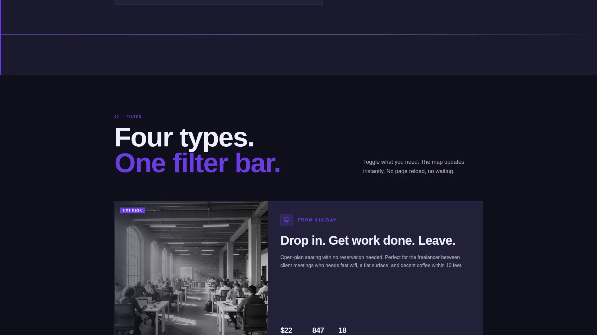
| Filter Spoke | Showcases workspace type filtering options including Hot Desk, Private Office, Meeting Room, and Day Pass |
| Compare Spoke | Lets visitors see how the app helps them evaluate multiple spaces side by side across neighborhoods |
| Book Spoke | Communicates the booking flow with a focused content block and supporting user interface crop |
| Review Spoke | Surfaces the review and trust layer, showing how listings earn credibility through user feedback |
| Live Mini-Filter Widget | Interactive mid-scroll component returning real listing counts by city |
| Primary App Download call to action | Heavy indigo slab button with paired App Store and Play Store badges, no form fields |
| Sticky Bottom call to action Bar | Re-anchors the download call to action after the second spoke; stays visible on continued scroll |
Design & branding system
The template uses a bold brutalist visual identity that feels like a poured-concrete stairwell lit by a single ultraviolet tube. Every color choice is deliberate and unapologetic.
- Deep slab charcoal (#1A1A2E) fills massive background blocks; electric indigo (#6C3CE1) drives all interactive elements and accent moments; exposed concrete gray (#B0AEB5) handles secondary surfaces and dividers; sharp chalk white (#F0EEFF) carries all text and card face content
- Typography uses a heavy grotesque typeface at oversized scale; section headers command attention without decoration
- The no-rotation, no-device-mockup approach to the product screenshot keeps the presentation raw, honest, and monolithic
Mobile & speed optimization
The template is structured to translate its brutalist weight cleanly onto smaller screens. The anchor navigation and sticky call-to-action bar are both designed with mobile interaction in mind.
- The sticky bottom call-to-action bar is particularly effective on mobile, where thumb-reach to a persistent download button removes friction completely
- The hub-and-spoke layout means each section loads as a clean, isolated block, keeping the scroll experience organized regardless of screen size
- The live mini-filter widget is built as a mid-scroll component, allowing it to function as a natural pause point on both desktop and mobile viewports
How this template helps you convert
Every structural decision in this template points toward one outcome: the app download. The page earns the tap rather than demanding it.
- The product screenshot header and live mini-filter widget front-load proof of directory depth, so visitors arrive at the call-to-action already convinced the product is real and comprehensive.
- The sticky bottom bar ensures the "Get the App Free" button is always one tap away after the second spoke, removing the need to scroll back up and eliminating friction at the moment of intent.
- The hub-and-spoke anchor navigation gives visitors a clear mental map of the page, reducing cognitive load and making it easy to return to any section that matches their specific use case before they commit.
Other information about this template
This template was designed for the intersection of technology product marketing and coworking digital presence. It is well-suited for teams launching or refreshing a coworking directory platform.
- The template style is Hub and Spoke with Anchor Navigation, making it a strong fit for feature-rich apps that need to communicate multiple capabilities without overwhelming a single hero section
- The creative direction follows a Feature Matrix approach, where each spoke section acts as an isolated gallery room rather than a scrolling sales pitch
- The bold brutalist theme and electric indigo color system make this template visually distinct from the soft, rounded aesthetics common in property and workspace marketing
- The landing page is built around an App Download conversion goal, making it most effective when paired with live App Store and Play Store listings
- The template supports a coworking directory niche that includes converted warehouses, silent pods, private offices, meeting rooms, and day-pass desks within a single unified product experience
Theme
Bold Brutalist
Creative direction
Feature Matrix
Color system
Electric Indigo
Style
Hub & Spoke (Anchor Nav)
Direction
App Download
Page Sections
Sticky Anchor Navigation Bar
Product Screenshot Header Block
Hub-and-spoke Section Layout
Live Mid-scroll Filter Widget
Sticky App Download Call to Action Bar
Workspace Type Toggle Display
Related questions
What type of business is this template designed for?
Can I customize the color system and typography?
Does this template include a form for collecting emails or signups?
How does the live mini-filter widget work?
Is this template suitable for a directory covering multiple workspace types?



