Bold Plumbing Email Newsletter Landing Page Template
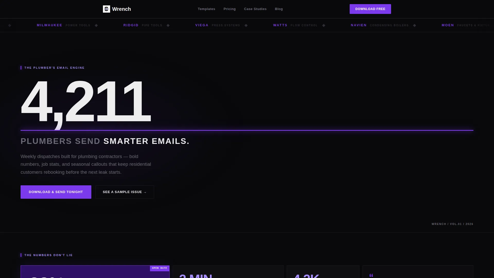
Wrench is a bold, brutalist bento grid landing page built to market a weekly plumbing email newsletter template. It leads with oversized stats, a scrolling logo bar, and a sticky app-download call to action. Designed for plumbing contractors, it speaks directly to homeowners, property managers, and general contractors who need reliable trade communication.
by Rocket studio
Quick summary
Wrench is a single-page bento grid landing page template built to promote a weekly plumbing email newsletter. It opens with a stat-first headline, moves through proof-driven metric cards, and closes with a frictionless app-download path. The Bold Brutalist design makes every number impossible to ignore and every next step obvious.
Who this template is for
This template is built for plumbing contractors who want a professional digital presence that earns subscriber trust fast. It suits anyone promoting a trade-focused email newsletter to a practical, time-short audience.
- Plumbing contractors sending weekly job updates and seasonal service reminders to residential customers
- Property managers and general contractors looking for a reliable trade communication resource
- Independent operators who want a high-impact landing page without a complex build
What problem this template solves
Most trade professionals struggle to present an email newsletter in a way that feels credible. A plain sign-up page does not communicate value. Wrench fixes that by leading with concrete numbers and letting the metrics do the persuading before a visitor even reaches the download prompt.
- Generic landing pages fail to establish trust with skeptical homeowners and busy property managers
- Friction-heavy sign-up flows lose visitors who are browsing on mobile between jobs
- Email templates that look amateur undercut the professionalism of the contractor behind them
What you get with this template
You get a fully structured bento grid landing page designed around a Stats-First creative approach. Every section is purpose-built to move a visitor from proof to product to action in a single scroll.
- A Logo Bar header with a slow infinite marquee displaying recognizable plumbing brand logos in monochrome violet
- A viewport-filling brutalist headline with an oversized stat and a pulsing violet underline
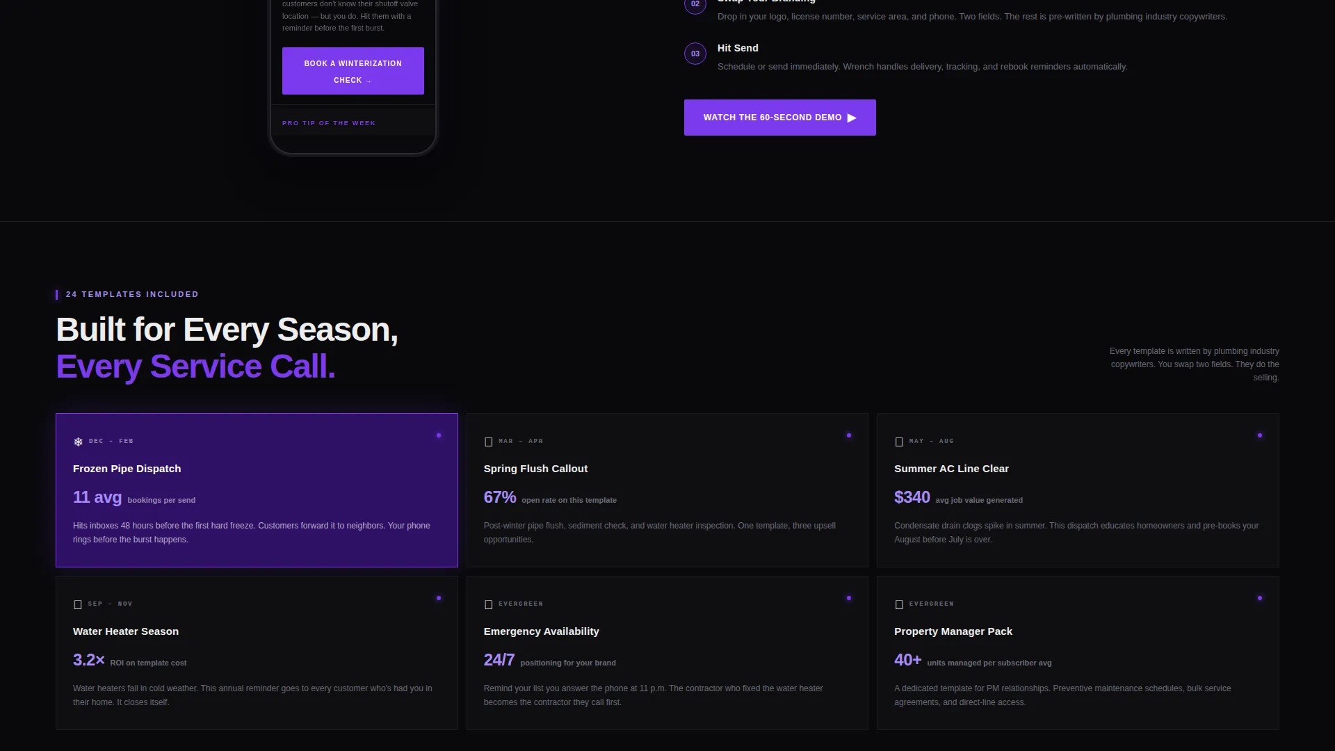
- A stats grid, a live-scrolling phone mockup, a three-tap customization flow animation, and a sticky app-download bar
Feature list
This section outlines the core built-in components that make the Wrench landing page work.
Oversized Stat Headline Block
The hero area replaces a traditional image with a single enormous number: "4,211 PLUMBERS SEND SMARTER EMAILS." Set in oversized condensed type, it fills the mobile viewport completely. A thin violet underline pulses once on load, drawing the eye before any body copy appears.
Bento Grid Stats Cards
Each cell in the bento grid leads with a metric. "38% higher open rate than industry average" and "2 minutes to customize" are examples of how proof arrives before explanation. Cards snap into view with hard-cut brutalist transitions and zero easing, keeping the pace sharp and direct.
Live Phone Mockup Cell
A tall vertical bento cell displays a scrolling phone mockup showing the actual newsletter template mid-send. Water-blue accent graphics appear inside the email preview, giving visitors a realistic view of what subscribers will receive.
Three-Tap Customization Flow
An animated phone frame inside the grid walks through the customization process in three steps. The animation is embedded within the bento layout and shows the process without requiring a visitor to leave the page.
Sticky App-Download Bar
A violet bar pinned to the bottom of the viewport carries the primary call to action: "Download & Send Tonight." Tapping the button opens a smart banner that detects the visitor's operating system and routes to the correct app store path.
Text-to-Self Download Link
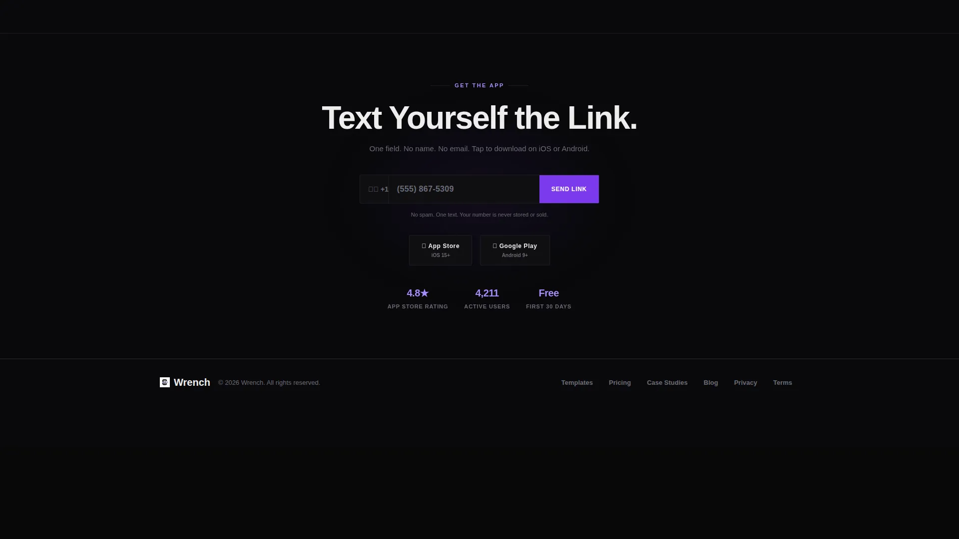
A secondary conversion path lets visitors enter a single phone number field to text themselves the download link. No name, no email address, and no extra steps. One field reduces friction to a single thumb tap.
Page sections overview
| Section | Purpose |
|---|---|
| Logo Bar Header | Scrolling marquee of plumbing brand logos builds immediate category credibility |
| Stat Headline Block | Oversized brutalist headline anchors the page with a single compelling number |
| Stats Proof Grid | Metric-led bento cards deliver open-rate and time-to-customize proof |
| Phone Mockup Cell | Tall vertical card shows the live newsletter template inside a scrolling phone frame |
| Customization Flow | Animated three-tap walkthrough inside a phone frame shows how easy editing is |
| Sticky Download Bar | Pinned violet call to action bar drives app download with OS-aware routing |
| Text Link Field | Single phone-number field lets visitors send the download link to themselves |
Design & branding system
The Void & Violet color system drives every visual decision on this page. The palette creates a utility-grade aesthetic that feels engineered and confident rather than decorative.
- Core colors: absolute void black (#09090B) for card backgrounds, electric violet (#7C3AED) for call to action buttons and stat counters, bruised purple-gray (#2E1065) for depth layers, and exposed-pipe white (#EDEDED) for typography and dividers
- Typography uses oversized condensed type in the headline block for maximum visual weight on any screen size
- Brutalist transitions replace soft animations with hard cuts, keeping every card reveal sharp and immediate
Mobile & speed optimization
The page is built with a mobile-first bento grid structure. The headline stat is sized to fill a phone viewport completely, and the sticky download bar stays accessible without scrolling back to the top.
- The smart-banner call to action detects iOS or Android and routes the visitor to the correct download path automatically
- The single-field text-to-self option removes all form friction for visitors on a small screen between jobs
- Hard-cut card transitions avoid animation overhead, keeping the visual pace fast without relying on complex easing libraries
How this template helps you convert
The Wrench landing page is structured around a deliberate proof-to-product-to-process escalation. Every layout decision serves the download goal.
- The stats grid earns belief first. Visitors see concrete open-rate and customization metrics before they encounter any prompt to act, which means trust is built before the ask arrives.
- The phone mockup and customization flow remove doubt by showing exactly what the template looks like and exactly how simple it is to set up, making the download feel like a logical next step rather than a risk.
Other information about this template
Wrench is a bento grid landing page template categorized under Technology and Plumbing Digital Presence. It is designed for use as a promotional page for a plumbing email newsletter template.
- The template style is Bento Grid with a Bold Brutalist theme and a Stats-First Impact creative direction
- The landing page direction is App Download, with both a primary OS-aware smart banner and a secondary text-to-self path
- The header concept is a Logo Bar featuring a slow infinite marquee, reflecting the kind of brand recognition that resonates with trade professionals
- The Void & Violet color system references a UV-lit utility basement aesthetic, making the grid feel like stamped raw concrete backlit by neon violet

Theme
Bold Brutalist
Creative direction
Stats-First Impact
Color system
Void & Violet
Style
Bento Grid
Direction
App Download
Page Sections
Oversized Stat Headline Block
Bento Grid Stats Cards
Live Phone Mockup Cell
Three-tap Customization Flow
Sticky App-download Bar
Text-to-self Download Field
Related questions
Who is the Wrench template designed for?
Does the page require a hero image?
How does the download call to action work?
Can visitors get the download link without tapping the app store directly?
What makes the bento grid layout effective for a trade audience?



