Micro-SaaS & Developer Tools Professional Website Template
Writer is a dark-glassmorphic AI social media landing page template built for solo founders, agency managers, and e-commerce brands. It features a live Feature Tab Switcher hero, a Problem-to-Solution scroll arc with animated comparison cards, and a Comparison/Versus conversion flow. The design uses void black, electric purple, and neon mint to make every section feel urgent and alive.
by Rocket studio
Quick summary
Writer is a single-page, hub-and-spoke landing page template for an AI-powered social media writing tool. It opens with a live typing simulation, walks visitors through a visceral pain montage, and closes every comparison with a neon mint call to action. The template is desktop-first with mobile-responsive layout, built to convert skeptical visitors into first-time users.
Who this template is for
This template is made for builders and marketers who need to show the speed and quality of an AI writing product in a single scroll. The design and structure do the convincing before a word of explanation is needed.
- Solo founders managing a personal brand across LinkedIn and Instagram who need a high-conviction landing page to grow their user base
- Agency social media managers handling ten or more client calendars who want a page that speaks directly to their daily overload
- E-commerce brands that need scroll-stopping copy at volume and want a template that communicates that promise instantly
What problem this template solves
Most AI tool landing pages describe features without making visitors feel the problem first. Writer flips that. It leads with the grind, names every painful alternative, and only then presents the product as the obvious answer.
- Visitors bounce from generic hero sections that list features without connecting to real frustration
- Comparison pages rarely show live proof, so visitors leave without believing the claims
- Conversion flows bury the call to action too late, after visitor attention has already dropped
What you get with this template
You get a fully structured, single-page landing page with five thematically distinct spoke sections anchored by a persistent left-rail navigation. Every section is designed to carry the visitor forward with growing evidence.
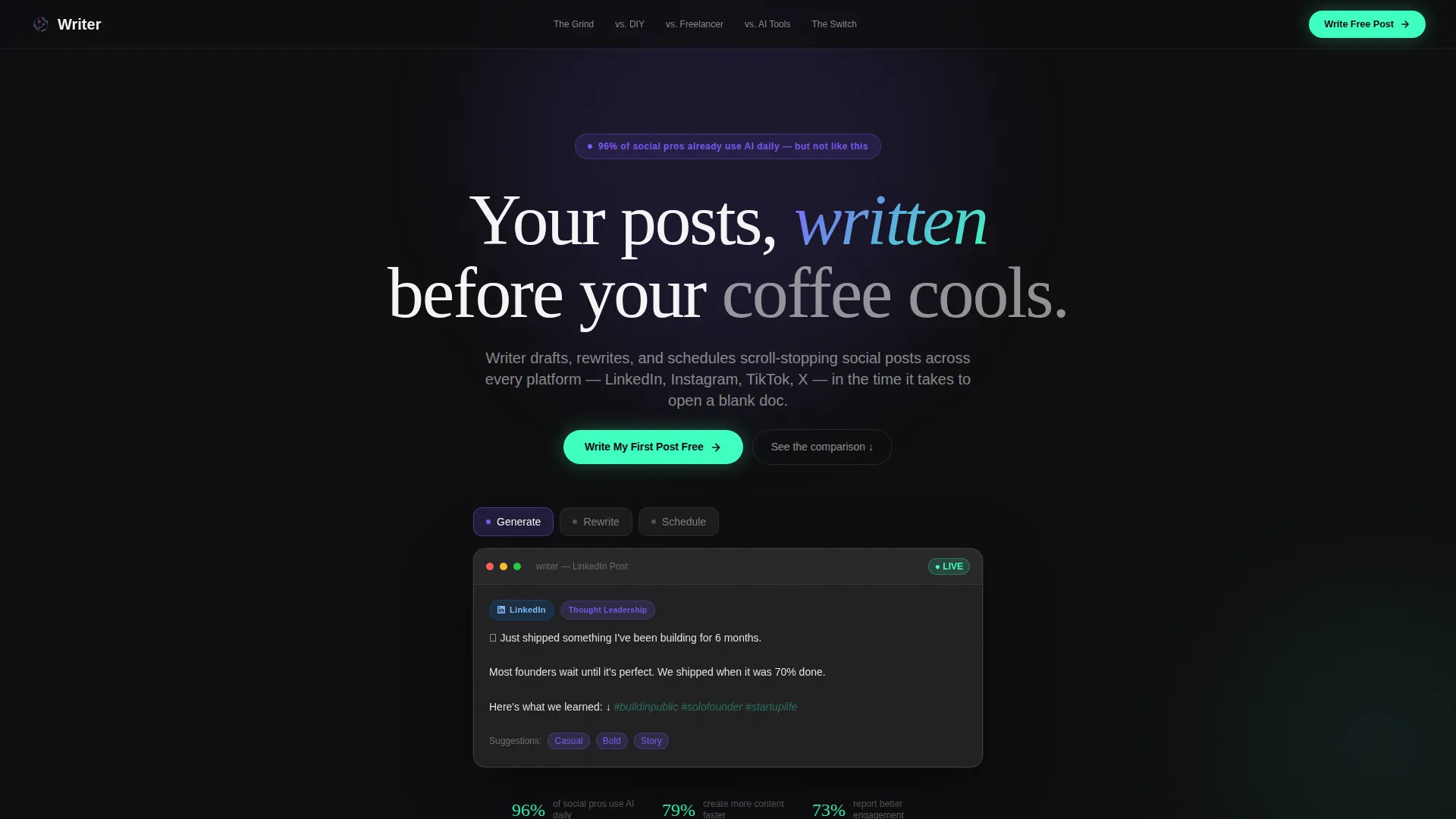
- A Feature Tab Switcher hero with three interactive tabs: Generate, Rewrite, and Schedule, each with its own animated editor state
- Five comparison spoke sections including pain montage, DIY versus, Freelancer versus, AI Tools versus, and a live rewrite call-to-action closer
- A floating neon mint call-to-action pill that persists from the second spoke onward, plus an email-capture live rewrite input field
Feature list
This template includes purpose-built components tied directly to the conversion goal of an AI social media writing product.
Live Feature Tab Switcher Hero
Three frosted glass tabs sit above a simulated editor. The default tab types a LinkedIn post in real time with ghost-text emoji and hashtag suggestions. Clicking Rewrite replays the post transforming from corporate tone to casual copy mid-sentence. Clicking Schedule morphs the editor into a week-view calendar with platform icons dropping into slots.
Animated Pain Montage Section
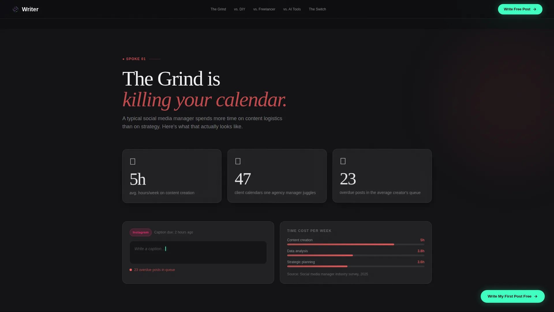
The first spoke section opens with a ticking clock, a blinking blank caption field, and a notification badge showing 23 overdue posts. Subtle parallax tremor animations keep the visuals restless and emotionally resonant without requiring user interaction.
Split Glass Comparison Cards
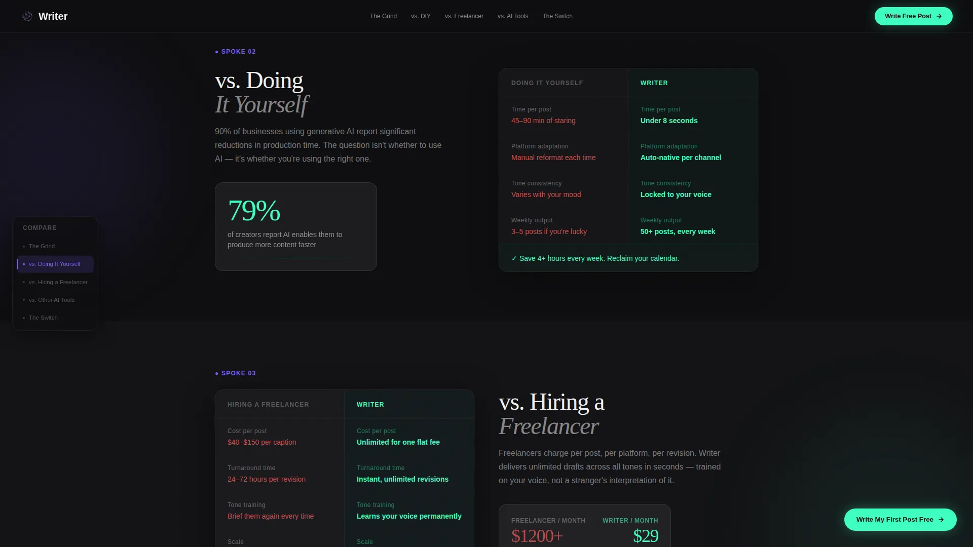
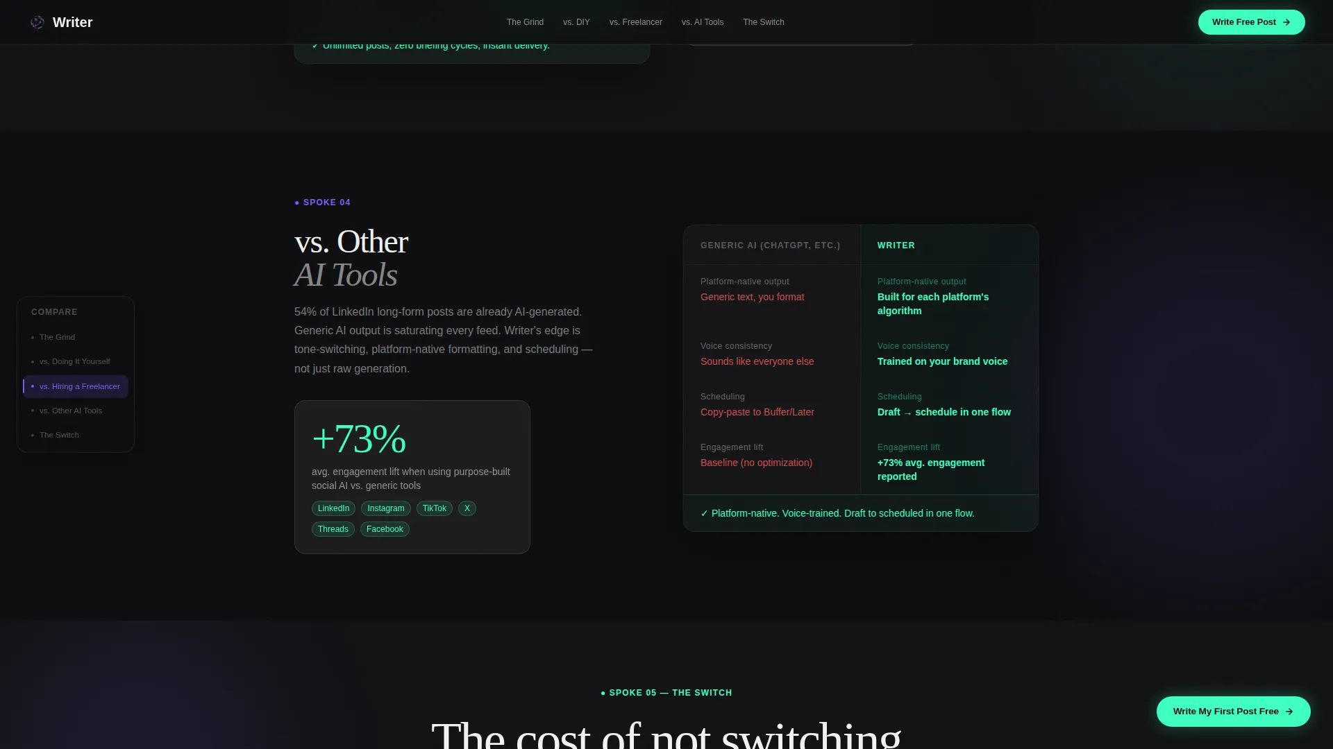
Each versus spoke renders as a split glass card. The left panel shows the competing approach in muted gray values. The right panel shows Writer's metrics in electric mint with scroll-triggered number counters climbing on entry.
Escalating Social Proof Flow
Evidence builds section by section: time saved, output volume, engagement lift data, and redacted client screenshots. The structure earns trust progressively rather than front-loading claims the visitor has no reason to believe yet.
Live Caption Rewrite Input
The final spoke includes an input field where visitors paste their worst-performing post and receive an AI rewrite. Their email is captured to deliver the result, turning curiosity into a qualified lead.
Persistent Floating Call-to-Action Pill
After the second spoke, a neon mint pill button floats in the bottom-right corner and stays visible throughout the rest of the page. The primary label is "Write My First Post Free," keeping the conversion path always one tap away.
Page sections overview
| Section | Purpose |
|---|---|
| Feature Tab Switcher Hero | Simulate the product live with Generate, Rewrite, and Schedule tabs |
| Anchor Nav Rail | Pin five spoke links to the left rail for fast section jumping |
| The Grind | Open with an animated pain montage of overdue posts and blank fields |
| Versus DIY | Compare the cost of doing it yourself against Writer's speed |
| Versus Freelancer | Show time, quality, and consistency trade-offs against hiring out |
| Versus AI Tools | Highlight metric advantages with mint-highlighted scroll counters |
| The Switch | Deliver the live caption rewrite input and email capture closer |
| Single-Row Footer | Close with a minimal linear footer row |
Design & branding system
The visual language is built around a Dynamic Motion theme and a Glassmorphic color system. Backgrounds stay in void black while frosted panels float above with soft blurs and subtle depth shadows. Every interactive or live element fires in neon mint, creating an instant visual language of action versus context.
- Core palette: void black (#0D0D0F) as the base, frosted panel white (rgba 255, 255, 255, 0.08) for glass surfaces, electric iris purple (#7C5CFC) for navigation and hierarchy, and neon mint (#3DFFC0) reserved for active states and calls to action
- Typography: DM Sans handles all body and user interface copy for clean readability at small sizes; Fraunces display serif provides high-contrast accent headings that contrast the dark panels with editorial weight
- Motion style: fluid morph transitions between tab states, parallax tremor on pain section elements, scroll-triggered number counters, and CSS transform-based animations keep the page kinetic without feeling chaotic
Mobile & speed optimization
The template is designed desktop-first to support the tab switcher hero and split glass comparison layout, with a mobile-responsive structure that adapts each section cleanly to smaller screens.
- Animation interactions scale down gracefully on mobile, preserving the visual feel without overwhelming smaller viewports
- Scroll-triggered counter animations use Intersection Observer so they fire only when elements enter view, keeping the experience smooth across devices
How this template helps you convert
The conversion architecture follows a Comparison/Versus model that removes objections section by section before the primary call to action lands.
- The hero tab switcher lets visitors experience the product behavior before reading a single feature bullet, building immediate credibility through demonstration rather than description.
- Each comparison spoke makes the cost of not switching feel concrete by pairing muted competitor metrics with mint-highlighted Writer numbers, so the call to action arrives after the argument is already won.
- The live caption rewrite input captures email addresses from visitors who are actively curious, converting passive browsers into qualified leads at the exact moment of highest intent.
Other information about this template
This template is built for the AI social media writer niche within the Micro-SaaS and developer tools category. It sits at the intersection of creator tools and social media automation, making it useful beyond just product launches.
- The hub-and-spoke anchor navigation structure makes it practical for running paid traffic campaigns where visitors need to self-select by their specific pain point
- The redacted client screenshot slots and stat counter components (including figures such as 96 percent adoption and 79 percent faster copy creation) are pre-positioned for easy content swap
- The template supports English-language, US-market positioning with USD pricing context built into the conversion copy structure
- It uses a Pattern 1 linear single-row footer, keeping the close of the page clean and uncluttered
Theme
Dynamic Motion
Creative direction
Problem→Solution Arc
Color system
Glassmorphic
Style
Hub & Spoke (Anchor Nav)
Direction
Comparison/Versus
Page Sections
Live Feature Tab Switcher Hero
Animated Pain Montage
Split Glass Comparison Cards
Persistent Floating Call to Action Pill
Live Caption Rewrite Input
Escalating Social Proof Structure
Related questions
Who is this landing page template designed for?
What sections are included in the template?
Can I customize the color palette and typography?
How does the email capture mechanic work?
Is this template suitable for a paid traffic campaign?



