Meat Processing Vertical SaaS Cost Calculator Website Template
The Yield Industrial Meat Processing Management Software Comparison Landing Page Template is a single-page, conversion-focused layout built for meat processing software companies. It opens with a live Yield Calculator, drives visitors through a structured Problem→Solution Arc, and presents a head-to-head comparison table across six critical processing capabilities. The page is designed to turn yield-loss data into demo requests.
by Rocket studio
Quick summary
This template gives meat processing software companies a sharp, data-driven landing page that opens with a live yield calculator and closes with a clear call to action. Every section is built around the real pain points that plant managers, quality assurance leads, and operations directors face every day on the processing floor. The structure turns raw numbers into compelling reasons to act.
Who this template is for
Plant-facing software companies need a landing page that speaks the language of the production floor, not the marketing department. This template is built for businesses selling management solutions directly to operations decision-makers inside meat processing facilities.
- Plant managers overseeing second-shift operations with lean crews
- Quality assurance leads tracking Hazard Analysis and Critical Control Points (HACCP) logs across multiple production lines
- Operations directors who need accurate yield data before the next morning meeting
- Software vendors selling into beef, pork, or poultry processing facilities
- Chief Financial Officers and ownership groups evaluating the cost of processing inefficiency
What problem this template solves
Meat processors face a specific challenge: the gap between what enters the facility as raw materials and what ships out as finished product is rarely visible in real time. Spreadsheets and generic enterprise resource planning systems cannot measure that gap with the precision the meat industry demands. This template helps software companies communicate exactly why that difference matters and what their solution can do about it.
- Plant teams running on manual spreadsheets lack the automated data capture needed to identify losses as they happen during processing
- Generic enterprise software is not built for meat-specific tasks like batch temperature monitoring, trim loss calculation, or USDA hold flagging
- Operations leaders struggle to make confident decision making choices without real-time yield numbers tied to actual production volume
What you get with this template
This template delivers a fully structured, single-page layout with five distinct content sections and a supporting footer. Every section is built around a specific persuasion task, from creating initial urgency with the calculator to closing with a full-width call to action bar. No stock photography, no decorative filler; just functional components built for an industrial audience.
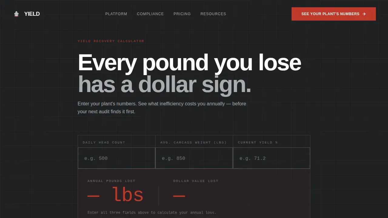
- A live Yield Calculator header with four steel-framed input fields and an animated, alert-red loss figure
- A structured comparison table covering six feature rows across three competing method columns
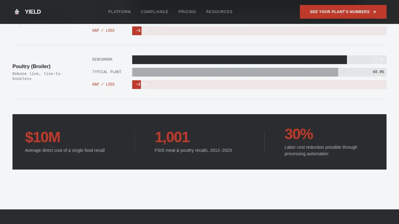
- Three plant scenario blocks showing before-and-after yield figures with bolded dollar recovery amounts
Feature list
This template was developed with a focused set of capabilities that serve the conversion goal of demo scheduling. Each component serves a specific role in the Problem→Solution Arc.
Live Yield Calculator with Animated Loss Output
The header calculator accepts three inputs: daily head count, average carcass weight, and current yield percentage. A fourth field auto-calculates annual pounds lost to inefficiency. The loss figure animates upward like a scale settling on a final reading, and a dollar value appears beside it in alert red. This is the page's primary persuasion tool. By the time a visitor sees their own plant's numbers, the case for the software is already made.
Benchmark Gap Visualization
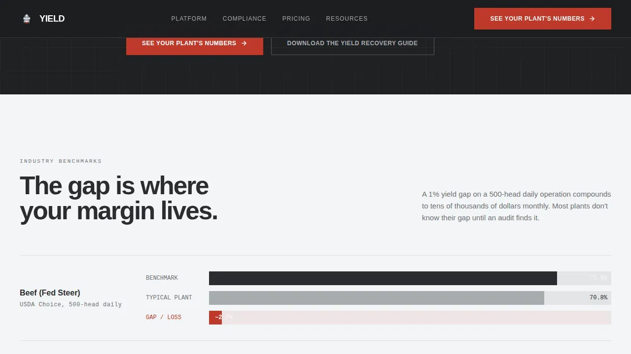
Immediately below the calculator, section one presents industry benchmark yields alongside the visitor's calculated figure. The difference is visualized as a red bar, giving meat processors a clear, visual measure of where they stand relative to industry peers. This method of displaying data transforms abstract percentages into a tangible gap that demands attention and drives the scroll downward.
Head-to-Head Comparison Table
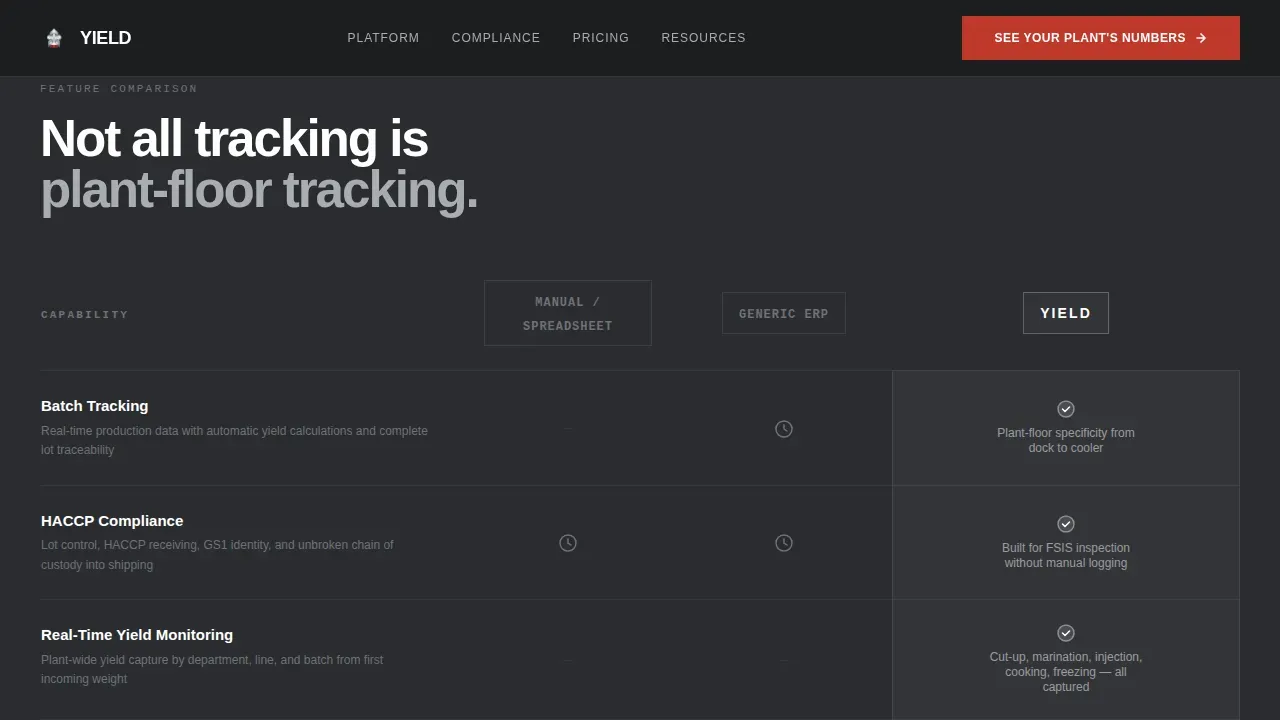
The comparison table is the structural core of the page. Rows cover six critical processing capabilities: batch tracking, HACCP compliance, real-time yield monitoring, trim optimization, recall traceability, and USDA audit preparation. Three columns compare manual spreadsheet processes, generic enterprise resource planning systems, and the Yield software solution. Cells where competitors cannot deliver remain as steel dashes. Cells where the software delivers glow with a subtle white highlight. The table gives buyers a transparent, side-by-side view that supports confident decision making without requiring a sales call first.
Plant Scenario Blocks with Dollar Recovery
Section three moves from data to narrative with three scenario blocks covering beef, pork, and poultry operations. Each block presents a before-and-after yield number, with the dollar recovery figure bolded for emphasis. These scenarios give customers in each segment a concrete, relevant example of what improved processing performance looks like in real financial terms.
Dual Call to Action System
The primary call to action reads "See Your Plant's Numbers" and routes visitors to a demo scheduling page. It appears three times: directly below the calculator, pinned at the comparison table footer, and again as a full-width bar after the plant scenarios. A secondary call to action, "Download the Yield Recovery Guide," captures email addresses from visitors who are not yet ready to schedule a conversation. This combination ensures the page serves both high-intent and research-stage visitors.
Monochrome Steel Design System
The visual identity uses four values: industrial charcoal (#2B2D30), brushed stainless (#A8ABAF), cold-room white (#F4F5F6), and a single alert red (#C0392B). Backgrounds alternate between charcoal and white in hard cuts. Typography uses Manrope for headlines and DM Sans for body and data text. The red appears only for yield-loss callouts and primary calls to action, ensuring it commands attention every time it appears.
Page sections overview
| Section | Purpose |
|---|---|
| Hero Yield Calculator | Capture plant-specific loss data and create immediate financial urgency |
| Benchmark Gap Visual | Show the yield difference against industry standards using a red bar |
| Software Comparison Table | Compare manual, generic ERP, and Yield across six processing capability rows |
| Plant Scenario Blocks | Present beef, pork, and poultry before-and-after yield figures with dollar recovery |
| Full-Width call to action Bar | Drive demo scheduling and secondary email capture for research-stage visitors |
| Linear Footer | Provide a clean single-row footer with supporting business links |
Design & branding system
The design system is built around a USDA-facility aesthetic. Every surface is either steel or tile. There is no warmth, no decorative photography, and no unnecessary visual noise. The palette and typography choices are deliberate: this page is meant to feel like a freshly sanitized production floor at 5 AM, where everything is accounted for and nothing is wasted.
- Color system: industrial charcoal (#2B2D30) as the primary background, brushed stainless (#A8ABAF) for secondary text and user interface lines, cold-room white (#F4F5F6) for light-section backgrounds, and alert red (#C0392B) reserved exclusively for yield-loss figures and primary calls to action
- Typography: Manrope in bold for all headlines and data callouts; DM Sans for body copy and table data, keeping readability high across both light and dark backgrounds
- Visual language: SVG-based visuals only, no heavy image assets, with scroll-reveal animations and counter animations on numerical data points to reinforce the processing theme
Mobile & speed optimization
The template is built desktop-first, reflecting the real working environment of its target audience: plant managers and operations directors reviewing data on office workstations before or after their working hours on the floor. Performance is prioritized through lightweight SVG visuals and no photographic assets.
- SVG-based graphics and no heavy image files keep page load fast across standard office network connections
- Scroll-reveal animations and counter animations are implemented with performance in mind, avoiding render-blocking resources that would slow the initial load
- The layout structure is designed to translate cleanly to tablet viewports for quality assurance leads who may review data on shared facility devices
How this template helps you convert
A well-designed comparison page can significantly influence a purchasing decision by presenting key differentiators clearly and honestly. This template is engineered around that principle. The calculator does the persuasion; the comparison table provides the evidence; the scenario blocks provide the proof. By the time a visitor reaches the final call to action bar, the click is a confirmation of what the data already showed them.
- The live Yield Calculator personalizes the page immediately. Visitors enter their own plant's numbers and see their specific annual loss figure in alert red, making the cost of inaction impossible to ignore before they read a single line of marketing copy.
- The comparison table gives buyers the transparency they need to justify a decision internally. Seeing the difference between a manual spreadsheet method, a generic enterprise system, and a purpose-built meat processing solution removes ambiguity and supports faster, more confident purchasing conversations.
- Three strategically placed calls to action guide high-intent visitors toward demo scheduling while the secondary email capture retains research-stage visitors, ensuring no business opportunity leaves the page without a next step.
Other information about this template
This template is relevant for any company in the meat industry looking to communicate the value of digital transformation to operations-level buyers. In recent years, the meat processing industry has faced increasing economic pressures: rising raw materials costs, labor shortages, tighter regulatory scrutiny, and shifting consumer preferences around food safety and product transparency. Software companies that can speak directly to these pressures in their landing page copy are better positioned to connect with the buyers who control processing budgets.
The template structure supports a content management system approach to page updates, meaning the comparison table rows and scenario blocks can be updated as the software's capabilities evolve without rebuilding the full layout. The page is also suited for secondary meat processing operations, where secondary processing steps like further cutting, portioning, and packaging introduce additional yield loss points that purpose-built software can track and measure.
- Automation technologies in meat processing are improving yield management by providing accurate data on product loss and operational inefficiencies, making the comparison table format especially persuasive for buyers evaluating the difference between manual and automated systems
- The meat processing industry is increasingly adopting automation and robotics to meet rising consumer preferences and address high costs associated with labor-intensive production lines, and this template helps software vendors position their solution within that broader industry shift
- Robotic systems in the meat industry are employed primarily for packaging, labeling, and palletizing tasks, but integrated management software plays a critical role in the process control and quality control layers that sit above those automated systems
- Integrated management systems facilitate better decision making by providing transparent and measurable operational standards, and this template's comparison table is designed to make exactly that case to potential customers
- The yield industrial meat processing management software comparison landing page template is specifically designed to serve the discovery-and-comparison stage of the buyer journey, where clarity, structure, and honest data presentation are the most valuable tools a company can offer
Theme
Directory & Discovery
Creative direction
Problem→Solution Arc
Color system
Monochrome Steel
Style
Comparison Table
Direction
Click-Through
Page Sections
Live Yield Calculator with Animated Loss Output
Benchmark Gap Visualization
Head-to-head Comparison Table
Plant Scenario Blocks with Dollar Recovery
Dual Call to Action System
Monochrome Steel Visual Identity
Related questions
Who is this landing page template built for?
Can I update the comparison table rows without rebuilding the page?
Does this template work for beef, pork, and poultry operations?
What makes the live Yield Calculator effective as a conversion tool?
Is this template suitable for secondary meat processing operations?



